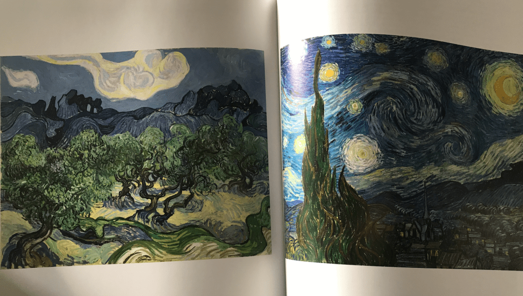
Inspired by Gus Powell and Van Gogh
The ‘Everything is a Remix’ poster combines two different artist techniques together to create something new from something old.
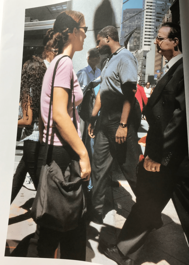
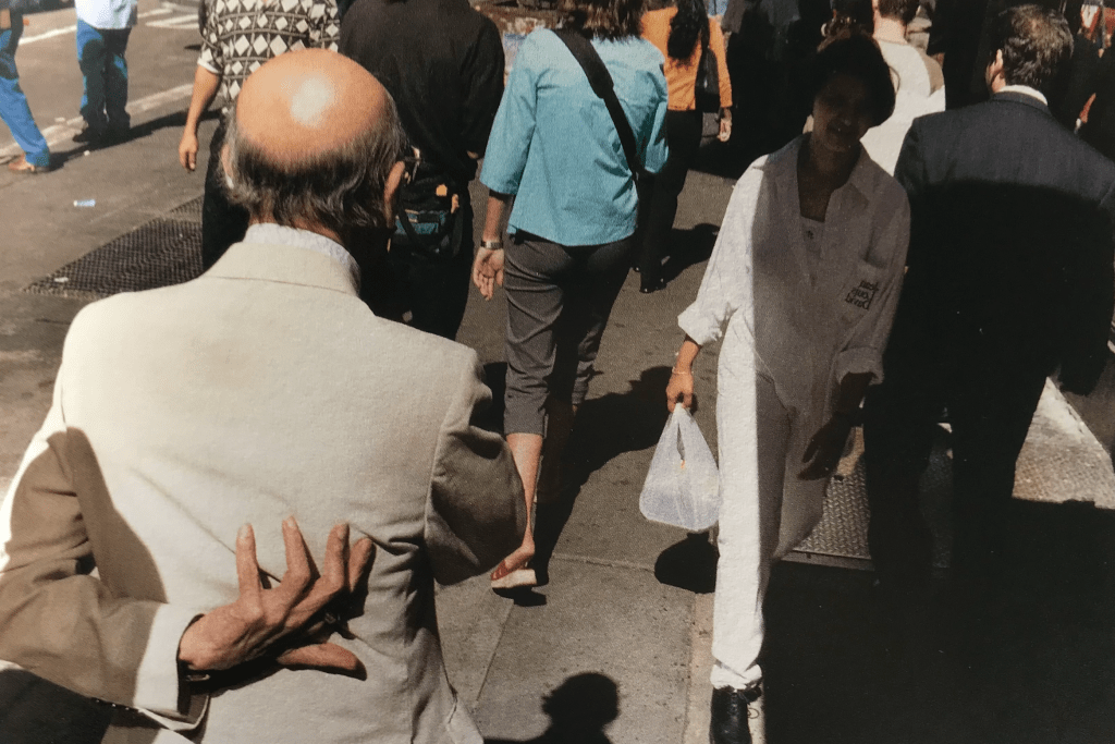
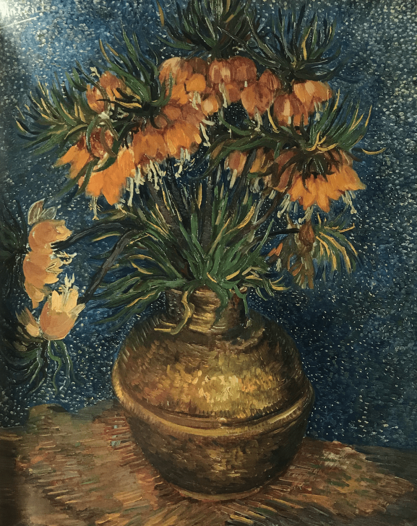
For this project I chose photographer Gus Powell and painter Van Gogh to be my inspirations.
After selecting various images and photos from books ‘Van Gogh and Nature’ and ‘The Company of Strangers’ I began to brainstorm various ideas for my poster.


My three initial ideas were…
1 – Exploring shadows + paint movement
2 – Black and white photos + paint accentuating different parts of a person / surroundings
3 – Busy scene of people with flicks of paint expressing nature
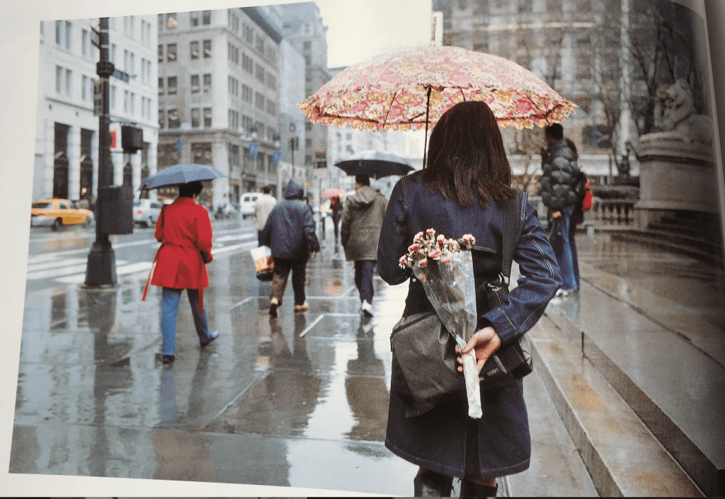
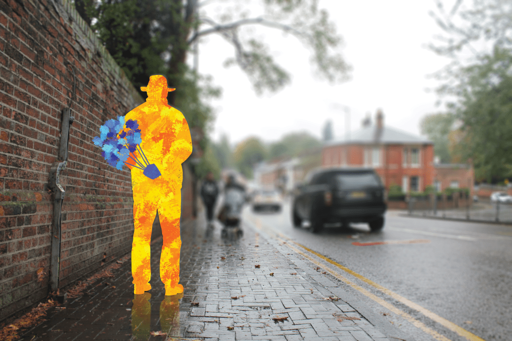
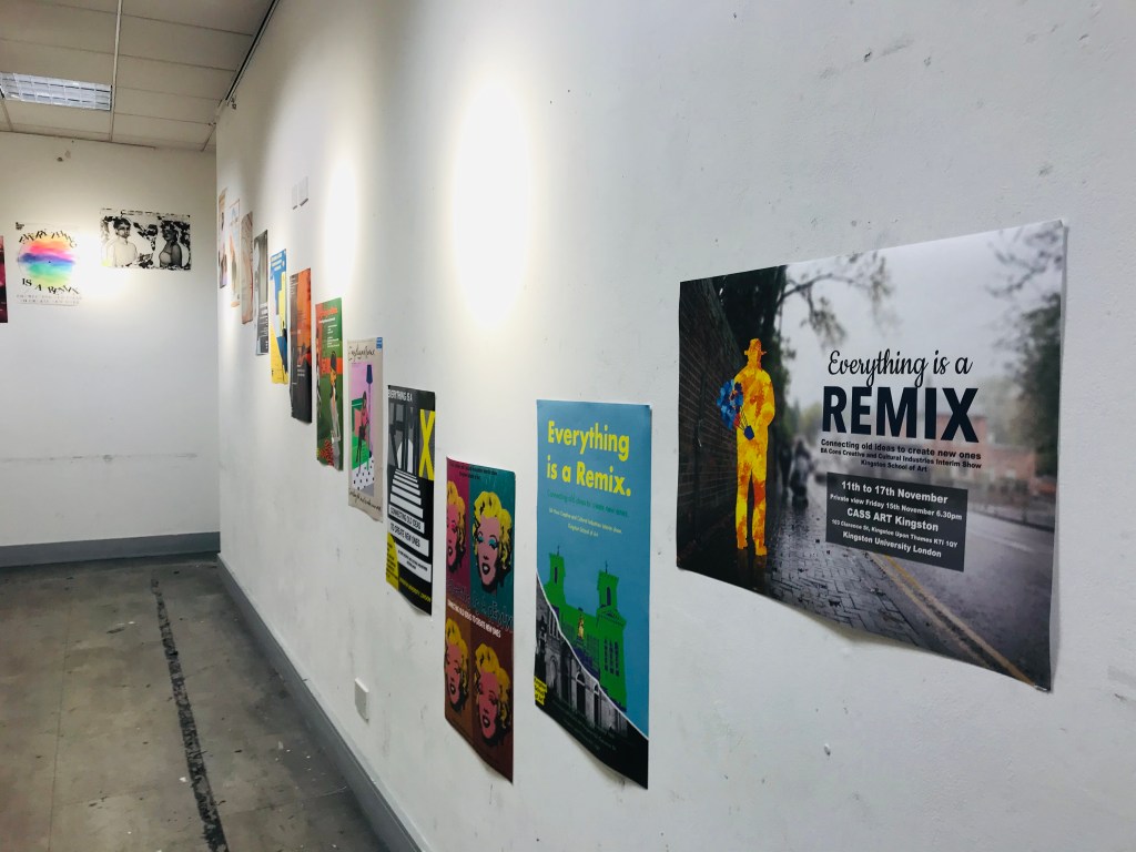
I then thought through my ideas and chose to create a combination of ideas 2 and 3 by taking a photo of a person in an open space like Gus Powell’s photography, with their silhouette painted in the style of Van Gogh. This idea came to mind when looking at one of Powell’s shots of a woman holding flowers behind her back with a city-like background around her.
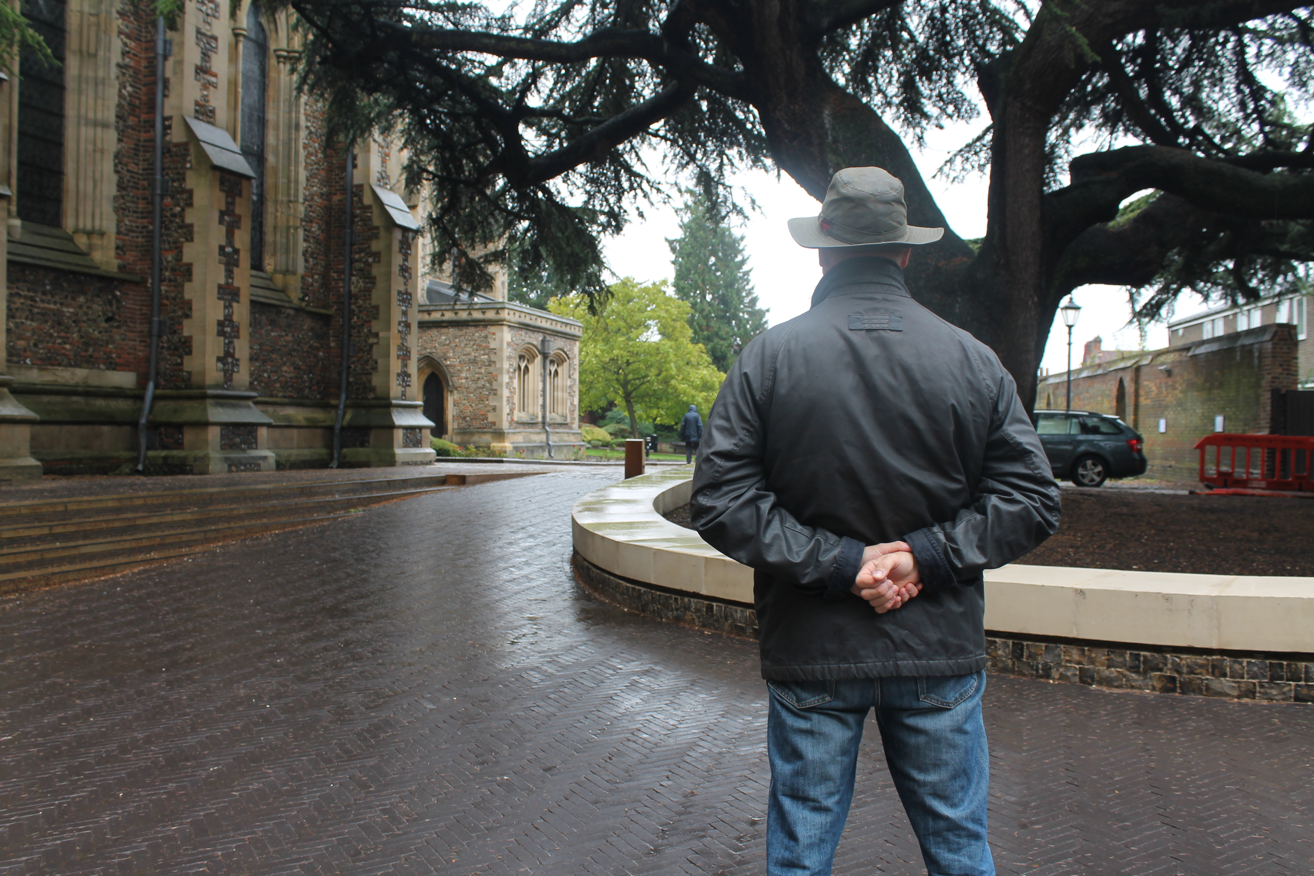
The following day I went to London and took photos of a person with their hand behind their back in the style of the referenced photo. Photos were taken in locations such as parks, church yards, streets etc. I wanted to have a selection of images to choose from.
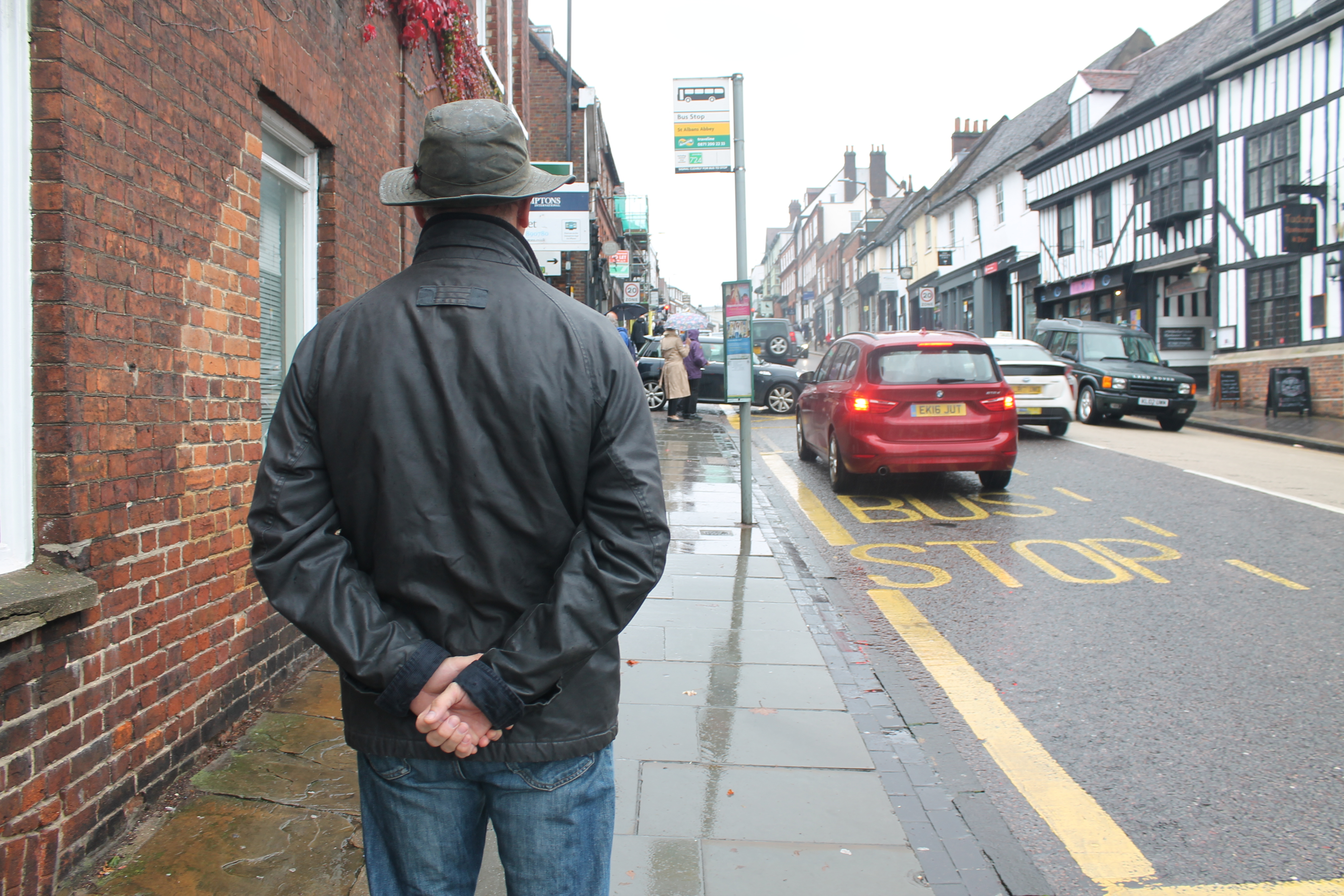
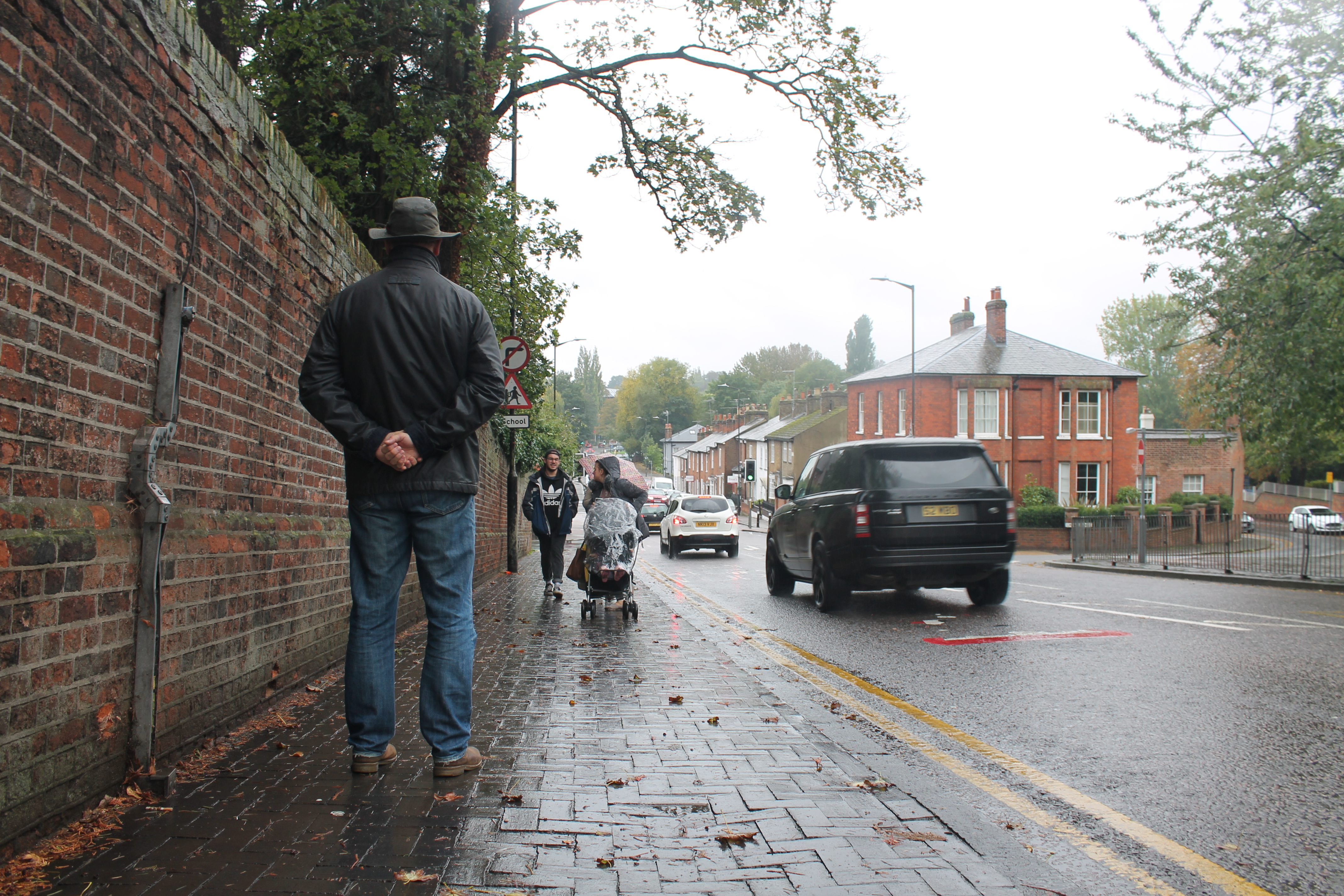
Out of all of the photos, I chose the street scene to show the business of the world around the model. Then I edited the photo on photoshop by tracing the shape of the model and creating a separate layer. I used the ‘French Sharp Block’ tool to paint within the shape, and chose Van Gogh’s colours (deep orange, red etc). I then added on a separate layer the bunch of flowers in his hands, with different shades of blues.
The reason for choosing to only paint on the model was to bring the viewers attention to him rather than the scene around him. He stands out in a busy, perhaps bleak environment – and that’s what I was aiming for aesthetically.
Then the final touches were added, including the subtle reflection of the model on the ground and the blurry background.

After the picture was ready, I worked on a second copy of the artwork with text written on top for the poster. I chose bold and enticing fonts to spark attention, and I used the colours blue, white and black for a simple and eye-catching effect.
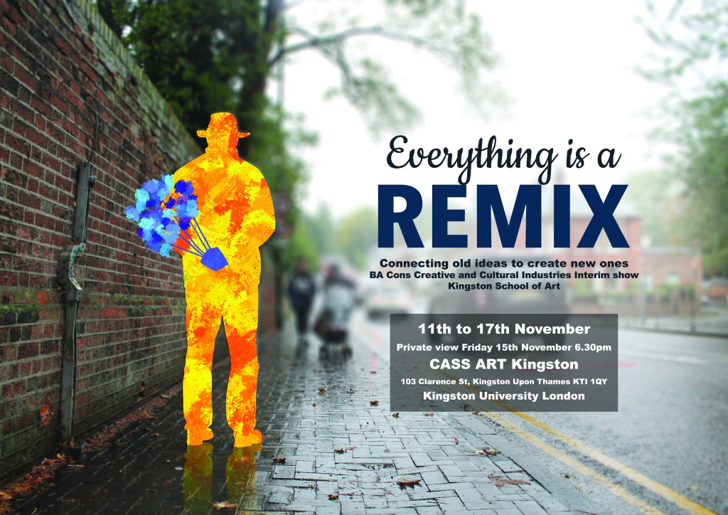
The project as a whole has been rewarding and insightful when combining two contrasting artistic styles together. The final poster is aesthetically pleasing and concentrates on the human figure which is what I was aiming for.
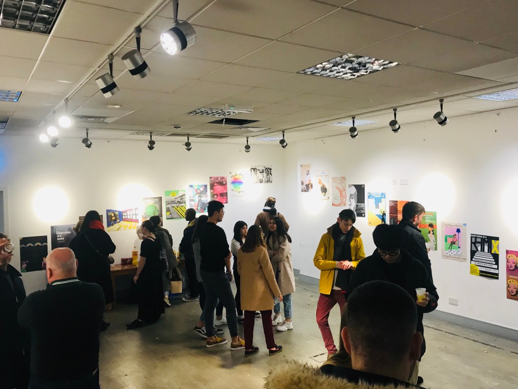
As a result, the poster was printed in A2 and presented in the exhibition ‘Everything is a Remix’ in the CASS Art Shop in Kingston Upon Thames.

Good job, Katie. I really like the subtle detail of the guy’s reflection in the damp pavement.
LikeLike