PAIK – Tate Modern

Visiting the Nam June Paik exhibition at the Tate Modern has been a very insightful experience.

His work stretches across a large spectrum from experimenting with technology and objects, to sound and large installations. Every piece carries deep meaning and causes fascination (or infant confusion) for the viewer.
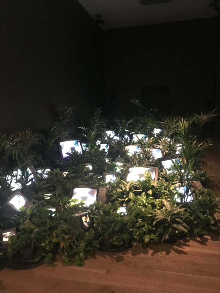
TV Garden – Paik 1974-77

The first piece was ‘TV garden’ where Paik pictured the ‘future landscape’ and how technology would become a part of our ‘natural world’. This installation, made in 1974-77, with its bright colours and comforting natural greens draws the viewer into understanding its meaning. 

What I personally found overwhelming was the fast-paced colours and movements from the screen, and how they contrasted with the calm mutual colours of the surrounding plants. It created a sense of sadness and disturbance, I felt the need to separate the two worlds. Paik follows the Buddhist belief that everything is connected, and yet in this art piece I found it difficult to accept the two art forms together.

Nam June Paik, Zen for Head, (1962) 
Photo: Harmut Rekort
Courtesy Kunsthalle Bremen © The Estate of Nam June Paik
Taken from The Tate page


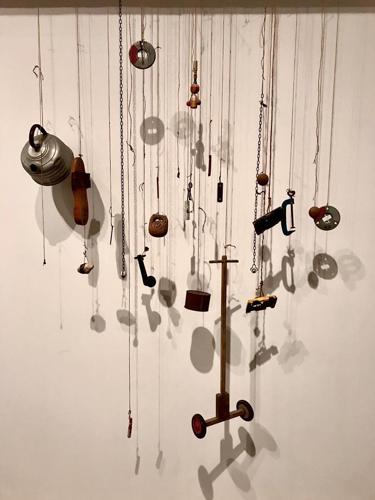
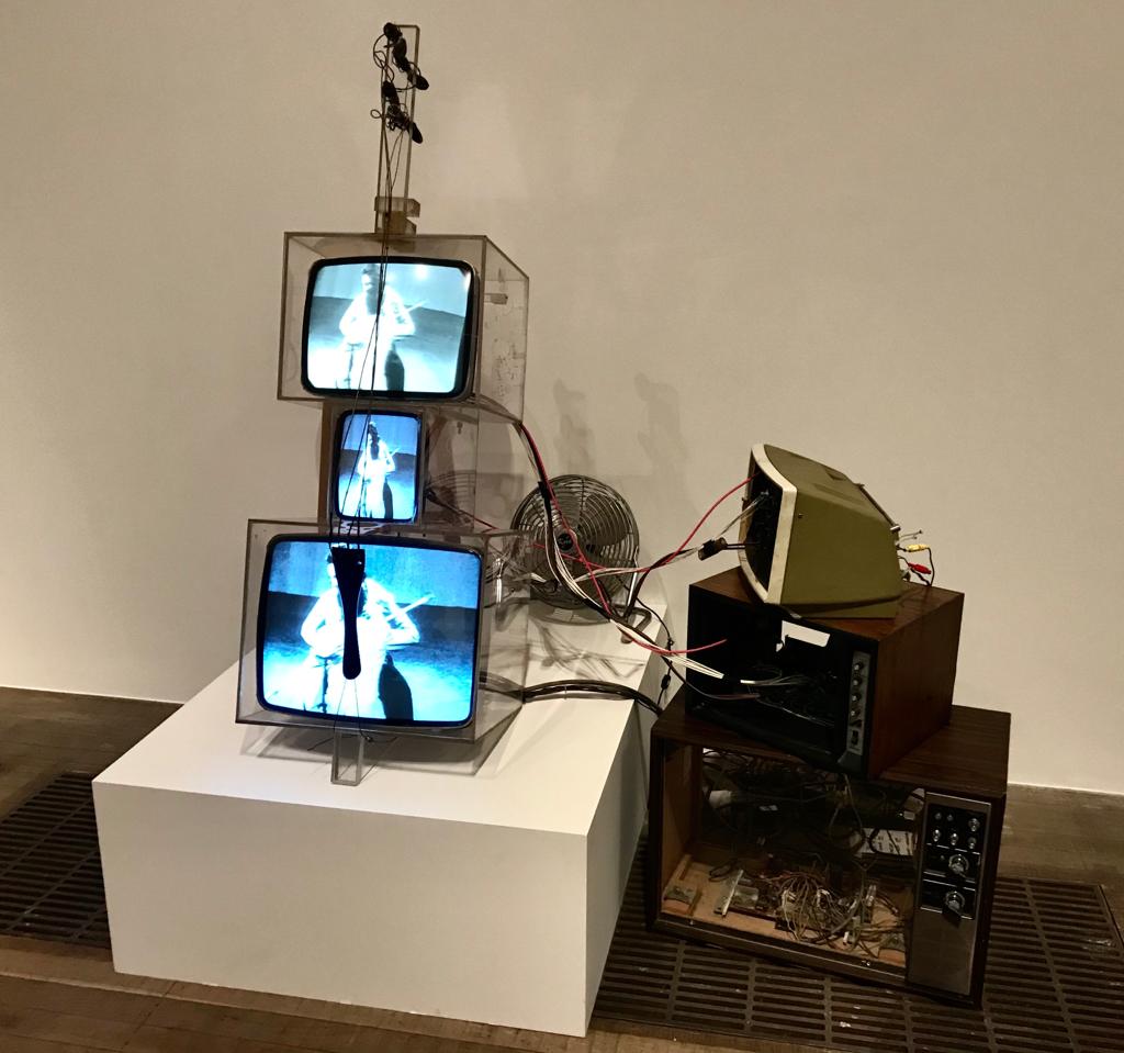
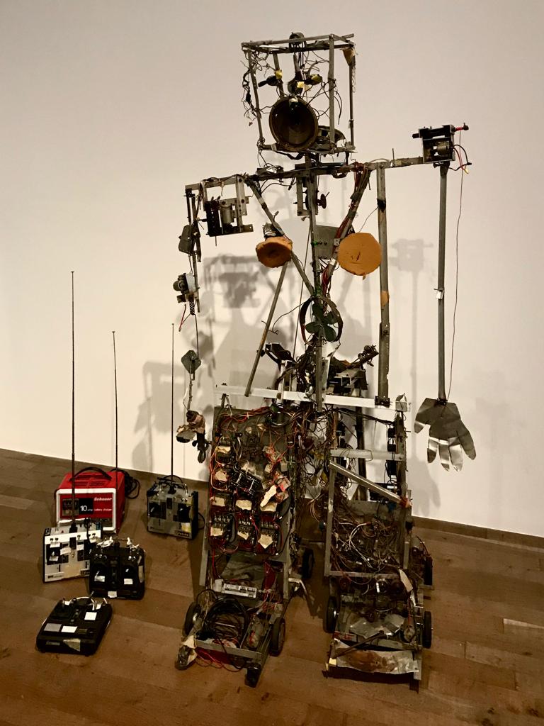
The exhibition continued by showcasing many contrasting pieces of work ranging from misshaped musical instruments to more quirky pieces such as the ‘Zen for head’ 1962. 

‘Zen for Head’ is a long roll of paper smeared with ink which Paik made by dipping his head, hands and tie into ink and running them down the page.

This piece was performed in front of an audience and was displayed on an old TV at the exhibition. Paiks movements were very agitated and restless when he performed, he seemed to be holding a lot of sadness inside of him. He gripped and ran his tie down the paper, and then immersed his head in the ink and dragged it down the work. It seemed as though it was an act of desperation. 
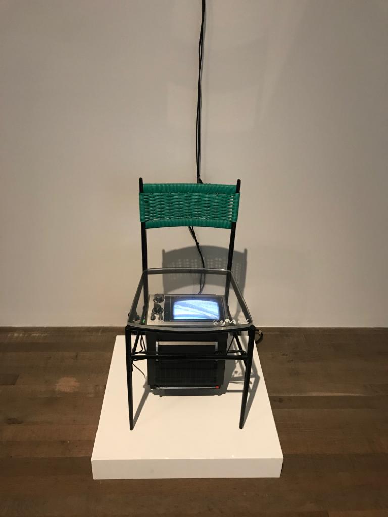
Tv Chair – Paik 1968


‘TV Chair’ is a fascinating piece of art. High above the chair is a security camera facing down, and under it is a TV with its screen facing up towards the base. When observing this installation, there was a sense of discomfort caused by the thought of sitting on the chair and being ‘watched’ from above and below. The colour green in this case wasn’t comforting like the previous installation, but instead unsettling

One Candle – Paik

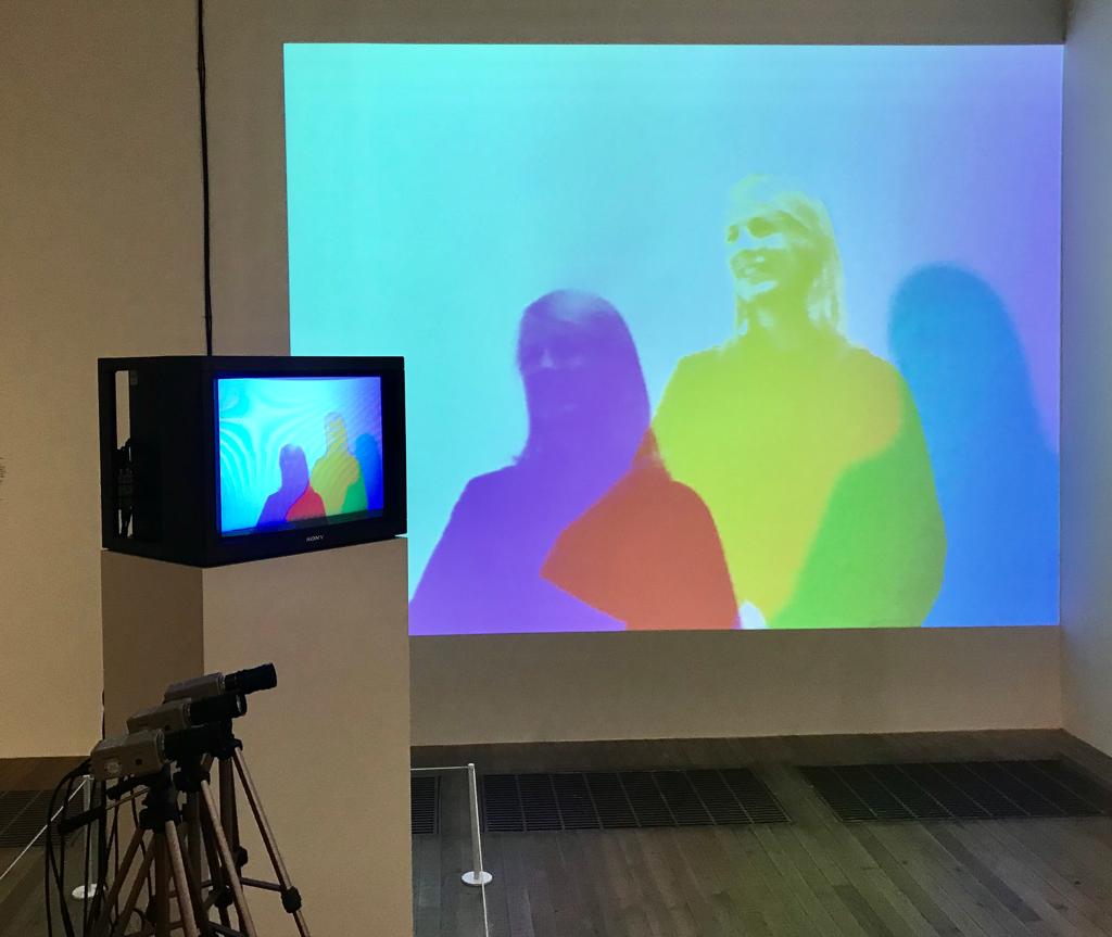
The ‘One Candle’ is of a flickering flame which is recorded by a CCTV camera and projected in multiple images on walls surrounding it. The colours of the flame are hot and alive, but once projected, they become cold and parallel to the original piece.

Paik’s intentions were to represent the Buddhist belief of connection and process of continual change. He concentrates how visitors’ movement affects the flames form and rhythm.

Initially I interpreted the piece as portraying of how technology can only create a replica of the real thing, and will never be the original. Whereas after, when having studied the artists intended meaning, the piece has taken another form. 

Every art piece was enriching and inspiring. The installations with music and audio were the most memorable for me, as I was able to have a full emersion into the art. All the surrounding noise and distractions were cancelled out, and I was able to concentrate on the visuals ahead of me. 

The colours, movement, sounds, fabrics and shapes were all a part of the wonder in Paik’s art work, and as a result will be an inspiration for future work and development. 
Christmas Card Competition

The brief was to create a Christmas card for DARE ‘The Development, Alumni Relations and Engagement directorate’ from Kingston University and to keep in touch with alumni in and outside the UK.

The request was for a Christmas card including one of the Kingston University buildings and to include an artistic flair. If successful, the design will be printed in C5 and distributed in December 2019.

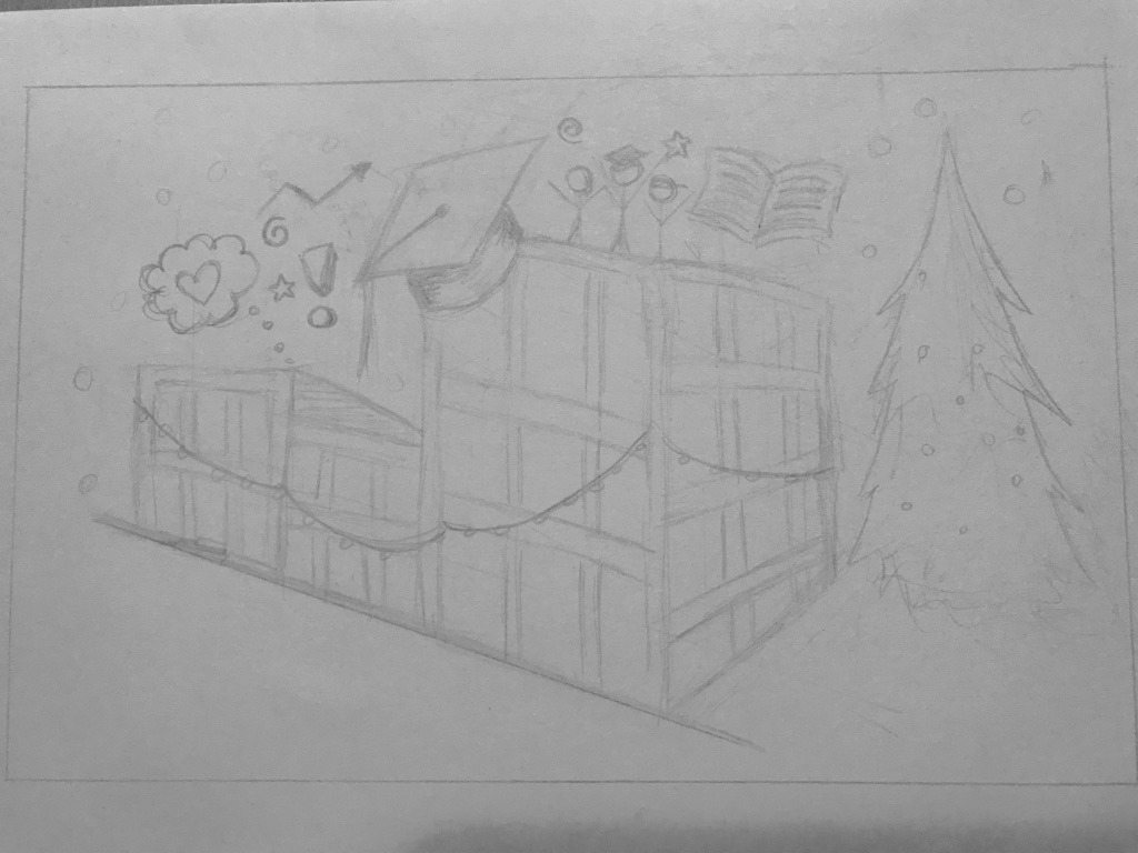
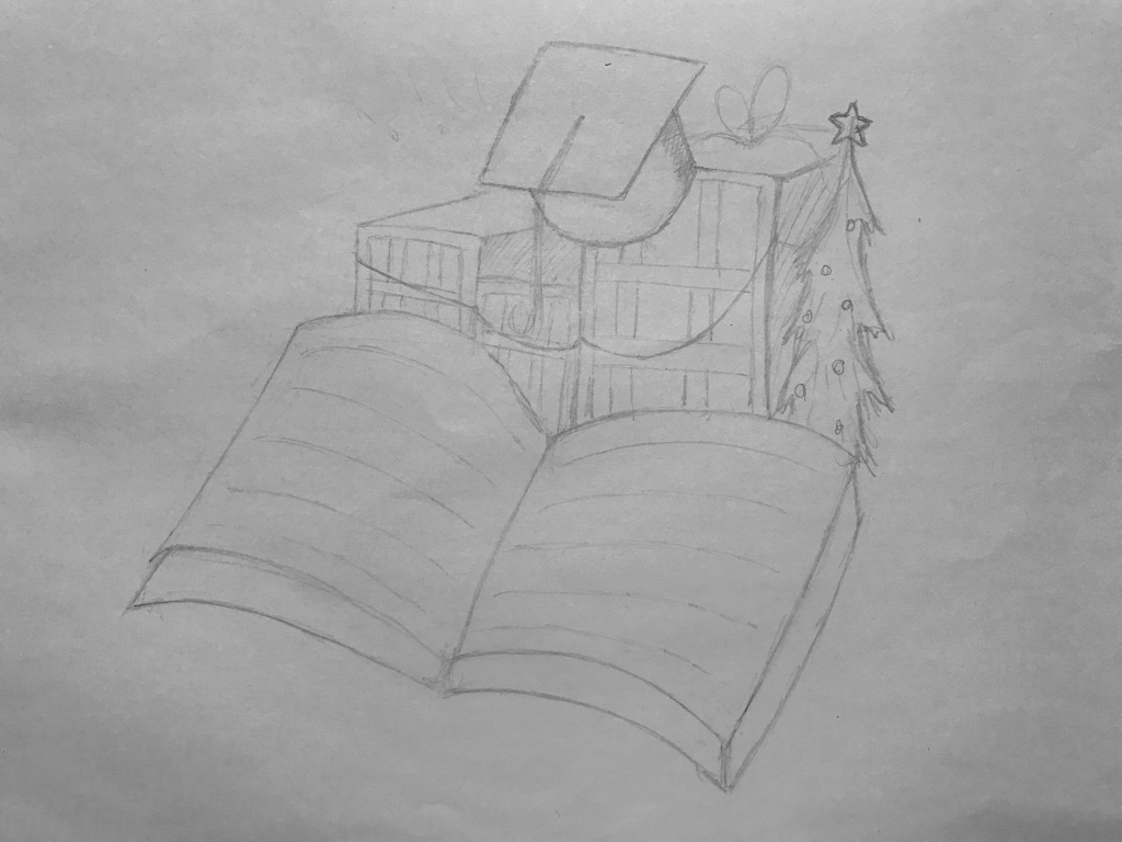
To begin the brainstorming process, I started by listing possible ideas. I initially thought of including the new ‘Town House‘ university build on Penryn Road, a graduation cap and lots of trees and decorations.
I sketched books, think bubbles and people on top but after some thought I decided not to use those drawings when considering the target audience.

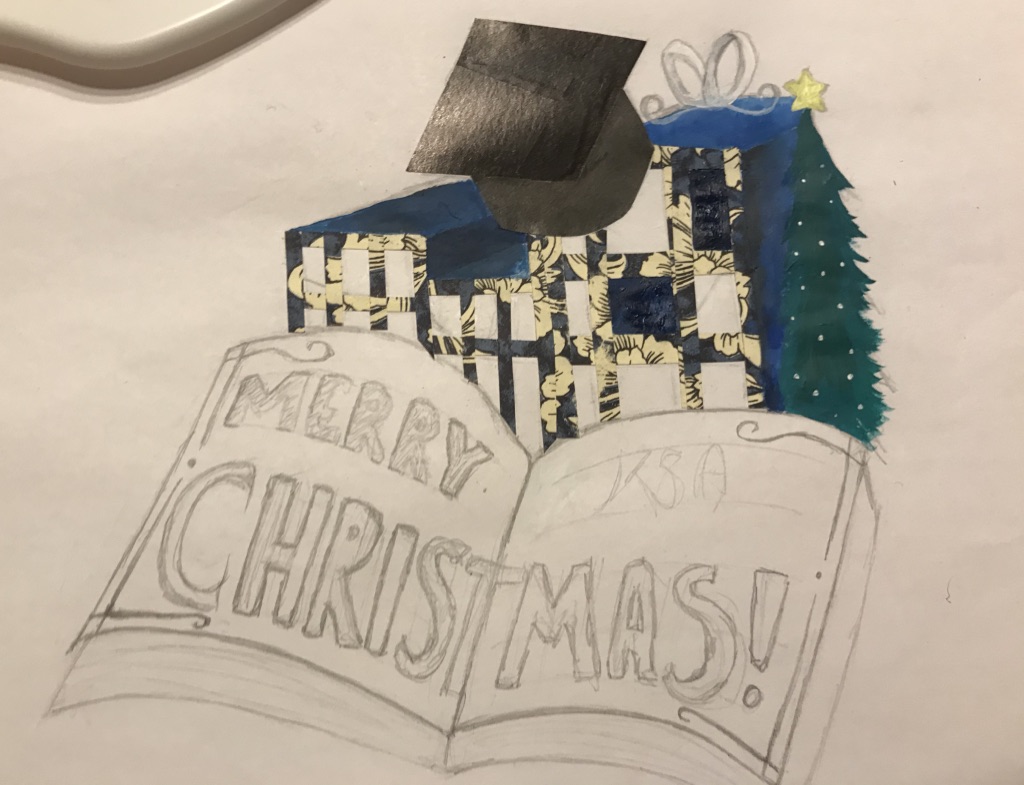
Then I thought about how I could add text to the piece, so I added a book in the centre and positioned the building onto with the graduation cap and trees.
During this process, I played with the idea of turning the buildings into presents by adding a bow on top and transforming the buildings into box shapes.

When working on the final piece, I saw how the buildings were appeared to be too dark. So I decided to add more colour surrounding the book by adding reds and lighter greens in and outside the book. I used shiny pens to highlight the pages and ‘KSA’ on the right.
Overall this task was enjoyable but also challenging when coming to composition. My initial idea ended up being very different from the final piece which I felt was a risk.
If I could do this again, I would make the buildings as the central focus rather than the text, and add some figures of students to create a better connection between the card and the audience.

However, the card shows to be visually pleasing with warm colours reflecting the Christmas spirit, so time will tell whether this card gets through the competition!

Everything is a Remix

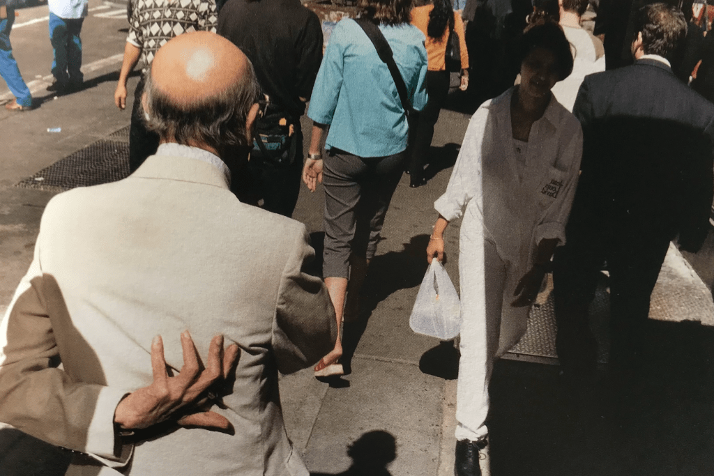
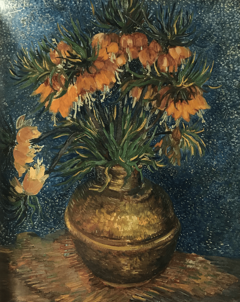
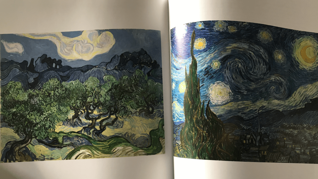
Inspired by Gus Powell and Van Gogh

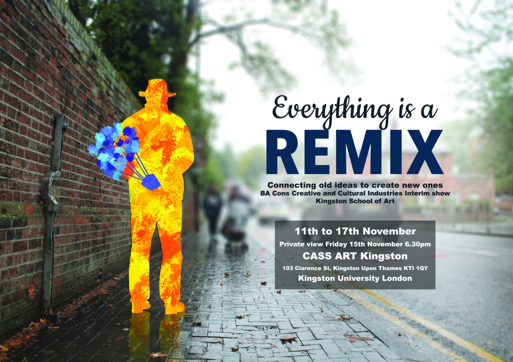
The ‘Everything is a Remix’ poster combines two different artist techniques together to create something new from something old. 

For this project I chose photographer Gus Powell and painter Van Gogh to be my inspirations. 

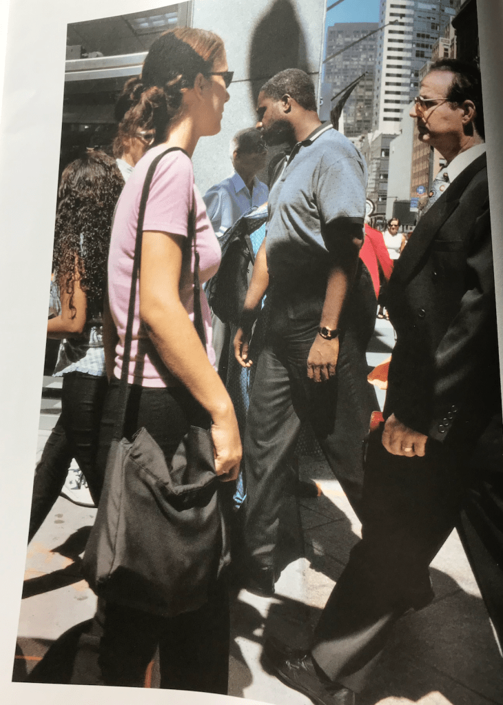
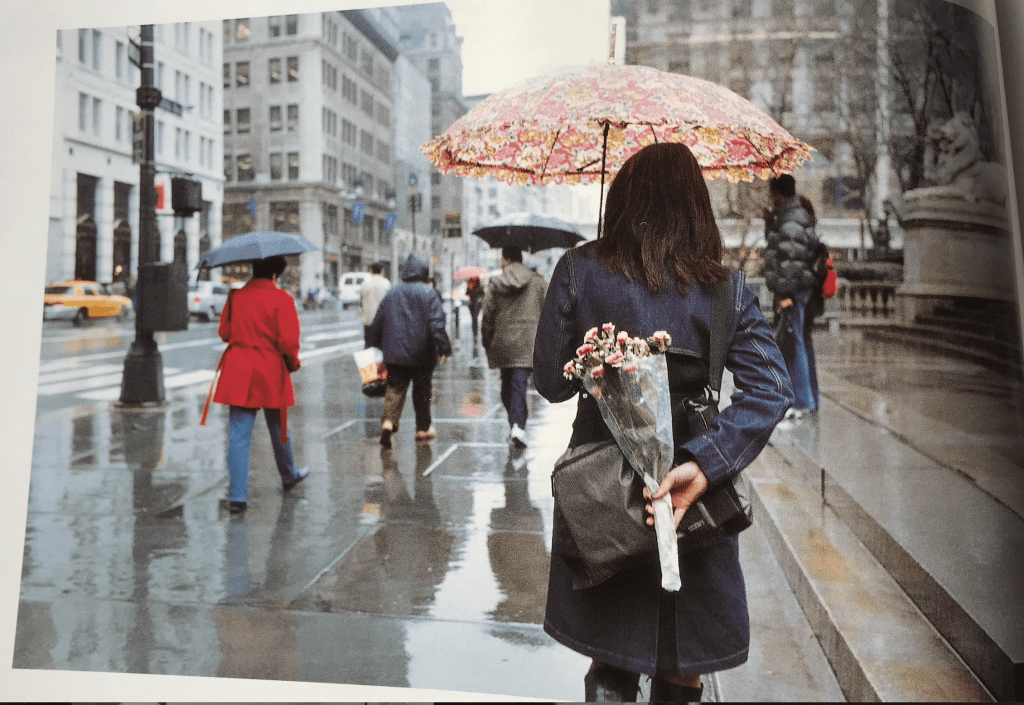
After selecting various images and photos from books ‘Van Gogh and Nature’ and ‘The Company of Strangers’ I began to brainstorm various ideas for my poster. 

My three initial ideas were… 

1 – Exploring shadows + paint movement 

2 – Black and white photos + paint accentuating different parts of a person / surroundings 

3 – Busy scene of people with flicks of paint expressing nature 

I then thought through my ideas and chose to create a combination of ideas 2 and 3 by taking a photo of a person in an open space like Gus Powell’s photography, with their silhouette painted in the style of Van Gogh. This idea came to mind when looking at one of Powell’s shots of a woman holding flowers behind her back with a city-like background around her. 

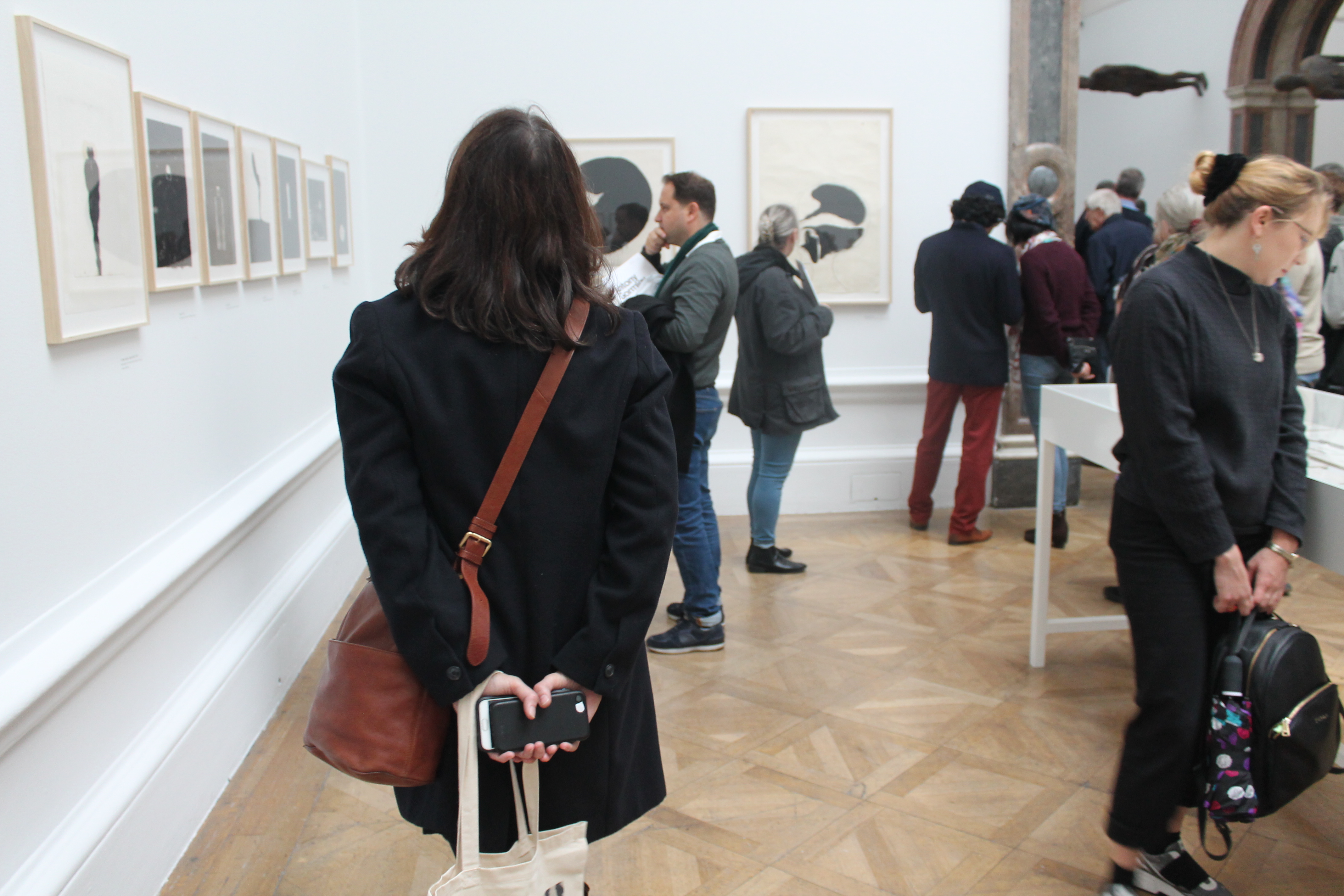
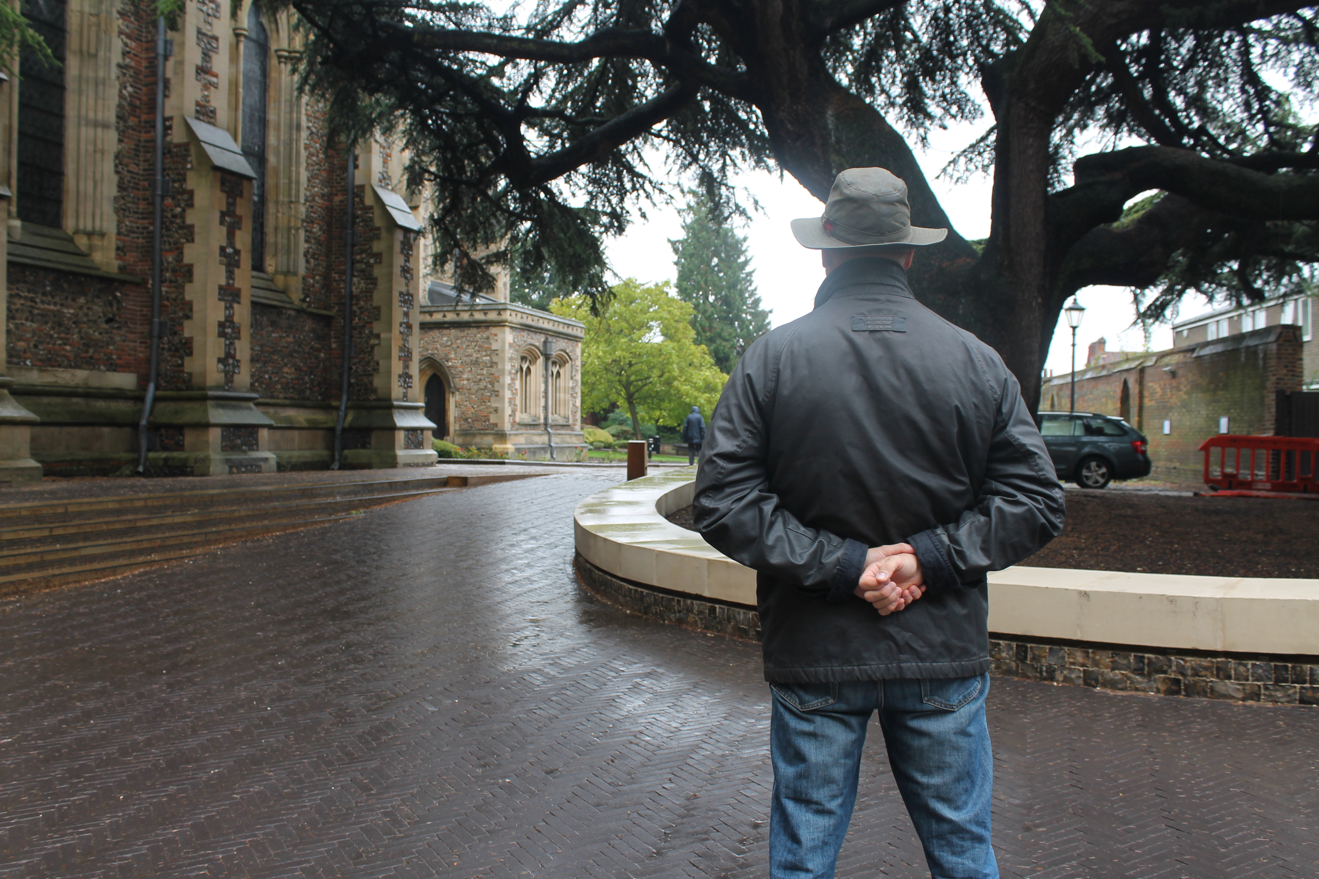
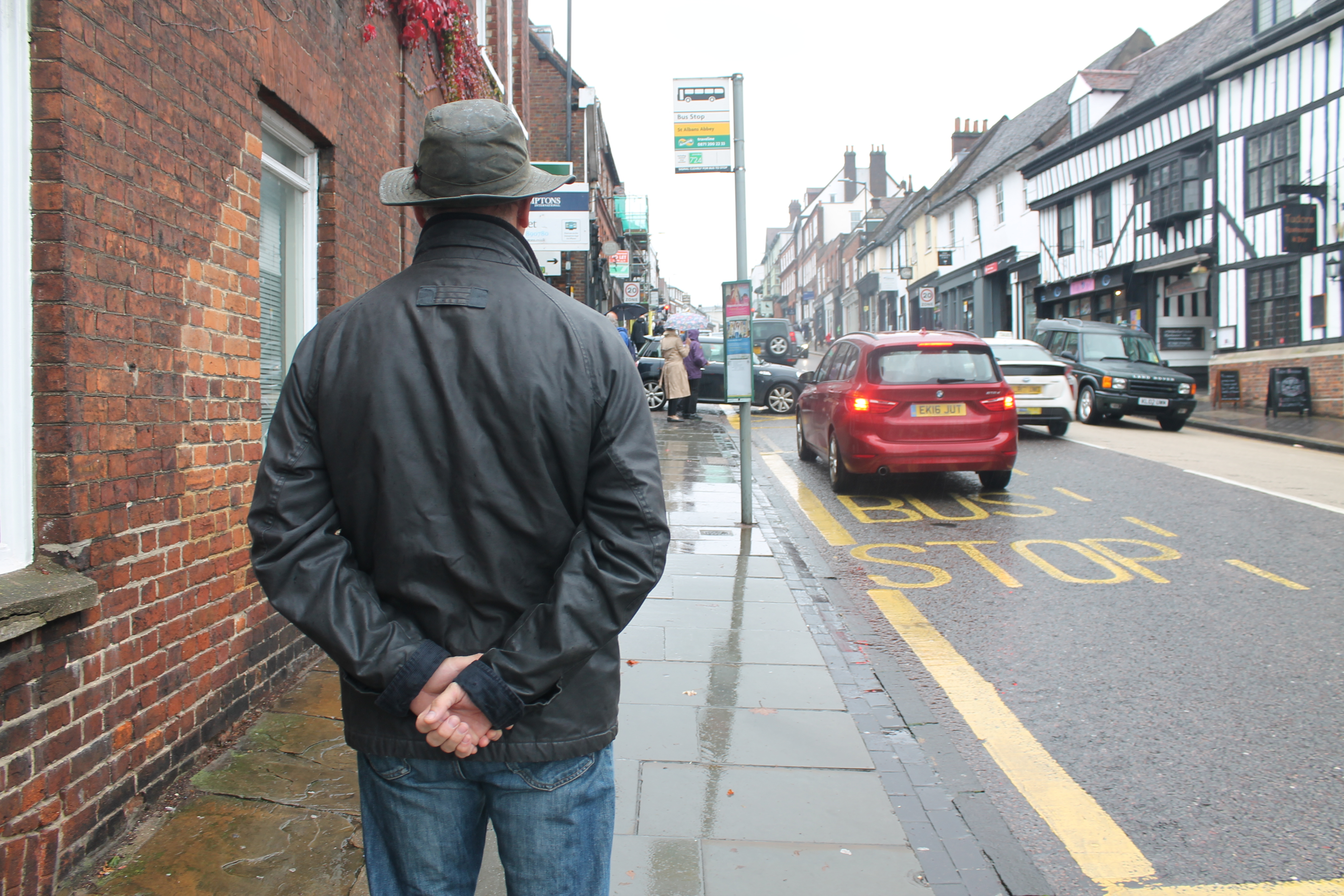
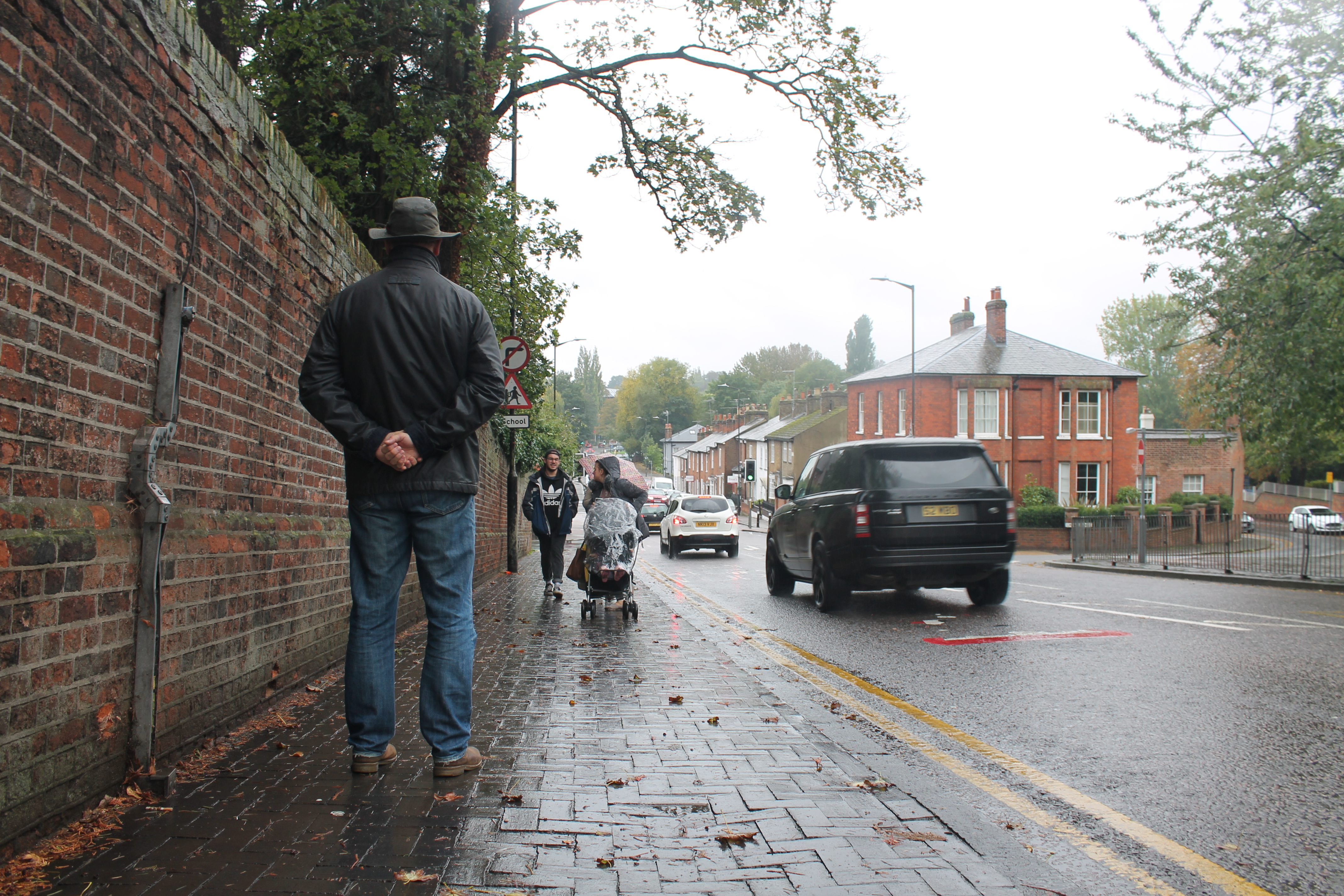
The following day I went to London and took photos of a person with their hand behind their back in the style of the referenced photo. Photos were taken in locations such as parks, church yards, streets etc. I wanted to have a selection of images to choose from. 

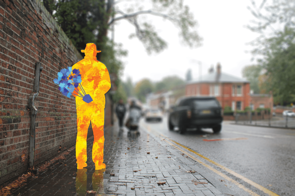
Out of all of the photos, I chose the street scene to show the business of the world around the model. Then I edited the photo on photoshop by tracing the shape of the model and creating a separate layer. I used the ‘French Sharp Block’ tool to paint within the shape, and chose Van Gogh’s colours (deep orange, red etc). I then added on a separate layer the bunch of flowers in his hands, with different shades of blues. 

The reason for choosing to only paint on the model was to bring the viewers attention to him rather than the scene around him. He stands out in a busy, perhaps bleak environment – and that’s what I was aiming for aesthetically. 

Then the final touches were added, including the subtle reflection of the model on the ground and the blurry background. 

After the picture was ready, I worked on a second copy of the artwork with text written on top for the poster. I chose bold and enticing fonts to spark attention, and I used the colours blue, white and black for a simple and eye-catching effect.  

The project as a whole has been rewarding and insightful when combining two contrasting artistic styles together. The final poster is aesthetically pleasing and concentrates on the human figure which is what I was aiming for.

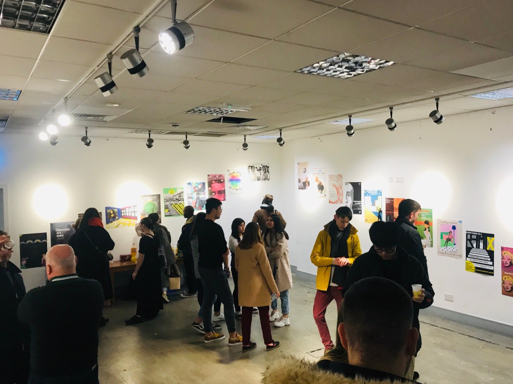
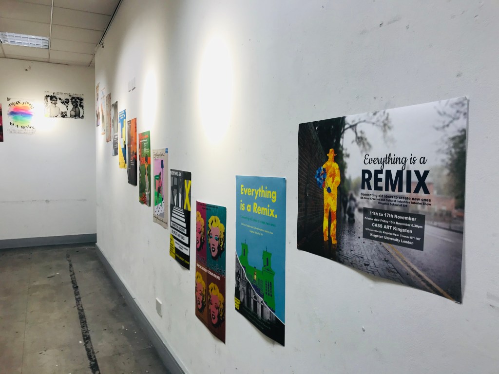
As a result, the poster was printed in A2 and presented in the exhibition ‘Everything is a Remix’ in the CASS Art Shop in Kingston Upon Thames.

Assignment 1 | Typographic Collage

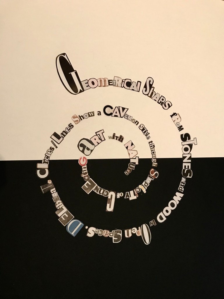
Richard Long is famous for creating geometrical shapes out of resources such as stones and wood, in open spaces. The paleolithic style can be seen through his art due to his use of simple shapes and materials. His deliberately placed mediums forming circles and lines shows the simplicity of connecting art with the natural world.

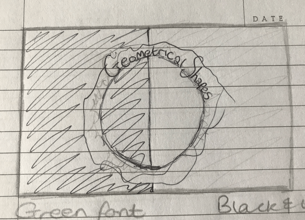
When thinking about how to incorporate Richard Long’s art into a typography piece, I began by sketching possible ideas using shapes and text. The text limit is 25 words, so I initially thought it would fit in one circle.

The idea of cluttering text around a solid circle shows the precision the artist uses with shapes. His use of materials (stones and wood) are wild and unpredictable, so to express this I’m using an unorganised method of placing the letters.

Intial sketch idea

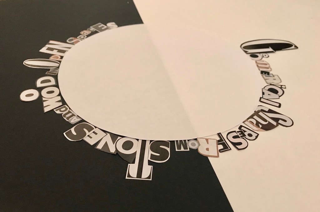
To start with, I stuck black paper onto a white A2 sheet to have a black and white background. This represents Richard’s simple approach to making decisions, and how it can have an impact on the viewer. The strong line down the middle of the page (from the separation of paper) is to represent his work with lines.

‘Grazia’ and ‘Your Home’ magazines
Cut up letters from magazines

I started by selecting a range of bold and interesting fonts to place around a cut-out circle template to see how the composition would look.

This was the point when I realised all of the worlds can’t fit around a circle, so I decided to create a swirl instead.

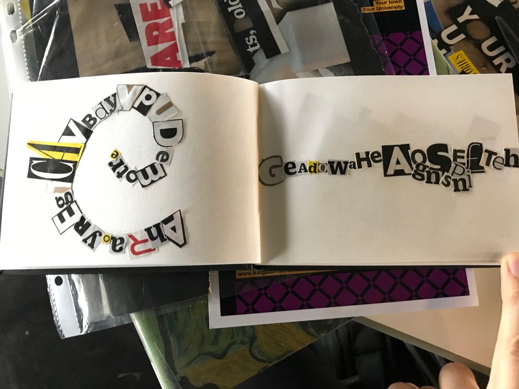
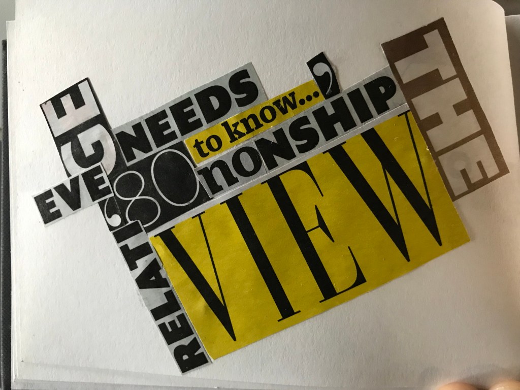
After lots of concentration, cutting and sticking my piece was finished. I have enjoyed this project, and was inspired to create extra mini pieces as a result…

Remixing Barbara Kruger

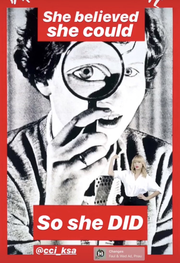
To experiment the theme of remixing, we used Barbara Krugers work to create our own video ‘remixes’.

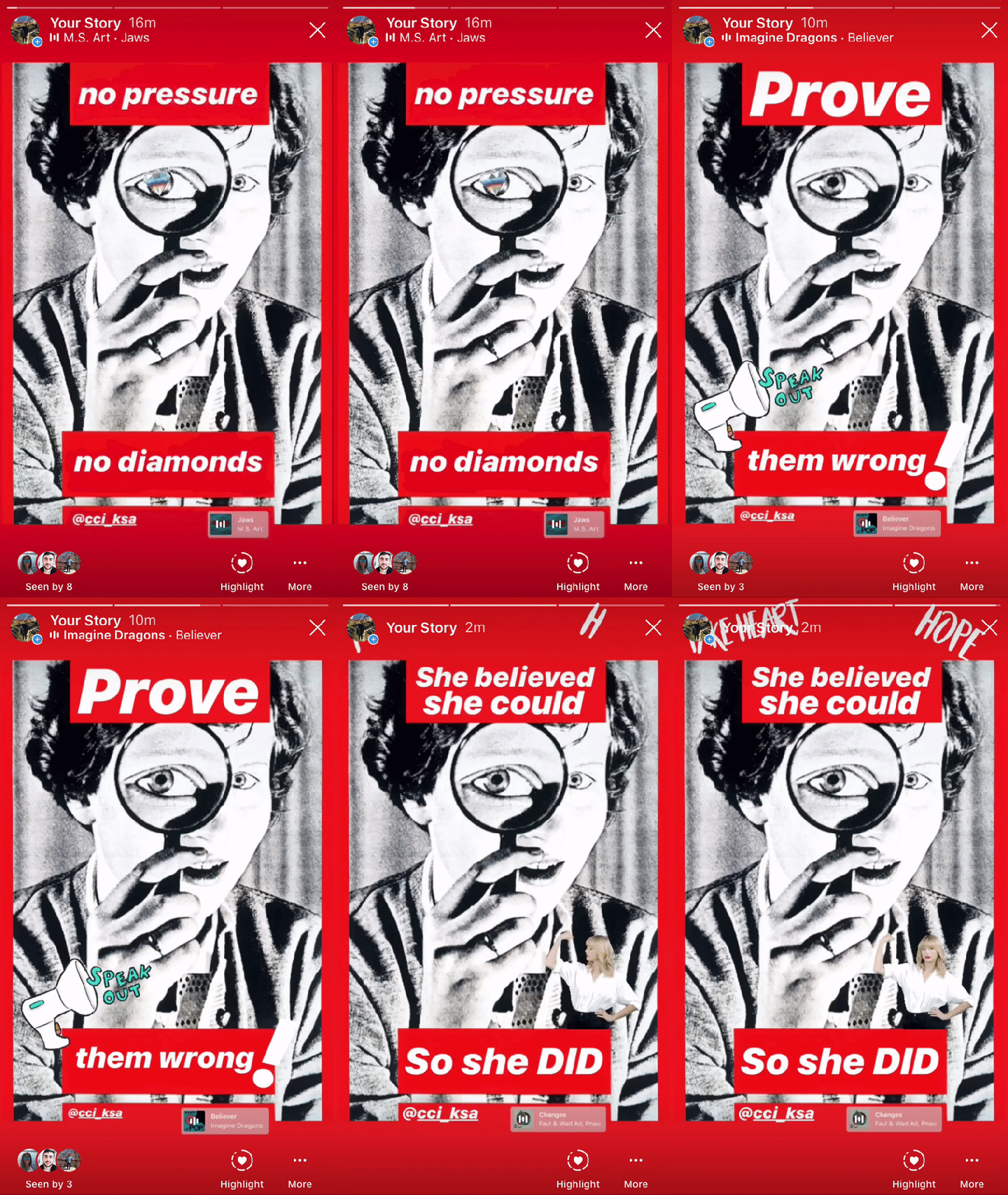
As a group, we chose three different photos by the artist and removed the original words from her work and added three self chosen quotes. Then we published our work on Instagram with further mediums such as GIFs and music to create more engaging pieces.

I chose Kruger’s untitled piece ‘It’s a small world, but not if you have to clean it’ for the project. It is a bold piece with a strong image, so I believed it would go perfectly with my chosen quotes.

When choosing the GIFs and music, the quotes had to be considered in order to create a relevance between them.

My quotes were …

No pressure, no diamonds

Thomas Carlyle

Prove them wrong

Arnold Schwarzenegger

She believed she could, so she did

R.S. Grey

When choosing the music I considered the quotes and the background image. For instance, with the ‘Prove them wrong’ quote, I added the music ‘Believer’ by Imagine Dragons because it is a punchy, inspiring song which can inspire the viewer.

Another example ‘She believed she could, so she did’ I added the song ‘Changes’ by Faul & Wad Ad because it is an upbeat positive song which has an energetic rhythm which will interest the viewer. In the background I put GIFS, with the words hope and take heart, to further express positivity towards acting towards your dreams as shown in the quote.

The third image has the quote ‘ No pressure, no diamonds’. As a backing track, I used the theme tune to Jaws, creating a build up of pressure. A diamond GIF on the woman’s eye expresses the need for intensity in order to get good results.

After creating the pieces, we posted the videos on instagram which were viewed by my followers.

It has been an interesting task working alongside people who weren’t able to use technology easily, because I was able to teach what I have taught myself over the years on social media. Working in this team has opened my eyes to discover more about promoting my work, and making stories on instagram look as clean and eye-catching as possible. Nowadays, people look for simple and shocking visuals which they can interact with. Learning how to choose the most impactful quotes, images and GIFS has been a worthwhile exercise.

Extra Activity

Pieces of paper with 30 drawn circles were handed out to the class. We were instructed to draw a face inside each of the circles, and then pass the paper onto the next person. After each rotation of paper, we added different features. So by the time we passed the paper on four times, we has a sheet full of eclectic looking faces. We were then named them, gave them a job and then created a story as a group with a given story board.

This entertaining exercise showed how incorporating different ideas by ‘remixing’ gives an unexpected outcome. Seeing how others reacted to the challenge was intriguing as many couldn’t cope with the time limit and simplicity of the exercise. I find enjoyment in working with other ideas, so this challenge was rewarding. 

The Invasion of Kingston

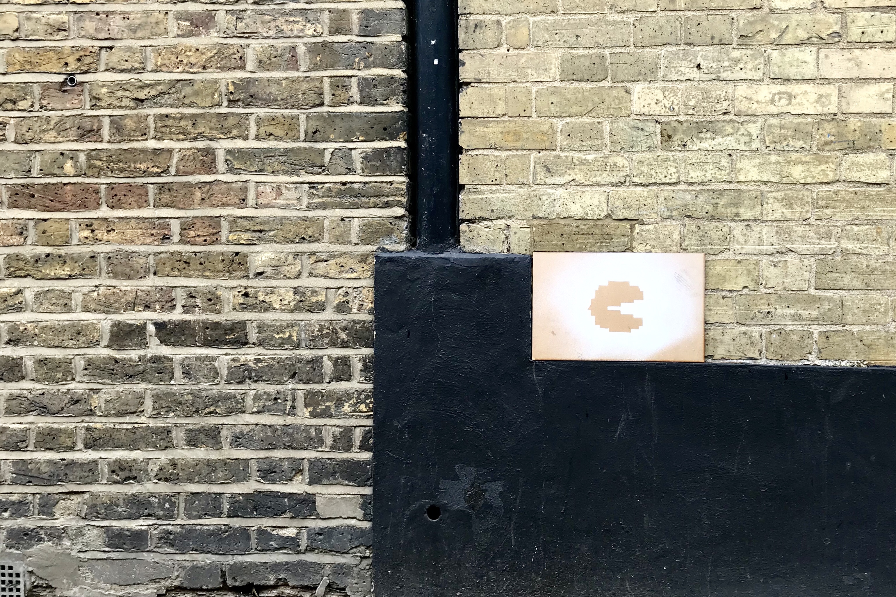
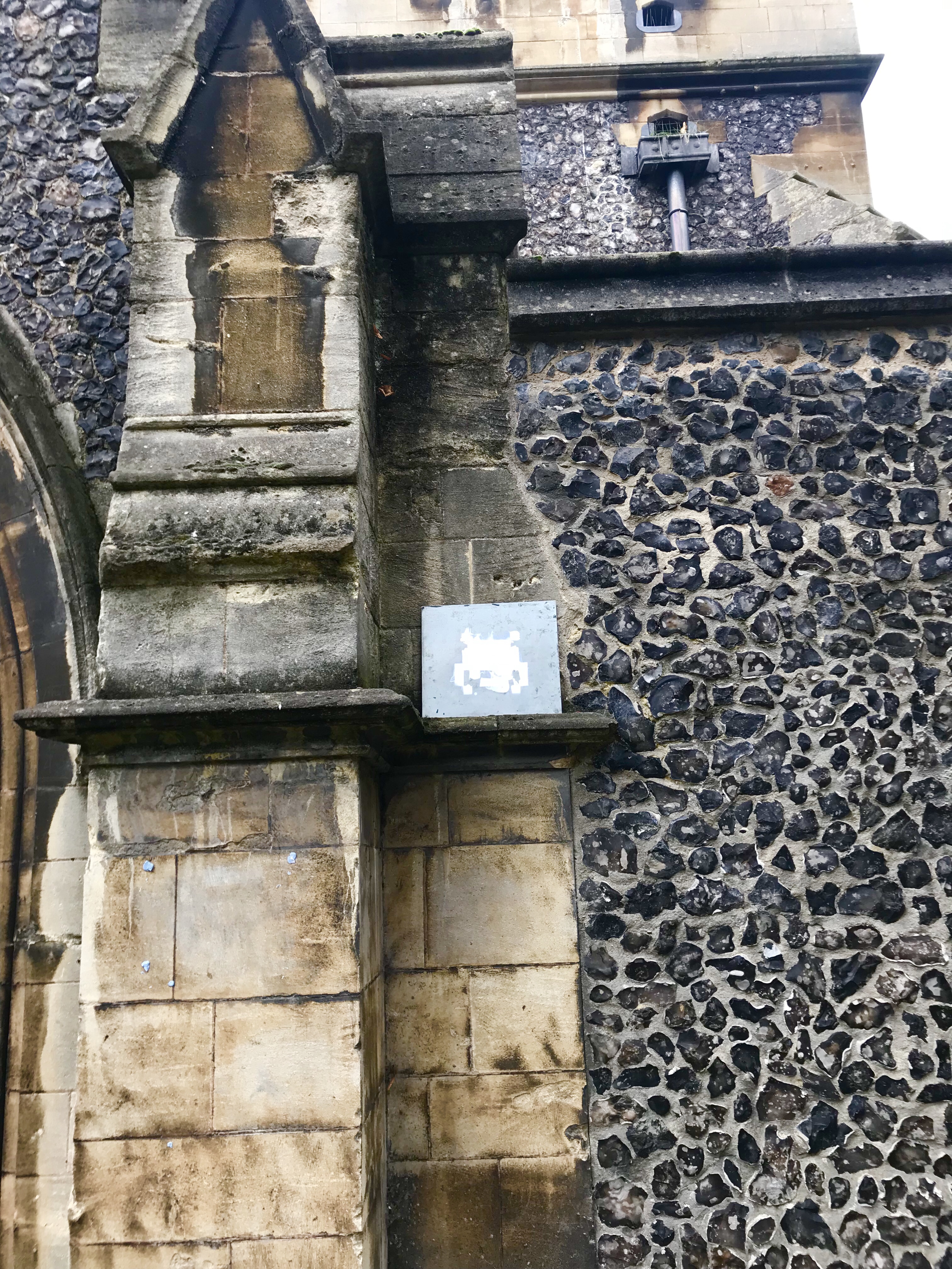
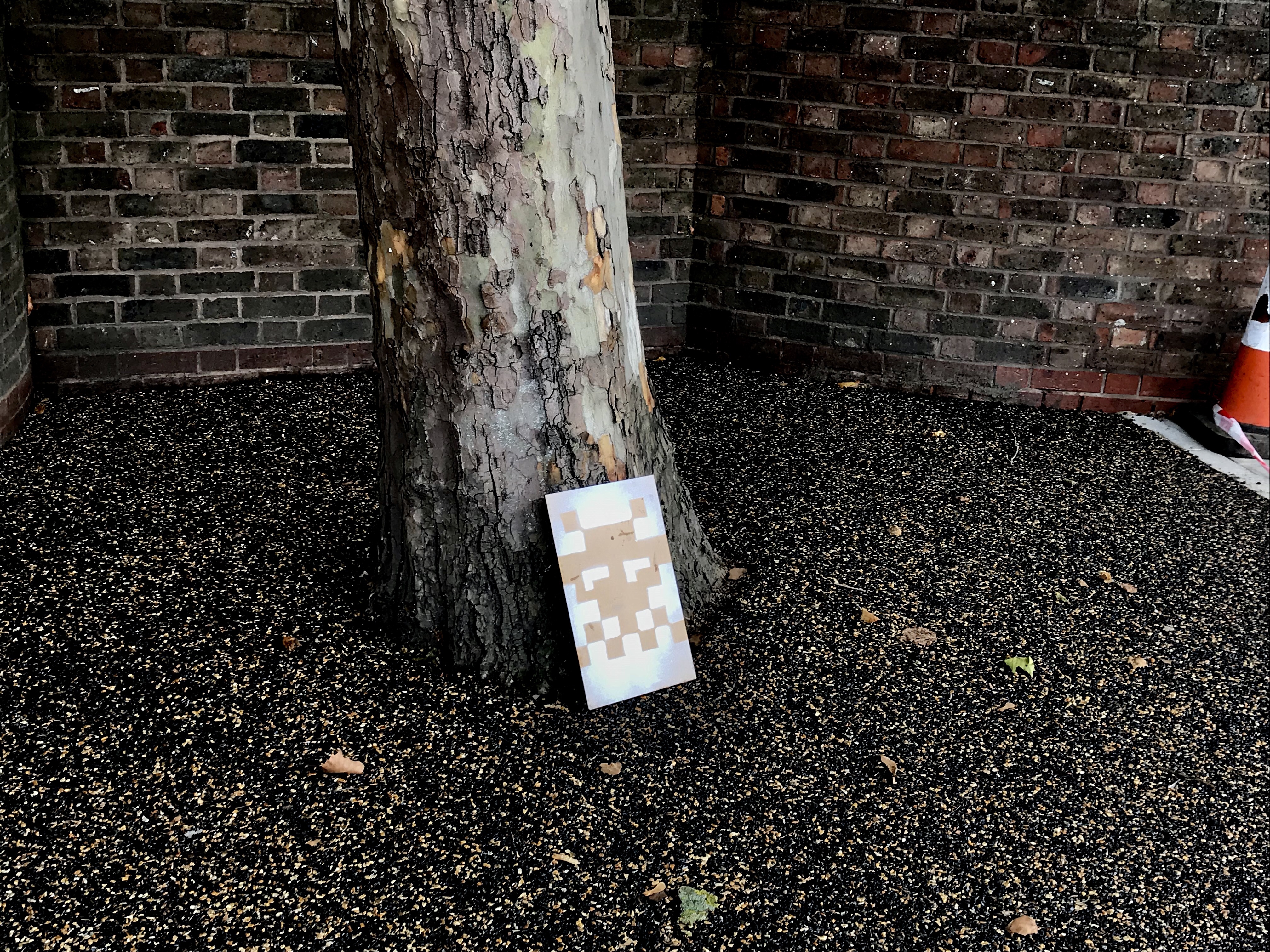
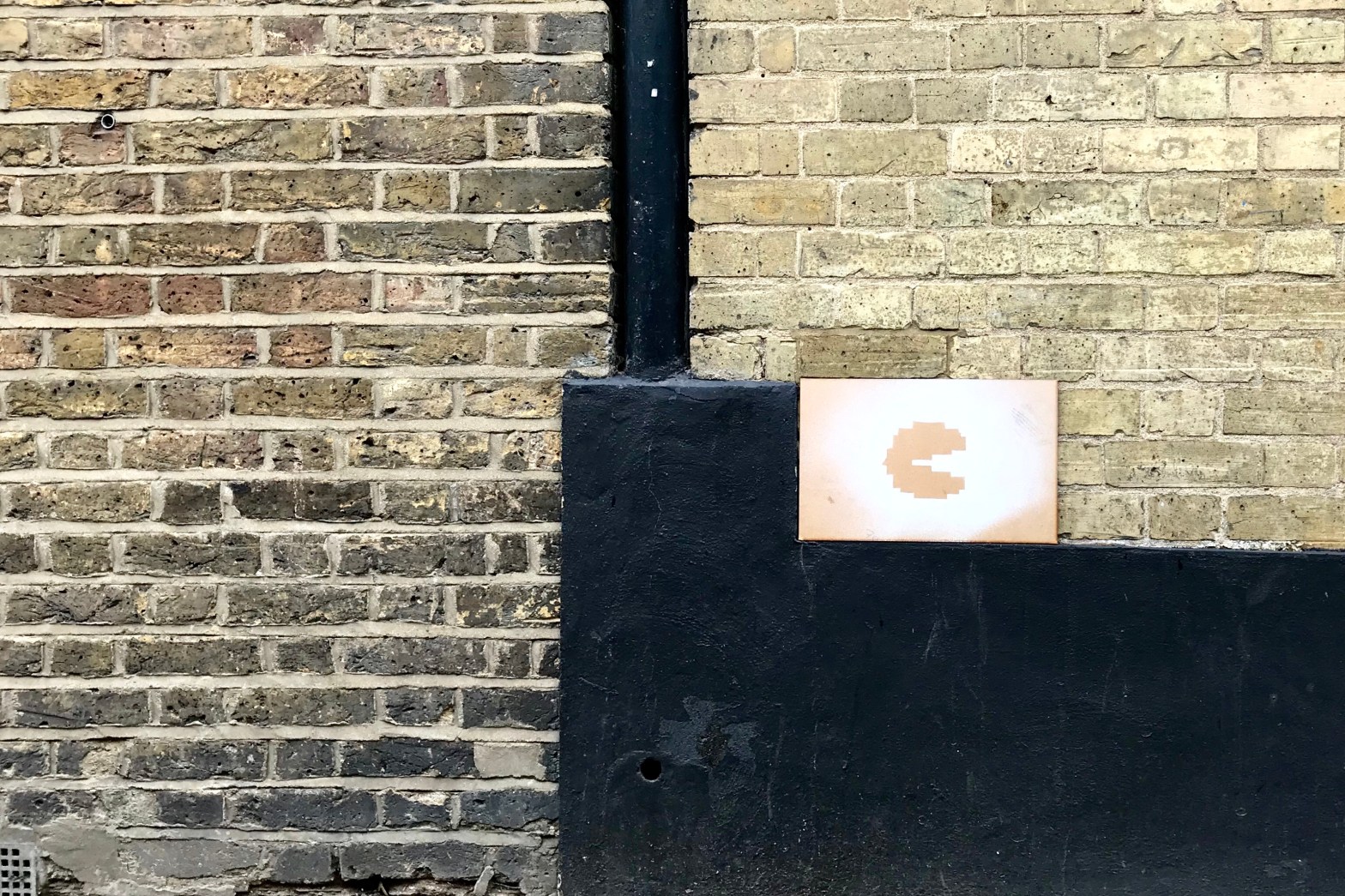
As a small project, we were instructed to choose three 8 bit invaders (inspired by the artist ‘Invader’) and put them around the town of Kingston.


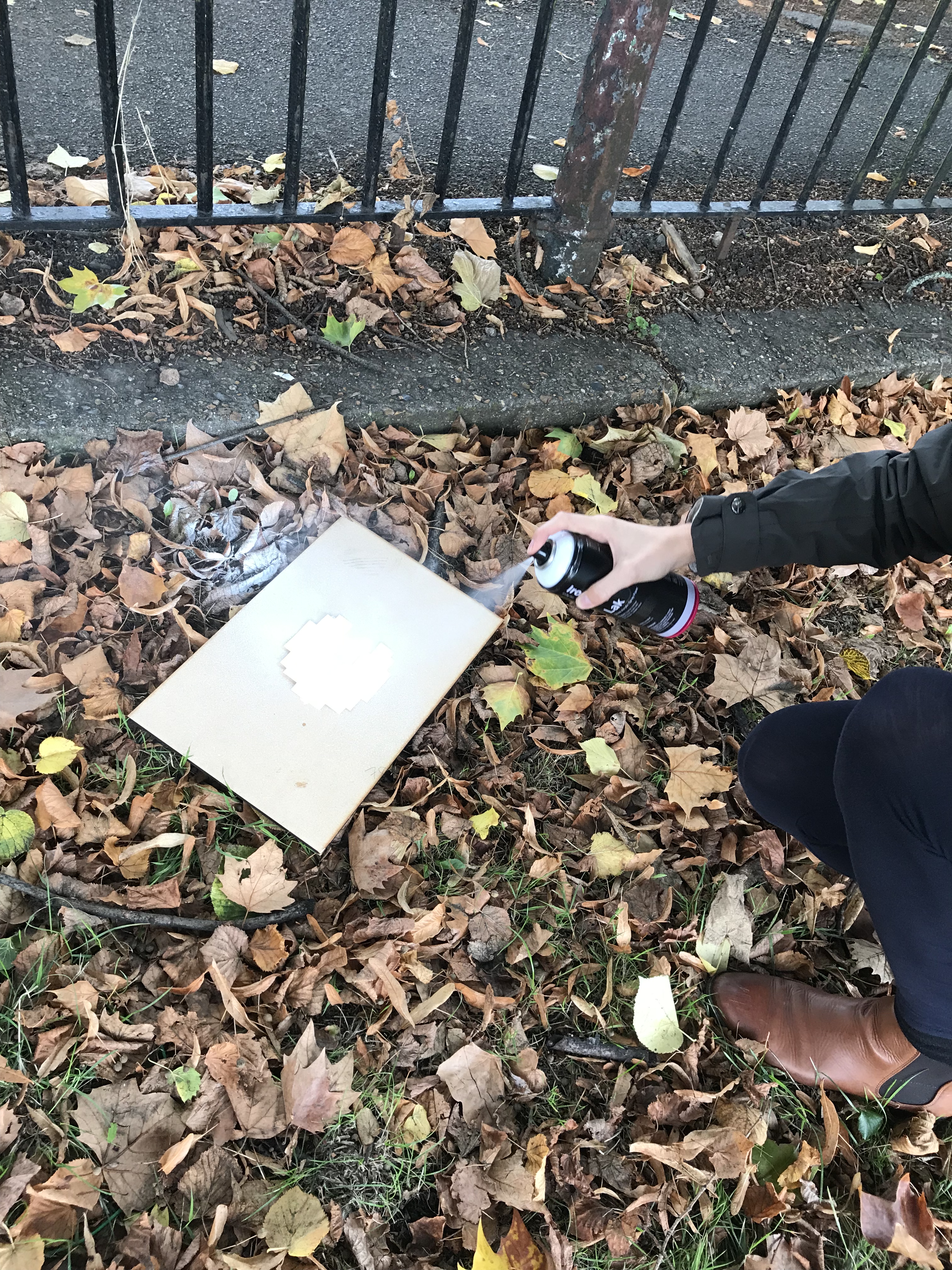
As a group we initially chose three 8 bit images and discussed which materials we wanted to use to paint the shapes on. We chose to create stencils of the Invaders and spray paint over the top of different surfaces.

We began by sticking our cut-up stencils on wooden and metallic materials. Following this we sprayed white paint over the top of the stencils and waited until the paint dried. When revealing the shapes beneath, we found different results. The wooden surface was shown to be the best for spray painting on while the metal surface wasn’t. The metallic surface caused the paint to seep under the stencil creating a blotchy effect which wasn’t what we wanted. Despite the outcome, we used all three pieces for the project.

Spray painting our Invaders

After discussing possible locations, we set out into the town and placed our invaders in different places such as on church walls, and down streets. Our locations were inspired by Invaders work on different walls all over the world.

The project showed me a new way of using art in different locations, and helped us develop team work and spray painting skills.

To conclude, we presented our work by explaining our thought process, choice of materials and locations. This allowed us to reflect on what we have achieved, and think about what we could have done to improve our project.

Leadbydonkeys

Discovering the Led by Donkeys group has been an eye opener in regards to the topic of campaigning. The group is made up of four men who publish past statements on billboards by Brexit supporting politicians. These statements show the lack of action to their promises, and the lies they have declared as true.

I have participated in the campaign ‘Get ready for Brexit’ by creating an image like theirs expressing how we have fear towards Boris’s choices as a leader.

Design a site like this with WordPress.com
Get started