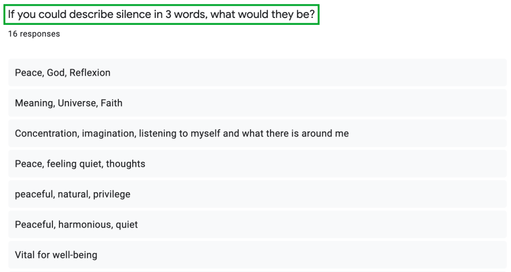
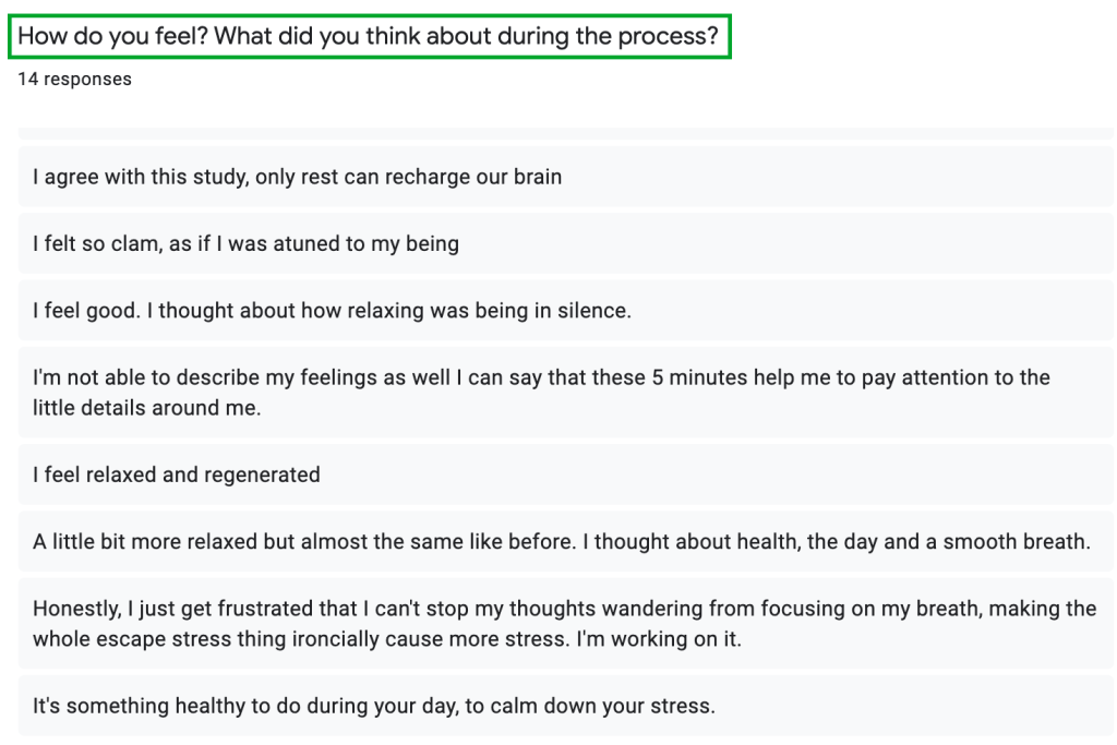
The Brief
Change the lives of young female athletes in Adidas’ key cities. Build them a future in their city’s pitches, fields and courts of play
My initial thoughts when approaching this brief was to highlight the main objectives and brainstorm possible ideas to ‘Get young women from 14 – 18 into sport’.
To begin the process, all the possible routes to take were evaluated and considered by mind-mapping thoughts and ideas and by conducting further research to find out how young women are involved with sports today.
Having an interest in boxing and badminton myself, I investigated women who are influential in the sports as well as how they make an impact in their communities. This research inspired me to chose both sports to base my initial ideas around for the campaign.
Strategy for Approaching Target Demographic
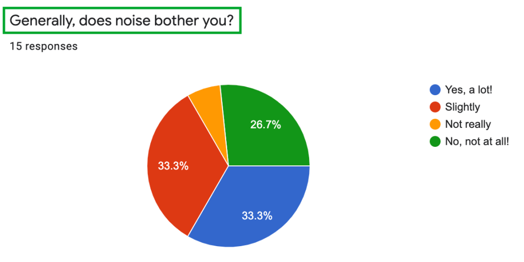
The insight on this target audience has shown me that 14 – 18 year old females stop playing sports mainly due to being insecure about their body changes, or to having a lack of confidence in their athletic capabilities. Whereas Gen Z males are more likely to continue playing sports after school. Considering this information, I decided to dive deeper into the reason why women stop at a certain age and to find a possible solution.
Compared to older demographics (Baby Boomers to Millennials), Gen Z’s are generally more focused on the values, interaction and experience of a brand. They are a generation that have grown up online, and have little motivation to act on anything unless there is a strong ethos behind it. Considering this, the campaign needs to encourage interaction and involvement between Gen Z’s and the activity/ product.
Furthermore, the intention (to get women to practice sports) has to be very clear to the audience without having a subliminal message.
Typically the attention span of a Gen Z is up to 8 seconds, so creating an engaging campaign with eye-catching visuals is very important.
Facts and further studies on this topic can be found on: https://www.campaignmonitor.com/resources/guides/guide-to-gen-z-marketing-2019/
https://www2.deloitte.com/us/en/insights/industry/telecommunications/media-consumption-behavior-across-generations.html

Target Research/ History of Women in Sport
After having carried out further research on the target audience, I decided to ask women in person about their opinions and experience with sport.
After having asked a wide range of women across my university campus, I discovered that most women gained mental and bodily insecurities around 14 – 18 which resulted in adopting a negative approach towards practicing sports.
‘My body grew in areas which made me insecure when I moved, so I felt I couldn’t continue without feeling humiliated’
‘I had no motivation to continue after school. I ended up concentrating on my university studies rather than sport’
These answers show that a change needs to be made in order to encourage women to get back into sport which focuses on entertainment rather than amplifying insecurities.

In a Design Marketing lecture, we analyzed our target audience findings and discovered patterns regarding insecurities with sports and the reason for stopping.
Demographic Online Connectivity
Gen Z’s have constant access to their phones and rely on an easy Customer Journey when buying products or interacting with a brand. No campaign can succeed with this demographic if their online experience has any form of confusion. Therefore creating direct links from website platforms to social media is key. Gen Z’s are notorious for having low attention spans, so having quick/ simple transitions between the process steps is crucial.
https://www.campaignmonitor.com/resources/guides/guide-to-gen-z-marketing-2019/
Initial Ideas
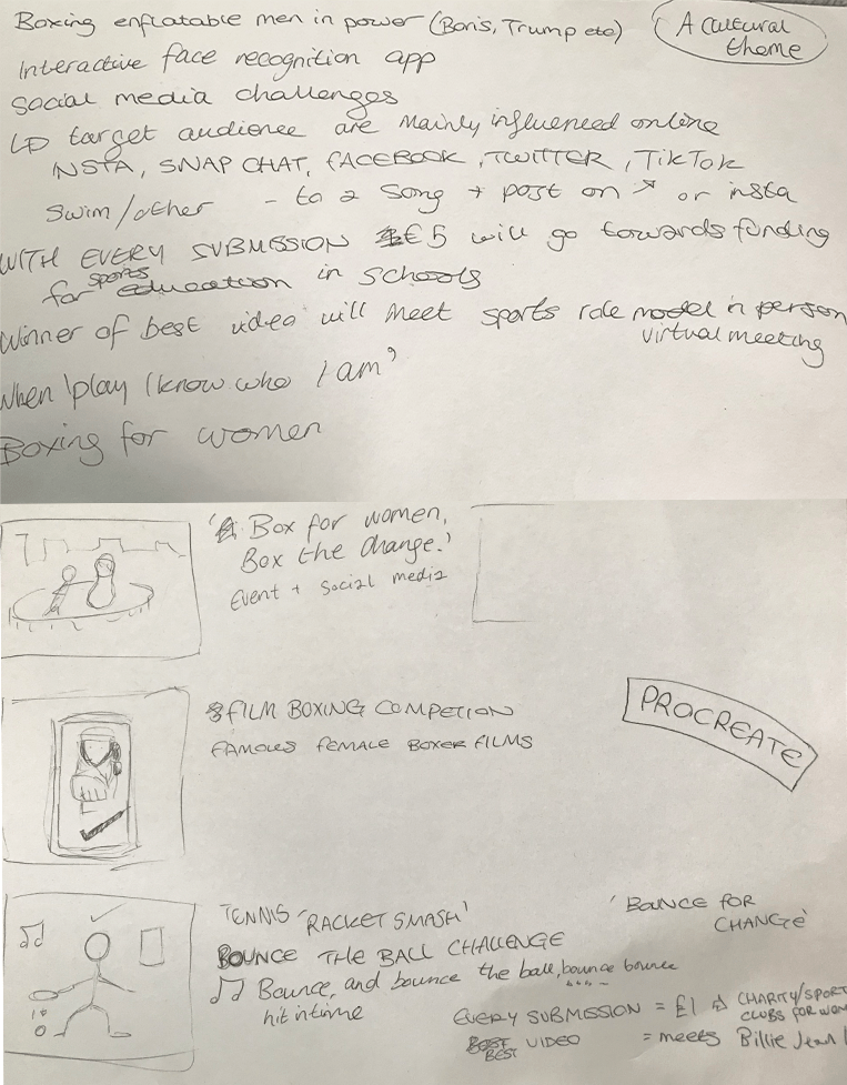
IDEA 1
‘BOX FOR WOMEN’ Social Media Campaign
- Young women take part in an Instagram/ TikTok challenge where they have to show themselves boxing with an added filter on video. The filter has an American flag background, red boxing gloves on hands (which follow hand movement) and boxing music in background
- Every hash-tag #BOXFORWOMEN per clip will equate to a $3 donation from Adidas to support women in sport
- This idea is interactive and sparks interest for a very entertainment orientated demographic
IDEA 2
‘Box for women, box the change’ – Boxing Arena Event
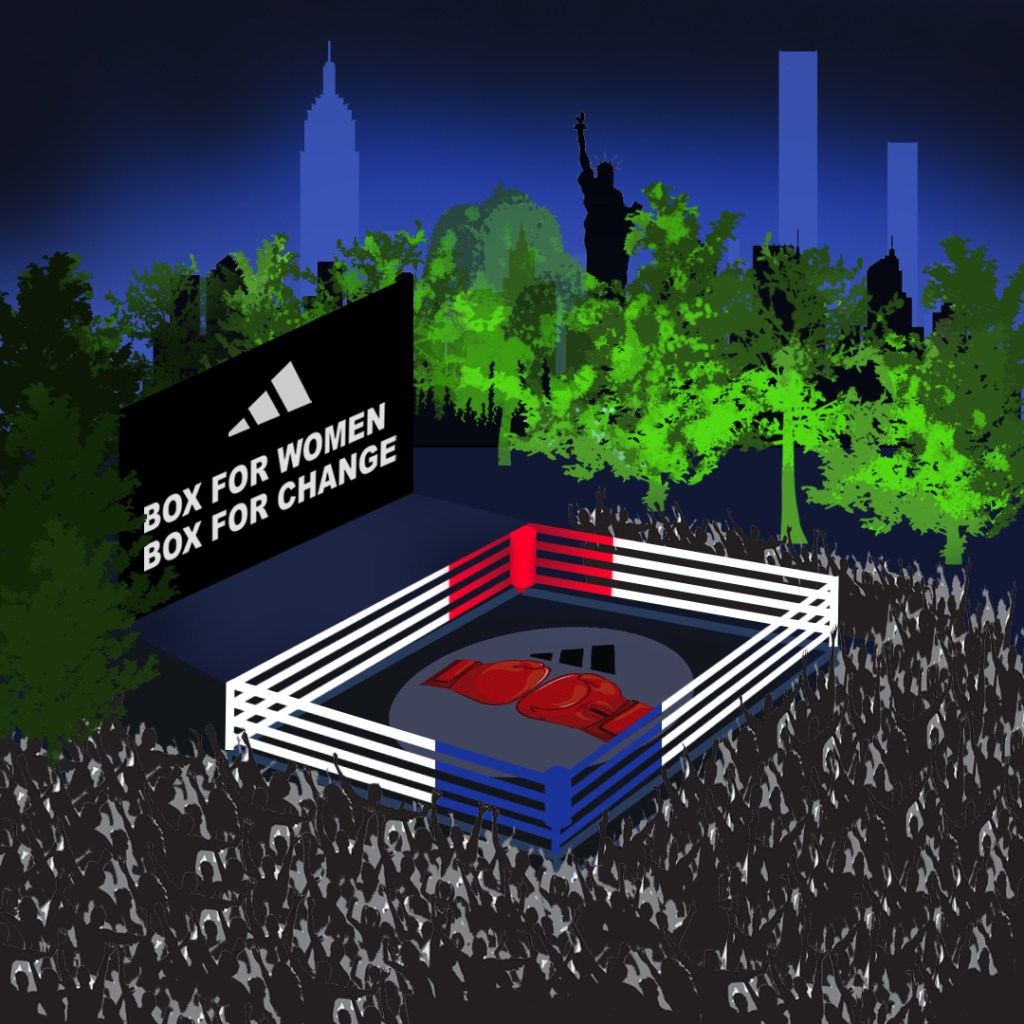
- A similar concept to idea 1, however this involves an event in chosen capital New York, which is based around going viral on social media
- Have two famous female famous boxers from NYC fighting in ring to start the event, followed by a speech talking about women in sports
- After this is a COMPETITION involving young female members of the public boxing and the famous boxers commentating the event
- Event will have lights, loud music, and a boxing theme.
- Set in Central Park
- Will attract attention of the news, radio, social media
Audience
- The boxing area will only be dedicated to the female teens. The surrounding park area will be open to the public.
- Schools will be invited to event (for young female teens).
- Hired Adidas boxing gloves available
- The winners of challenge will get to meet celebrity boxers after competition, and speak about their experience of sports as a female
IDEA 3
Tennis ‘RACKET SMASH’ – Bounce the Ball Challenge

- Based around a video of famous American teenagers 14-18 in New York dribbling a tennis ball in time with the music ‘Bounce, bounce, bounce the ball’ which gets progressively faster until they lose the momentum.
- The call to action will be ‘Bounce for Women’
- Young females 14-18 have to post a video of themselves completing the challenge with the hash-tag #BOUNCEFORWOMEN on social media
- For every video with #bounceforwomen across platforms TikTok, Instagram and Facebook, Adidas will donate $1 to a charity that supports young females in sport.
- The idea – ‘Because you shouldn’t be ashamed to bounce in sport (bouncing body parts)’. All women can be involved in regardless of different body types.
Inspiration taken from Rafael Nadal’s #WIMBJUGGLEDON https://www.youtube.com/watch?v=qgvdDZ7o9Ng
After having presented and discussed the ideas behind these three visuals with my class, I decided to pursue the idea of #BOXFORWOMEN due to being the strongest idea.
Why New York/ Boxing?
“Fighters cannot enter the sport of boxing and become a fighter and make a living at it,” he said. “Professional boxing has basically left New York.” – The New York Times, ‘How New York City Lost Boxing’
After researching the different cities mentioned in the campaign brief, I decided to base my Box for Women campaign in New York City. Having previously read numerous articles on boxing, I discovered there is a desperate need to reintroduce boxing into the community. The boxing scene seems to have faded out over the years due to people not seeing a future in the sport and consequently not practicing it.
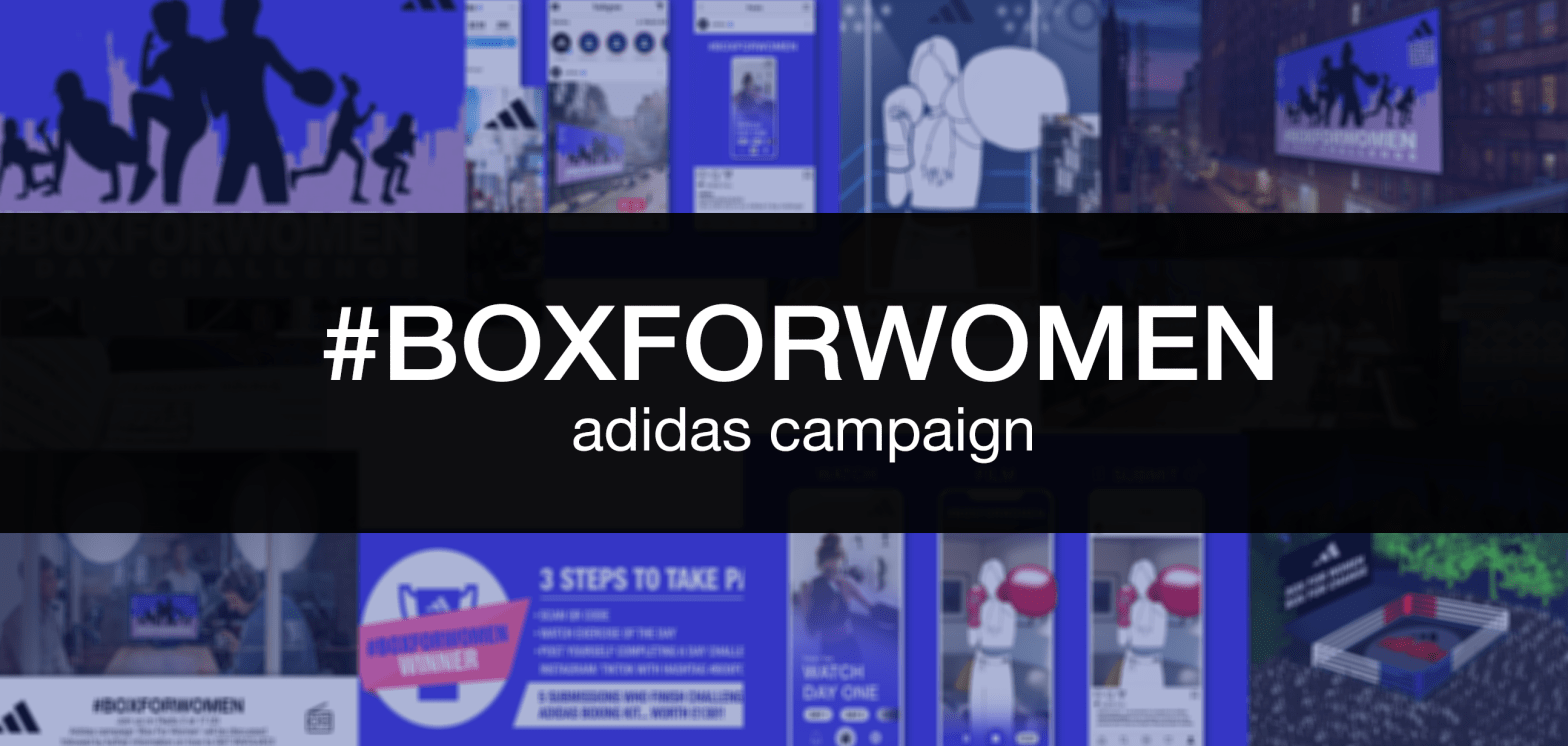
THE CAMPAIGN
Final Idea – BOX FOR WOMEN
Box for Women is an entertaining and impacting campaign to get young females from 14 – 18 into the ring and discover a passion for boxing.
The campaign is an interactive 6 day challenge where young women watch 6 prerecorded training sessions across 6 days and post videos of themselves completing the training and showing there results. Each video posted with #BOXFORWOMEN in the description on social platforms Instagram and TikTok counts as a submission for the end prize!
Starting from New York, this bright, energetic campaign will reach a wide online audience, and will be advertised throughout NYC. With bold visuals and an inspirational core motive, Box for Women will strike quick attention and will consequently become an addictive trend for young women across the world!
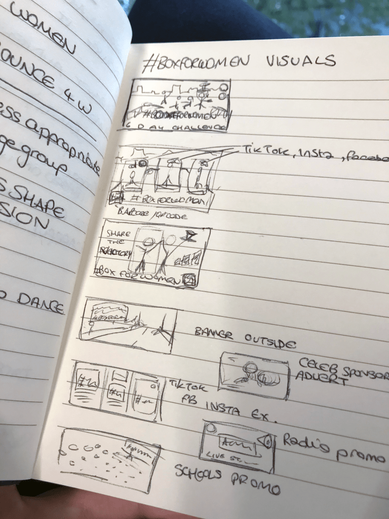
Creating the 8 Visuals
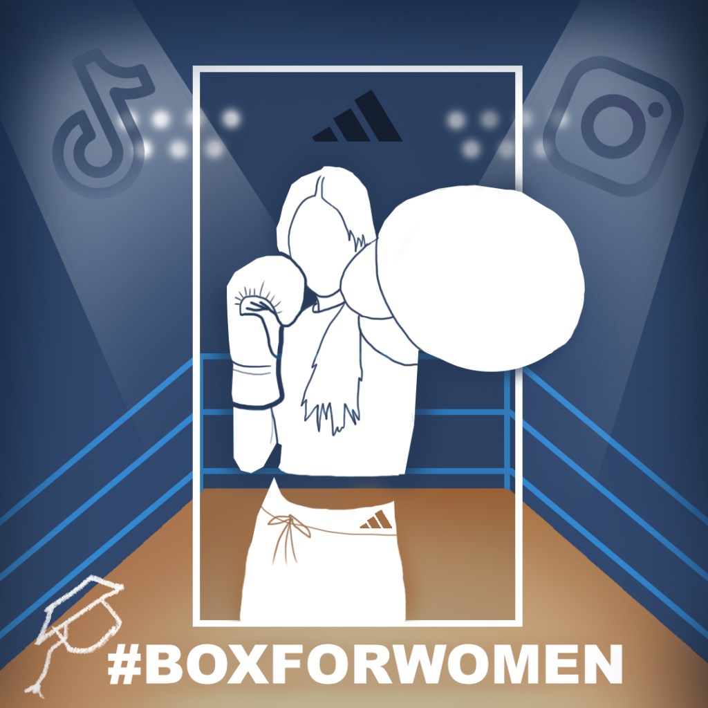
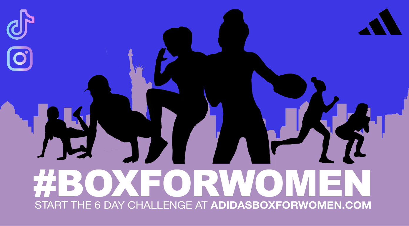
Visual 1
For the primary campaign visual, I created an informative, aesthetically appealing image with a colorful boxing theme. When researching boxing adverts online, I discovered a common theme of using the colour pink when connecting women with sports.
As a women myself, and after having asked other women to further question my opinion, I find using the colour pink ironic and sexually discriminating. The colour pink isn’t offensive in itself, however the past intentions behind it (pink being for women and blue for men) is past its time. When looking at adverts for male boxing however, I found darker more intense colours such as red, black and orange. So to explore this idea further, I created this visual with many different colours in order to see which worked the best (without using the colour pink).
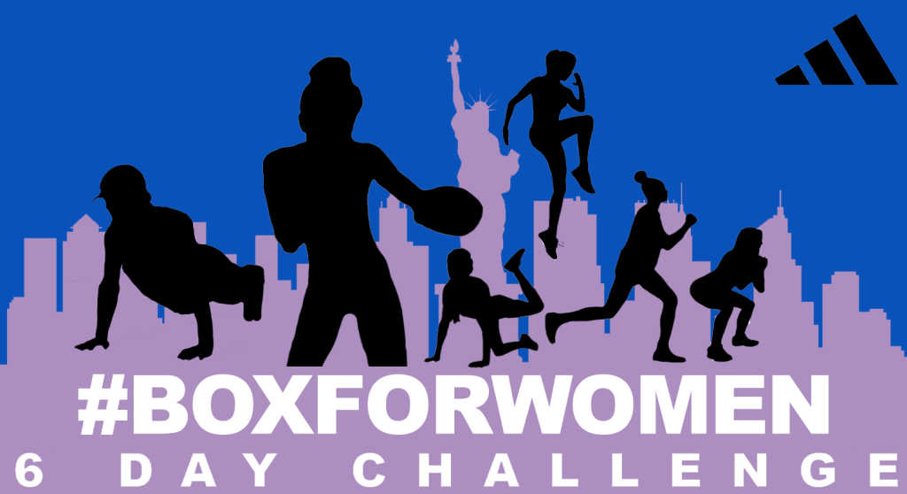

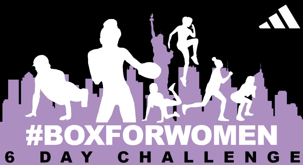
After having asked members of family and friends within the target demographic which coloured visual they preferred, the results showed that having a bright blue background with a purple NYC silhouette, the white text and the exercising female figures in black was the most eye-catching and visually appealing out of the other options.
From my own experience, I find seeing adverts with bright colours and a clear message the most memorable. The text in white draws the eye to the main message and then onto the background (which includes the information of the sport and city).
The reason behind having silhouettes instead of real women on the advert was to have the viewer refer to the concept of ‘being a woman’ rather than comparing themselves to other women in the photos. Many women find looking at women in sports intimidating when they don’t practice it themselves, so the silhouettes are catered to that factor. Confidence is the target, not jealousy/ negative comparison.
The social media logos TikTok and Instagram are also included in the background to connect to the call to action of posting the video content online. When Gen Z’s see the logos, it will generate a sense of familiarity and interest to take the next step of connecting with the campaign.
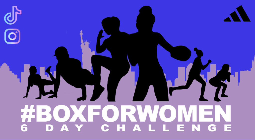
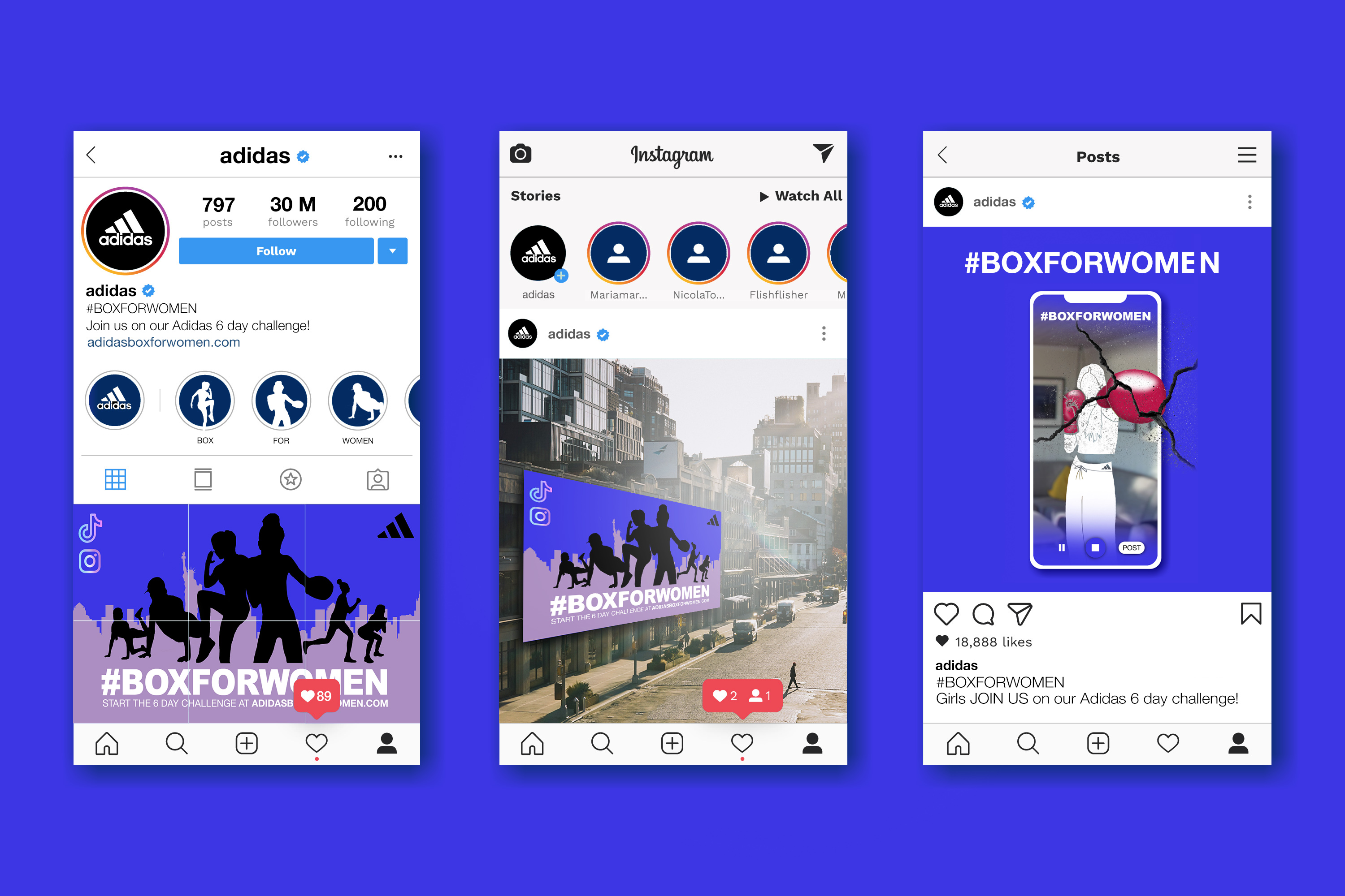
Visual 2
Visual 2 shows an example of how the campaign will look on social platforms, and in this case on Instagram. The decision for the campaign to be on the main Adidas platform was made so that #BOXFORWOMEN would reach an existing larger audience rather than having to create a new following on a separate page.
The campaign will be advertised for a month, including posting the main visuals of the campaign and examples of billboards/ posters etc displayed around New York city.
Examples of the platform (as seen on the right) will be posted in order to give the target audience a taster of what to expect when clicking on the link in the description.
#BOXFORWOMEN has a vibrant blue/ black and purple colour scheme which will stop scrollers on social media, and introduce huge interest across major platforms.
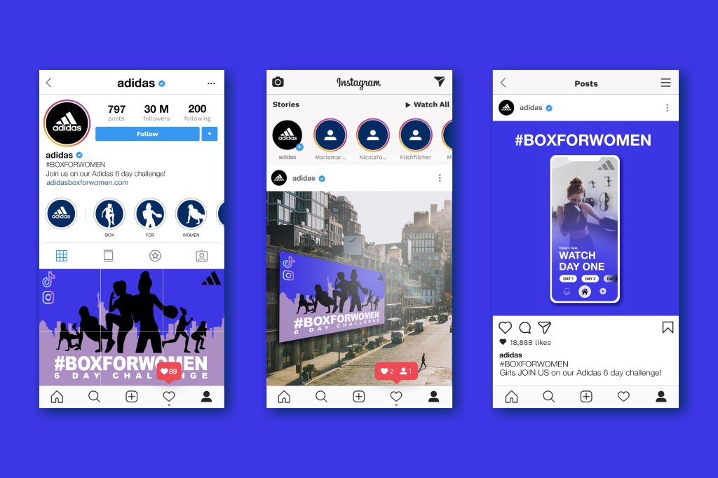
Instagram social media fonts
When creating this key visual, I researched into the framework of recreating the Instagram pages by looking at the font (Neue Helvetica), shapes and colours used as a base. This process was enjoyable, and the research payed off as you can see by the results.
Visme’s ‘Instagram Marketing Guide’, written by Anand Srinivasan, inspired further research regarding social media styles and image formats/ sizes to use.
The Adidas Logo
Instead of creating a new logo for this campaign, I decided to use Adidas’s in order to not bring the focus off of the brand. The target is to bring awareness to women, and inspire them to do sports, so the emphasis should be on the activity and experience, not solely on the branding of the campaign.
This demographic looks for the meaning behind the brand
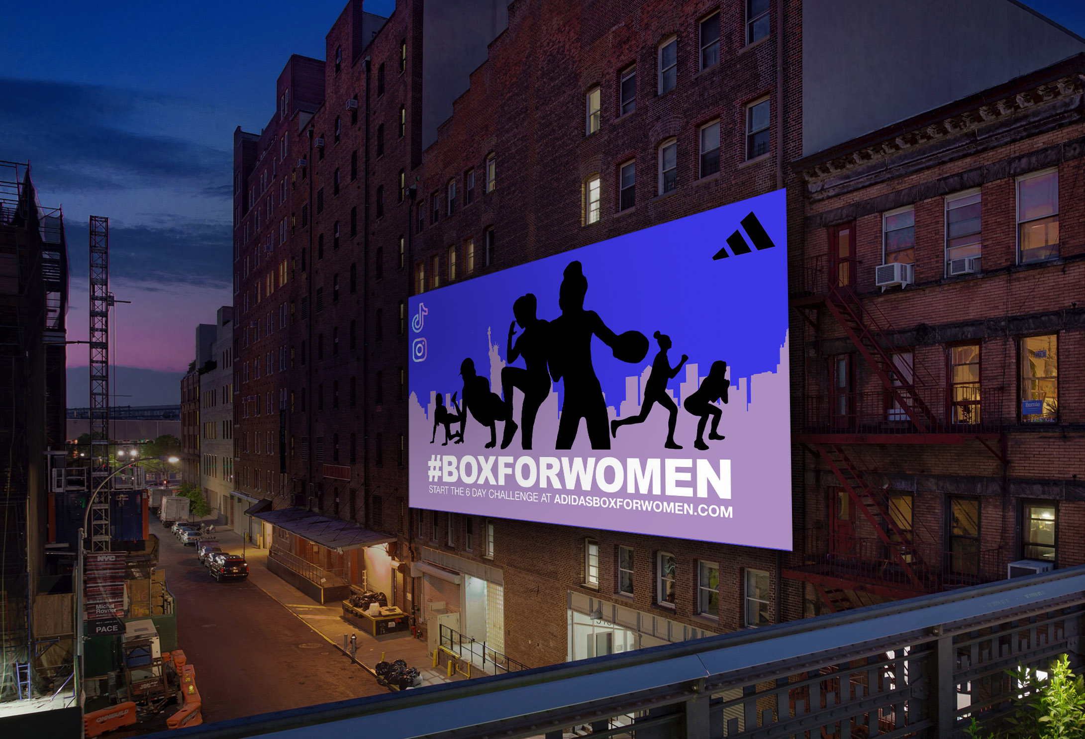
Visual 3 and 4
Visual 3 and 4 both show billboards of Box for Women displayed in different locations in New York. These adverts will have a fixed lighting screen behind them to gain 24h visibility. A QR code is available to viewers to scan with their mobile devices which will send them directly to the Box for Women platform.
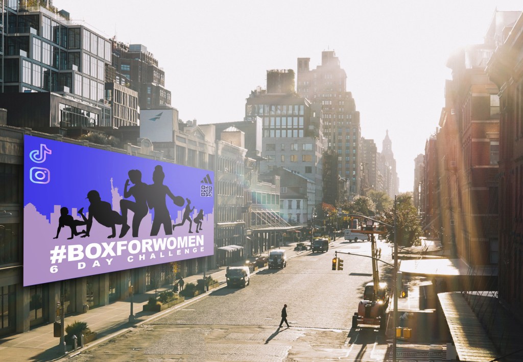
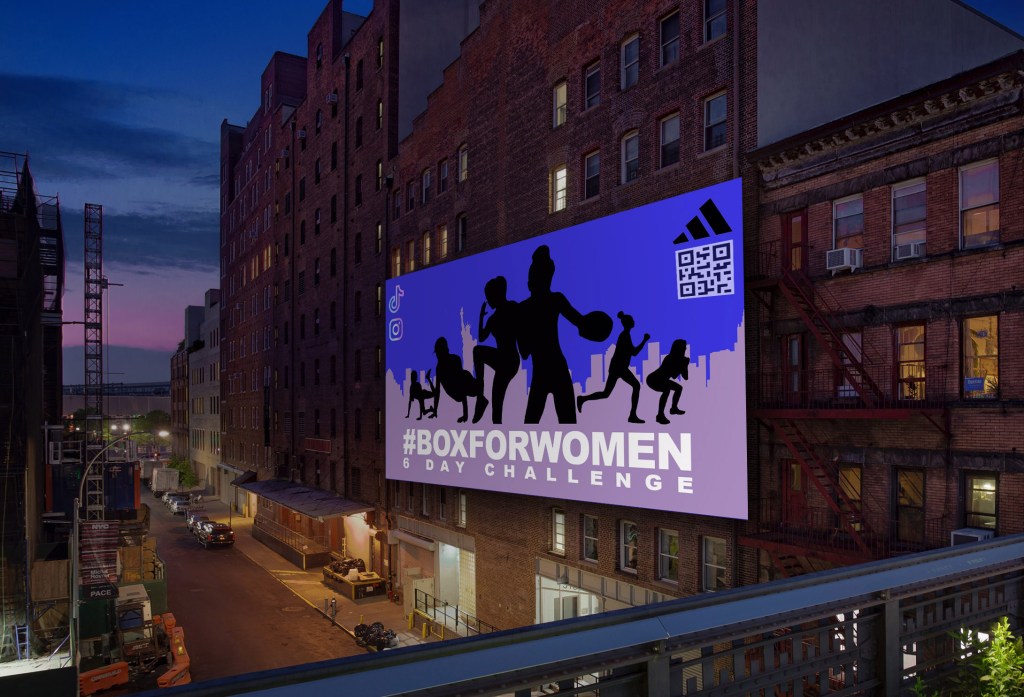
Gen Z’s appreciate quick access to websites without having to navigate too much. Therefore this QR code simplifies the customer journey and effectively strikes interaction between the campaign and the viewer.
Visual 5
Visual 5 shows a live radio broadcast of Box for Women which will attract a larger audience than Gen Z’s, and pushes the advertisement even further through explaining the purpose behind the campaign, and the activity for the audience to get involved with.
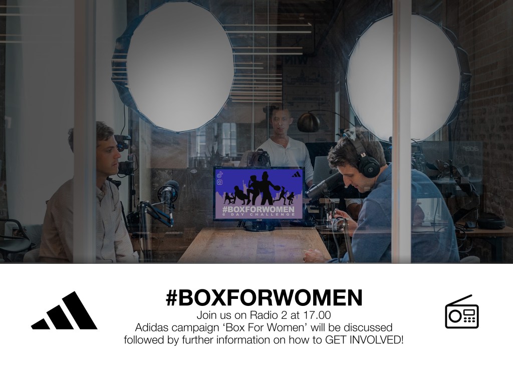
To push this approach further, a podcast containing guest speakers such as famous female boxers and important women in sport will be available to listen to on Spotify and BBC Podcasts.
https://www.bbc.co.uk/sounds/play/live:bbc_radio_two
https://www.spotify.com/uk/
Visual 6
Visual 6 shows the customer journey from watching the training videos, to filming themselves completing the same routine, to submitting the video by posting the progress online (on TikTok or Instagram) with the hash-tag #BOXFORWOMEN.
Each participant will complete the 6-day-challenge with the linking hash-tag each day until the end in order to win/ complete the contest.
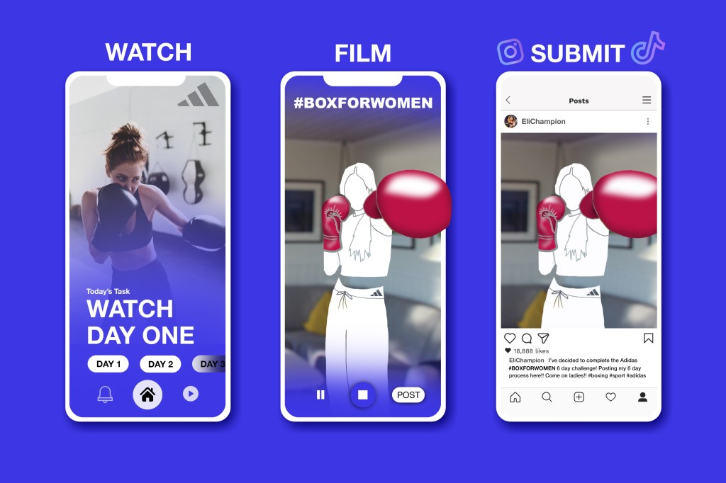
The Box for Women page is clean, easy to use, and links all stages of the process with buttons rather than links (which is preferred by Gen Z’s).
Visual 7
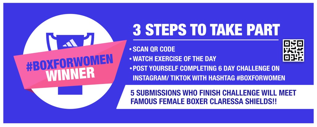
Visual 7 is a banner which explains the 6-day-challenge along with the prize, and a QR code to start the journey.

This banner will be posted across all social media platforms including Instagram, Facebook, Twitter and on the main Adidas website.
Visual 8
Visual 8 shows an example of the influence the campaign can have on the streets of New York. When visiting the city myself, I remember seeing lots of graffiti, street art and stickers posted everywhere, even on the main high streets. In order to connect more to the Gen Z demographic, I thought giving out stickers for female teens/ young adults to stick around the city would also be a fun interactive activity for them to socialize and spread the awareness of the campaign.
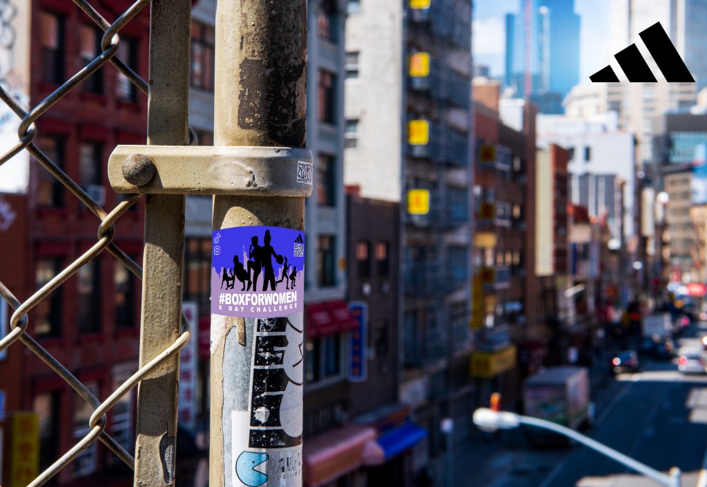
Gen Z’s are influenced by trends and are obsessed with being entertained, so having a product as little as a sticker is an effective way of having the target audience interact with the product on a first level basis.
Presentation
The campaign pitch was successful due to the insight and the strategy being clearly explained from the beginning, and having striking clear visuals to present the concept.
While presenting, further ideas came to mind for developing this campaign and strengthening the overall plan. The following feedback was very beneficial as I was able to take into consideration both positive/ negative comments and understand what improvements can be made.
Feedback
‘This idea could be re-framed into something bigger than winning a bit of kit. It feels like a big idea being squashed at the moment’
‘The radio part is very good. Think about how a mix by DJ/ Sportsman could motivate the training.’
‘Another name for campaign could be ‘BOXING BANGERS’’
After having presented my idea, I realized that this campaign could be pushed even further whilst keeping its main objective ‘Get young women into sports’. When creating my final idea, I wanted to keep the main concept simple and clear rather than over complicating it with many different objectives.
Considering the feedback given, I decided to stretch my idea further by having the reward be meeting a professional female boxer instead of winning a boxing kit. This was one of the primary ideas thought of at the beginning of the project which wasn’t pursued.
During my primary research on female athletes, I came across boxing champion Claressa Shields who sparked my attention and is known famously for winning numerous global awards in boxing and being a successful woman in sport.
https://www.teamusa.org/usa-boxing/athletes/claressa-shields
Having the winners of the ‘6 day challenge’ meet a famous woman in sport (such as Claressa Shields) gives them not only the encouragement to continue practicing sports, but influences other young women at the same time.
Further Improvements
After having received this valuable feedback, I decided to further develop the project by making the following adjustments.
I deleted the unnecessary visuals and replaced them with more constructive/ informative ones which has made the overall presentation more digestible. The street visual has been replaced with a step by step visual explaining the campaign process.
The QR codes have been replaced with a call to action on the outdoor advertisement due to likelihood of the code not working when being scanned at a distance.
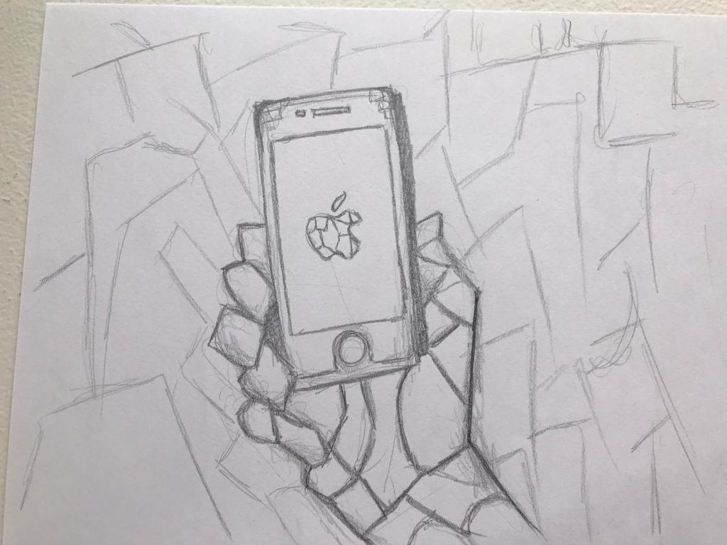
Cracked effects were added to the main visuals to create further curiosity for the viewer, and a few of the visuals have been adjusted to create more impact. When creating the crack, I followed a useful video which opened my eyes to new tools and ways of using Photoshop.
/cdn.vox-cdn.com/uploads/chorus_image/image/50156443/GettyImages-497919538.0.jpg)
On the step-by-step visual, I was apprehensive to use a photo of Claressa Shields as I could have copy-right issues as a result. However, having seen other projects use photos taken from the internet, I decided to use it to show an example of what the project would look like if the permission was granted.


Reflection
Overall this project has been thoroughly enjoyable and has stretched my capabilities by learning to think outside of the box and concentrate on the targets views in order to create a successful campaign which fits the brief.
Not being a hugely sporty woman myself, I could relate on many levels with the target research and discovering that many young women think similarly towards sport.
Following on from this brief, I aim to be even bolder and creative when confronted by tasks such as this, and will use the knowledge I have gained from this experience into my future work.


