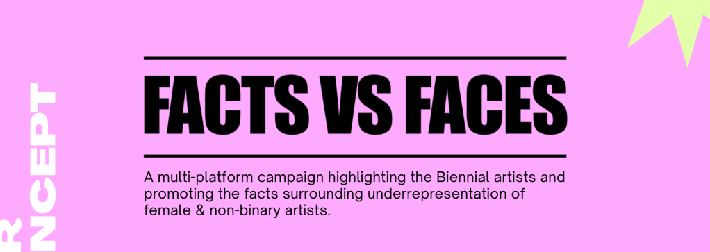
The brief: To create a crowd funder, marketing campaign and strategy for the promotion of Every Woman Biennial 2021 while expressing the company’s ethos and vision.
Crowdfunder – aim is to raise £100k Promote the Crowdfunder to amplify reach / drive people to donate. Concepts / designs for Crowdfunder
Open Call for Artists Applications Marketing campaign (to promote the call-out and reach artists, emerging artists and those that tend to be marginalised within the art world.
Exhibition / Perfomances / Film Programme A marketing campaign to promote the above and also the purpose and values of the Every Woman Biennale.
The project was created and developed in a group of three, and was completed within a week. This meant having to plan out each stage of the campaign in a very organised and methodical way.
Independant Research – Stage 1
To start the process, my group organised a meeting to discuss initial ideas and research collected separately. By voicing our creative input, we were able to filter out the strongest concepts and find ways of making the project a success. This meeting was very productive and helped us bond as a group, creating healthy working relationships from the beginning. We also discussed our strengths and weaknesses as creatives, which meant we better understood how to navigate the brief. Below you will find the research I completed prior to this meeting.
Campaigns
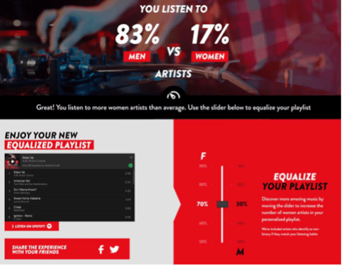
Smirnoff and Spotify – The Equaliser
Link: shorturl.at/vwBX6 ‘Designed to tackle gender bias in the music industry, and promote the creative talent of both women and men. The goal behind the Smirnoff Equalizer is to get more people listening to more women artists.’
H&M – She’s a lady
The campaign shows women of all sizes, shapes and colours expressing themselves in a free way while advertising the brands clothing. This powerful campaign includes all those who identify as women, and expresses them in a fun and entertaining way.
Women’s Aid – Interactive Digital Billboards – Look At Me
Women’s Aids interactive digital billboards showed women with physical signs of domestic abuse, with bruises on faces. They used face motion sensors so that every time someone passing by the billboard looked at the screen, the bruises disappeared. This was a strong campaign, and made an impact on the general public mentally and emotionally.
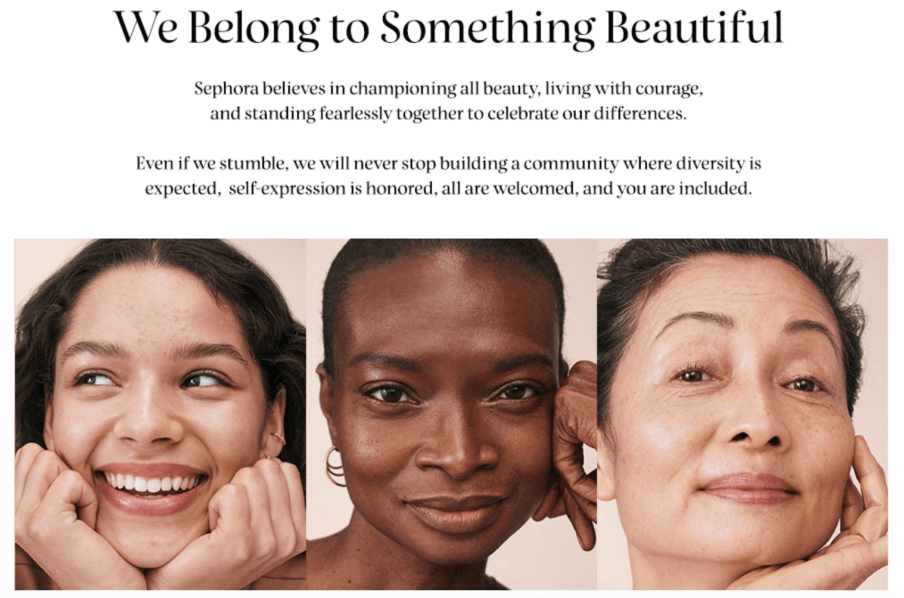
Sephora
This campaign by Sephora demonstrated women in all of their beauty, surpassing social ‘barriers’ of race and beauty standards.
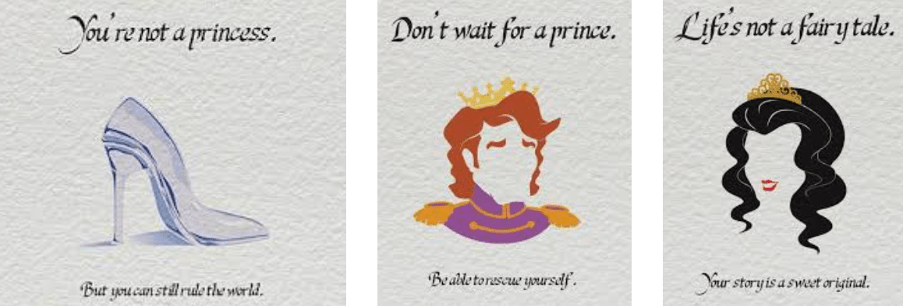
This 2013 campaign told girls to stop associating the idea of being a princess with real life. This holds a strong insight and communicates a positive message for women.
After collaborating our research in the meeting, we decided to further develop our concept by conducting further research. Below you can find my research for this section of the project.
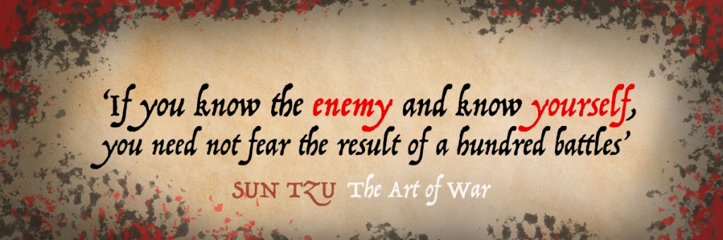
Idea 1 : When Facts Meet Perception
The first idea was to have OOH visuals with QR code (scan for more info) which contain lies people believe about female artists, followed by a fact to make a point. This will express an informative yet positive message while raising awareness of the publics ignorance to the current situation. Facts will include statements such as: Only 13.7% of living artists represented by galleries in Europe and North America are women.
The idea of having a connection between OOH interactive boards and a page people can swipe through, perhaps including an interactive quiz.
Idea 2 : Invisibility of Women in Art
Who is the artist? A simple question that will spark thoughts and realisation. Basic or motion-sensored visuals, when public sees the woman in the photo, she is revealed. In an exhibition room or OOH.
Idea three involves creating visuals with questions such as ‘How many female artists do you know?’ which would test the publics knowledge on females in the art industry. This could also become a stunt where the public are interviewed in person. To further this idea, I thought we could have had a focus group and record responses/ reactions to questions.
Idea 4 : Female Artwork in Exhibitions
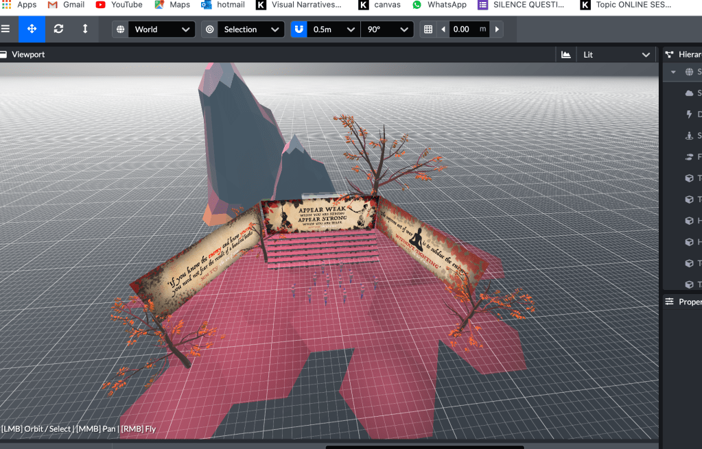
I created these visuals to demonstrate what another teammates’ idea would look like in visuals. These visuals weren’t refined, however the top visual represents what an exhibition looks like normally, the second shows what the wall would look like if art created by male artists was taken away, and then the third shows if white female artists work was taken out.
This concept shows how galleries don’t show enough diversity in their exhibits, and supports the insight that female artists need to be included much more in the art world.
This idea was later developed further and was eventually presented in the final pitch.
Decision Making | Project Planning
For the next part of the process, we collaborated our research and came up with a constructive POA for the week. We made a list of the tasks needed to complete for each section of the project.
The tasks were:
Teammate 1 Social media mock ups
Teammate 2 Billboards, short social media video, stunt
Me The main video
The project outline:
A stunning crowd funder and marketing campaign to raise the goal of £100,000 for the Every Woman Biennial. Create a buzz around the upcoming event and promote both the female artists and highlight inequality in art.
Video Making
My main task for the project was to create a video ad for the campaign which would be shown across all social media platforms.
Before creating the video, I made a list of the tasks I would need to complete to prepare for it:
Make a list of questions
A list of facts
Finding music
1 minute time-frame (1920×1080 youtube size)
Inserting video files (with voice over + peoples reactions and answers)
Insert text
Understand an art direction to follow
Call to action (link in description)
Creating & Finding Assets
Video Assets
Videos were taken from website Pexels.com and were used to build the narrative behind the audio and music samples. When deciding on the scenes, I considered the context and built up a rough story board to fit them. Considering the tone of the advert should be informative/ powerful, I made sure the text was ‘Impact’ (following the visual branding guidelines) and for the colours to be simple and bold. Every video contained a woman, pieces of art or exhibition rooms in order to connect with the narrative
Music
The music was the most challenging part of the video to find as it was going to create the base of the campaign. In my research I found tracks such as:
After having asked the group for their feedback on the music options, they said how the ‘Strong and Powerful’ track was the most appropriate, however they weren’t very enthusiastic about any of them which confirmed my reaction to the tracks. After further research online I found a suitable track for the campaign called Overthinking by RYYZN. The track was perfect for the narrative behind the video, starting as informative and ending in a fun and exciting way. The music is copyright free, and was liked by the rest of the team.
The Timeline
1 – (Empty gallery) Text + Audio ‘Name me a famous artist‘
2 – Audience reply with all male examples
3 – Text + Audio ‘Now name me a female artist’
4 – Silence
5 – Black screen ‘FACT’ ( in a click way)
6 – Facts vs faces
7 – Clips of scenes relating to facts – with info written on top (percentages etc)
8 – Videos in a sequence in time with music – Female artists working, their faces + stunts etc
9 – Every Woman Bieniall 2021, followed by Facts vs faces
Video Copy
The facts used in the video were taken from the National Museum of Women in the Arts. The facts were simplified to ease the amount of text per section and increase impact on the audience.
Facts used:
13.7% of living female artists are represented by galleries in Europe and North America.
Women earn 2% of $196.6 billion from auctions.
In Australia 33.9% of artists represented in state-run galleries and museums are women.
Videos such as Dove Real Beauty Sketches and #NotMyJob campaign were referred to when developing text transitions and style in the advert.
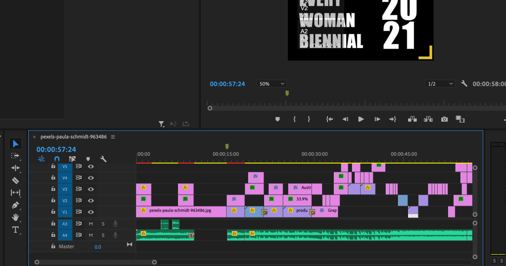
Premiere Pro | Creating the Video
Typewriter text effect | When creating the video, I challenged myself by learning a new technique where the text would appear on the screen and appear to be typed on. This required following a tutorial and manually inputting the paths on the effect section. This technique was used at the beginning of the video in order to draw the viewer in from the start.
Putting the video together took a few days to complete, due to organising the video compilations, learning new techniques with transitions and effects, following a consistent art direction, and matching the video and image timings with the text and music. Below you will see the final video for the Facts VS Faces Campaign.
The final Fact VS Faces video
The Presentation & Reflection
As a team, we came together with all our visuals and assets for the campaign and created a powerpoint presentation for the client. We created the deck on Canva, and changed the shapes and colours to best fit our art direction. We made sure the presentation was clear and easy to understand, while keeping the text minimal and precise. After completing this, we added audio recordings of ourselves talking about Facts vs Faces. We organised this by dividing the presentation slides equally between us and uploading the recordings individually. The final outcome was very satisfying considering we completed everything within a week, and seeing all of the work we produced in one document was very rewarding.
Overall this project has been enjoyable, and working in a team of three was great for testing my organisation skills and relying on others. The fact that I concentrated mainly on creating the video for this assignment meant that I was working independently within a team, which was good practise. I was very punctual with deadlines and meetings, and was open to asking questions and helping other teammates throughout the process. In projects I have experienced teammates not meeting deadlines, and have had to learn to trust the process and not to put pressure on myself for a section I didn’t need to do. In groups, I have learnt that we have to have a balanced approach by working to each others strengths and abilities. This means assessing the situation constantly, understanding when someone needs help and working together collaboratively. People in general work at different paces, and especially in this project I was able to proactively do my part for the team while trusting that the others were completing theirs. In future projects, I would like to work again in a small group like this as I thoroughly enjoyed it.
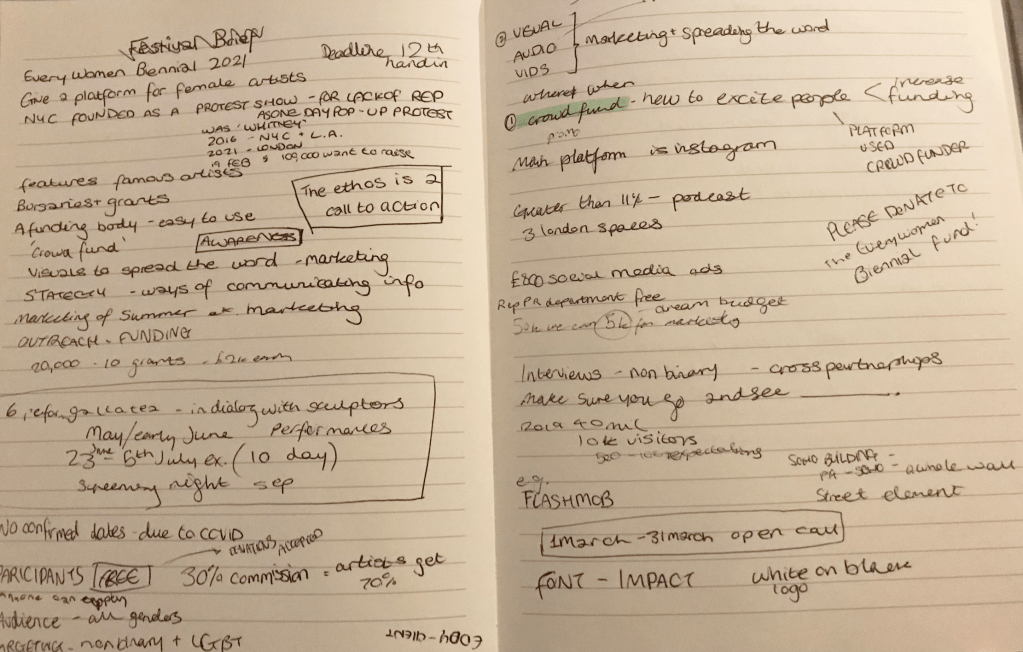
The client asked for an assessment of the show format, a strategy for tech/ video, a decision on best platform and a visual identity (brand guidelines or a marketing plan). During the meeting with the client, I took notes of the main information and created ideas of my own.
Notes taken from client meeting
To begin the project, my partner and I had a meeting over Teams and discussed our initial thoughts on the brief. The call was very productive and we managed to brainstorm and develop a brief structure of how we would approach the project. From the beginning we worked well together and had a very clear vision about what we wanted to achieve from the project. Below you can see the separate stages we wanted to cover in the pitch.
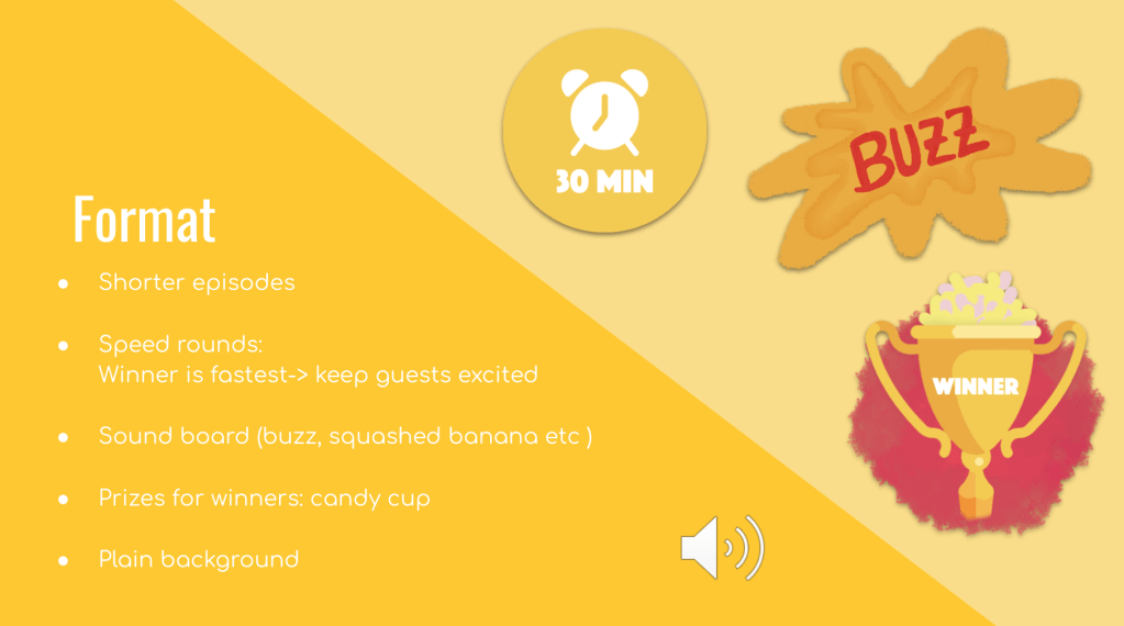
Format
Shorter episodes – maybe 30-35 minutes long; easier to digest and focus on
Competition-led speed rounds: quizzes -> way to keep the viewers and the guests excited
Buzz sounds to answer questions instead of speaking over each other; gives the guest time to answer better and not lose focus
Prizes for winners and punishments for losers: prize could be a coveted cup of candy, punishment sing the jingle (high pitch)
Ask guests for plain/minimalistic background – doesn’t distract the viewer
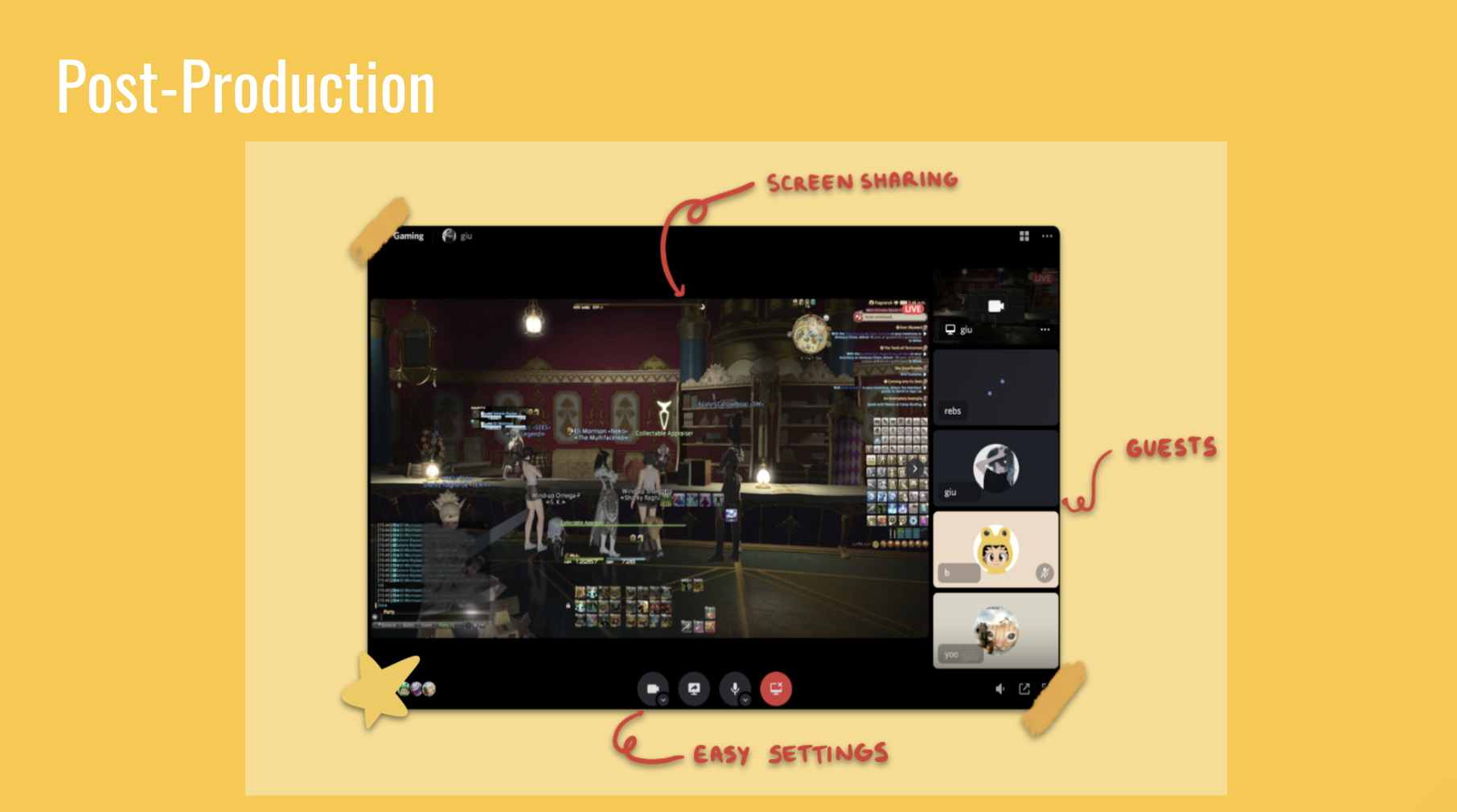
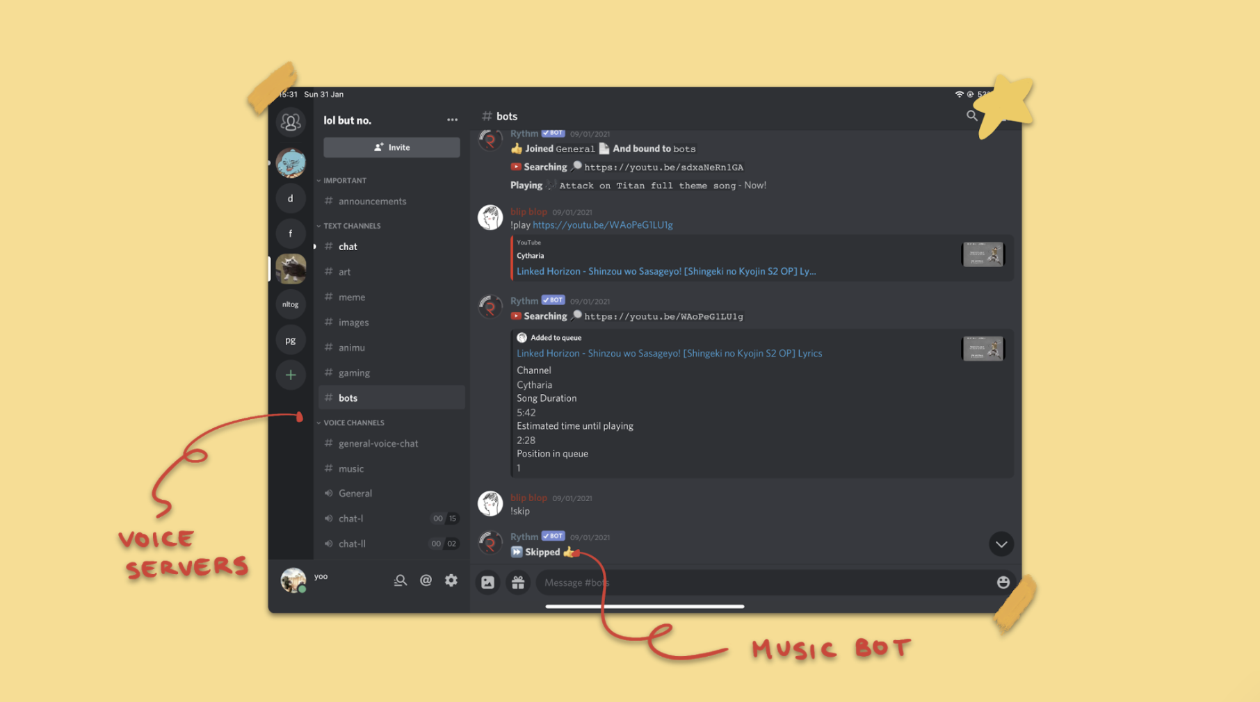
Tech / Post Production
Discord – with discord you can create servers where you can invite guests, and have clear music bots in the background (which will be easier for quizzes), easier to screen share with less lagging, better for playing games together, ability to hop in and out of a conversations, multiple streaming options, open chat during the call.
Idea of putting the videos on the side of the video
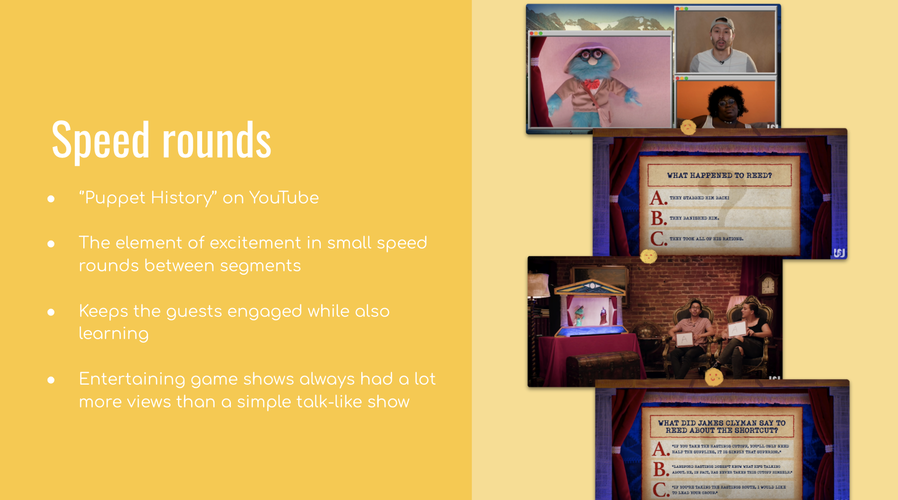
Quiz/Speed Rounds
‘’Puppet History’’ by the channel Watcher on YouTube is the perfect example of a great history show
It’s a different format than Hot Bananas but the element of excitement is beautifully portrayed by all the small quiz-like questions between segments, keeping the guests engaged and focused
Competition keeps the guests ready and focused on the goal of winning the Banana Cup
Game shows that have something to lose and something to win, always had a lot more views than a simple talk-like show.
‘Puppet History’ reference for partners visual ideas
Jingles
Hot bananas jingle – shouting (with logo) Inspired by Bohemian Rapsody (Gallaleo)
Punishment ‘You’ve been squashed’
Sound effects (on sound board) e.g. bananas being squished sound when contestant looses
Visual of banana being thrown at the camera; red peel
Marketing
TikTok – bloopers montage ‘when Russell sneezed’ (with photo), punishments
Instagram – bloopers montage, punishments and advertisement
Target audience – Gen Z’s and students
During the process we bounced ideas off each other, and built on each idea through conversation. By the end of the meeting we distributed each section, according to our strengths and experience, and decided to meet up two days after to bring our work together.
My ideas in this meeting were:
Shorter episodes 30-35 minutes long; easier to digest and focus on
Competition-led speed rounds: quizzes -> way to keep the viewers and the guests excited
Punishment sing the jingle (high pitch)
Putting the videos on the side of the video
Hot bananas jingle – shouting (with logo)
Bananas being squished when contestant looses
Target audience – Gen Z’s and students
Bloopers montage idea of ‘when Russell sneezed’
Creating the Assets and Presentation
The colour palette was taken from the original hot banana logo, and has been used across all of the campaign assets. I used the website freepik.com for the basic phone outlines, and created the content on top. My partner gave positive feedback on the two visuals above, and said she would take the same style and colours for the visuals she would create.
FEEDBACK A few days before the final hand in, I had a surprise meeting with my lecturer who gave us some valuable feedback on our ideas. He loved the visuals and the over all strategy we created, however he suggested to take the concept of ‘losing’ out of the show as it brings the emphasis of the game away from the discussion and more to the competition. The whole idea of the brief was to increase audience interest to the main concept of getting the 3 contestants to discuss different topics etc. We took this advice, and tweaked our idea accordingly which made the overall concept a lot stronger. I really appreciate straight forward, constructive criticisms as they make me grow and think through my ideas more, so this feedback session was very valued.
The jingle idea was discussed in this session, and how we chose to have a person screaming ‘HOT BANANAS’ with metal music behind, and the lecturer seemed very excited to hear it.
My team mate created the slides above covering ‘Speed rounds’ and ‘Post-production’. The positioning and colours were inspired by the projects’ over all art direction. We made sure each slide wasn’t over crowded and simply demonstrated each concept.
30 minutes | trophy assets I created with the logo colours
When organising the presentation, we thought through what concepts we needed to cover and distributed the work load between us evenly. Each slide was chosen according to the sections we assigned to each other previously. I presented the projects format and marketing plan and my partner talked about the speed rounds/post production and the jingle. We both has an equal input and worked well together. There was clear communication throughout the project and the ideas we came up with were very entertaining and catchy.
Reflection
Having regular meetings meant we were always keeping a track on progress, understanding of the tasks to do and as a result we learnt new skills techniques along the way. When assigning sections the project, we played to each others strengths and enjoyed collaborating. My partner and I had met during lessons prior to this project, however had never expected to have produced such creative ideas and imagination as a pair. The most rewarding part of the process was the brainstorming meeting we had at the beginning where we bounced ideas off each other, and came up with a strong concept to present to the client. After having finished the recorded presentation, we checked over our spelling and slides incase of any mistakes and then submitted online.
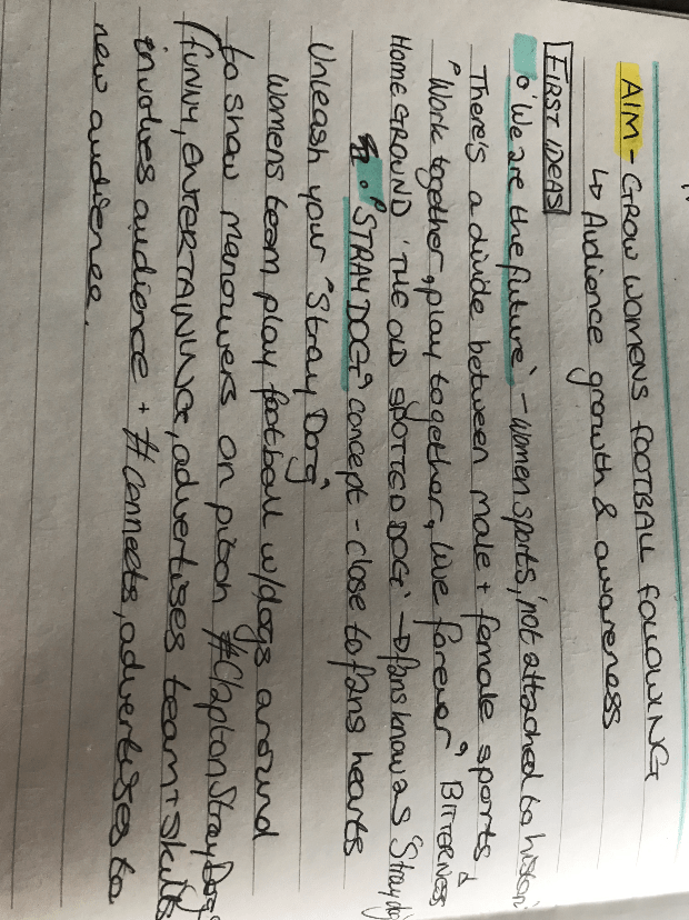
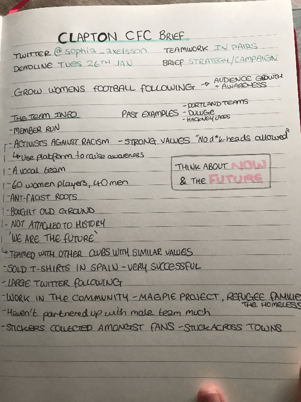
Aim – To grow Clapton CFC women’s football team following
Brainstorming/ Initial Meeting
To start the process, we analysed the brief individually and came together with our ideas. In our first meeting we were unable to connect via Teams due to technical issues, therefore we communicated via messenger. This change in plan meant our discussion took longer than expected as we weren’t able to speak over the phone. When beginning a project, I prefer to speak with my teammate as it is more personable and is easier to understand how the other person feels about plans. Despite this difficulty, we wrote down our ideas and collaborated them to make a strong final concept.
Notes taken from client meeting
My ideas:
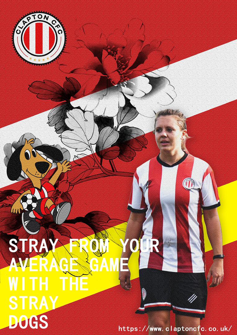
1 – ‘We are the future‘ – the client mentioned not being attached to the history of the team. There is a divide/ bitterness between the women’s and mens team (we could create a bond between them, or make the women’s team unique and stand out). If connected, the slogan could be ‘Work together, play together, live forever’.
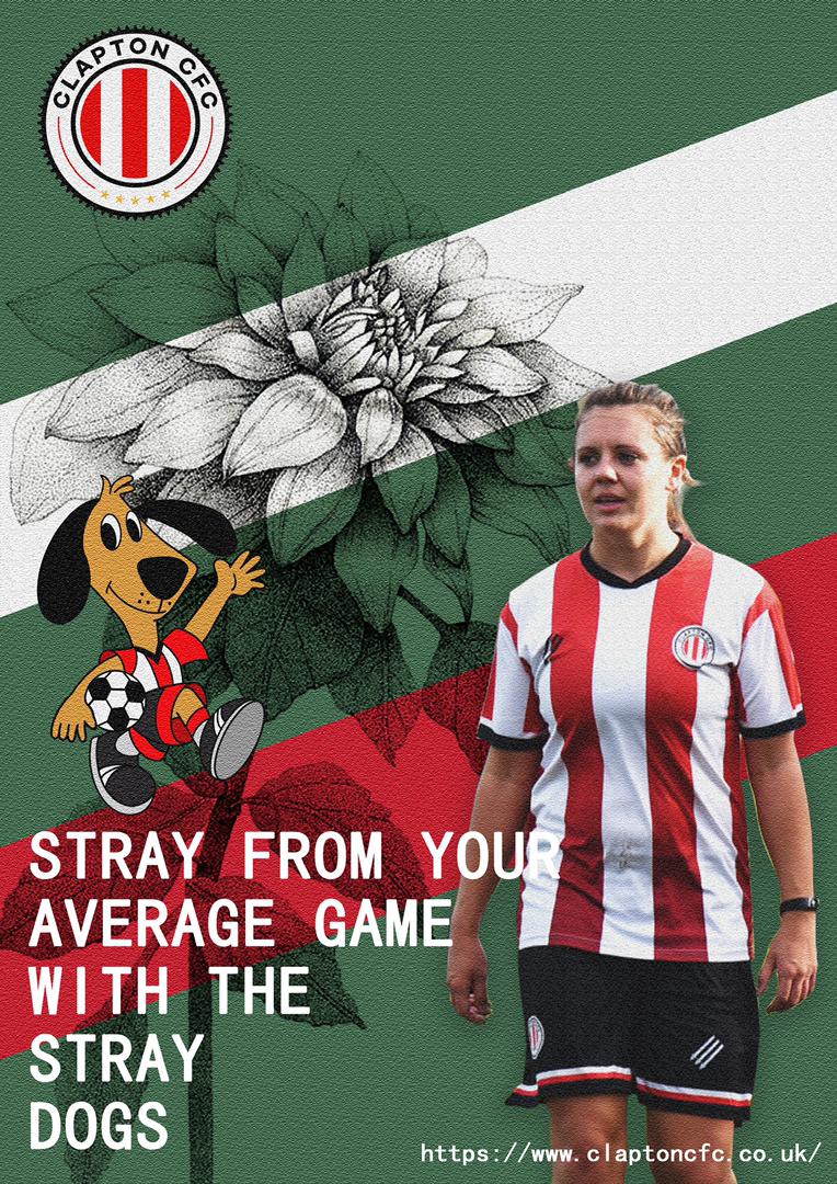
2 – ‘Stray Dog‘ – The Old Spotted Dog is the name of the teams home ground, which fans feel connected to and call it the ‘stray dog’. We can play with this concept and hold a match with dogs. The football match would be with the female players, manoeuvring themselves around dogs on a pitch (laughing, having fun, and showing their skills). This would be funny, entertaining, advertises teams and skills, and involves the audience . The hashtag could be #ClaptopStrayDogs
My partners Ideas:
The improvement of different kinds of fans – There are many white followings, so black people can add some hip-hop elements or commentators, and carry out some lottery activities to increase the number of fans. The star effect of Asian people has great influence, and endorsement can be invited to increase different types of fans. The periphery of the team can also be made of different national styles, such as Asian Oriental elements.
The women’s club has fewer fans than the men’s club.
Tagline and Title Ideas
My tagline ideas:
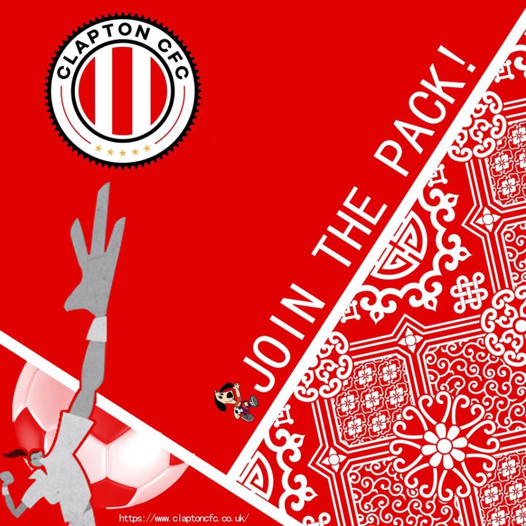
Join the pack! (like the pack of dogs)
We play to unite, you watch to change lives.
Borders are no barriers, we play.
CTA idea – Stray from your average game with the Stray Dogs
My partners ideas: The star effect , Stray dog attack back
Charity Idea
In the initial meeting with the client, she mentioned how the team is very active with volunteering work, and is passionate about working for a good cause. Considering this, we believed raising money for a charity in the football event would reflect positively on the team and would reflect their ethos. We chose to support the RSPCA for this campaign as it is the biggest UK based animal rescue company and we know its effectively.
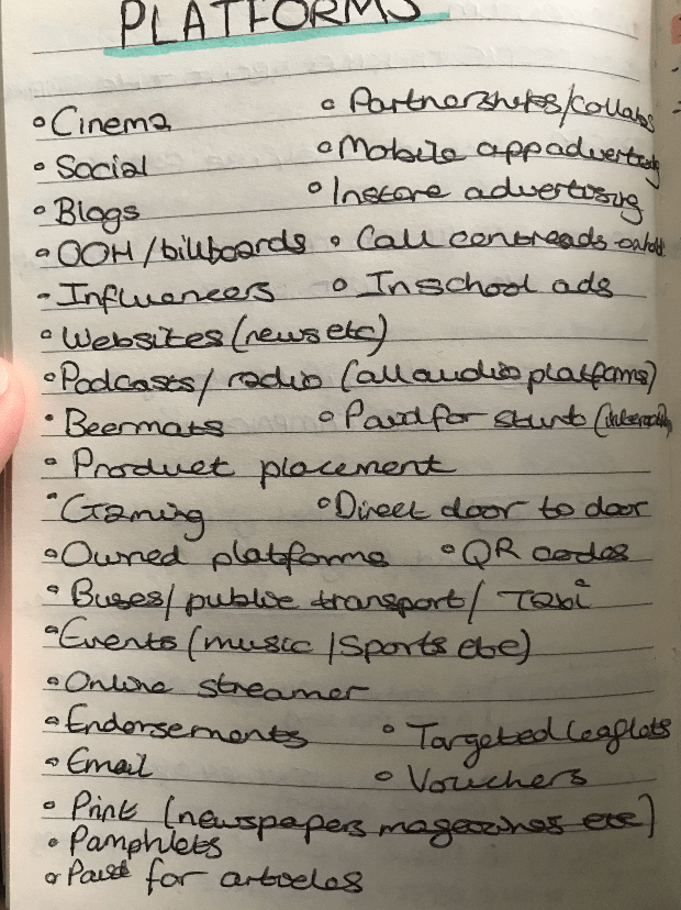
Advertisement Platforms
I made a list of potential platforms to cover for the campaigns advertisement and discussed them in a team meeting. We filtered through the options and decided to create posters, a live stream event, social media advertisement and influencers (celebrity as mascot) for the project.
The main idea we decided on was to create a strategy and clear art direction for the teams campaign, which would also help instigate further projects in the future. The idea wasn’t to over complicate the project by choosing many different platforms as examples, but instead to target a few options to give a sense of where the campaign could go.
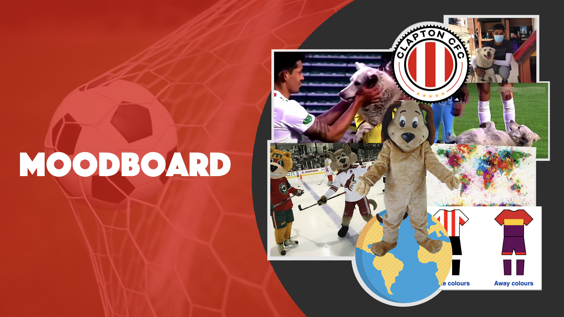
Mood-boards | Ideas and Potential Art Direction:
During another meeting, we discussed what our final concept and how to bring it to life. To further clarify the direction of the project, we decided on our audience, call to action, tagline, title, social media and posters.
This meeting was very beneficial as we were able to clearly outline our ideas and put our thoughts into action. During each call, we set tasks for each other to complete for the following meeting. This meant we enforced productivity and kept our creative ideas flowing throughout the creative development. At times we struggled with language barrier issues, however it was great practice using simplified English and finding ways of communicating without over-complicating ideas. Personally I find working with people who speak english as a second language a helpful and enjoyable challenge as I used to teach TEFL prior to this degree. In the working world, there are always issues with language barriers, so discovering ways of over-coming them is great practice.
In order to better understand each other, I chose to frequently type the information discussed not only to make a record of the topics, but also to clarify our decisions.
This was a successful communication method as we were very clear about the progression of the project and the tasks we were expected to complete.
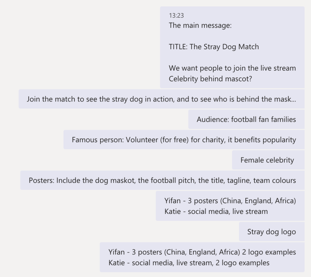
Our Final idea
The main idea is to effectively engage audiences through a live stream event called ‘The Stray Dogs’. The stray dog will partake in the event as a mascot, and a surprise celebrity will wear the costume and play in the match. At the end of the game, the celebrity will be revealed. This will be comedic and will increase audience curiosity and numbers. The event will boost Clapton CFC’s profile and popularity while building the team image.
The teams home ground is called ‘The Old Spotted Dog’, which fans feel connected to, so we decided on the idea ‘The Stray Dogs’.
The Stray Dogs campaign is family friendly and reflects the positive ethos Clapton CFC lives by, therefore targeting football fan families worldwide. Throughout the campaign, donation options will be available for the audience to give money to the RSPCA, and will consequently make a positive impact on the stray dogs in the UK. Clapton CFC are very focused on helping the community, therefore the strong ethos behind the campaign will reflect this.
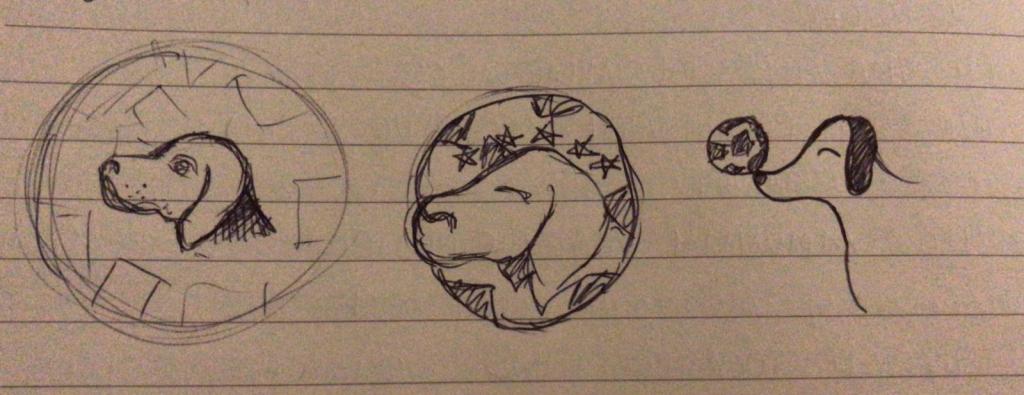
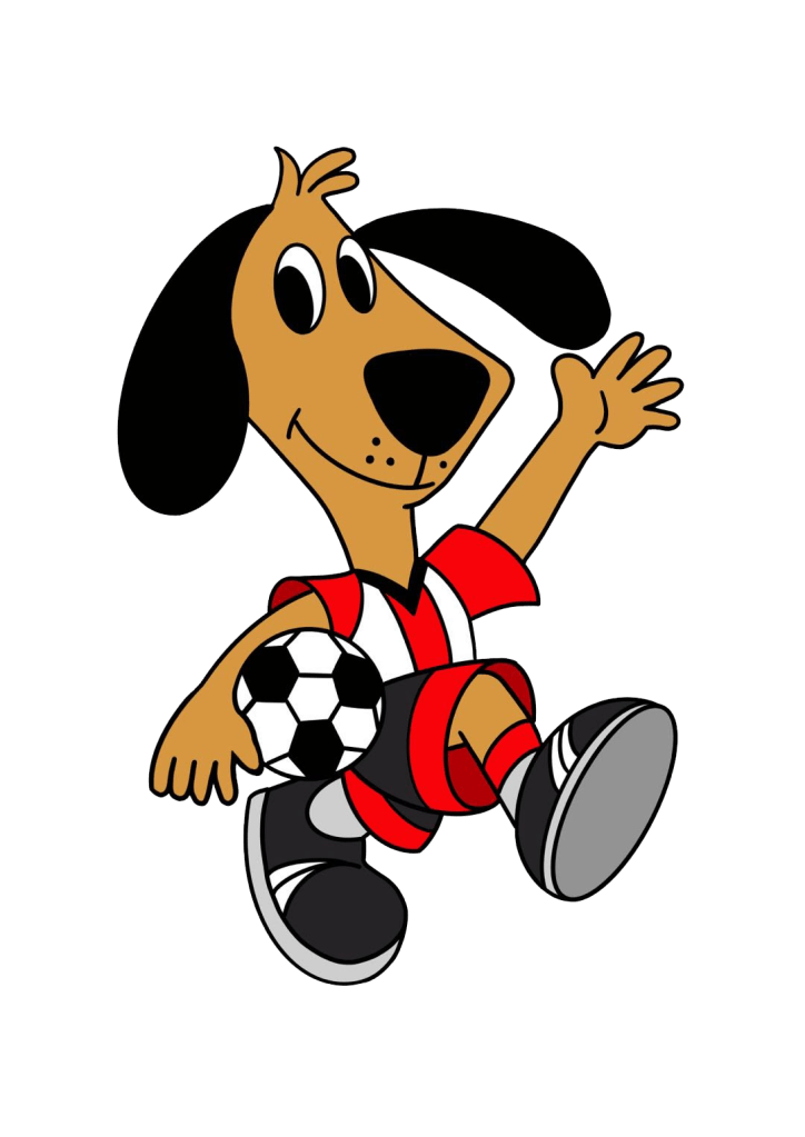
Creating the Logo
LEFT: my ideas, RIGHT: my teammates ideas
Before creating sample ideas for the campaign logo, we discussed the important assets to include. We agreed that the stray dog needed to be the central focus, to include a football (to highlight the sport) and to contain the teams’ colours.
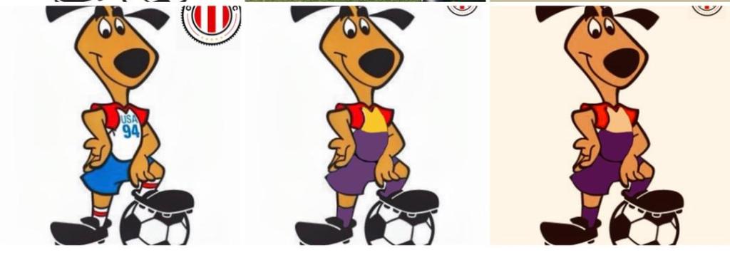
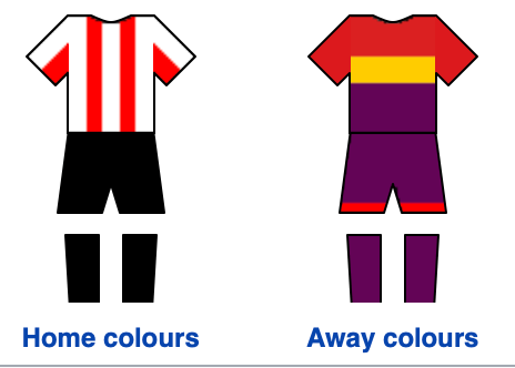
Clapton CFC has two uniforms, one for home and the other away. We chose to use the teams home colours to emphasise the teams grounds being at home, and consequently linking with the name. The logo needed to be simple and yet represent the campaign in its entirety. Therefore we created three examples each individually and came together in another meeting and confirmed our favourite sketch.
My teammate chose to create her logo digitally and found an example on the internet and changed the colours. I challenged this decision, as we could struggle with copyright issues if the client accepted our proposal. So my partner agreed to recreate the image and make the image quality higher.
As you can see on the right, the final logo is simple and yet highlights the main points within ‘The Stray Dogs’. Personally I wanted to make the logo even more basic, without so many colours, however due to the time restraint, time difference and language barrier, it wasn’t possible to keep changing ideas. The logo is fun, youthful and will cater to the target family demographic.
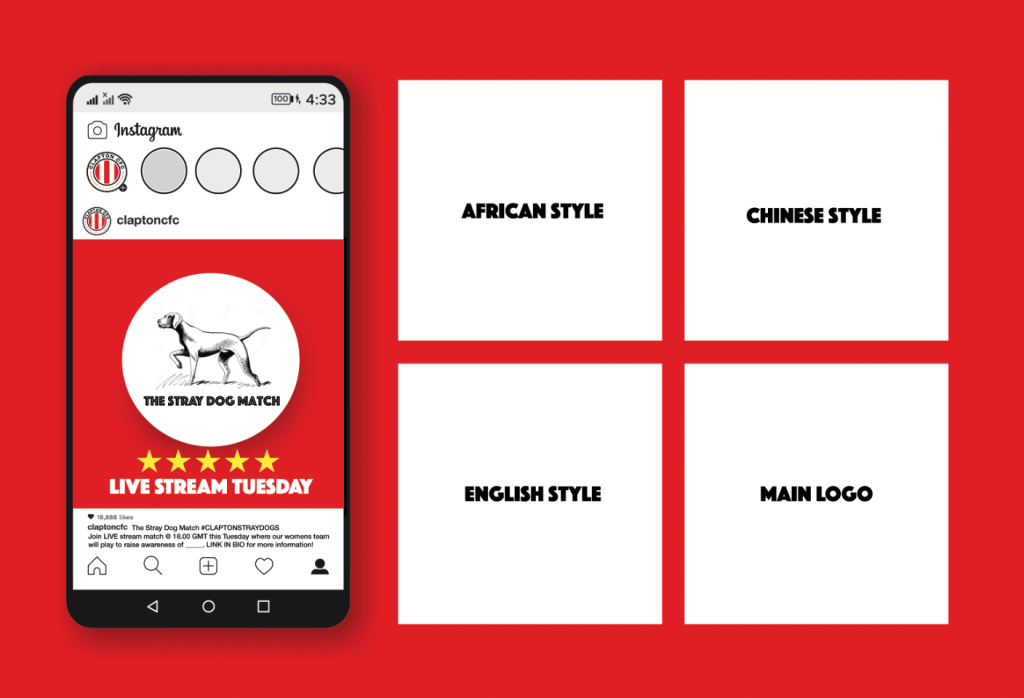
Advertisement | Posters
For this part of the project, my teammate was adamant to create the posters and had many ideas off-springing from the logo ideas. During a meeting we talked about what the client wants and needs from the project. We brainstormed how we could cater to these factors while creating visually appealing posters. My partner said how using flags from different countries will attract a global audience, and the posts can be forwarded on social media.
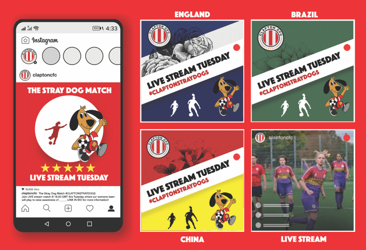
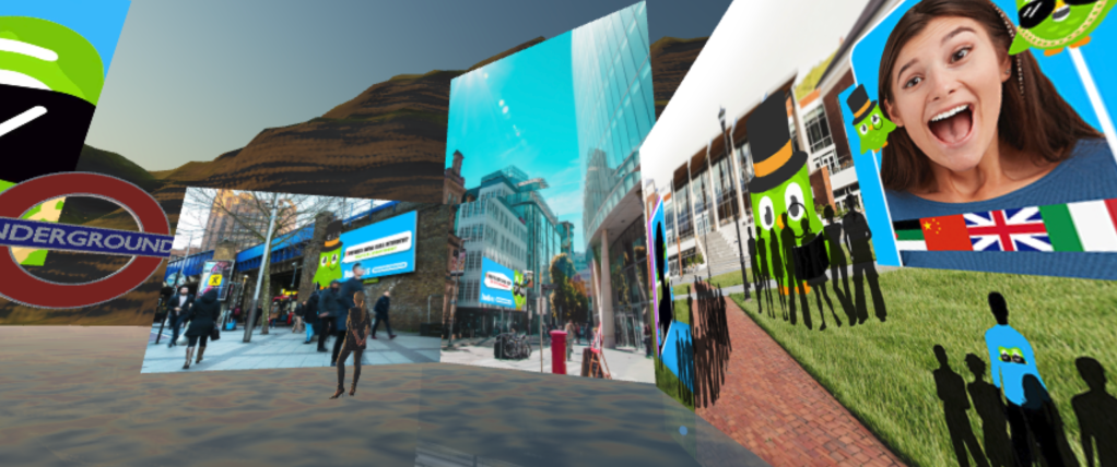
We made different posters with examples of different country styles to attract viewers globally. Considering our main goal was to increase the diversity of our fans, we chose to target three multi-ethnic countries in particular – China, England and Brazil. In the poster, we joined the team and countries colors with their national flowers.
I wasn’t sure about the initial visuals as the colours and patterns were too confusing, so i suggested making them simpler and sent a few examples online.
The posters overall are very colourful, contain the main message, however look a little over crowded for the client. Due to having received these visuals later than expected, we decided to keep them despite the uncertainty.
Social Media Advertisement
The social media advertisement was created by myself and represents what viewers will see across platforms such as Instagram and Facebook. Our younger demographic are active on Instagram more so than the older generation which are more reachable on Facebook, therefore we wanted to cater for both audiences. Having a consistent art direction with regular eye-catching posts will engage and attract new audiences.
The image above is a first draft example I created which was referred to when deciding on what we wanted to include in the visual. Below you can see the final visual used in the client pitch.
The live stream will be accessible across Instagram, Facebook and Youtube, and regular posts will advertise a countdown leading up to the event.
The outcome of this campaign will show a considerable increase of followers on social media platforms. The hashtag #CLAPTONSTRAYDOGS will connect activity gained across platforms to use for further advertisement after the event. It will attract global awareness of the womens team and their skills. Furthermore, the event will support the RSPCA and attract a more diverse crowd. This positive message will convey the spirit of football as well as bring attention to the stray dogs themselves.
Presentation Write-up/ Pitch
During a meeting we broke down the different powerpoint slides we would be presenting and decided who should talk about which section. When deciding on this, we weighed up our strengths and weaknesses and agreed to talk about the sections we created within the project. I offered to introduce the presentation and my partner chose other parts she felt most confident with. We made a draft of what we would mention and practised the talk until we were completely confident with what we were going to say.
To bring charisma, we practised our vocal intonation and fluidity in order to keep the client interested. My partner struggled with the pronunciation of some words throughout the text, so we highlighted them and I taught her them correctly. This gave her more confidence, and improved her side of the pitch.
Reflection
Overall this project was a fast-paced, eye-opening experience. During the process, there were challenges we faced due to communication, however as a team we worked well and enjoyed each step of the journey. My partner was positive and eager to learn, and was a great team-player. The design aspect of the campaign wasn’t as visually appealing and coherent as I wanted it to be, but the overall experience working with my partner was rewarding and worthwhile. In future projects, I need to find better ways of communicating my artistic vision in order to feel more satisfied by the final outcome.
The Brief Create a 60 second (max) live action advert YOUTUBE | 1280 x 720 MP4 H264 CODEC Presentation on 14th Jan – deck (pptx) with video embedded Rules: NO LIGHTBULBS NO DRAWING HANDS NO PENCIL BEHIND THE EAR
Brainstorming | Initial Ideas
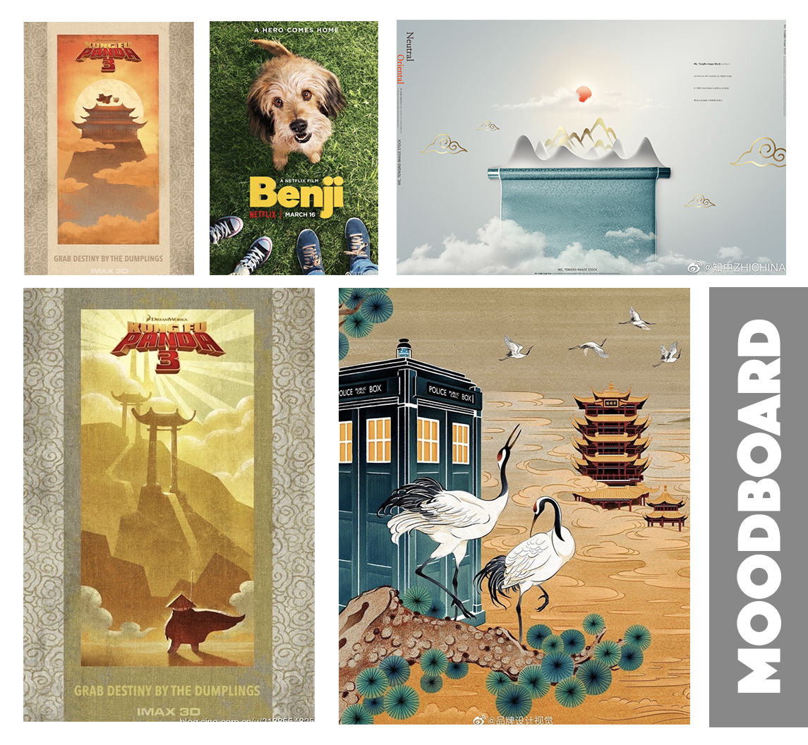
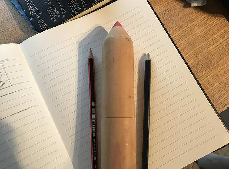
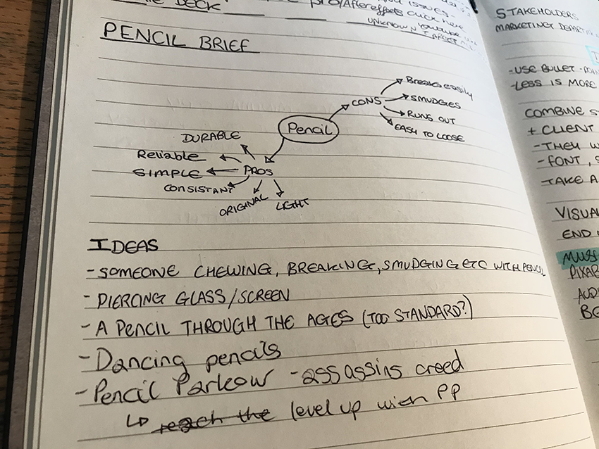
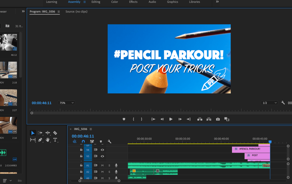
The simplicity of this brief meant having a lot of freedom with little instruction. With this in mind, my initial thoughts were very sparce which led to confusion. In order to gain inspiration, I created a Pinterest mood-board of key imagery which helped spark ideas for the brief. The pencil is an object which is so integrated in our daily lives that we can forget its significance and role. Therefore, to continue brainstorming, I listed the pros and cons of a pencil which led onto thoughts about its durability, shape, texture and weight. The brief outlined avoiding filming hands, so I thought about personifying the pencil and having it move/ play the role of a human.
‘Dancing pencils’ came to mind, so I researched YouTube videos for inspiration. While I was watching a video of a man creating dancing pencils, an idea came to mind of creating Parkour Pencils.
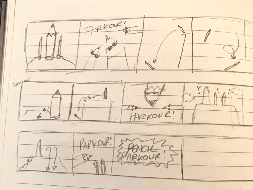
Parkour Pencils Story-board
This idea is exciting and funny which will attract the audience’s attention. Parkour is an energetic, free-minded sport which involves using technique and concentration/ a centred mind. The parkour parody from The Office US (2005) is a comedy sketch where different members of the team become obsessed with the concept of doing parkour that they run around shouting ‘Parkour!’ and performing minor stunts and moves. This reference influenced the comedic aspect within PencilParkour.
The Office US (2005) – Parkour PARKOUR
Filming
Before filming, I went through the plan and storyboard with a helper. We discussed the achievability and how to best optimise each scene. Due to the COVID restrictions, the supplies and location were limited, but I made use of the available resources on hand and the final product was better than anticipated.
Location | The filming took place in my back-garden and shed.
Materials | The materials we used were pencils, Sellotape, fishing wire, concrete slabs, wooden rods and Blu-Tack.
Filming Equipment | The project was filmed with an iPhone 7, and a Samsung when the battery died. We used a long wooden rod to attach the fishing wire and pencils to, in order to film at a distance.
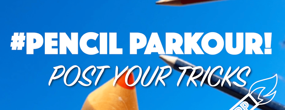
The Idea | To create a parkour scene with pencils and to have them perform tricks. The pencils would flip, run and jump with see-through fishing wire and manually. The advert would be published with the tagline ‘Post your tricks’ and hashtag #PencilParkour to involve audience participation and to create a social media trend.
Clients could replace the pencil with their own branded range and change fonts/ transitions to incorporate the company style into the advert. The advert follows an original idea and its comedic and fresh storyline will have a ‘trending’ success.
Music | Having followed parkour social media pages, two principle video styles caught my attention which were the fresh drum and bass style, and the rough rock music style.
To examples of this are ‘Paris Rooftop Parkour POV’, where the music has a fresh sound and the visuals are clean cut and in time with the music, and then ‘The World’s Best Parkour and Freerunning’ which focuses more on different examples of moves with disjointed video shots.
When looking for copyright free music, I used pages such as Pixabay, Audiomusic, Bensound and YouTube. Bensound was a great website to use, however I didn’t find the right track style for the advert. When looking on YouTube, I found many parkour videos have used copyright free music and added the links in their captions. This is how I discovered a playlist of free music with my chosen song ‘HOPEX – Warrior’ used in the advert. ‘HOPEX – Warrior’ is an energetic track which flowed perfectly in time with my parkour scenes.
Editing with Premiere Pro
Using Adobe Premiere Pro, I was able to modify the timing, length and volume of the music track and videos. I thoroughly enjoyed this process and was able to finish the editing in a day. Having worked with this program before, I have seen significant improvements with the speed and organisation when using it. With practise of using the basic tools on Premiere, I felt this experience was more immersive and enjoyable than in previous projects.
FONTS | The original plan was to have the title with a graffiti font, but having tested this I found the background interfered too much with the title. In order to avoid this, the titles font was changed to a bold ‘Phosphate’ and the tagline to a squiggly ‘SignPainter’.
LOGO | The logo was created by merging a shape of a pencil with fire (to represent the parkour movement) and the ‘PP’ initials for Pencil Parkour. This logo can be replaced with the clients company logo once the advert is launched.
YouTube PP tutorials were helpful guides when editing the advert, and I found new transition tools, special effects and short-cuts as a result. In previous projects I have used AE to create animations, and to export the files in the MP4 format I used Adobe Media Coder, whereas with PP the exporting process was far simpler.
The clients specifications were to export as an MP4 H264 CODEC with YouTube measurements 1280 x 720. I set the screen size at the beginning of the project to save time, so the exporting process was straight-forward. PencilParkour was shared on YouTube and presented in a University lecture.
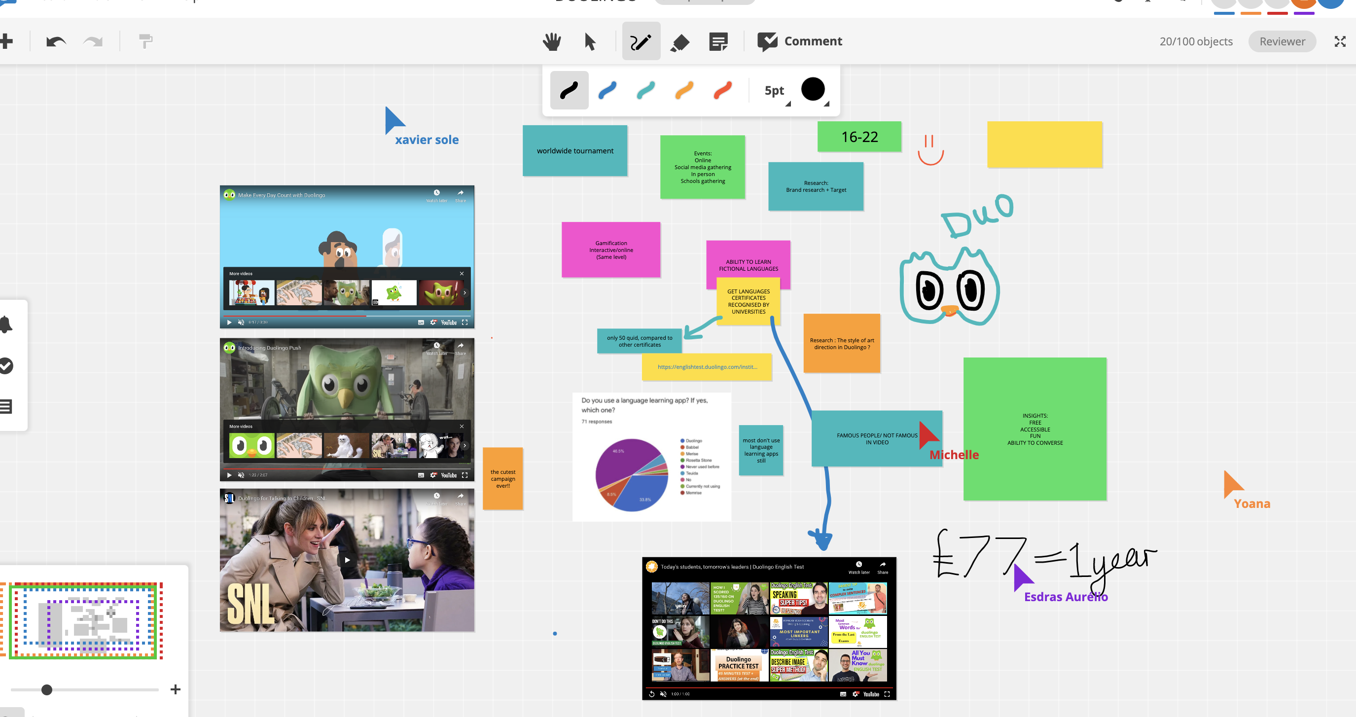
The Duolingo Campaign was created in order to encourage young 16 – 22 year olds to learn languages using the application Duolingo. When initially breaking down and discussing the Duolingo brief with a group of fellow students, we researched and discovered many key insights regarding the target demographics relationship with learning languages. Talking with other people about the same brief helped develop further ideas which lead onto deciding possible routes to take for the campaign.
The main insights we found during the discussion: – Gen Zs needs to learn a language and have easy accessibility. – The target demographic wants free education, a fun way of learning and the ability to converse in the language (with no barriers, embarrassment etc).
Considering the needs and wants of our consumers, we discussed our individual campaign ideas in order to gain further inspiration for our projects. The team discussion lead to learning additional facts about Duolingo, such as:
Duolingo offers language certificates recognised by universities which cost 50 pounds compared to other language boards which charge £100+
The company featured in SNL and other famous channels mocking language learning
Duolingo and Angry Birds have had a partnership in a past campaign
Discussing our prior audience research meant we could better understand the target audience and decide on which routes to focus on for our individual campaigns. This demographic looks for free products, but would be willing to spend extra if it was a worthy investment. Due to the age range being from 16 to 22 years old, many within this bracket would be either finishing school/ studying at university or working, therefore the concept of saving money shows to be a priority. Involving the fact that the basic Duolingo is FREE would be a key point to cover and would increase user engagement.
Gen Z’s are highly technology based, therefore the use of gamification will increase interest and build the ‘pleasure’ aspect of learning. Fast Company’s article ‘Do Gamified Education Apps Actually Help You Learn’ discusses this educative approach and explains the positive aspects of using gaming in learning. Gen Z’s crave interaction and entertainment, therefore this Duolingo Campaign needs encourage the audience to interact with the product while being entertained in the process. Duolingo has successfully turned learning a language into a game. In order to promote this factor, possible routes to take would be holding events and challenges online (social media gathering), in person (e.g. schools gathering) using gamification, worldwide tournaments etc.
Having conducted an online survey and online focus group, I discovered how Gen Z’s have many ‘blocks’ when learning languages. In this Campaign, I have included insights from this research in order to tackle the issues and find possible solutions.
Language Learning Focus Group
Initial Campaign Ideas
Referring back to the the main brief requirements helped to ground my concepts and discover the core insight of the campaign. Thinking about previous Duolingo campaigns helped ignite further inspiration. ‘The Team-Up’ campaign was created partnership with Angry Birds where they played with the concept of frustrations of notifications and creating a dramatic scene behind it ‘You wouldn’t like Duo when he’s angry’.
Seeing this inspired me to explore similar ideas but using grammar as the enemy rather than a figure from an external company. Considering the market research conducted for this demographic, the importance of entertaining the audience is crucial otherwise there will be a lack of interest. If the audience doesn’t feel connected with the brand/ message, the meaning and purpose of the campaign would be lost.
3 Initial Ideas
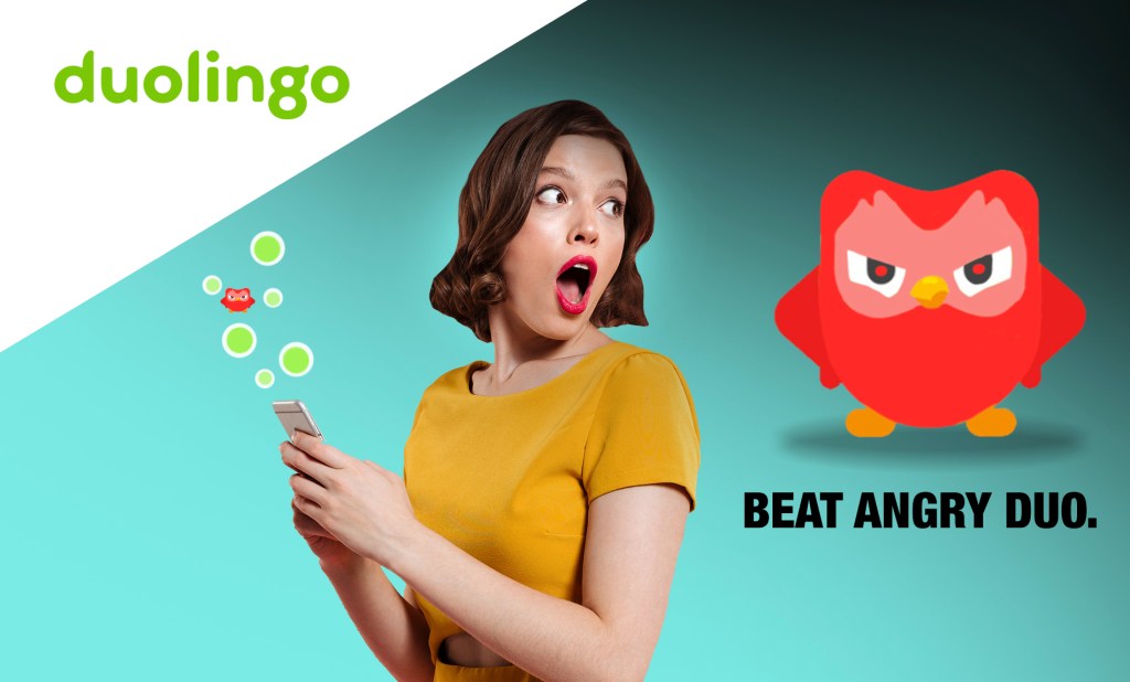
Grammar Enemy | Fight Back with Fluency
Idea –A comedy stunt around the concept of fighting fear of grammar Insight – Fear of grammar
The first idea that came to mind was to have an advert where Angry Duo, an angry/ irritating character (representing grammar), pops up and chase the user when a mistake is made (representing the fear factor when confronting grammar). Then, when the user uses the Duolingo app, she is able to face the enemy by shouting at him in another language to fend him off. The more knowledge, the more power. This would be made in the form of an advert and potentially a game (on the Duolingo app), helping demographic to fight their grammar fear. A following idea was to have a street stunt where people have the power to get rid of angry Duo by using the app (or throwing green Duo balls at angry Duo).
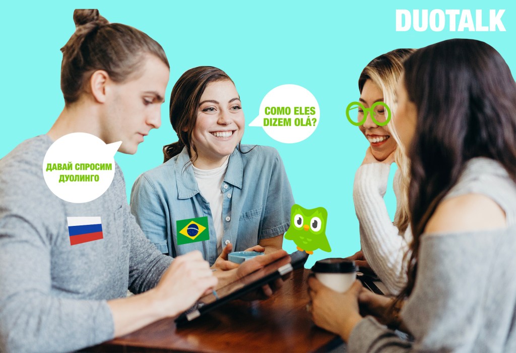
Idea – A conversation-based campaign collaborating HelloTalk and Duolingo, encouraging conversation with languages Insight – Survival communication methods force learners to use a language
A room of 5 people (within demographic) are given a challenge to solve (such as a murder mystery) which can only be solved by understanding and communicating with each other in their own languages. Having only the app as their language guide, they have to break the barrier of communication by learning and finding ways to understand each other without using the internet (Google). Each member of the group would be paired with people who speak languages unknown to them, this way language learning will be enforced. The challenge would be filmed and created as an advert, and would encourage the audience to try it themselves.
An online version of this game would be available for schools/ universities where students (with student logins) could connect at random with other students across the world and complete random group tasks.
DuoTalk wouldn’t just be a game, but also a platform which has the option of connecting via messenger in order to encourage friendship and connection worldwide. Considering the prior target research, the demographic crave interaction and communicating with others, therefore this idea meets their needs. When self-teaching myself Italian, in the early stages I used the apps Duolingo and HelloTalk to build up my vocabulary and to chat with local Italians. HelloTalk was fantastic for boosting confidence in the language and getting to know real Italians across the world.
Learning a language through interacting with games and writing/ speaking with locals really helped develop my language skills. This is where the idea ‘DuoTalk’ came from, combing two learning techniques to create a fun educational challenge.
References – Group Visual – taken from Unsplash (Copyright free photos)
Duolingo Fluency Filter
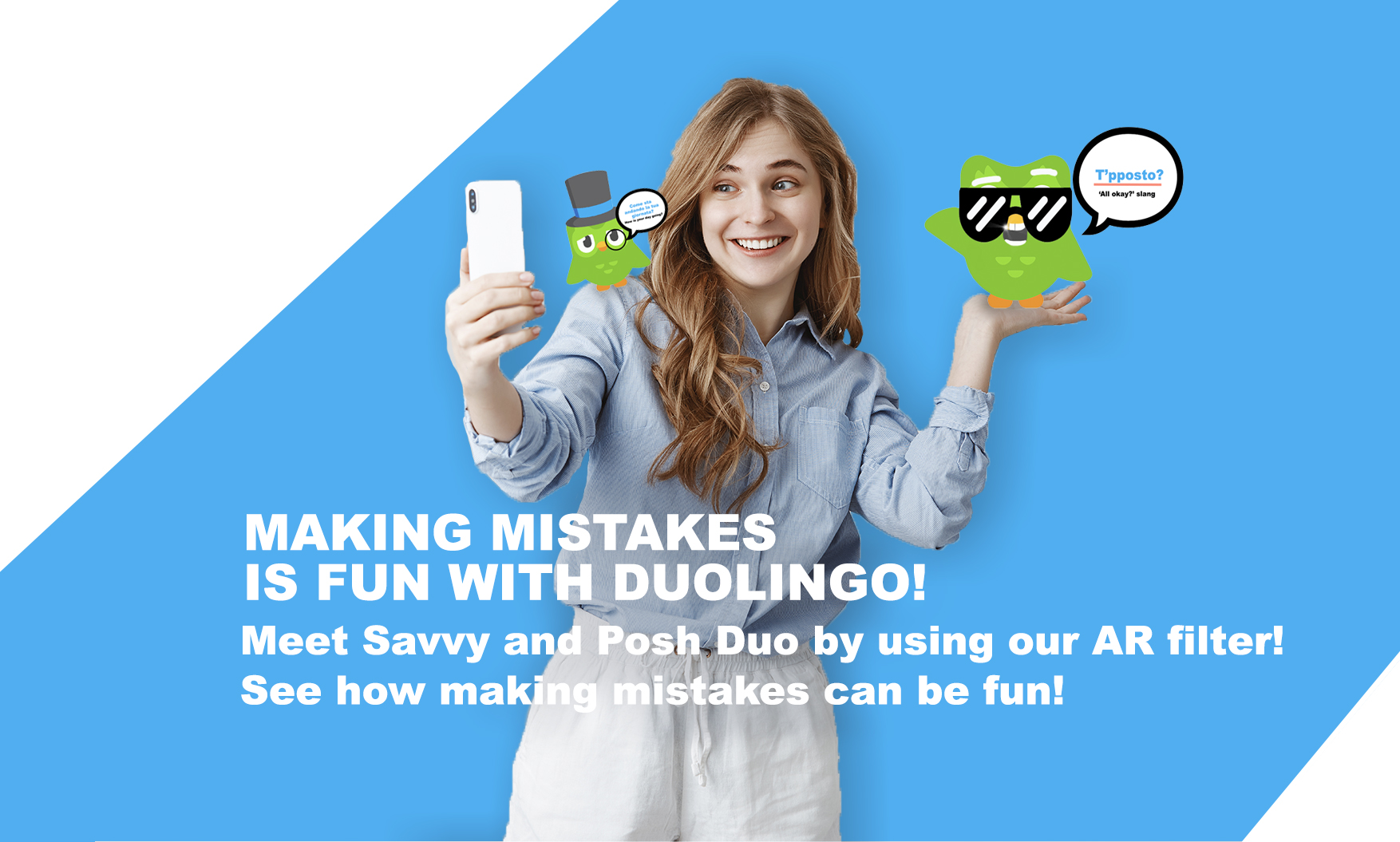
Idea – What would you look like if you spoke Spanish/ Chinese/ Dutch fluently? Insight – The fear of speaking in a different language
The Duolingo Fluency Filter shows users what they would look like if they spoke fluently in another language. When the user moves their mouth (pretending to speak) a sensor picks up this information and a voice over speaks intime to the users lip movement. Before using the filter, there will be an initial option to choose the language and accent to speak with This filter will be accessible on social media platforms TikTok and Instagram. This filter is entertaining, engaging and shows the user what they could look like if they spoke other languages.
In the target research, many participants stated that they are too afraid to make mistakes in other languages so they shy away from trying all together. This confidence issue needs to be confronted, and ‘mocked’ in order to get past the fear factor of learning/speaking in another language.
From personal experience, I can understand the fear in making initial mistakes in a language, but knowing that I could eventually be fluent and be able to communicate with people from another culture was what encouraged me to keep going. The demographic behind this campaign crave interacting with new media, therefore creating a language learning filter would be a strong idea.
References – Photo of woman taken from FreePik (Copyright free photos)
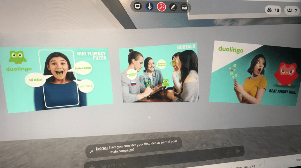
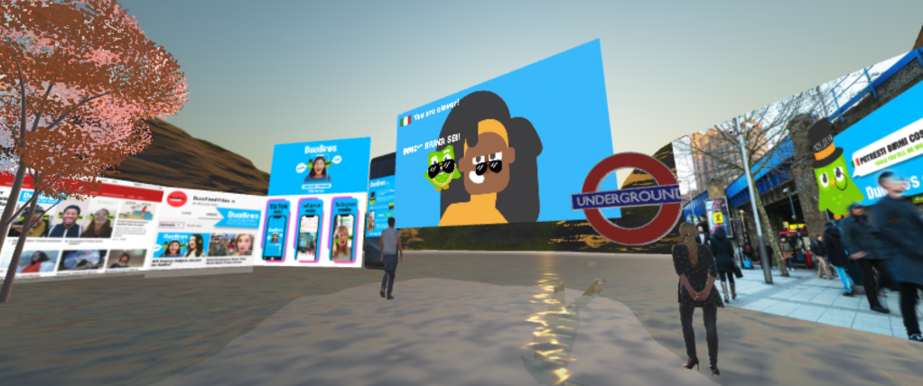
After having presented the campaign ideas to the course lecturer and class in my Mozilla Hubs VR Exhibition Room, I was informed of ways to further develop my ideas.
The main points of the session were:
The 1st and 3rd visuals have the most potential as they meet the briefs requirements.
The 2nd is out of the brief, but the idea is strong. The 3rd idea can be incorporated within the campaign but not used as the main idea.
The campaign should encourage the target audience to use Duolingo, not improve it. The idea shouldn’t be in the app, but to help promote it.
Stick to one concept – ‘The more mistakes you make, the better you become’. Break the fear of making mistakes (flip it so it isn’t negative). The main idea is too negative, and the audience needs a positive boost. The Angry duo could be used as a joking tool instead of a negative character.
Moving Forward…
‘Don’t be afraid to make mistakes’
Taking this feedback into consideration, I made a list of all the different ways the campaign could go down and picked the strongest options. I decided to conduct further research on the concept ‘stopping fear of making mistakes’ in order to gain inspiration and strengthen my ideas.
Inspirational Videos
This advert inspired creativity and humour in the project
The ‘Anger’ character in Inside Out
16.11.2020
‘Don’t be afraid to make mistakes’
A common fear amongst language learners is the fear of making mistakes. This insight needs to be confronted and ‘played with’ in order to turn the fear into a positive factor when learning a new language.
This topic is highly relatable on a personal level, so I believe this will be also enriching moving forward. Holding the focus group highlighted this insight, therefore this campaign will have a positive impact on the target audience. This demographic are more likely to engage with a product/ campaign if they see its potential benefits.
Second Development Stage
Taking the first feedback into account, I further developed my ideas by thinking of ways to turn a seemingly negative concept into something more cheerful and relatable. A helpful way to approach this second development stage was to write down the feedback received alongside potential ideas in order to improve them.
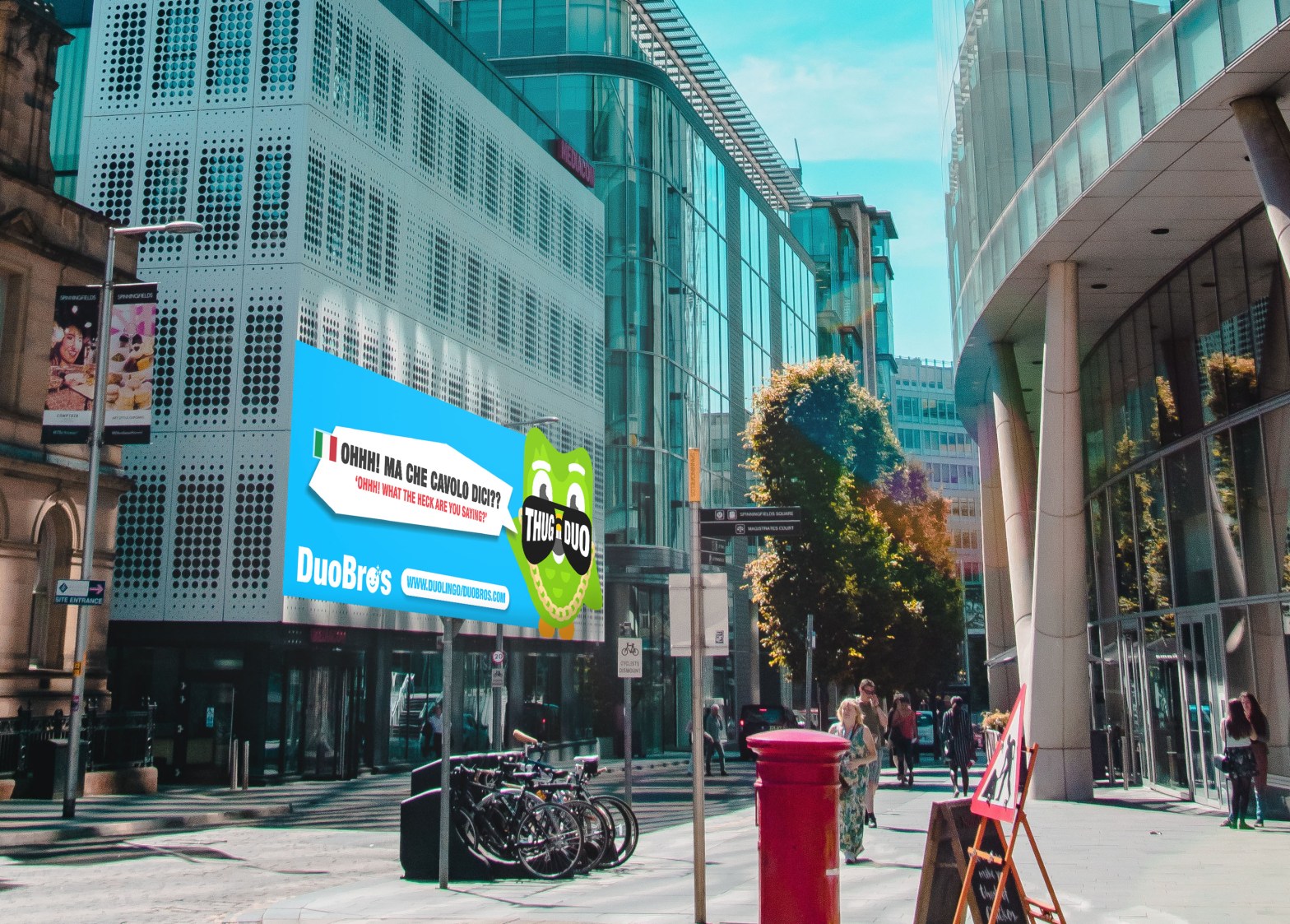
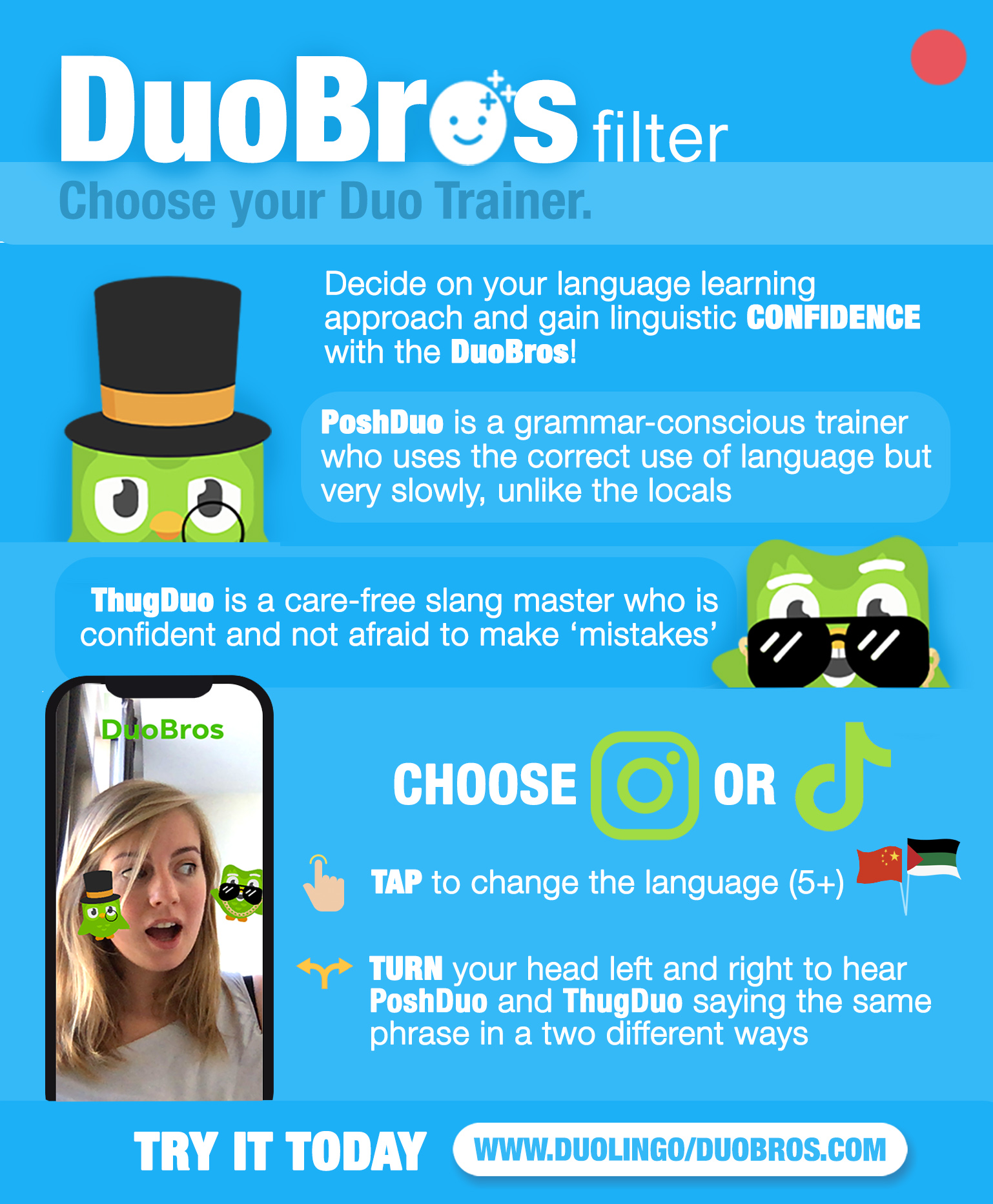
Making a mockery out of something you’re afraid of can make you feel as though the fear can be overcome. Therefore I decided to use the Duo character as the main focus of the campaign, and to change his personality according to different types of language learners.
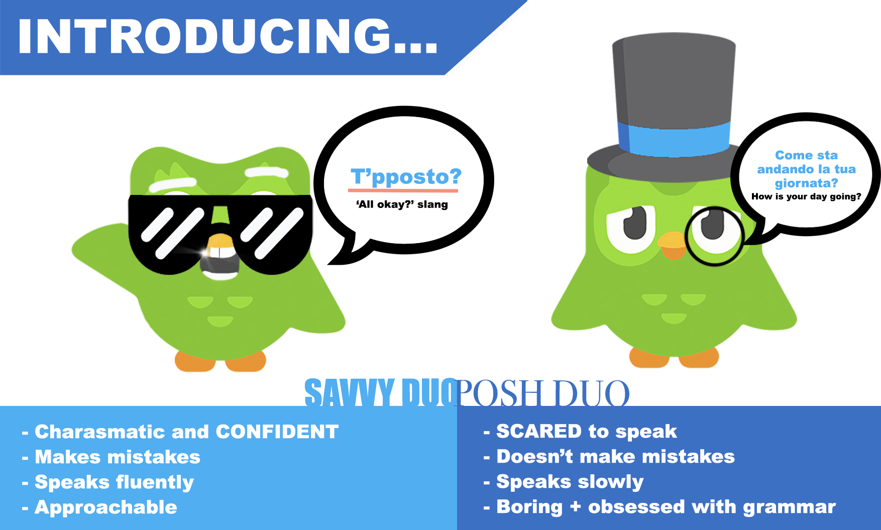
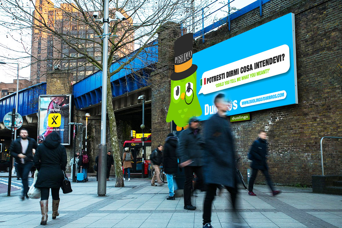
Thug Duo – A charismatic and confident language learner who makes mistakes but doesn’t care about them. He speaks fluently using slang and shorter sentences which makes him entertaining to speak to as he doesn’t worry about the judgement of others. Despite the errors, he is approachable and has no fear to try out new languages.
Posh Duo – A sullen and rather boring language learner who speaks grammatically correct in any language however is hard to follow due to talking at a very low pace. Despite not making any mistakes, Posh Duo is scared of tripping up on errors and therefore speaks slowly and uses longer sentences in the process.
23.11.2020
Brainstorming and Action Plan
Continuing on with the campaign, I brainstormed different routes to take when considering the digital, physical and video part of the submission. The thinking process was made by writing a list of all the possible routes to go down within each section, and to filter down the routes which would be best suited to this campaign.
While weighing up the importance of each potential path, I wrote down possible titles and tag-lines for the project…
Titles
Duofilter
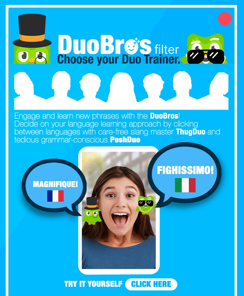
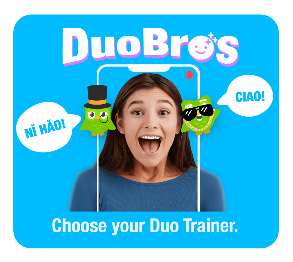
DuoBros
LingoBrothers
Taglines
Break the fear of communication
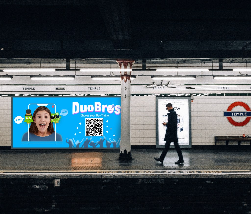
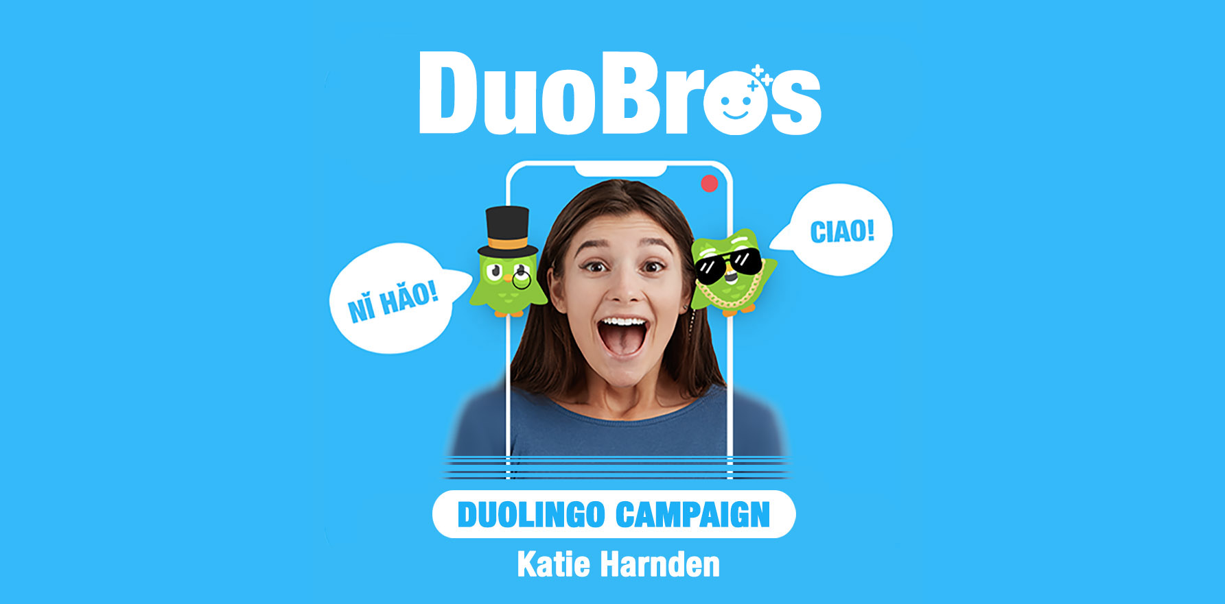
Choose your Duo Trainer
Build your confidence, choose your bro
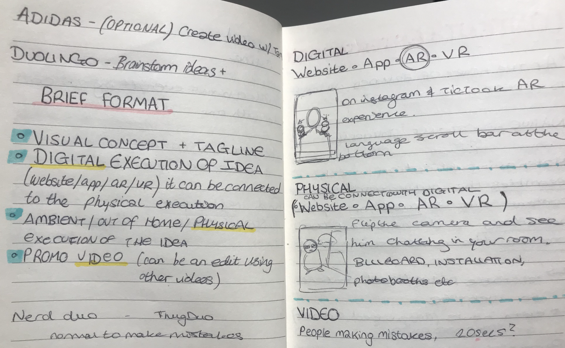
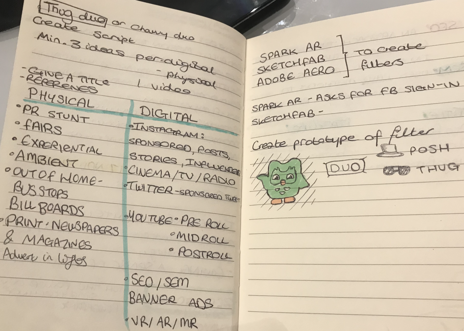
Clearly identifying the possible titles and tag-lines for the project helped build a foundation for the project. The decision for the title was ‘DuoBros’ and the tagline ‘Choose your Duo Trainer’. The brief asks for a digital and physical interpretation of the campaign, therefore I listed the possibilities best suited for the DuoBros, and considered POEM in the process.
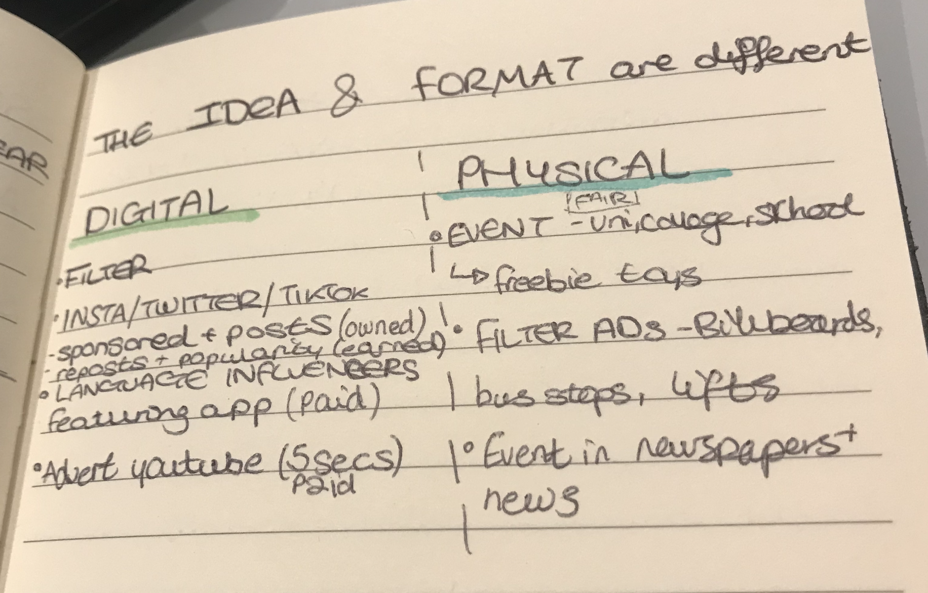
Digital
Filter (owned)
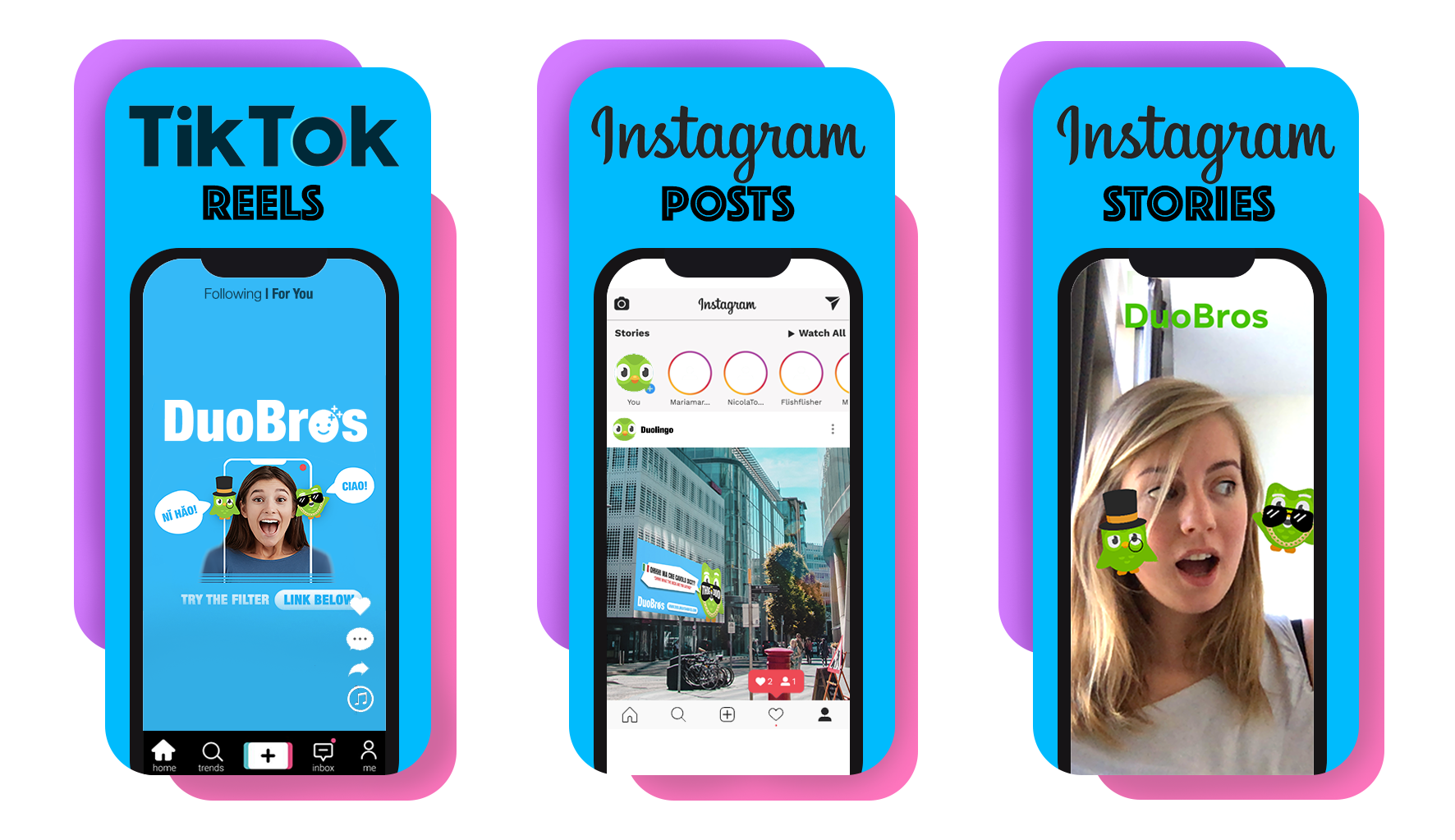
Instagram/ Twitter/ Tiktok (teaser, launch and sustain) advertisement Posts (owned) = Reposts and popularity (earned)
Language Influencers (YouTube) featuring app (paid)
Advert on YouTube, 5 seconds (paid)
Physical
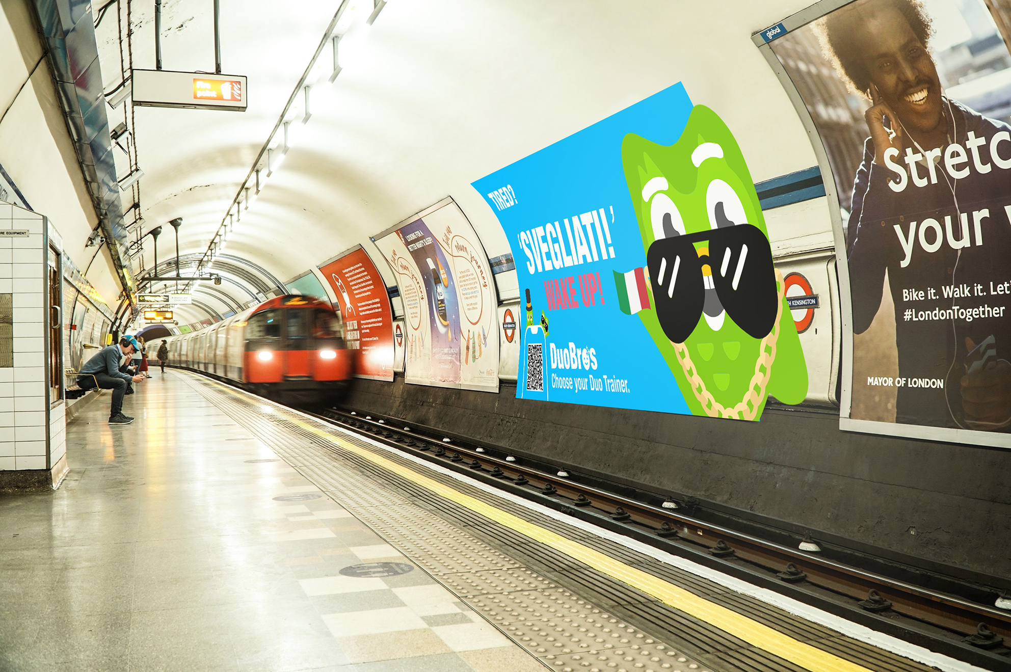
Event, outside Universities, Schools and Colleges in major cities in England Freebies with toys (from downloading Duolingo), Giant DuoBros filter screen to interact with and actors dressed as PoshDuo and ThugDuo (paid)
Outdoor advertisement on billboards, bus-stops and in lifts (paid)
Event gaining interest in national newspapers such as The Daily Mail and The Times (earned)
TV news report and interview from gained publicity (earned)
Making a clear list of steps to venture down greatly motivated me when progressing to the next stage.
Digital Media
DuoBros Filter
To start the process of making the DuoBros filter, I researched the main ways to create a filter to post on Instagram/ Facebook. The most used programs are: Spark Ar, Sketchfab and Adobe Aero. As I looked into the functionality of each app, Spark Ar seemed the most suitable for the process I needed to take. Having downloaded the program and logged in through Facebook, I watched YouTube tutorials to better understand the software.
The main video used to understand Spark AR Studio
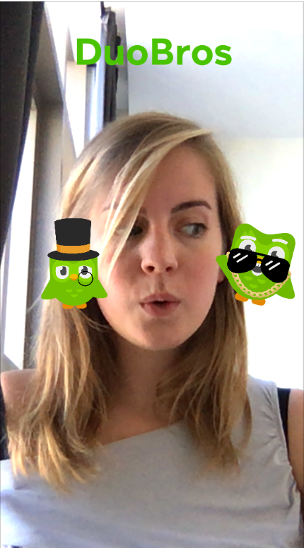
Having gained a basic understanding of the program, I tried to replicate my original filter idea which was having PoshDuo and ThugDuo on each shoulder where they move when the user turns their head side to side. Every head tilt would trigger a pre-recorded script of a phrase spoken in a different way for each Duo (slow and lengthy for PoshDuo, and quick and witty for ThugDuo).
Face Meshes YouTube Tutorial
This idea was fun to develop, but proved to be very difficult to recreate. I managed to create two ‘canvases’ that connected to a face tracker but I had no success in having them move according to when the head tilted towards it. I experimented for hours while researching online different possibilities in order to tackle this problem. Unfortunately I had no success, and therefore had to re-consider my idea. The most successful filters on Spark Ar are mask types which move with facial movement.
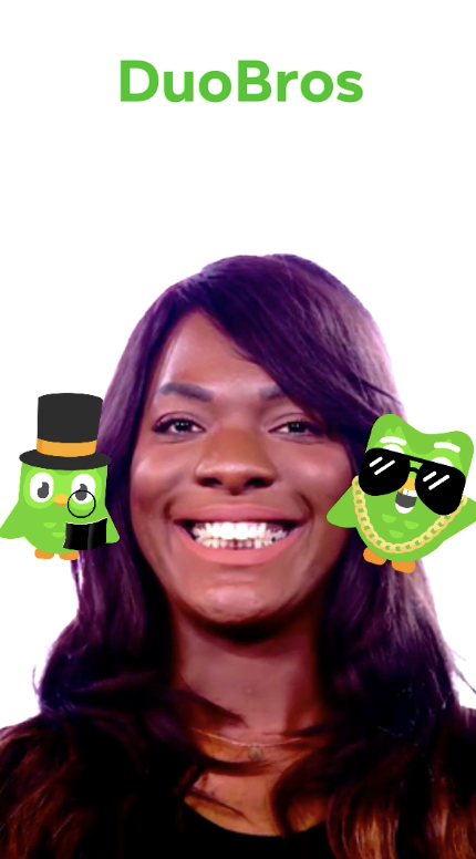
Creating the Face Filter
After having watched the inspiring Face Mesh tutorial, I decided to create a mask myself with the PNG Duolingo files previously created.
In order to do this I followed the ‘How to create a Screen Tap…’ video and managed to create successful filters. To make the DuoBros aligned with the models face, I had to bounce back and forth from Photoshop to Spark Ar to get the proportions right. The faces of the Duo birds looked scary at the beginning and didn’t fit the masks measurements. After experimenting for a while, the filters managed to look a lot better.
DuoBros Filter (First Review/Change)
Receiving feedback on the filter clarified it didn’t follow the main idea of the campaign which I agreed with. I discussed with my tutor how I can accomplish the principle idea (of having a duo on each shoulder and interacting with them), and he said how the filter needs to be as near as possible to the main idea and could be modified on the video submission.
Moving on, I recreated the filter with the original idea and positioned the birds next the model’s ears instead of the shoulders which worked better. In order to adapt the functionality of the filter with the intended purpose, I created it as near to the original idea and republished it.
Once the project was saved and published on Instagram, I asked my friends and family to try the filter on their social media channels. The feedback was positive, and they enjoyed using the filter.
Before creating the video, I wrote down the steps I needed to take.
Create a timeline of scenes
AUDIO RECORDINGS of different languages: Casting, recruiting and editing I casted 6 friends with 5 different languages to complete voice recordings, asked them to record 2 phrases (with a similar meaning) using a ‘posh’ and ‘thug’ style
VIDEOS of filter being used: Casting, recruiting and editing I considered using animated and enthusiastic actors for the roles
Create the VIDEO on After Effects: Considering colours, duolingo characters and time-frame (52 secs)
VOICE over for video: Scripting and recording
MUSIC for the background of video
The Script/ Audio Recordings
The script and audio are important parts of the DuoBros filter, therefore I chose 5 of the top spoken languages in the world (Spanish, Italian, Chinese, Arabic, English) to show examples of how it would work. The principle sentence of the DuoBros exclamations was ‘I’m good at speaking ___ ‘ (the language).
When creating the scripts, I discussed the best suited local/ colloquial phrases to use for each language by speaking to friends from different countries who knew the most accurate adaptations of the sentence. Regarding the voice-type, the Duo character appears to be male so I purposefully chose male voices.
The message sent to each partaker: ‘Hi ___! I am looking for a man to record himself saying two phrases in ___. One recording with a posh, slow voice and the other with an edgy and ‘gangster/chavy’ accent. Would you be willing to do it?’
Casting
Spanish: Josè and Alessandro (Columbian) Italian: Alessandro and Marco (Italian and Sicilian) Chinese: Luke (Chinese) Arabic: Waleed (Australian/Jordanian) English: James (Wales)
Scripts
English: P: My level of English is rather high considering ones grammatical accuracy T: I’m well good in English init!
Italian: P: Sono oltremodo basita dalla celerità con cui la tua mente acquisisce una nuove nozioni T: Min**! Brava sei!
Spanish: P: Mi nivel de español es bastante alto teniendo en cuenta la precisión gramatical. T: ¡Soy bueno en español! ¿No?
Chinese: P: 我觉得我的英语应该还是不错的 T: 我觉得我英语水平应该还可以吧
Arabic: P: مستوى لغتي العربية متميز جدا نحويا T: انا كويس بالعربي
Audio Recordings
When the audio clips were received from each person, the pitch and tempo of the clip were raised in order to sound more bird-like for the duo characters and then the files were later added to the video.
30.11.2020
Feedback Session
Throughout this week I managed to prepare most of my OOH (physical) and digital visuals. Having prepared these visuals meant I was able to get further feedback on my campaign progress from my two lecturers.
The feedback given:
The outdoor visuals need to have different visual purposes, i.e. the billboards could have one quote from each bird. – This idea sparked more ideas, like playing with the shape of the banner (into the bird shapes). Also an idea came to make them more visually striking and engaging.
The event is too predictable, it seems corporate. There could be a rap-battle or something more stimulating?
The insight isn’t very clear, you need to advertise it more in the work
Following on from this feedback, I decided to recreate my visual concepts to make the insight clearer and more impacting.
Out of Home
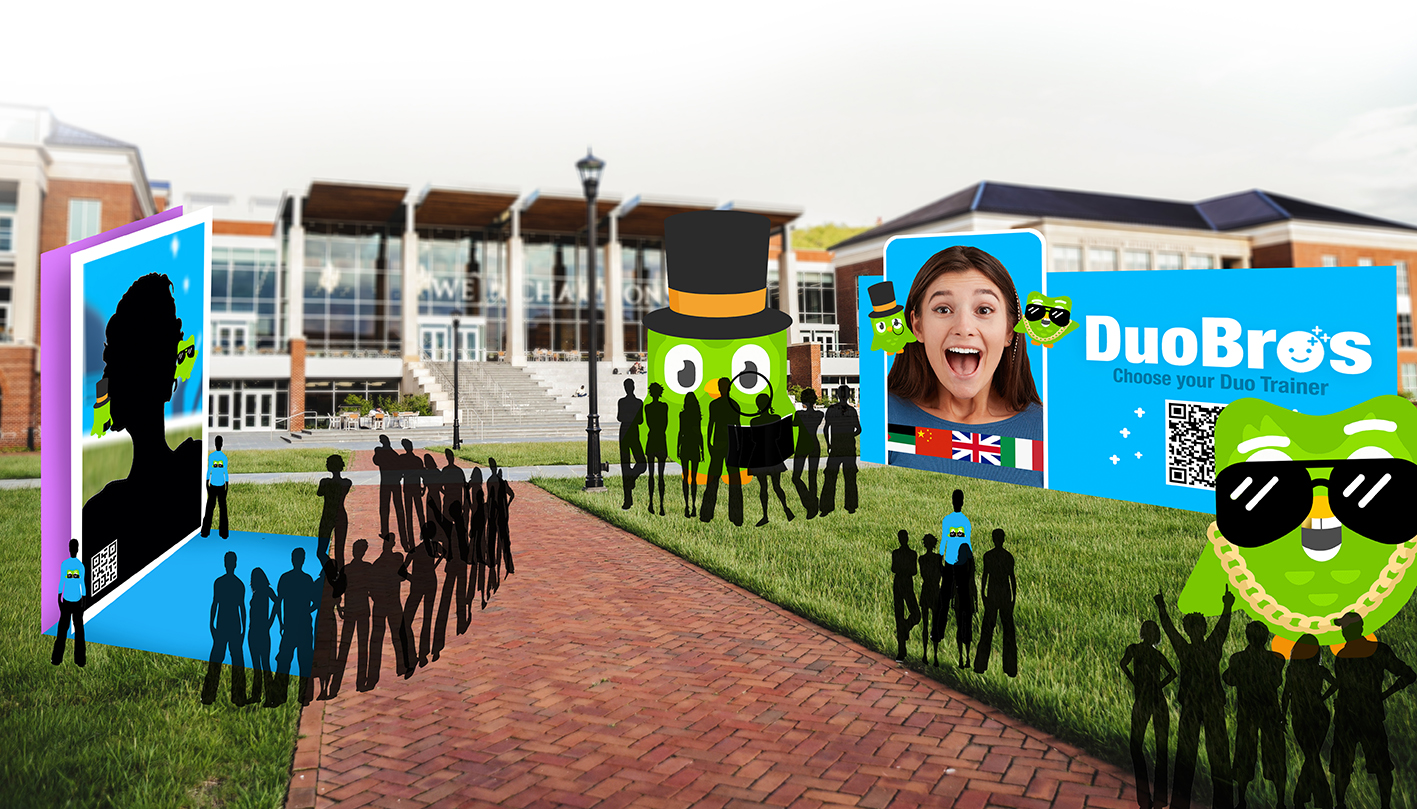
The University & College events will take place all across the UK for one day at the start of the campaign. The event will consist of a banner advertising the campaign, two actors in giant DuoBros costumes who will communicate with the students in different accents and languages, a giant screen linked to the filter for customer interaction, QR codes for CTA, Duolingo helpers to guide and discuss Duolingo with students and music in the background to set a ‘feel good’ atmosphere. Freebies of mini PoshDuo and ThugDuo will be offered to audience who download, or show they have Duolingo on the day. This event will create organic word-of-mouth interest when students understand how entertaining and addictive the DuoBros filter is. Once the filter is used, discussion will lead to further brand awareness for Duolingo.
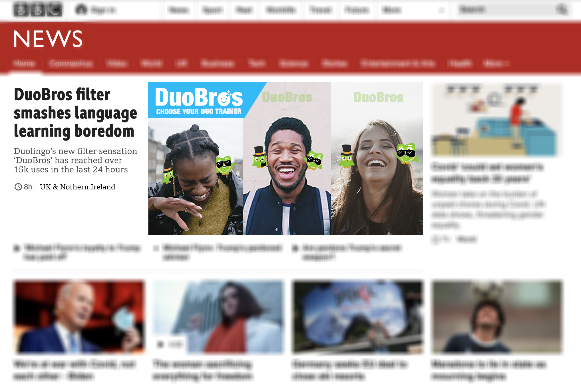
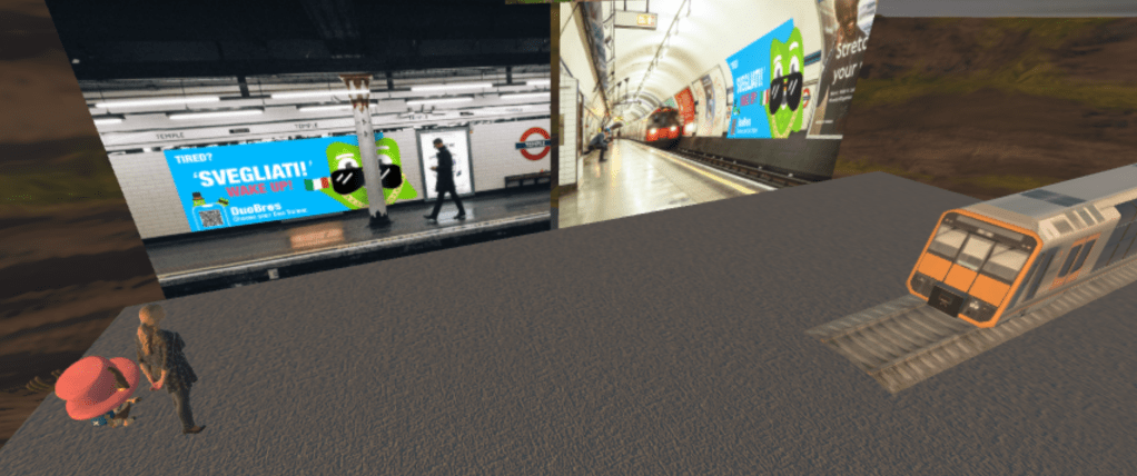
The OOH billboards and banners will be shown across major cities in the UK for one month. Their bright, bold visual appeal will catch on-goers attention and will direct workers/commuters to downloading the app and using the filter. The BBC News visual demonstrates the viral potentiality the DuoBros will have and how the campaign will look across the news.
The Final Visuals
The Video
3 Filter Videos
In the video, I asked 3 people to take a portrait video of themselves listening and interacting with ThugDuo and PoshDuo around them. I asked the three volunteers to act surprised and enthusiastic with ThugDuo and not be so interested in PoshDuo in order to show how the interaction with ThugDuo (the more confident character) is more entertaining. This will show the audience that interacting with someone who is freer/ not so cautious about grammar and sentence structures is far more entertaining than someone opposite.
Creating the Video
I created the video on After Effects and combined all the collected elements (videos, recordings and imagery). When considering the colour palette, I used the same colours as Duolingo use by taking them from the website design.duolingo.com.
The characters used were also taken from the same website and were adapted to fit the campaign. I edited the images on Photoshop and inserted them into AE. The fire symbol and speech bubble were taken from flaticon.com. The female character had blue trousers which bled into the background, so I used a Duolingo green instead (Hex: #8ee000).
The time-frame had to keep between 20 and 60 seconds. After editing the video, everything came to 52 seconds.
MUSIC
When choosing the music for the video, I chose ‘Most Happy Background Music For Videos’ which is an engaging upbeat tune which sits comfortable in the background. I wanted the audience to feel positive when watching the film and therefore the music needed to reflect this.
Rendering | AE and Adobe Media Coder
When exporting and publishing video, I encountered some difficulties rendering the video on AE, so I learnt a new way to export the file through Adobe Media Coder by following the video https://www.youtube.com/watch?v=mJwZ-nwvG3Q
The Final Video
Combining the main campaign insight with a moving narrative has been a rewarding and inspiring process. In the future I would like to work more with using videos to promote concepts. Using moving images in advertising is key especially for Gen Z’s as they need to engage with the project to gain interest. Creating the video on AE has been a useful challenge as I have discovered new ways of using the program and have learnt new problem solving skills in the process.
07.12.2020
For the days leading up to the final hand-in I had been finalising and making adjustments to the project to make the insight clear, and the visual concepts affective within their environments. To present the work, I created a VR exhibit on Spoke, and exported it on Mozilla Hubs where I presented the project to the class.
The VR Exhibition
The visual content added to my exhibition room were arranged carefully in order to create an impacting project ‘reveal‘. My idea was that the audience would come through my exhibit and see final visuals in the distance so when they lead up to it, curiosity would heighten until the come out into the ‘open air’ and see the DuoBros campaign surrounding them.
Spoke hasn’t been the easiest program to use as there were many difficulties with inserting images and saving the project. Even when the files were compressed to a small file size, the images couldn’t be inserted in the project on many occasions, therefore a lot of patience and problem-solving was needed for this issue.
The final outcome of the exhibition is positive, and I am hoping the final presentation will run smoothly.
“She stood in the storm and when the wind did not blow her way, she adjusted her sails.”
Elizabeth Edwards
The Duolingo brief was created to encourage 16 – 22 year olds to use the Duolingo app and inspire them to learn new languages. The DuoBros campaign caters for this target demographic with an interactive language filter, bright colourful visuals across digital, video and physical media. Its engaging core insight, gaining confidence by fighting the fear of grammar, is relatable for Gen Zs and will build confidence and encourage language learning in their daily lives.
This multiplatform campaign will take place in major cities across the UK for one month, and has the potential of becoming a viral sensation. Once the DuoBros filter is released across social platforms TikTok and Instagram, it will reach Gen Zs worldwide through its popularity and addictive gamified approach.
The KPI’s of this campaign will be measured by the number of users reached and the increase of Duolingo application downloads across the campaign period (one month). The filter interactions can be accessed via Instagram and TikTok, and the number of downloads recorded from internal company records. Considering the campaigns viral potential, the comedic and interactive factor of the filter will spread organically through consumer engagement.
Following on from this campaign I intend to use the knowledge gained from this project and further develop my skills in future work. This brief has stretched my abilities as a creative and has revealed both strengths and weaknesses artistically and skills-wise. Working independently on this project meant having to set specific time-frames, plan and organise the tasks at hand, communicate with others, conduct research etc. Managing these tasks meant learning to prioritise certain actions over others and being flexible to program changes. At the beginning of the project I created a plan to follow over the weeks which helped when understanding the stage I should have reached at the time. The project timing didn’t end up so rigid and ended up spreading across more/ or less time than expected. For future projects, I will plan project timings in advance and be more flexible when adapting to unforeseen circumstances.
Photoshop has been a reliable program to use when creating digital visuals, however in this project I have experimented and discovered new programs to realise my ideas. Adobe After Effects and Media Coder were used for creating the DuoBros video, Spark AR to create the interactive filter, and Mozilla Hubs and Spoke to create the VR presentation. A program I have discovered and would like to use in future projects is Adobe XD. This program offers a wide range of tools which I would like to use to my advantage, like interactive artboards, prototypes, grids and smart canvas navigation (which can be used for creating websites/links).
Due to the COVID 19 pandemic, the DuoBros had to be created from home and that meant having limited resources and space. Distractions were the hardest challenge to deal with during this project as I was limited in choosing where to study and develop the campaign. Cafes and libraries have always been my go-to when needing to concentrate, so not having the choice of location meant having to purposefully adapt to my surroundings and finding peace/ concentration where I was. This practice was very useful as I have developed a gratitude for the freedom prior COVID, and a strength in dealing with unprecedented times.
The DuoBros campaign has been enjoyable to work on and I look forward to developing even more entertaining projects in the future.
For the second part of the project, we were told to come together in a group of four and create a marketing plan and prototype for a Duolingo Campaign.
We started the process by breaking down the expectations given to us, and what we could do as a group collaboratively. As this project was to be completed in a team, we discussed our strengths/ weaknesses as a group and brought all of our ideas and research from our separate Customer Research Reports together. This team-building meeting gave us strong foundations to branch our following actions off of, and it propelled us into the next step.
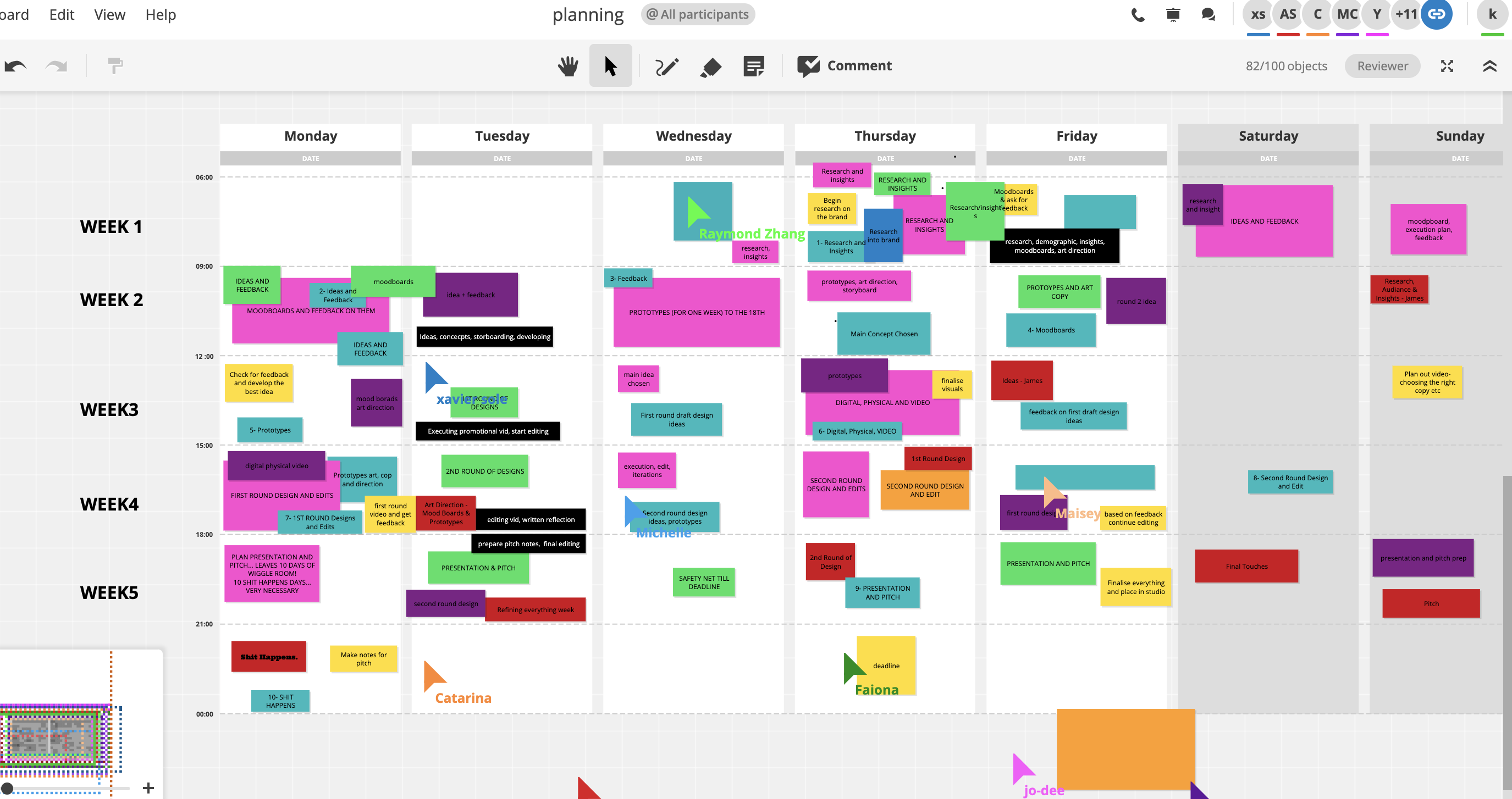
After having brainstormed and analysed the brief, we distributed the work load between us and held consecutive meetings throughout the weeks to catch up on our progress.
The Marketing Plan and Prototype would eventually have this structure:
✦ Intro • The brief & challenge (s) • Objectives • Tactics • Media plan(including POEM) ✦ Clearly link how your creative response to the challenge(s) / targeted audiences ✦ Analysis methods for measuring results ✦ Conclusion
Self Review
The tasks I completed throughout the project were:
Creating an Introduction draft
Writing ‘Objectives’ section – 161 words
Writing ‘Analysis methods for measuring results’ section – 186 words
Planning meetings, and checking projects progress
Creating Social Plan (with team) – Focusing on Instagram and OOH (tease, launch, sustain)
Researching inspiring campaigns to refer to within Marketing Plan
Constant proof reading and editing written text (with team)
Changing color and style of 4 personas
Creating visuals for Instagram
Bringing all the work together, proof-reading and making the work aesthetically pleasing (on Canva)
Creating a marketing plan and prototype was an enjoyable experience. The process was challenging and taught us as a group of four to work together efficiently within a set time. Our group played to each others strengths, communicated clearly and worked in a very organised way. We planned regular meetings which gave us structure throughout the process, while setting goals and targets to meet in order to sustain productivity. Considering not knowing each other well at the beginning, we had to be transparent about our strengths and weaknesses in order to help each other out and work to the best of our abilities. Completing this brief as a team was very rewarding and has shown me how enjoyable bouncing ideas off of others and collaborating creatively is. Leading up to this brief I was apprehensive about the team aspect of the challenge, but now I have a much positive outlook on working with other people. I found myself taking the role of organising meetings, initiating discussions (early on) and chasing up on completed tasks. Our group worked very well as a result and we all had something different to contribute to the team which resulted in a successful outcome.
To begin the brief, we were told to complete a ‘Customer Research Report’ in pairs by analysing and researching the brief demographic and Duolingo as a brand. We were expected to complete this task in 4 weeks, and then to move onto the second part of the campaign.
To begin the process, we chose our partners (with the same brief) and started to think about arranging meetings, phone calls together. Considering my partner and I didn’t know each other very well to begin with, we briefly discussed our strengths and weaknesses as team players, and to arrange the distribution of the task between each other in a tactful way. Personally, I enjoy writing/ analysing and organising meetings/ calls etc, so I occupied myself with that, and my teammate on the other hand enjoys the artistic, art direction side of the project whilst also finding information and analysing it. As we both live in different cities, and we were in the middle of the COVID-19 pandemic, we decided to meet primarily over Microsoft teams and talk over the phone.
Our first meeting consisted of combining our individual research and ideas about the brief, and construct a plan of action between the two of us. The class had been told what was expected from the Customer Research Report, and were given guidelines as to how to structure it. This was a massive help, as I personally have never written a formal report before.
The Online Survey
Later on in the week, all of the Duolingo task members joined a Whatsapp group and decided to meet over Microsoft teams to discuss ideas and our thoughts on the brand. I organised and set up the group meeting over Teams and invited them, and managed to record the meeting to further analyse it later with my teammate. The group decided to create an online survey (with Google Forms) to gather data from a wider audience. We brainstormed questions together, and one member of the team put them together and published the survey.
The call was successful and very beneficial for all of the large group members. Hearing other peoples opinions about learning languages and Duolingo was very inspiring, and initiated ideas to start the report.
After the meeting, I volunteered to post an announcement on the universities Facebook page asking people to fill out the survey. The Facebook post received no follow up comments, therefore we all decided to send the survey to our friends and family directly (within the target demographic age range 16 – 22) which gained more interest. The personal touch of sending private messages seemed to be more effective.
Teamwork and Planning
Following on from this call, my teammate and I discussed how we should tackle the report as a pair, and decided to dedicate certain sections to each other as we were aware of time-keeping and deadlines. We discussed which parts worked to our strengths and also discussed possible answers and websites to explore. To make sure we were on track we arranged a meeting every other day in order to discuss our progress and help each other out with difficulties and dilemmas. Approaching the brief in this way was effective and worked to our advantage. We were both open to criticism and advice along the way, which helped with the dynamics of the project.
In order to gain further knowledge about our target audience, we arranged a Duolingo focus group. I personally occupied myself with creating a Whatsapp group and we both sent an announcement to our friends within the demographic to participate in the call.
My announcement was:
‘Hey everyone! Thank you for being willing to participate in Sunday’s Duolingo Focus Group! We really appreciate it and look forward to hearing your opinions! The meeting will start at 14.00 and will begin asking questions at 14.05. To prepare, here are the four main questions we will be asking:
What helps you decide to learn a language? What motivates you to keep learning long term? What is your ‘block’ when it comes to languages? What’s the main factor you consider when deciding to download a language app?
This will take from 20 – 30 minutes, and will be a fun discussion so bring your ideas ready to share! 🙂 Will send the meeting link on Sunday! Thanks again‘
Before sending this message, as a pair we discussed what questions to ask and how we can use them in within our research. We thought it wise not to swamp the group with too many questions as we would prefer to hear their opinions in order to gather the data. Considering this, we were careful when deciding on the questions and filtered them down to a shortened list.
Focus group questions:
Raise your hand if you have heard of duolingo
Raise your hand if you are multilingual
Those who have raised their hands, do you think it’s a good app?
What helps you decide to learn a language?
What motivates you to keep learning long term?
What’s stopping you from learning a language/ continuing?
What is your ‘block’ when it comes to languages?
Have you ever felt embarrassed when speaking another language/ why?
Raise your hand if you know Duolingo is free.
What’s the main factor you consider when deciding to download a language app?
Outside of language apps, what do you do to practise your language skills?
Optional Questions:
At what point do you consider yourself to speak a language? eg asking for directions? Reading? Watching movies?
Have you ever been embarrassed by having an accent?
Do you have enough time to learn a language?
The questions in bold we considered to be the most important, and therefore used them in the focus group announcement (via Whatsapp) so that participants could prepare in advance and not feel flustered/ unable to answer the questions on the day. 12 of my connections were willing to participate and my teammate gained one person too, so we had a good turn out in the end.
The Focus Group Meeting
The participants of the Focus Group came different parts of the world (Canada, Philippines, England, South Africa, Italy, France, Germany, The Netherlands etc). This meant we were able to reach a wide range of Gen Z’s internationally, meaning the results weren’t bias.
Creating the Report
For the rest of the report, we divided the work load between us and combined all the gathered research while analysing and discussing the results. We held regular meetings (almost four/ five times a week) in order to understand each-others progress and help one another if needed. Once we finished the report, we edited and simplified the text in order to make the report digestible for the reader. We used Canva to make the report creative and aesthetically pleasing, and worked collaboratively on finalising the work in a professional and effective manner.
Report Work Division Summary
Peer Review
Focus group – invited friends, created recorded teams room
Focus group – invited friends, set up WhatsApp chat
Researched initial ideas (finding links and references for report)
Carried out individual research
Brainstormed questions survey/ focus group
Created Personas and thought of ideas
Created Duo Infograph
Wrote sections – Introduction (200 words), Research Section 2 with research references (350 words), Insight/ problem (209 words), Tactics (200 words), Measurement & Effectiveness (250 words)
Finalized all written work together
Customized the report on Canva together
Created ‘Customer Profiles’ together
The report has been a fun and challenging project to work on, and I have thoroughly enjoyed working collaboratively with my partner. We played to each others strengths throughout the project which eventually paid off with the results we have achieved. This is the first report I have made, and have thoroughly enjoyed the process of collecting data, analysing and presenting it.
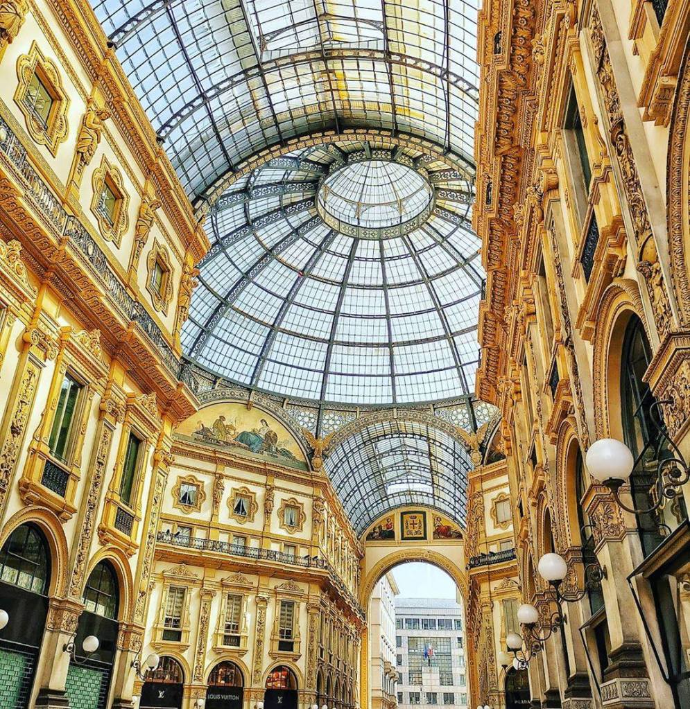
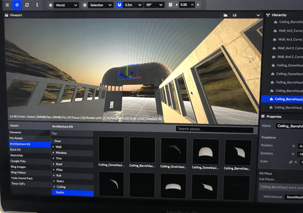
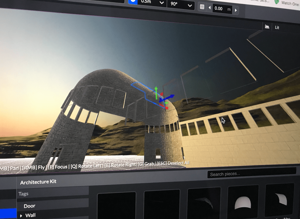
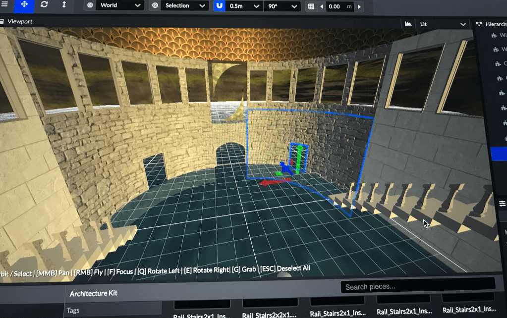
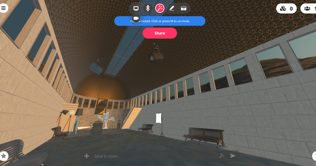
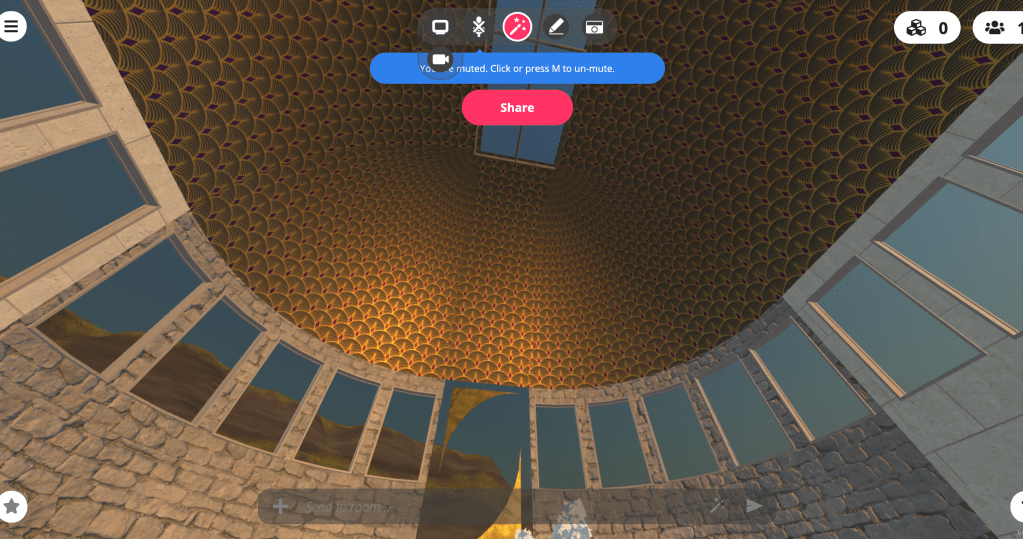
The task was to create a personal exhibition on Spoke (Mozilla Hubs) in any desired style. When being confronted by this task, many different initial ideas came to mind and having visited many exhibitions across the world, this task was approached very willingly. Having lived in Italy for over 3 years, I was particularly fascinated by the architecture I saw and the warmth of colours and ambience. To explore this further, I researched many of the buildings I have personally visited to spark inspiration.
My most prominent inspiration came from Milan’s Galleria Vittorio Emanuele II, which I visited often when living in Milan and was breath-taken every time. Its high ceilings and walls lit up with a golden haze of light creates a sense of wealth and warmth as soon as you walk in. Situated in the main Piazza of Milan, the open aired Gallery is lined with designer shops and populated by the busy, curious tourists that visit the city. Many times I’ve stood in the centre of the crossed ‘paths’ and have looked above me in awe at the beautiful arched glass ceiling above lined in cast iron. This elegant 19th century shopping arcade has an energy which propels tourists to explore more of the city. Architecturally Galleria Vittorio Emanuele II is designed intricately with stunning results. In this project I was inspired by the Gallery and wanted to give the place a similar feel with having a long entrance leading off into another section which the Gallery does. The glass ceiling was also inspired by this master-piece, and the mountains surrounding the building are to express the feelings tourists have when walking through.
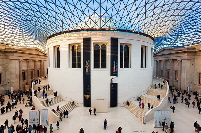
The British Museum has a spacious, energetic feel to it. When visitors enter its grandiosity, they instantly feel compelled to lift their heads to the latticed glass ceiling with the beaming sun pouring through. This inspired me to include a glass ceiling/ windows to the roof of my exhibition. Obviously the colours would depend on the changing seasons, and that would give the building a greater depth and diversity. On a reflective note, my art is constantly changing, as are my creative insights, therefore I would like this to be reflected in my personal exhibition.
When considering the flooring of the exhibition, I chose water to symbolise my thought process with art/ design. Water is cleansing, compelling and refreshing. On the flip side, it can drag you down and work against you. Personally I have a love hate relationship with water, I love the positive attributes it has… but can also be my worst enemy when trying to keep afloat. With art there is a similar story, creativity comes in waves and sometimes we are unable to control it. When I have creative ideas, sometimes they come easily, and other times there’s a block and I feel like I’m sinking. I have represented this in the building, showing that the creative work was made when I was ‘on-top of’ or ‘in-control of’ my creative flow.
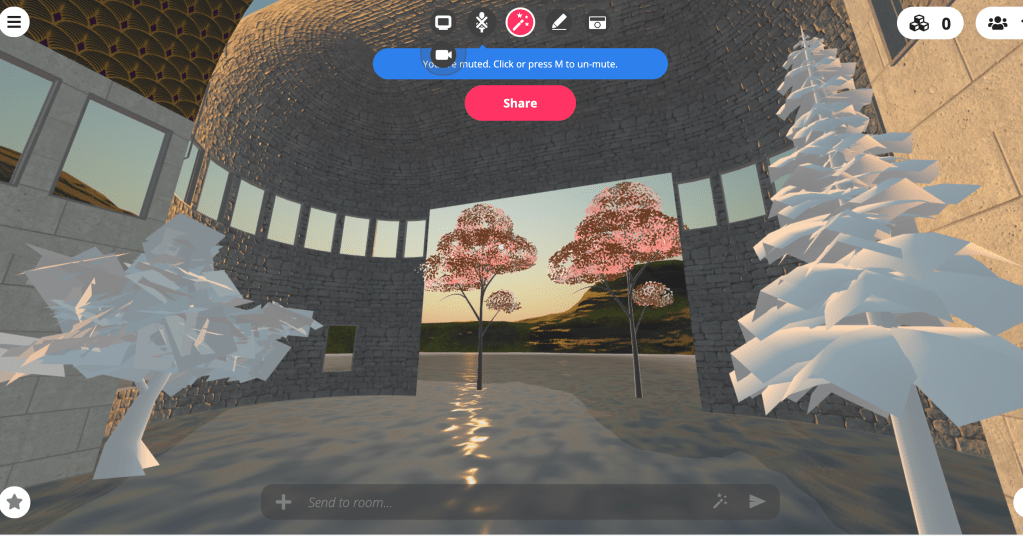
Future, past and present are all concepts that I find fascinating to dive-deep on. My past desires are important to today and tomorrow, but those that shape my future are even-more so. My desire is to explore Arabic and Indian cultures around the world. The architecture especially fascinates me, with the rounded rooftops, and fascinating intricate designs covering the outer-walls. Then the simpler, pattern-less buildings are even more curious, as they often contain detail on the inside of the building… essentially drawing the viewers imagination into the building. To further represent this in the exhibition, I covered the inside/ outside of the building in patterns to show where I would like to go with my creative style. The golden colour inspires a sense of wealth within the walls, which is how I view art. Art enriches the soul, and creates curiosity in life. My desire is for others to be enriched by all the design/art work I do, so benefit others and spark independent thinking.
“Yesterday is history, tomorrow is a mystery, today is a gift of God, which is why we call it the present.” ― Bill Keane
The created scene has many objects inside to bring a bit of perspective when viewers enter it, including trees, benches, a reception area, lights etc. Spoke was exciting to explore, and required patience and time in order to make the building what it turned out to be. When constructing ‘3D’ buildings before spoke I would play on Sims or use Google Sketch up, so this was a new challenge.
Following on from this project, I would like to create more environments and explore ways of transforming thoughts and imagination into tangible virtual reality experiences.
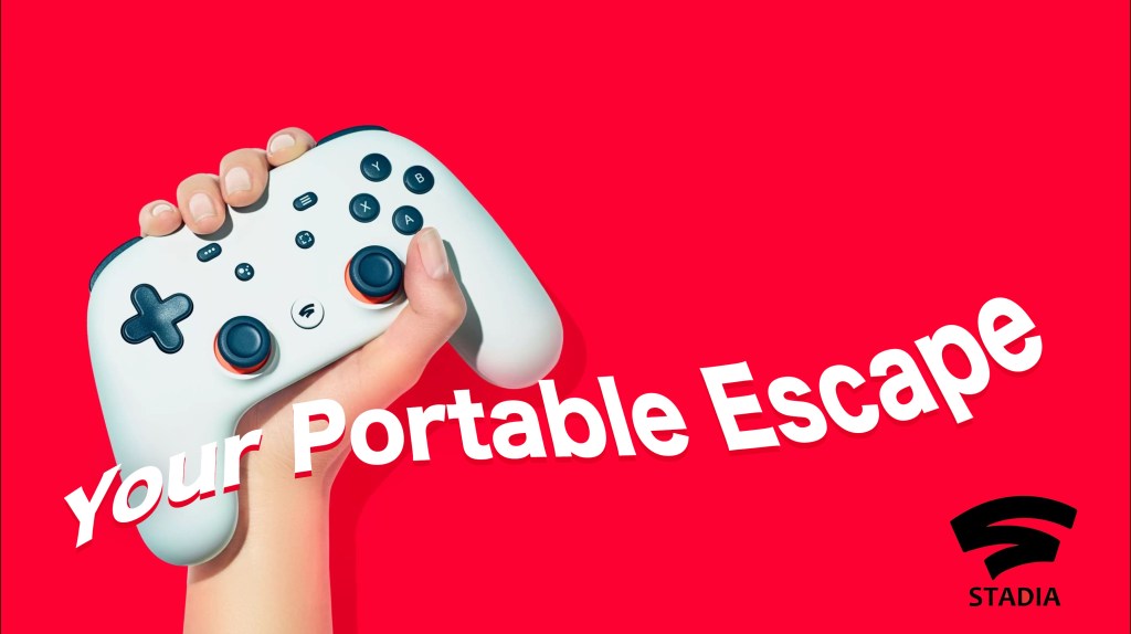
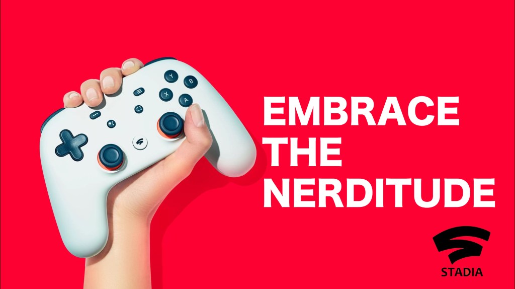
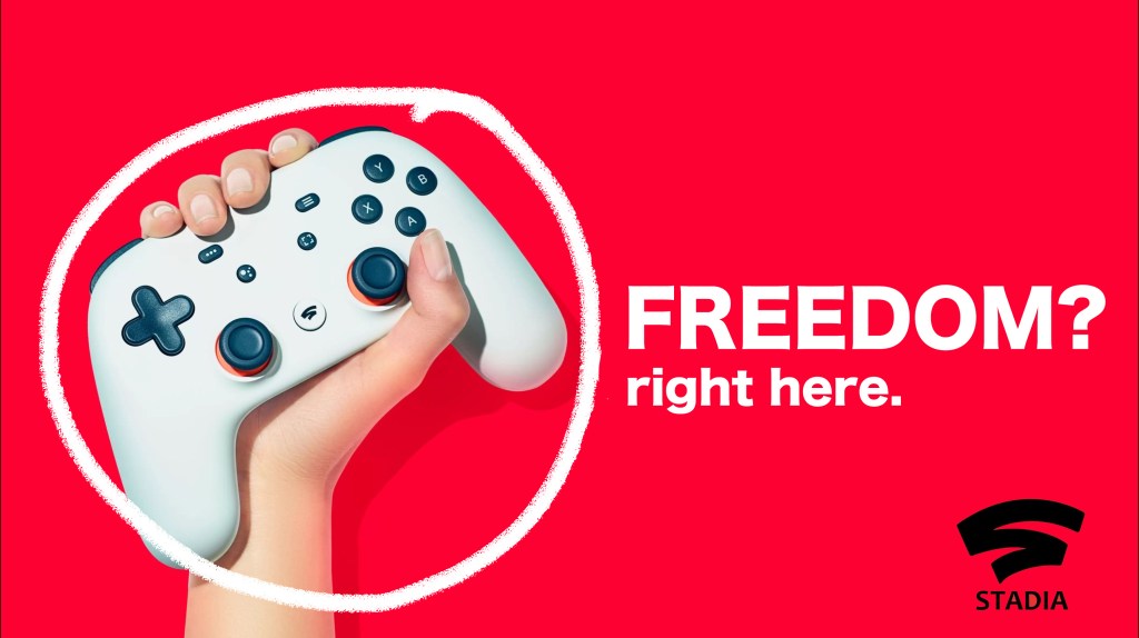
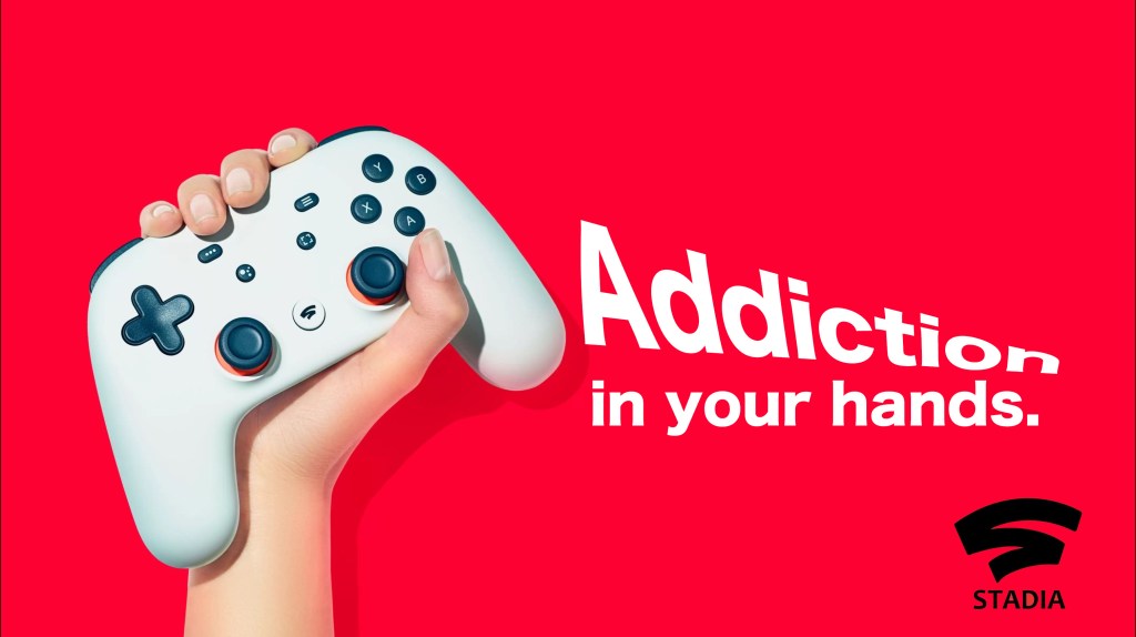
When starting copywriting for campaigns, you need to consider your audience. Think how they think, study what language they connect with and how you can use this to your advantage.
When thinking about the layout of the campaign, there are three points to consider: – The Headline – The Body Copy – The Call to Action
The headline needs to GRAB your attention, entice the viewer in to reading the body copy (which contains the main information/ explanation of the campaign/ product) and then onto the Call to Action which will link the audience to the activity you want them to do.
In this lesson we looked at Google Stadia, which is a up and coming cloud gaming service developed by Google which allows users to game on the go via their mobile phones, and not have to rely on bulky consoles. As a challenge, we were told to use our copywriting skills to think of 2 ideas of headlines for an advertisement, and create 3 examples for each idea and display them on a given draft asset.
Thinking about the demographic given ( ages 20 to 50 ) I thought of two ideas came to mind for the project. The first idea was ‘Freedom/ Escape’, people generally are either studying or working between these ages, so a craving of escaping reality/ returning to a childish freedom can be un underlying fantasy. So in order to present this, I created three visuals with headlines under this idea. The second idea was ‘Addictive/ Playful’. Gaming can be seen as a distraction of reality, a tempting addiction, so playing with this idea I created a further 3 visuals to underline this idea.
1st Idea
2nd Idea
To recap, a headline needs to be ‘Eye catching’ and ‘Attention grabbing’ and consequently needs to bring the main message across and initiates an idea that the body copy will go deeper on.
“On the average, five times as many people read the headline as read the body copy. When you have written your headline, you have spent eighty cents out of your dollar”
‘Promote the book with 3 billboardsdisplayed in HUBS(opt) Art direction of the room’
This brief was to promote, ‘The Art of War’ by Sun Tzu, by creating 3 billboards based on the book and to present to work in VR (using Mozilla Hubs and Spoke).
After having read ‘The Art of War’ by Sun Tzu, I found the book very inspiring and direct. The book is a very literal treatise on war, it gives the reader ancient techniques and advice on how to confront battles/challenges in life effectively. These tactical pieces of advice have been used in business and workplaces all over the world.
The most impacting quotes I found from the book were:
‘If you know your enemy and know yourself, you need not fear the result of a hundred battles’ ’The supreme art of war is to subdue the enemy without fighting’ ’Appear weak when you are strong. Appear strong when you are weak’
Thought Process
Considering the theme and the chosen quotes, I decided to create the three story boards in the style of a story. The billboards have a narrative which begins from the right-hand side to the left. The inspiration behind having the boards viewed from right to left was after reading that traditionally Chinese text was read from top to bottom, right-to-left. Therefore, I thought it best to have the viewer embrace a similar approach in the exhibition.
Creating the Billboards
As the viewer enters the VR world, they are confronted by the three billboards surrounding them.
1 Before fighting 2 During fighting 3 After fighting
The billboard on the right ’The supreme art of war is to subdue the enemy without fighting’shows a woman meditating at the centre of the text and surrounded by red petals which represent peace and harmony. This visual represents tranquillity before fighting.
The second middle visual ‘Appear weak when you are strong. Appear strong when you are weak’shows two warriors preparing for battle on either side of the text with darker leaves surrounding them (symbolising tension before the battle).
The third visual on the left with‘If you know your enemy and know yourself, you need not fear the result of a hundred battles’ highlights the words ‘enemy’ and ‘yourself’ underlines how to win a battle with knowledge.
The reason behind creating this sequence of billboards was after reading the narrative style Sun Tzu used in the book. This concept for me couldn’t be dismissed, and therefore the visuals had to have a flowing concept. The colours, font and backgrounds are matching to further display the importance of each element of battle – before, during and after fighting.
Furthermore, the text had to remain the main focus of the visuals so the background needed to be relatively simple and not too chaotic. The overall aesthetics of the pieces looked well connected and showed narrative sequence as intended.
When looking at other VR world styles online, I realised I wanted to create a Chinese theme to the whole exhibition and make It out-doors rather than in a building. After researching further into the Chinese theme, colour scheme, style, objects etc… I experimented with my ideas on website Spoke (by Mozilla Hubs).
By exploring first hand on Spoke, I was able to create and develop my idea in 3D which was very exciting! I imported 3D objects such as mountains and trees, created stairs to lead up to the banners, positioned the billboards to surround the audience, changed the lighting over the exhibition and much more!
In the end, I didn’t want to over complicate the composition, so I left the scenery simplified in order to bring the main focus on the billboards.
After creating the scene on Spoke and importing the file into Mozilla Hubs, I show-cased my work to the students and lecturers on my Design Marketing Course. The feedback I received was very positive, and they had an enjoyable experience being immersed in the Chinese VR environment.
Reflection Overall this project has been very eye-opening and enjoyable. Before this brief, I had never created anything with VR, so having this useful tool will be very beneficial in the future.