Speculative design is a design method targeting important problems in society and aiming towards the future. In this class we were addressing problems, thinking of possible solutions whilst always thinking speculatively.
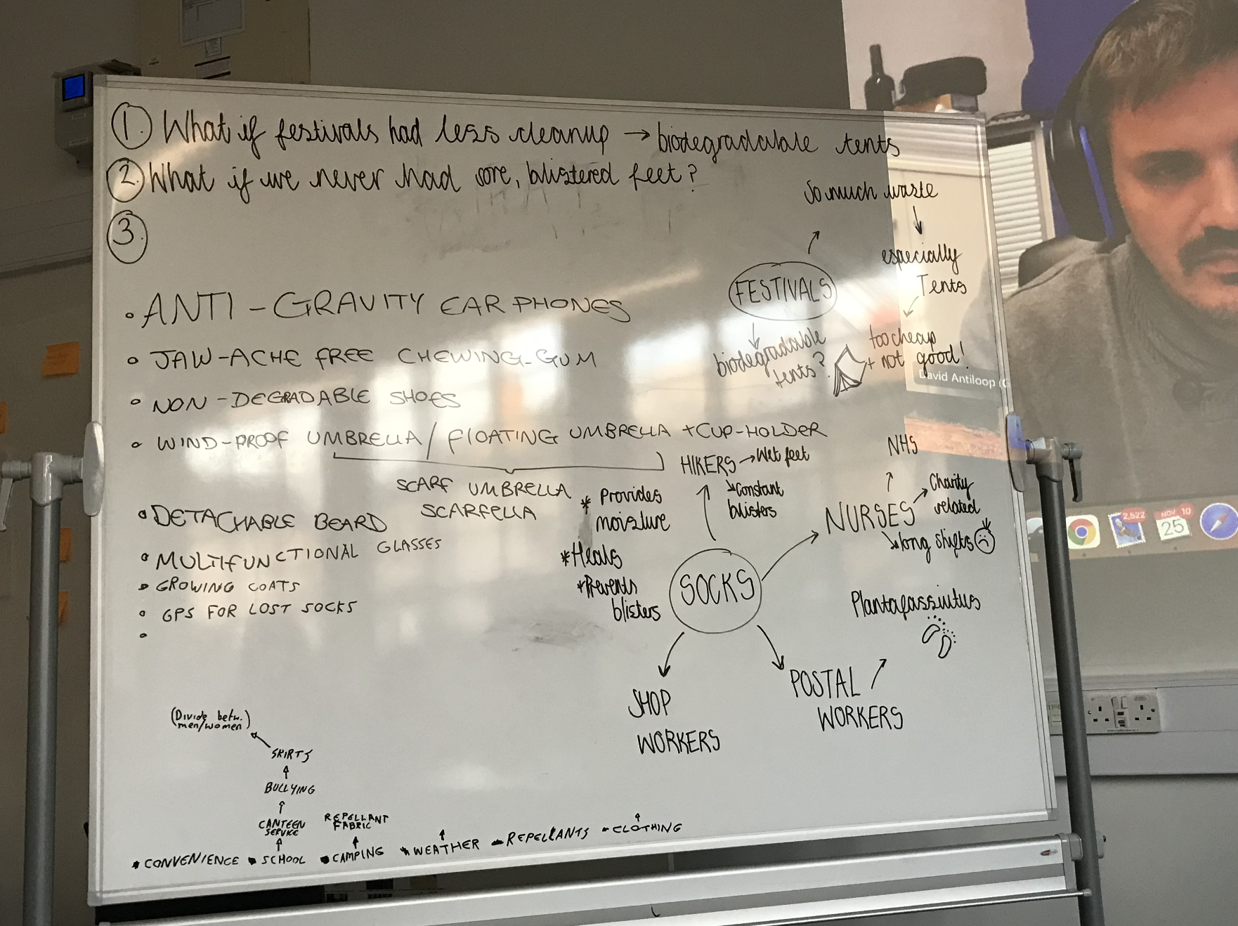
In a smaller group, we thought about issues that we come across in our daily lives and brainstormed possible solutions. While doing this we gathered speculative questions connected to each of the concepts. Below on the left you will see the white-board we wrote our ideas on. This task helped us to think outside the box and influenced productive, solution based thinking.
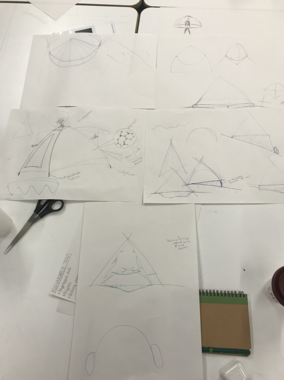
We were told to choose one of the ideas and think of how to make it into a functioning object or service. Above to the right you will see the workings-out of our biodegradable tent idea, based around the speculative question ‘What is festivals had less of a cleanup?’.
3D modelling is a key tool to use when going into the creative industries. Knowing how to use computer graphics softwares such as Blender give you skills that can change thoughts into a reality.
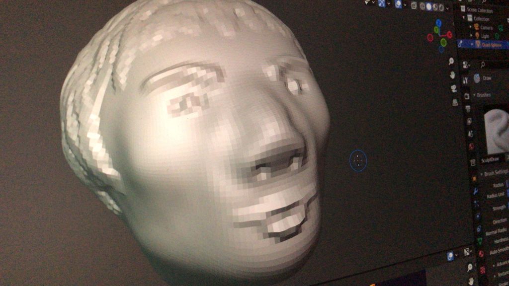
Before getting stuck into using Blender, the class was told to take a LinkedIn Learning class ‘Create Your First Sculpture‘ Blender 2.91 Essential Training by David Andrade. I found this class very interesting to follow and was able to learn the basic software tools in order to create my first 3D face (as seen below). We were also asked to create objects using clay or Playdough so we could get a better ‘feel’ of how to form 3D objects. I decided to create a lion and tortoise out of Playdough (as seen below).
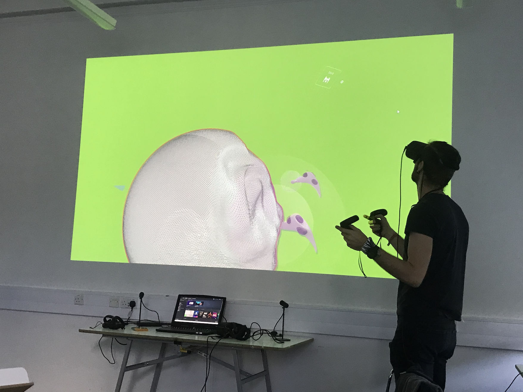
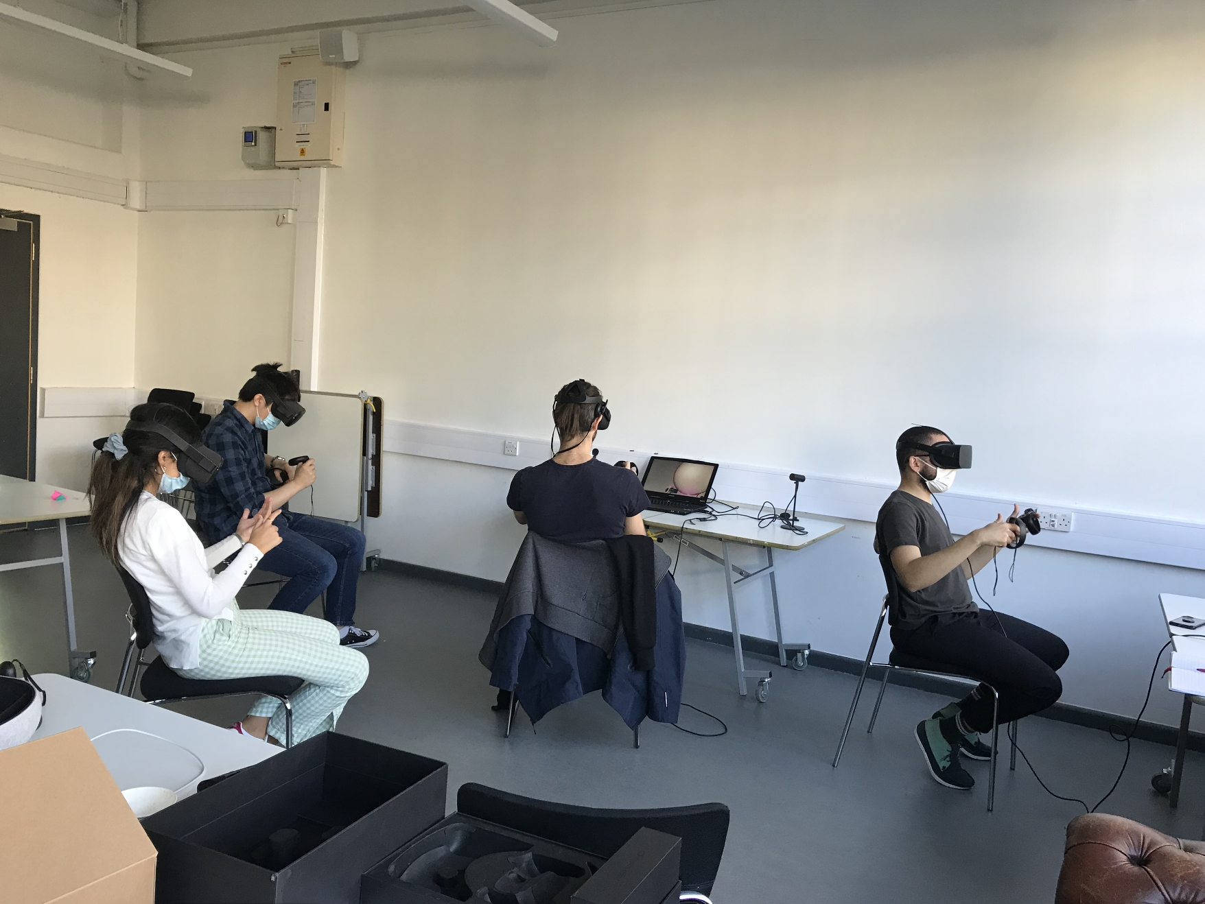
Creating the objects by hand inspired me to try and recreate them on Blender. Below you can see our 3D sculpting lesson where we were taught by the Argil founder, how to create 3D objects using VR headsets and remote sculpting tools.
This fascinating and eye-opening class inspired further exploration of VR technologies in another Culturepreneurship module where we created a virtual reality start-up company.
Further Research
Following on from this class, I conducted further research to explore the endless possibilities of working in VR. Below you will find the links I watched and learnt from.
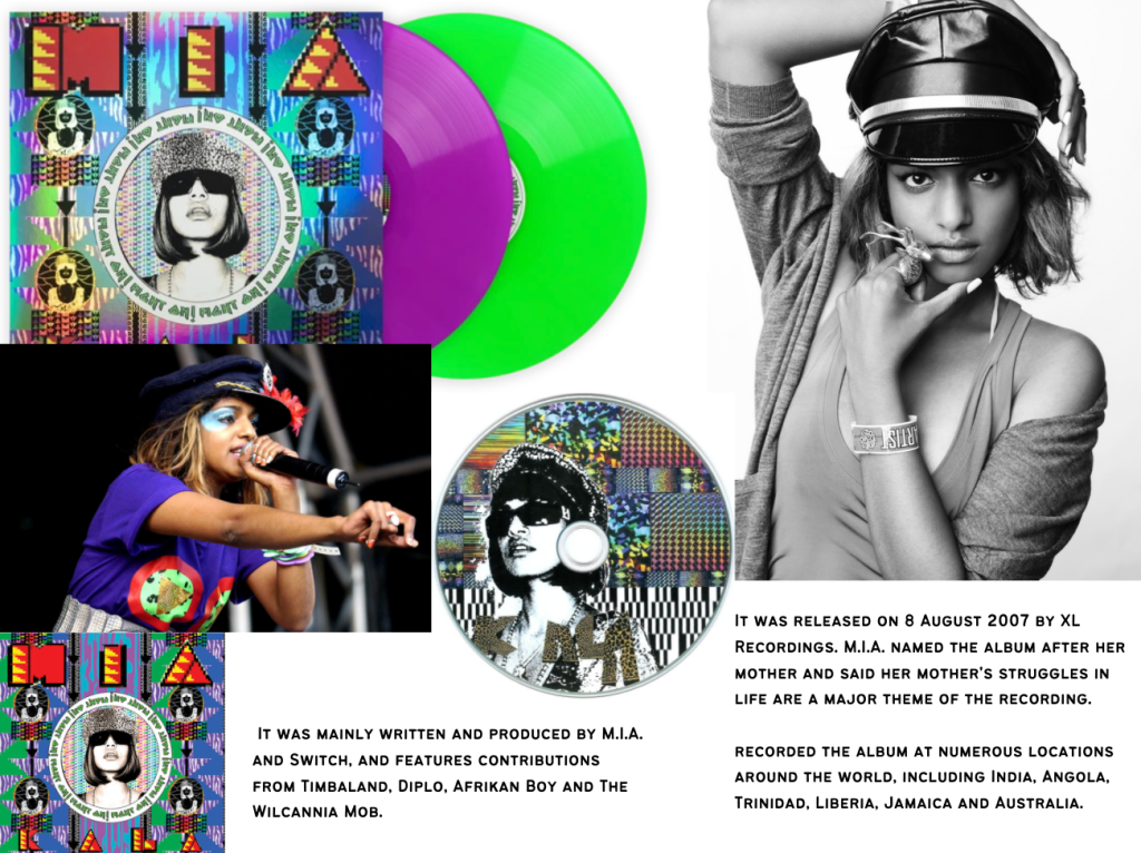
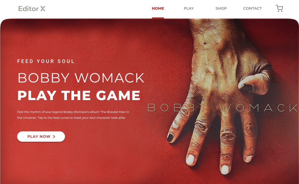
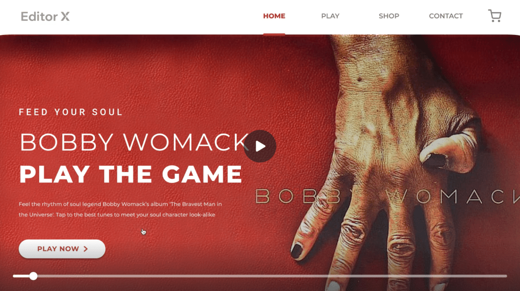
The aim of the brief was to create a website for a classic XL Recordings album (Editor X). The website needed to be ‘the next big thing’ and to attract music lovers and new potential customers to listen to music from the past. We had to find a way of joining these two audiences by creating a must see/ experience website with a unique UI and UX.
Considering Editor X’s passion in collaboration, the brief also needed to focus on the unity of music and how it can join us together. The website needed to be simple to use and to celebrate the anniversary of an XL artist’s album. The brief had a list of artists to chose from with their albums: Peaches, Teaches of Peaches; MIA, Kala; The Prodigy, The fat of the land; Bobby Womack, The Bravest Man in the Universe.
After listening to each album, I noticed how I could connect to two artists the most with their tone and message, these two were Bobby Womack and MIA.
MIA’s album Kala is energetic and colourful while also sending powerful messages of heartache and challenges throughout the lyrics.
I’m broke, I’ve got indefinite stay,
You can’t touch me like leprosy,
I hustle tough from here to Sri Lanka,
My mum told me to be an accountant,
But I wanna work in a corner shop,
Hussel, MIA (Kala)
The album bleeds with meaning, yet it still keeps the beat catchy for the listener to dance to and enjoy the musical melodies throughout. While brainstorming, I could see potential in the colour and patterns of the album and the momentum of the tunes. Ideas came like using spinning CD’s and moving images on the home page with dancers spinning in time with the beat. The energy and commotion MIA’s album has would make the website UI vibrant and inspiring to connect with, and consequently the UX would need to be just as entertaining.
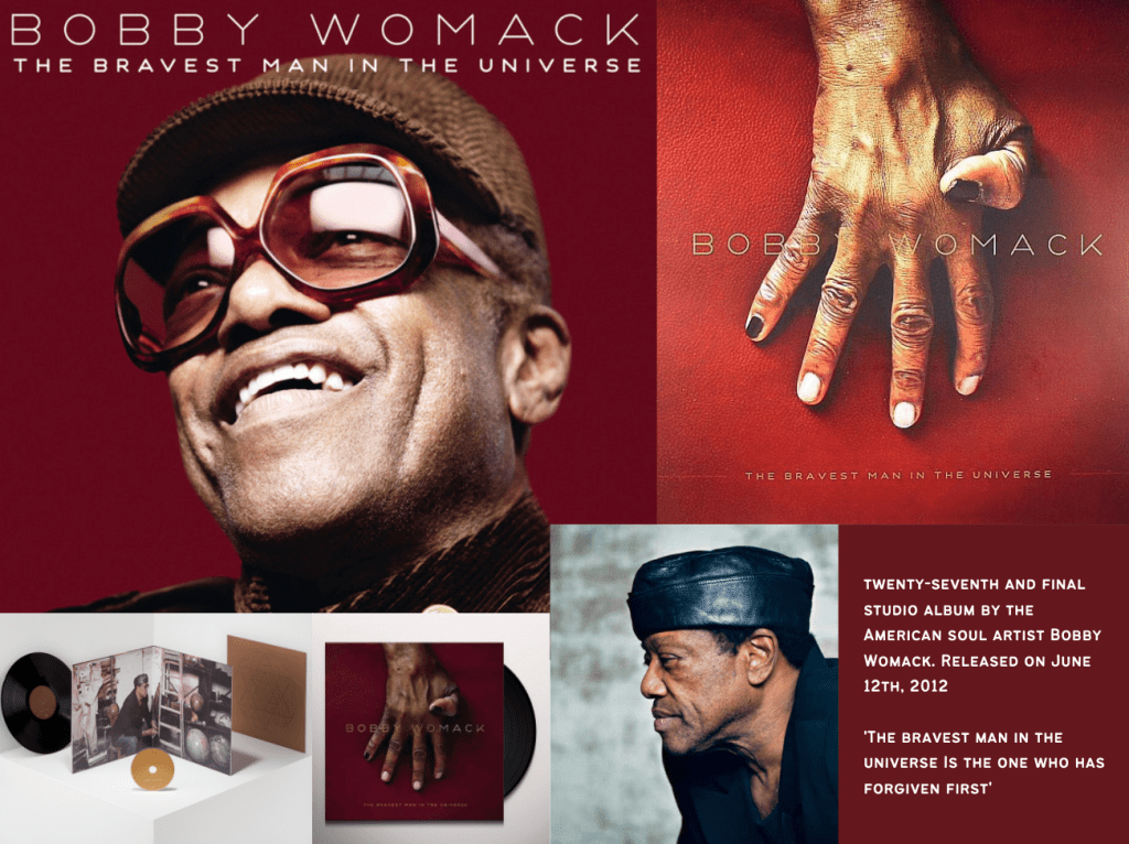
Bobby Womack’s album ‘The Bravest Man in the Universe’ is a reflection of the soul legend’s heart-ache and fears moving towards the end of his life. By this point he had many difficulties with his health, and this album was released just two years before he passed away. The grit and melody in his voice is warming to the listener’s ears and expresses hardship and determination which inspires and intrigues fans to listen on.
This album also contains collaborations with Lana Del Rey, Gil Scott-Heron, Warp studio wiz Kwes, and more. These other voices give another level to this album and knowing their input inspired me to think of how to represent their work visually on the website. Lana Del Rey is well known across Gen Z and Millenial audiences, so having her voice in the mix will definitely spark more attention for younger listeners.
Bobby Womack’s ‘The Bravest Man in the Universe’
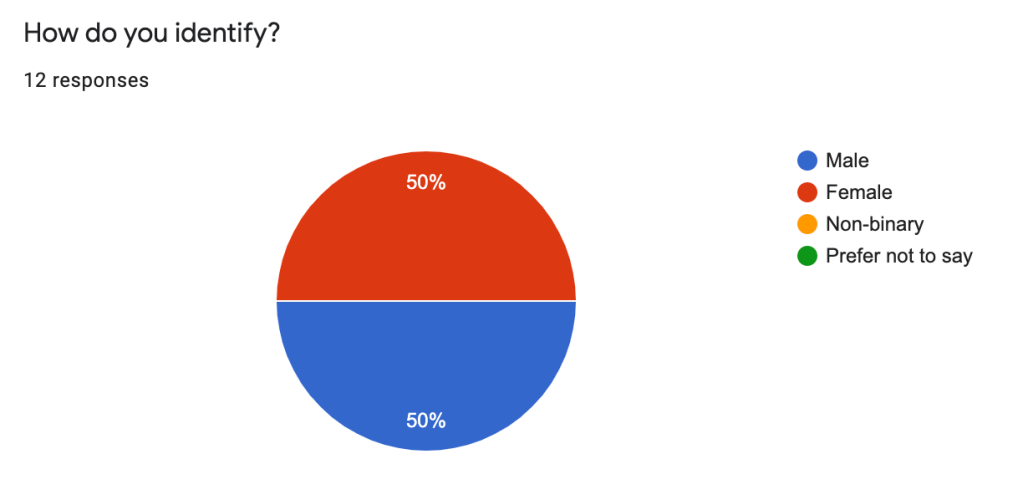
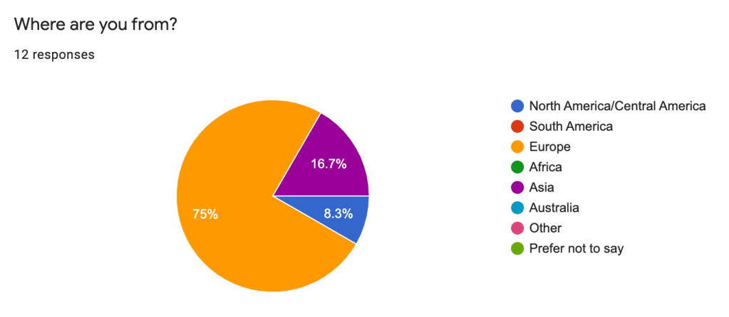
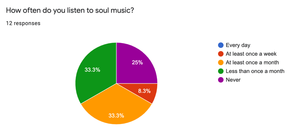
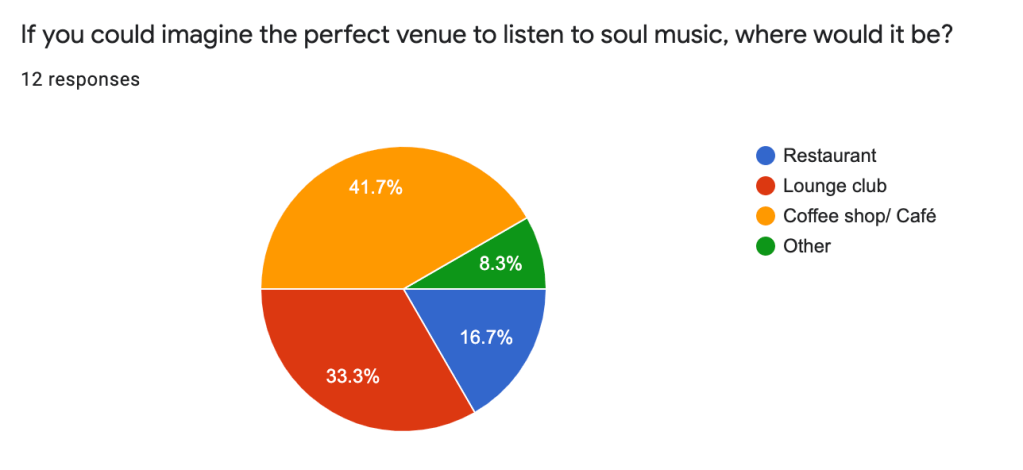
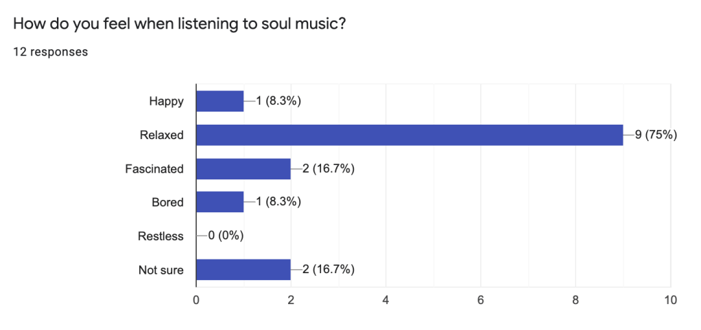
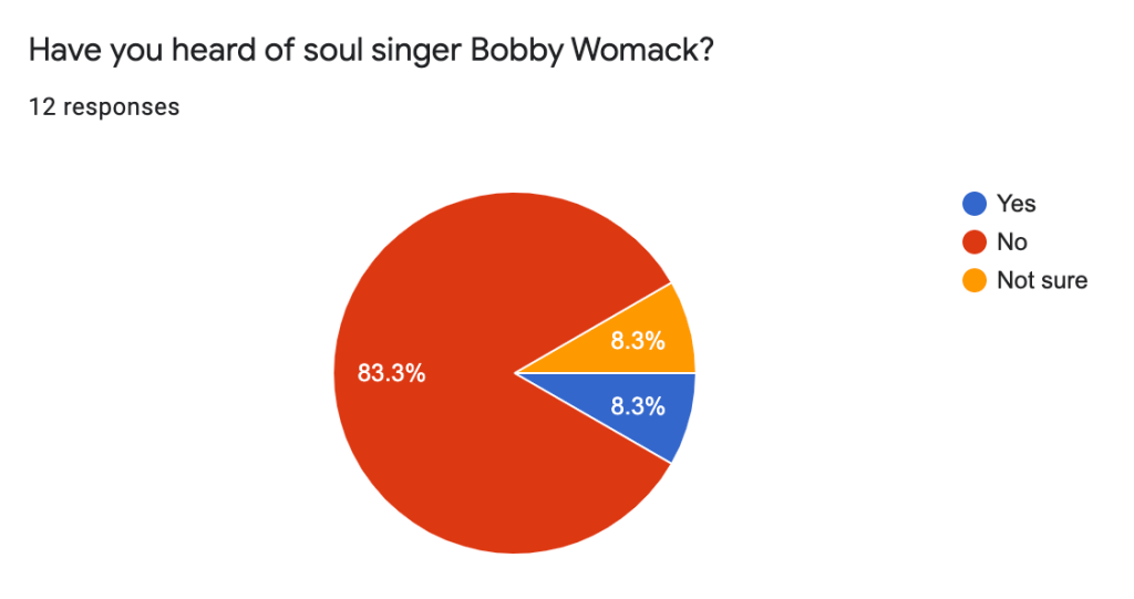
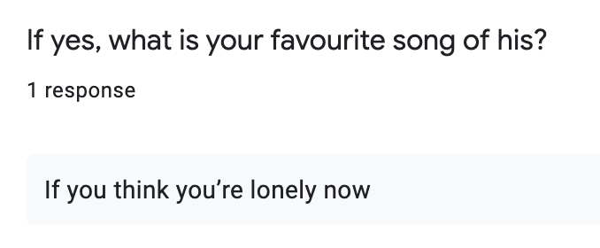
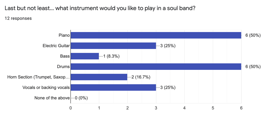
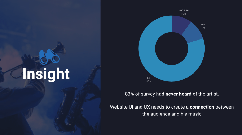
In order to know more about the audience’s opinion about soul music and Womack’s album, I created a survey on Google Forms which asked specific questions relating to the brief.
Before creating the questions, I noted what I wanted to achieve from the survey so my answers would connect to my insight. This technique has helped me create better structured research through surveys in my projects. Below you will find the survey questions and answers. https://forms.gle/Ran7CHjSBxjymmky5
Analysing these responses inspired further research into idea development. I used the a simple method of jotting my thoughts down onto paper so I could better visualise my ideas.
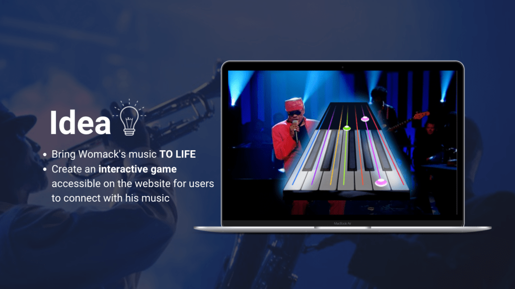
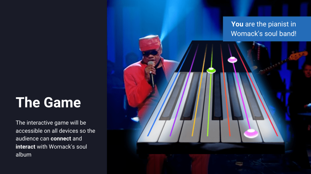
The strongest idea was to have a website homepage which had an interactive musical instrument to greet the viewer with the option to play a Guitar-hero style game. The music and theme would all be linked to Womack’s album, this way the viewer could interact and connect with his music by being involved with the entertainment. This game would be accessible across all devices and could eventually be used across other webpages D&AD want to create for the Editor X artists.
Musical Games and Incentive Research
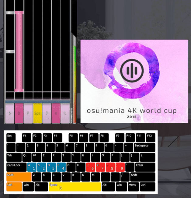
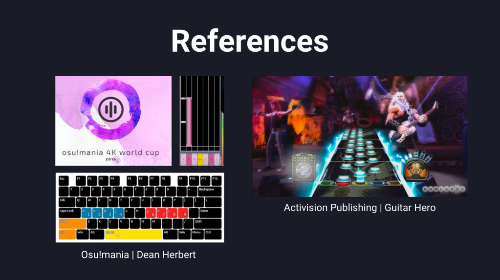
To better understand the achievability of this idea, I researched for other games that are similar to Guitar-hero but which are accessible on PC’s and mobiles. One video which particularly inspired me (below) showed an array of different options across PC and VR programs. One in-particular stood out called ‘Osu!mania‘, created and developed by Dean Herbert in 2007, which is free to the public and has explored various avenues of interactive online gaming.
Osu have a piano game that users can play intime with the music, like Guitar-hero but a simplified version and free all. I wanted to use this game for the website, but with updated graphics and theme.
Each chord or sound played on the keyboard would be inputted by using the computer keyboard (from 1 to 9 and the space bar). In order to make this simpler for the audience, I decided to keep the keys to 6. On other tough screen devices, the audience would simply touch the keys in time with the music once highlighted. The song would be 1 minute long and the users can choose the level to play with (easy, medium, difficult).
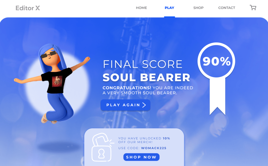
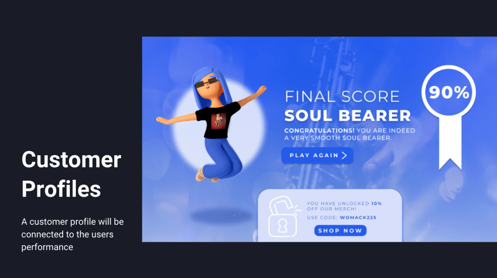
In order to create a reward aspect of the game, the audience would first input their name, complete the game and then be given a customer profile for their effort depending on their score. There would be four customer types:
90% – 100% – Soul Bearer Player who can play in time and completes a very high-score is a master of Soul.
70% – 89% – The Temptation Player who kept in time with the beat but missed some notes. Name inspired by soul band ‘The Temptations’.
50% – 69% – Staccato Stigmata Player who performed with each note sharply detached from the others and not in time with the song however did hit some notes correctly.
0% – 49% – Dissonant Genius Player who played didn’t play well, but has the potential to do better!
Having their name inserted in the profiles makes the user experience personal and therefore spark for organic interest. There would also be a 3D character to match the score wearing the merchandise for sale on the website. This would promote the items for sale as well as creating a sharable figure to connect to for users.
Visual Research
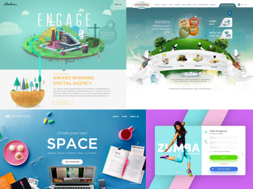
Websites that inspired 3D UI creation
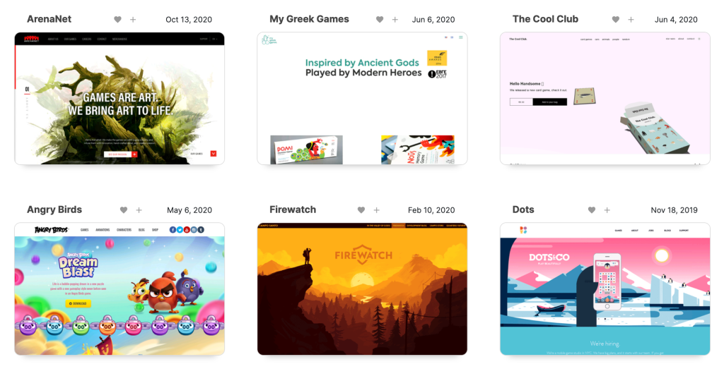
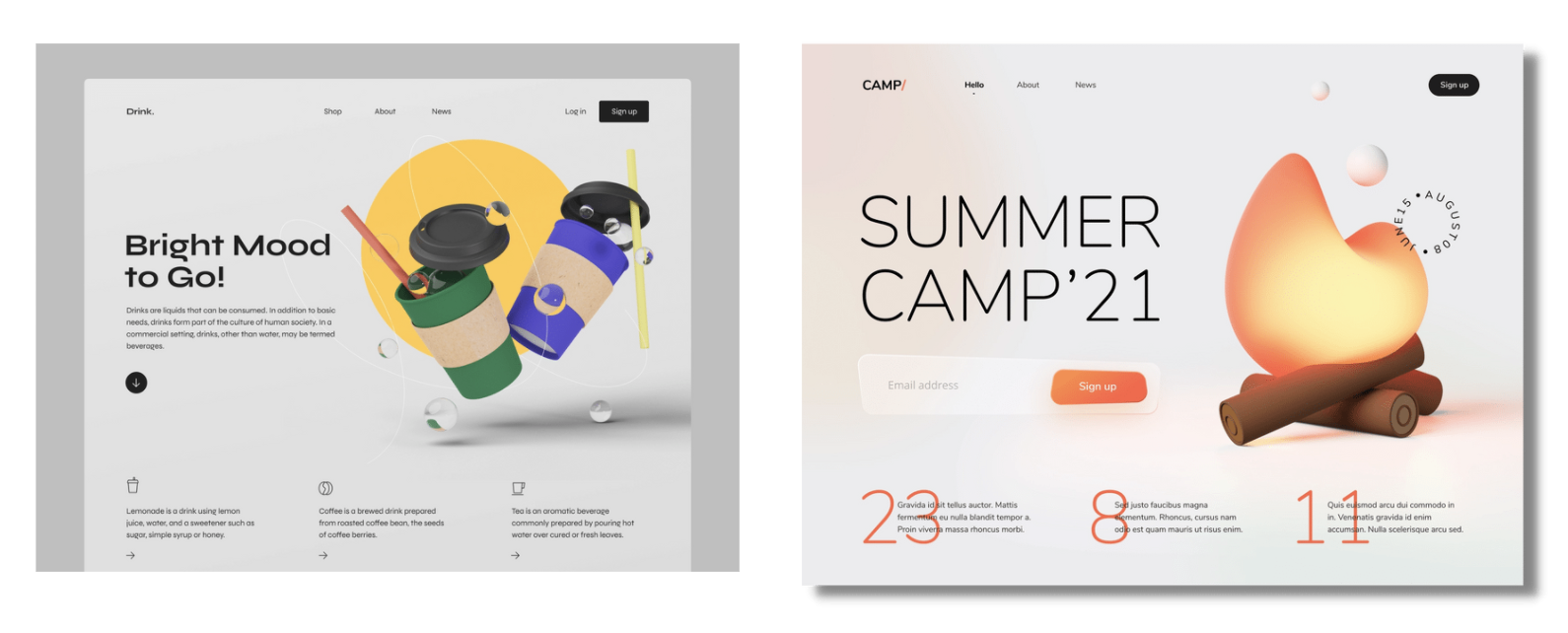
The latest eye-catching website designs today maintain a consistent art direction with familiar buttons and navigation tools. All of the examples above show this technique while also mixing in their brands own personal message or product. While researching for website types and styles, I was always interested in those which has a 3D element to the design. I decided to use this in this brief response.
Website Prototype Creation
Before creating the website, I had to consider the user flow and objectives of the website. The main points to cover were the gaming section and the incentive to buy the merchandise (via the shop).
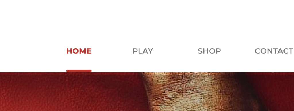
Having a section at the top of the screen with the ‘Home, Play, Shop, Contact and basket’ buttons means the customer can click to their desired page at any point in the user journey. A line under the selected page and bold lettering shows the user which page is active.
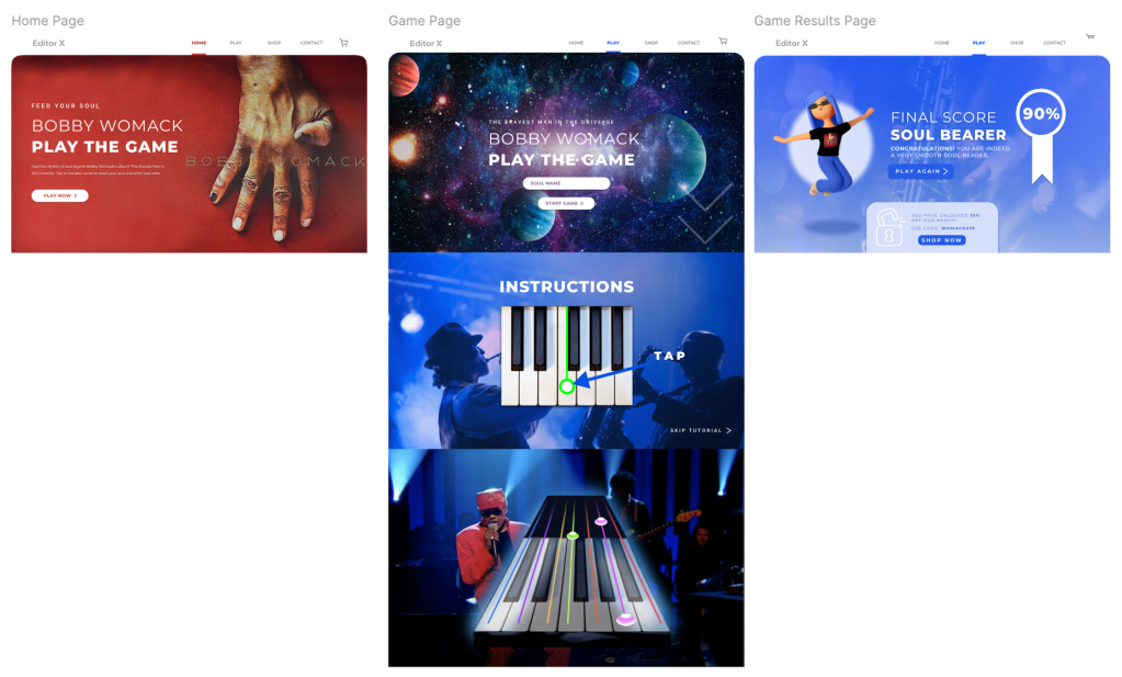
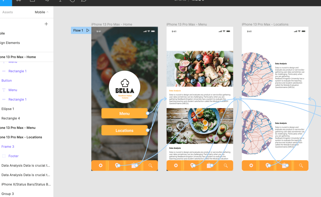
The Home page is clean and comprehensible, advertising the album while pointing the audience in the direction of the game. The button underneath the main body of text is bold and visible guiding the customer journey.
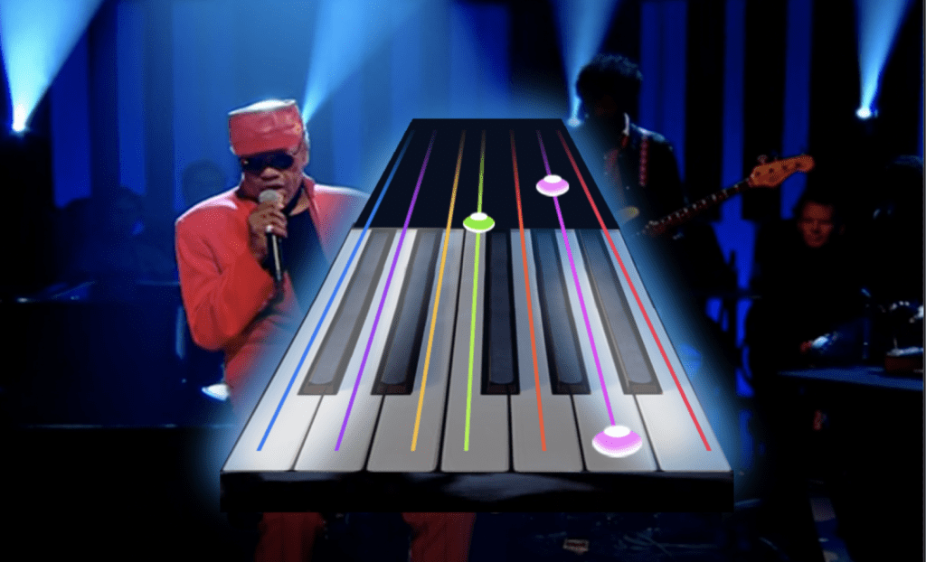
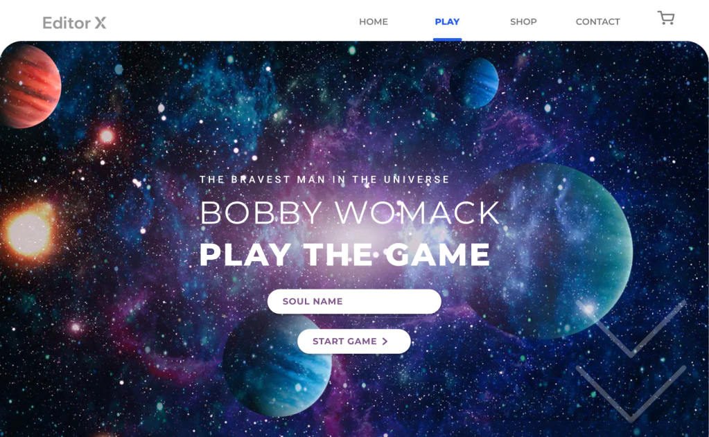
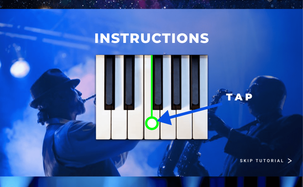
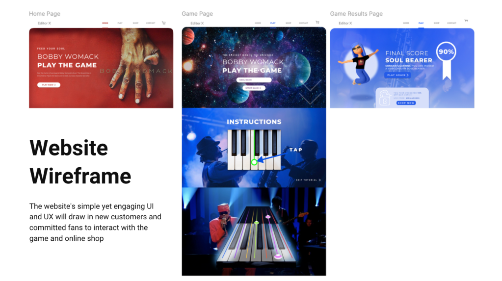
The second page is the ‘Play‘ page which greets the viewer with a bold title and a background of the universe, inspired by the album name. They would insert their soul name and press the ‘start game’ button to begin. Once pressed, the navigation moves the viewer down the page to the instructions section where they would be shown how the game works, which buttons to press on their keyboard or mobile etc. There is an option to ‘skip tutorial‘ on the bottom right to speed up the process.
Once completed or skipped, the customer will go straight into playing the game. There will be a video of Bobby Womack playing ‘The Bravest Man in the Universe’ song, and the player needs to tap the keys when the notes button comes towards them. This game was inspired by Guitar Hero, however is a much simpler version and is only accessible via the website. The song will last just one minute and gets progressively more difficult throughout the song.
Once the game has finished, the player will be given their score out of 100% with a name based on their success (as previously mentioned earlier on in blog). The customer has the option to play the game again by pressing the blue button, or they can use their 10% off voucher code to buy the website merchandise by pressing the ‘shop now’ button. This page is a reward page which congratulates the player (building customer satisfaction) and guides them to the next step. The character on the left advertises the brand merchandise while giving a face to reward page. Below you will find all of the pages mentioned.
Website Wireframe
After creating the website wireframe, I created a deck for the submission where the insight, idea and execution is discussed and analysed. I remembered at this stage to keep the visuals big and let them dot he talking rather than the text annotation.
Reflection
The D&AD (Editor X) brief was created and developed independently and was completed in two weeks. The aim was to create a website that would be ‘the next big thing’ and attract committed fans and new potential listeners while finding a connection that brings them together. I used Figma and Photoshop to complete this website.
I thoroughly enjoyed working on this brief as I put my creative skills and thinking to the test. After learning the basics of Figma in a previous task, I was able to experiment and work more flexibly with the tools and areas of the program to fulfill the brief. By creating a survey earlier on in the process, I was able to analyse the target audience’s habits and opinions from the very beginning which gave the rest of the project a strong foundation to build from. I learnt valuable skills to think from the customers perspective in order to frame the outcome around their wants and needs.
Creating this website prototype has inspired further research on UX and UI website designs and I will definitely be using the skills gained in this task in future projects. If I could do this project again, I would create a moving image of the game to bring the wireframe to life so the client can visualise the concept better.
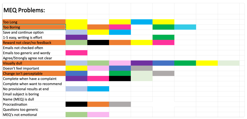
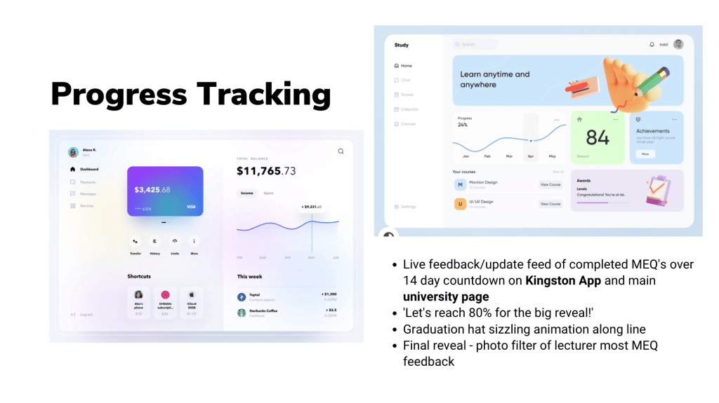
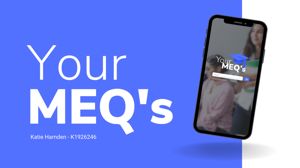
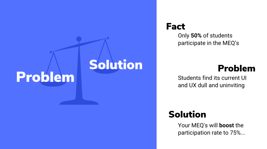
The task was to increase the student participation of the MEQ’s (Module Evaluation Questionnaires) from 50% to 75%. A high percentage of students do not engage in giving feedback, so the aim was to improve this by changing the UI and UX of the MEQ’s.
Learning Outcomes
Problem frame, idea and prototype
Reflect on your problem analysis. Your conclusions. Why are you doing what you are doing
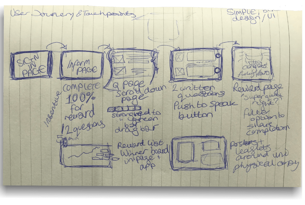
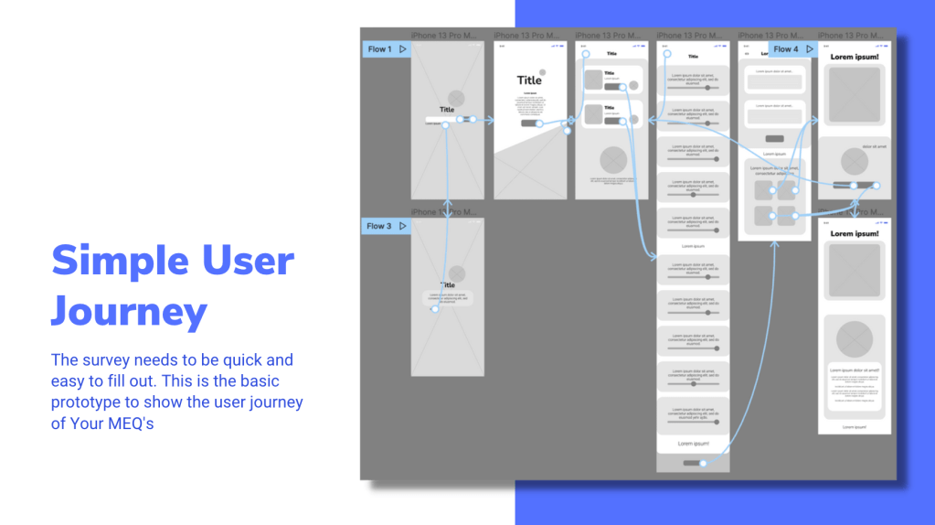
User journey, touchpoints
Design and prototype solution (MEQs) as an installation or UX/UI
Make a case study video (1 min)
I worked independently on this project to challenge my self-organisation skills. The deadline for the project was on Monday 8th November 5PM.
Response to Brief
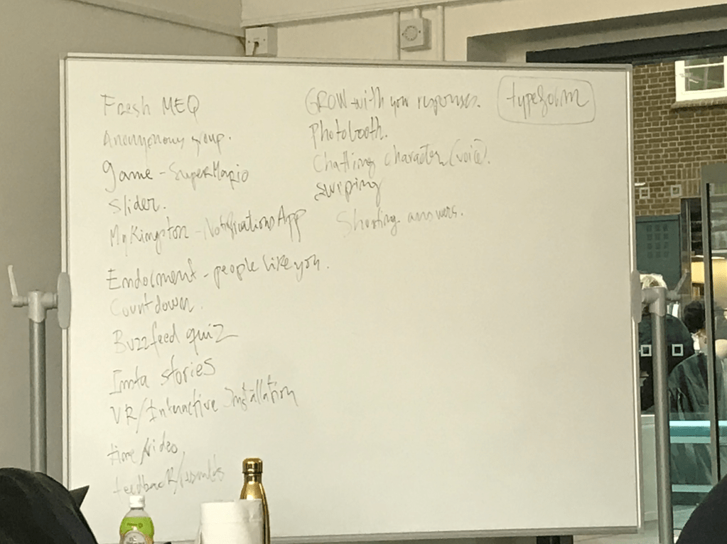
To begin the assignment we collectively brainstormed as a class different ways of approaching the brief and the initial ideas we had.
From this information we were able to analyse the positive and negative feedback given about the MEQ’s and start to apply it to our own ideas. This session was crucial for the development our projects and prompted further research into website UIs and UXs.
Above you can see the ideas I had during the session as well as a collective flow-map created with a smaller group.
Research and Framing the Problem
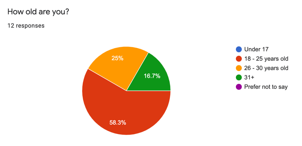
Target audience – students of Kingston University, mostly Gen Z’s and Millenials
What they want – reflecting back on my past research in my ‘The future of Gen Z‘ post, we can see that the majority of our target audience are wanting: A simple customer journey, clean and visually appealing interface, familiar buttons and navigation tools, a quick process and to be involved in the experience whilst being entertained.
When I complete surveys, I hardly ever enjoy the experience and it is usually something to finish quickly rather than something I want to spend a long period of time on.
When we had our class brainstorming session, I remembered how most of the class didn’t raise their hands when asking who had completed their MEQ’s. So the majority of the opinions from the class were negative, which meant our results were easier to target and analyse.
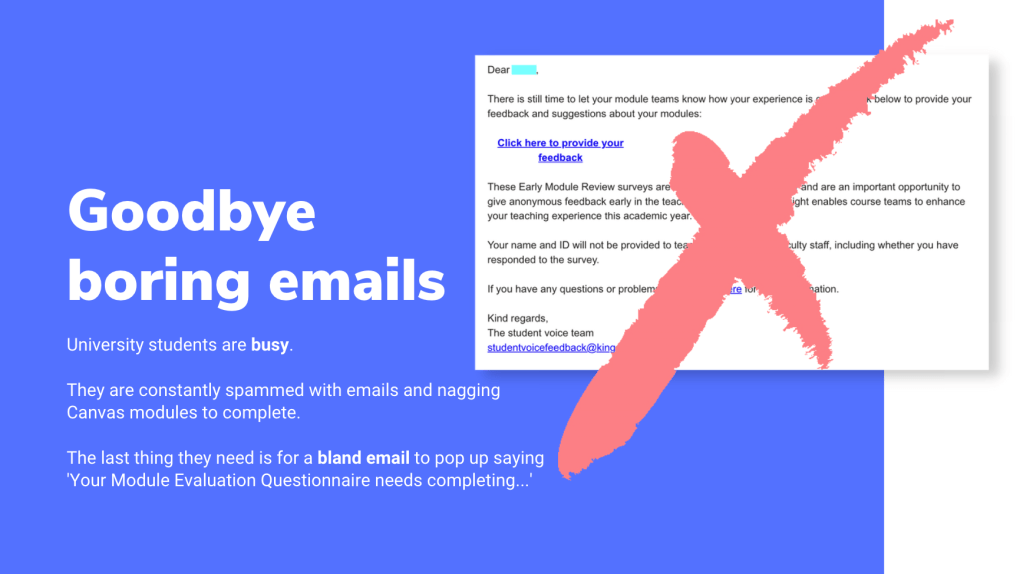
Students are typically bombarded my emails and information throughout the week, so the last thing they would want is another nagging email from their University asking them to complete a task. Knowing this inspired me to create a visually appealing interface that wouldn’t be irritating when seen by students and also for them to have some sort of incentive involved. Many of the students in the previous lesson mentioned that if an award was involved, they would more likely to partake in the survey.
Identifying UX and UI solutions
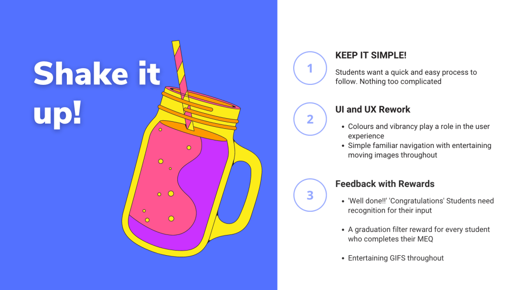
Simplicity
Students want an easy, quick process to follow. Nothing too complicated!
UI and UX
Colours and vibrancy play a role in the user experience
Simple familiar navigation with entertaining moving images throughout.
Feedback
Constant acknowledgement given to students throughout process, with written prompts and eventual feedback once results are collected and assessed
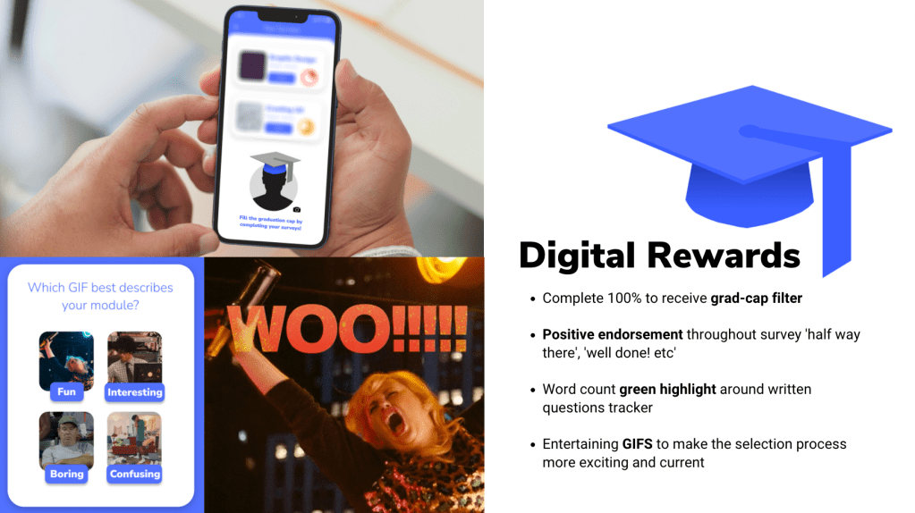
A reward for every student who completes their MEQ
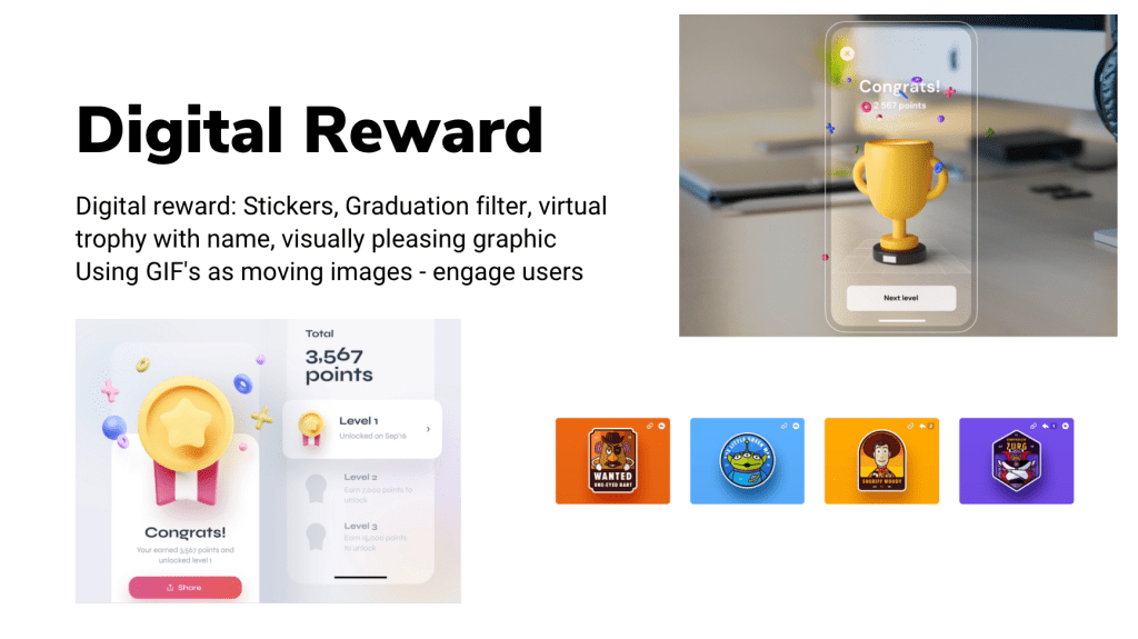
Exploring Rewards
Creating a visual board of different reward types helped me to compartmentalise my ideas and decide on the best choices to go ahead with for the survey.
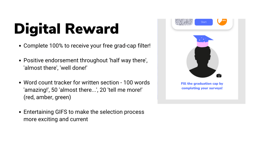
The strongest ideas lay in the digital rewards section, and that was fortunate as the brief didn’t give a budget to use for physical rewards. I decided to weigh up the effectivity of the following rewards: stickers, graduation cap filter, virtual trophy with customised name, and moving images (GIFS, videos etc).
In order to decide, I held some customer research across the university where I asked colleagues and friends what they would most likely find rewarding from completing a survey experience. 90% stated they typically find the surveys dull and not entertaining enough. Most mentioned how having an interesting moving image at the end would be enough. When I mentioned using stickers, most said they would make the experience more complicated and less precise. The filter grad-cap idea and the GIFs had the most positive feedback, so I decided to include them in the MEQ creation.
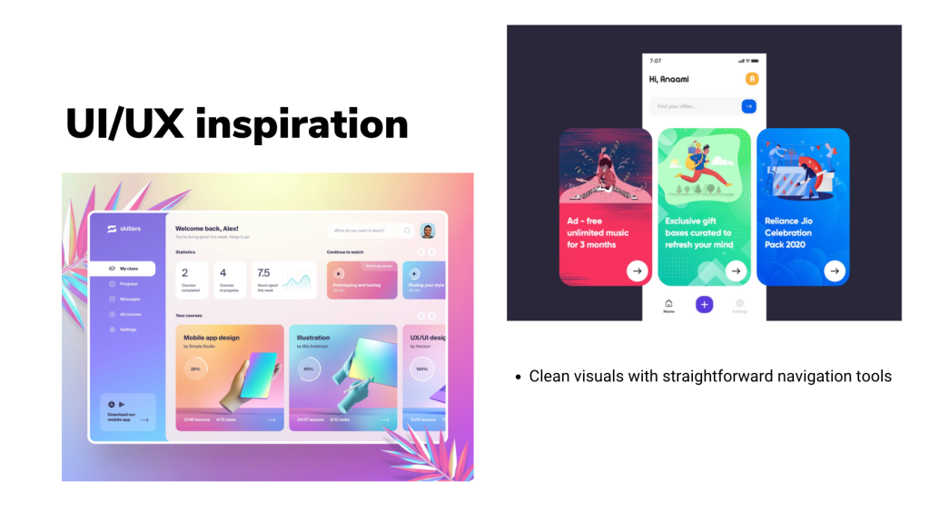
Website Design Research
Students are looking for clean visuals with straightforward navigation tools which can take them quickly through their customer journey. Exploring different website interfaces online (desktop and mobile) spring-boarded me into starting the creative process on Figma.
As a part of the project, we were advised to take a Figma Wireframing course on LinkedIn called ‘Figma Essential Training: The Basics’. I thoroughly enjoyed this course and learned a lot of new tools and techniques to develop website designs.
Learning about the many different navigation tools you can incorporate in a user experience made me realise how much we take for granted when browsing online or using an app. The familiar symbols and buttons we use today are very different to the ones we used even 10 years a go. Listening to my lecturer talk about the change of interfaces over the years taught me how complicated and cluttered the UI and UX used to be, and how most websites and graphics today follow a very similar layout and pattern.
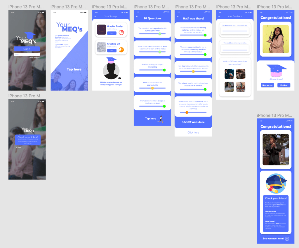
Your MEQ’s Creation on Figma
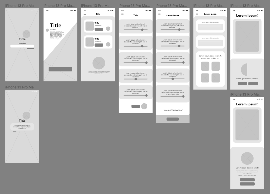
To begin wireframing, I used the wireframe I created on the Figma course as a base to work on and began to plan out how I wanted to structure the UX and UI. I sketched on a piece of paper how I wanted to approach the project with a loose wireframe with captions explaining the interconnectivity.
A basic wireframe from my initial ideas
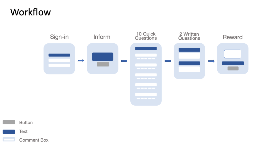
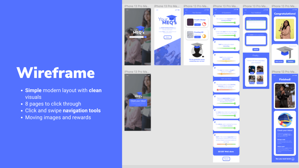
After this, I began to create the two wireframes of Your MEQ’s using this structure:
Home page
(Forgot Password Page)
Overview
Your Surveys
10 Questions
2 Feedback Questions
Reward Page
Final reward page
With 8 pages to click through, the users can complete all of their surveys in one sitting, or on separate occasions.
Overview and Considerations
Title creation – Your MEQ’s as a name is personal and expresses how the whole experience depends on the users form completion
Colour palette – Blue is a calming colour and is often used across educational UIs. This connection creates a familiar environment for the users and increases productivity throughout the survey. For the toggle bars to rate your experience having a red, orange and green colour code (in 5 shades) so users can identify whether they strongly disagree to strongly agree. A mutual grey colour is used when the user hasn’t completed the task.
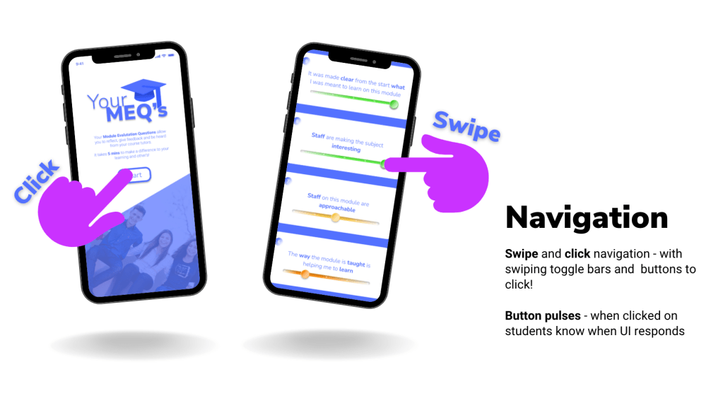
Simple design layout with familiar buttons and navigation tools.
Easy click navigation between pages.
An eye-catching and memorable logo.
Feedback
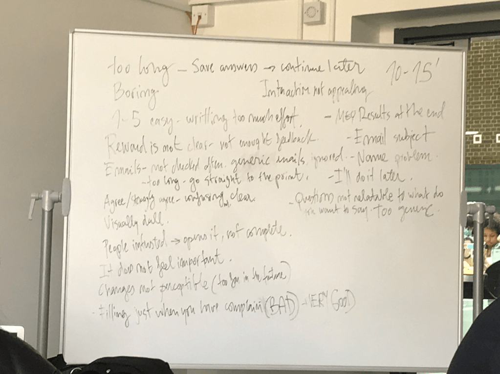
I had a constructive feedback session with my lecturer which helped me to further develop and make changes to the UI and UX of Your MEQ’s. This session was very useful and inspired tweaks and improvements of the user experience.
The points mentioned were:
To change the buttons from ‘click here’ to ‘start’ in order to express the action rather than a command
Try adding a scroll bar down the side of the page
Move the 10 questions on to one screen so it shortens the customer journey
Number the questions
Find a way of changing the slider toggle bar so they can understand the 5 levels to choose from
What would happen if a question wasn’t completed?
Make the user experience simpler
The 2 longer questions need some sort of submit button
Explain the process in the video submission – analyse, solve and explain
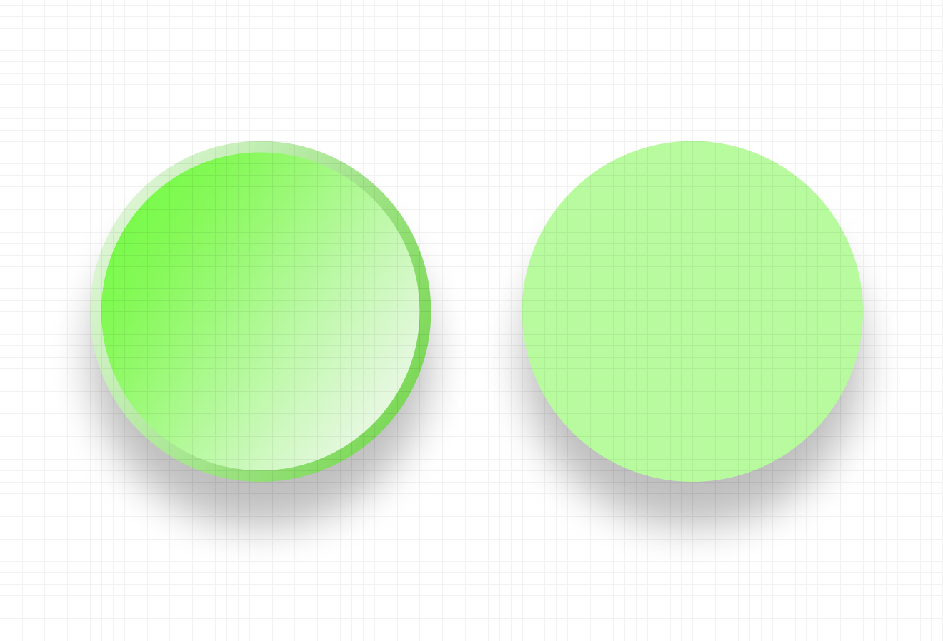
After having applied the changes, I decided to brush up on the visual assets throughout the prototype. Firstly I changed the colours on the toggle bars, and also the circular bar that you drag to answer the questions. I researched other buttons on Figma for inspiration and analysed the way they were made by checking their gradients, sizes, shape layers and translucency. Learning these techniques helped me to create realistic icons across the project. Below you will see the green toggle buttons I created from the reference to the right.
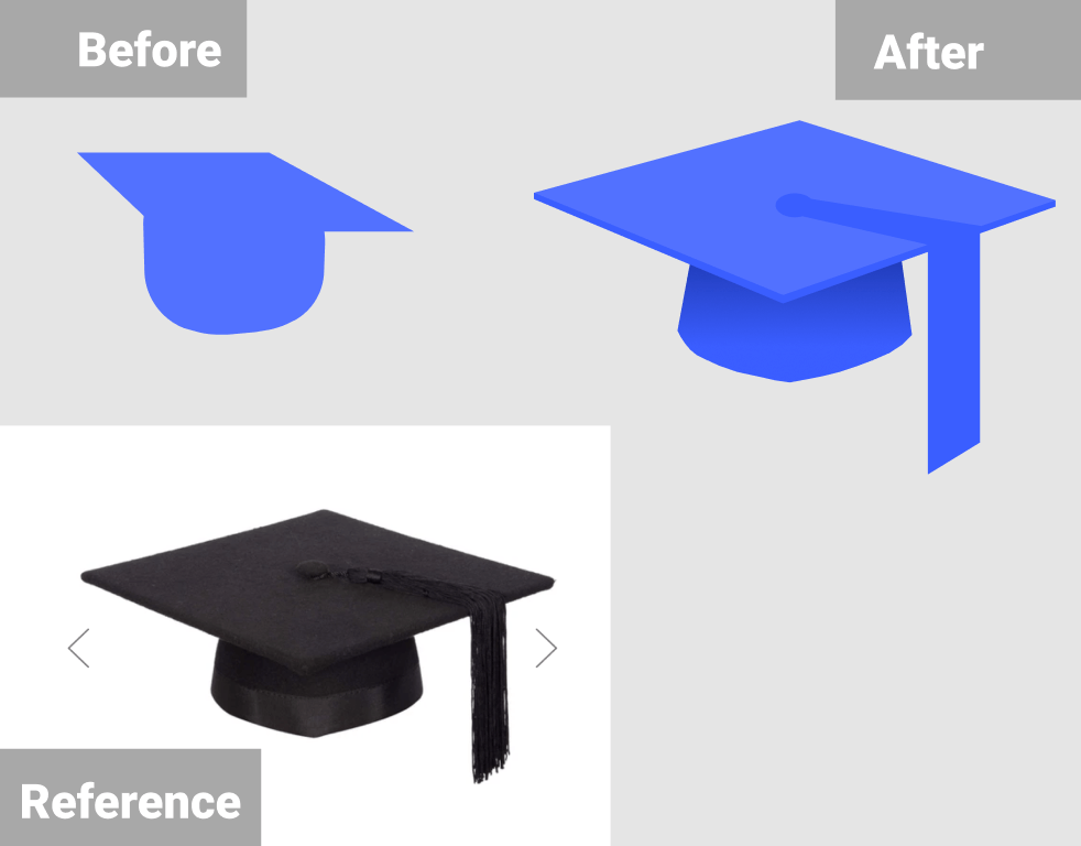
I asked for external advice about the logo and whether it was memorable enough. A friend advised me to look at the shape of a real graduation cap and try to recreate it as it wasn’t obvious enough. I took this advice and recreated the cap on Figma which ended up looking much better.
Case Study Video
The case-study video was created on Premiere Pro as I felt confident using the software due to using it in past projects. To begin with, I screen recorded myself using the Your MEQ’s mobile prototype on Figma and inputted it into Premiere Pro. While recording I made sure to highlight and hover over each button and navigationpoint so they would be explained in the voice-over. The video was initially meant to be one minute long, so I kept the recording under 50 seconds.
After this I began to write up the script for the voice-over. I kept in mind how I recorded the screen recording and elaborated on each section of the process. I ended up writing too much (494 words) and tried to record myself reading it but it ended up being over 2 minutes long. So I chopped the information down, and cut out the unnecessary parts to make it to 387 words instead. I recorded myself again and then inserted the audio files onto the Premiere Pro timeline and made sure the timings matched and flowed smoothly.
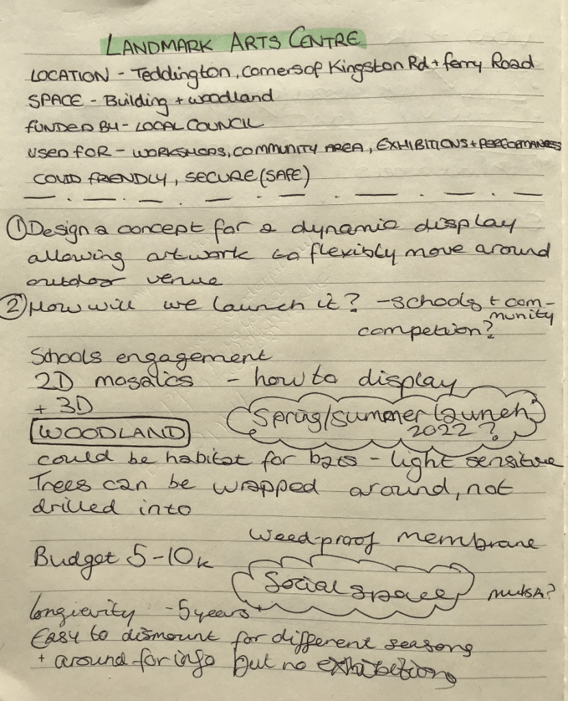
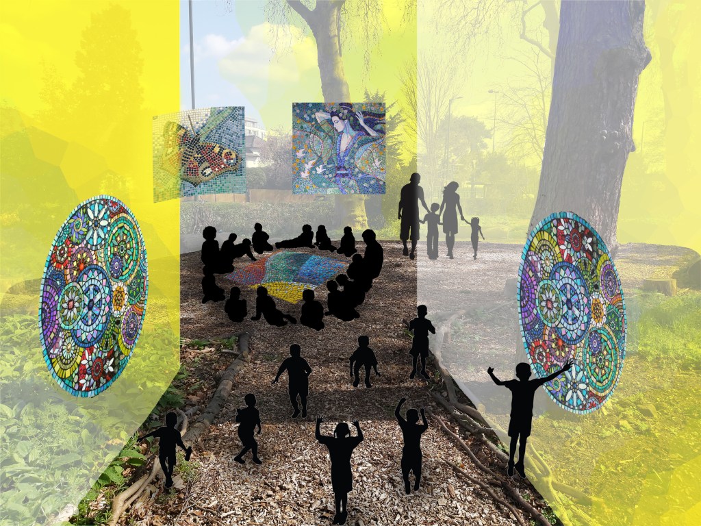
Our client Landmark asked for a concept for a dynamic display allowing artwork to flexibly move around the outdoor venue and an idea for the launch.
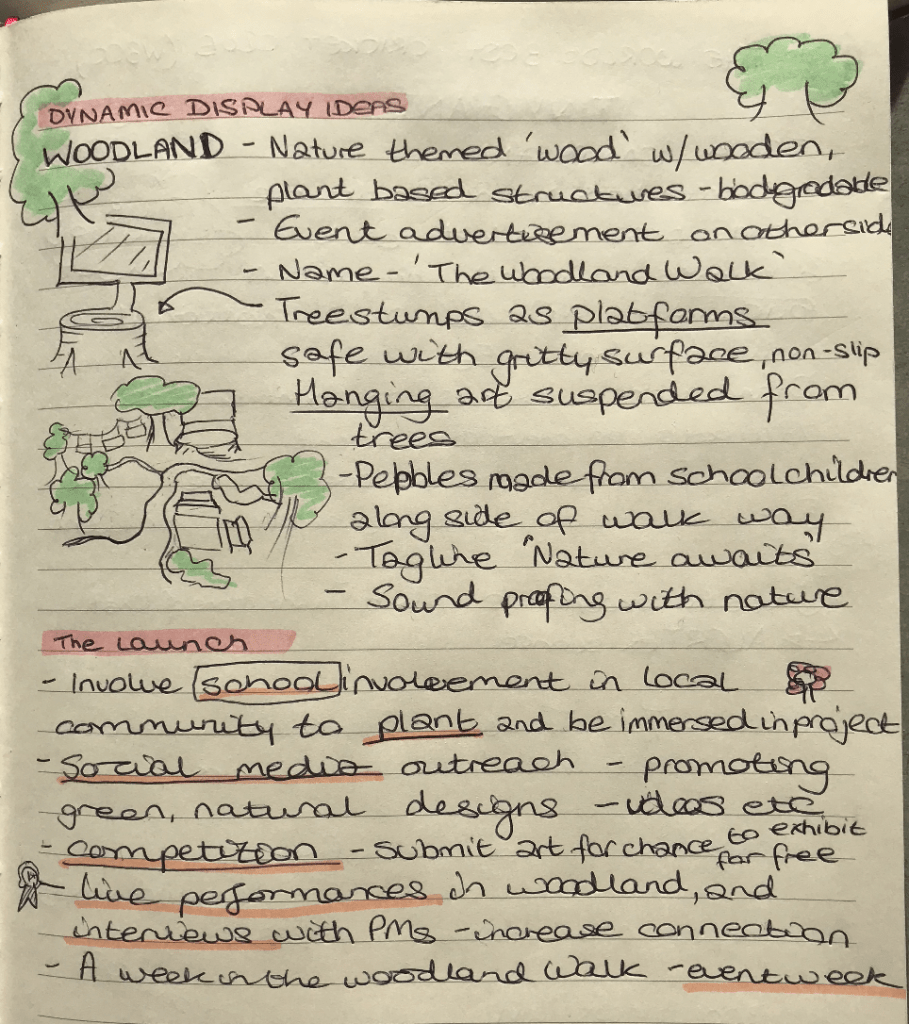
I worked with Emmanuel and Luke for this brief, and we started off the project by having a meeting discussing our thoughts from the previous lecture. In this meeting I presented my notes and thoughts (as seen below) and my partners liked what I came up with. For the ‘Dynamic Display Ideas‘ i thought of the name ‘The Woodland Walk’ and for the work to be displayed in a natural way, with plant based biodegradable structures, tree stumps etc. For the ‘launch‘ I suggested having an element of school participation from the local area, social media outreach, a competition, live performances, and an event week with interviews and more.
My initial project ideas
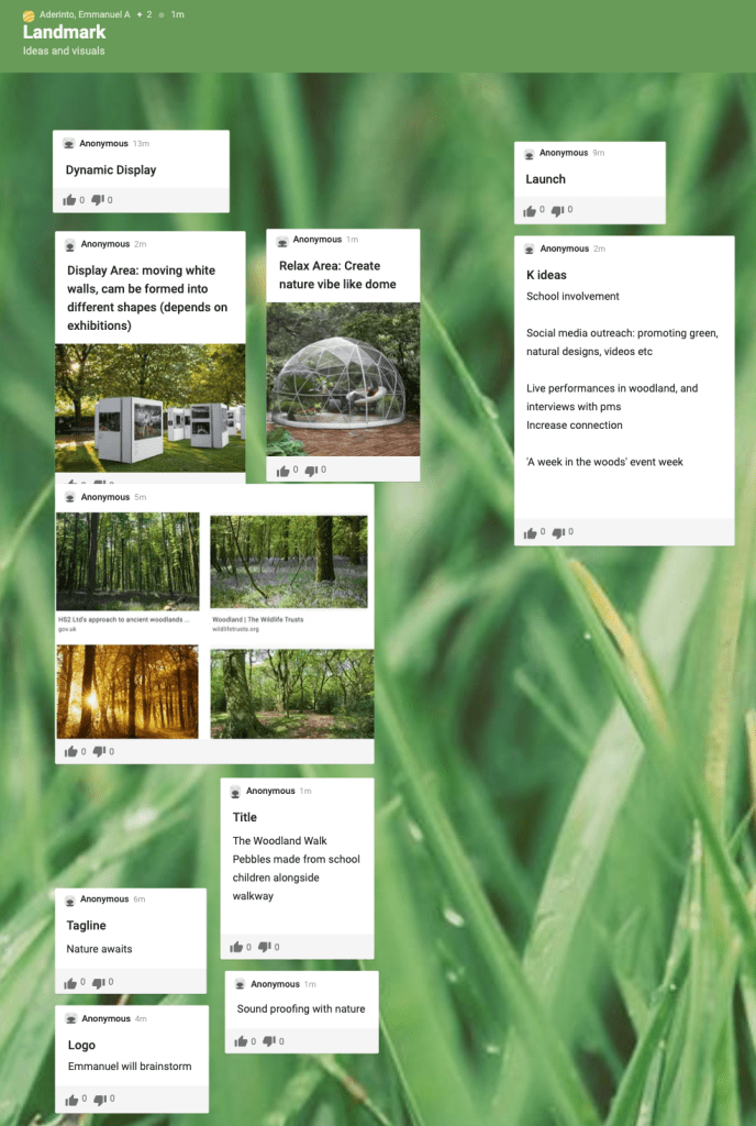
My partners also had great ideas such as hanging artwork from trees, having a mosaic theme (as mentioned by the client) and different ideas of dynamic displays. We added our initial ideas to a Padlet so we could visually understand how we could collaborate our propositions. This was a very useful technique, and was suggested by Emmanuel.
Then in another meeting, I suggested we distribute the work and get started on turning our thoughts into action. We discussed our strengths as a group, and agreed on the following tasks.
Dynamic display:
Logo/ colour scheme Emmanuel OOH visuals (in venue) Emmanuel – Mosaic stage – Hanging art from trees
Posters across town (advertise the event) Luke
Launch:
School involvement – competition (mosaic?) Katie
Social media mockups (instagram feed fb) Luke
Live performance/stream (instagram and facebook) Katie
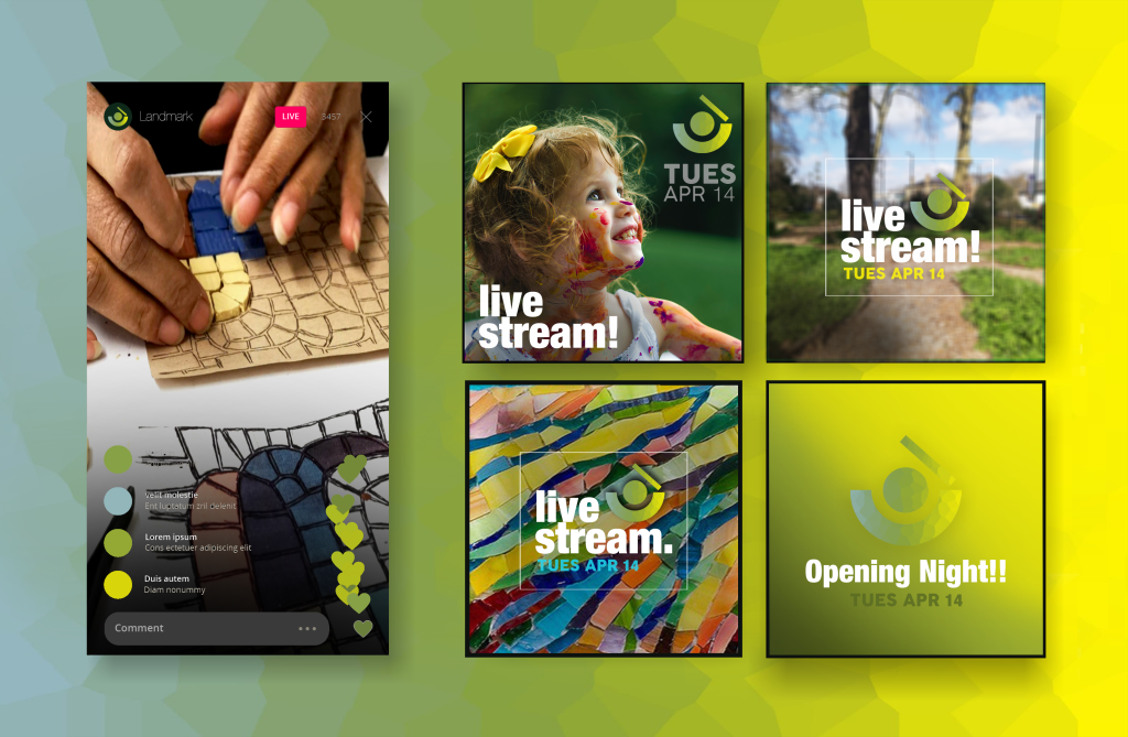
Social Launch – Live Stream
Social Launch Asset
The social launch asset I created reflects the live stream section of the campaign. The colours match the main colour palette, and the shapes and background were created to match other visuals from my partners.
The live stream event would take place across Instagram and Facebook, and will include a mixture of live art tutorials from The Woodland Walk itself and from artists featured in the art display. There will be a range of activities for both adults and children, and the children’s events will only be posted with parental consent. The visuals tease the live stream and opening night, and give a sense of what the posts could look like across social platforms.
I used Photoshop to make this visual, and took photos of the internet and from the clients themselves. The logo was created by Emmanuel prior to creating this mock-up which meant I could easily use it for this one.
School Event Visual
School Event in The Woodland Walk
Before putting this visual together, I asked the team whether my idea would fit into the campaign well and whether their assets would compliment it. My teammates were supportive of my idea, and said to use the site visual Emmanuel created as a base to build on so the visual identity would remain relevant.
Due to the lack of outdoor assets to work with, I made a miniature mockup of how the children would act within The Woodland Walk, showing also the mosaic pieces against the yellow backdrop hinting the trees behind. Overall, the visual looks atmospheric and brings our campaign to life.
Campaign Reflection
Landmark’s brief ‘The Woodland Walk’ was a productive fast-paced campaign developed and created with Emmanuel and Luke. I chose to work with these teammates for this project as I knew we were both from different courses (Art Direction, Design Marketing and Curation) which made the project more dynamic and interesting to organise. Our different skillsets made the process of creating this campaign more exciting and taught us what it’s like to work in a team of creatives. Assigning specific tasks according to individual skills made the process more manageable and enjoyable to work on, and consequently resulted in a successful imaginative campaign.
In this project I took the roles of organising meeting times, making sure the team was enthusiastic about the campaign and creating visuals for the school event and the social live stream mock-ups. The challenge I faced in this project was the lack of communication I had with other teammates. Despite the distance, we worked well together and all had a creative input in the project.
In future projects, I would like to continue working alongside creative students and to find ways of engaging the team despite distances and technical challenges. I will also be continuing to develop my Photoshop skills, and explore other Adobe creative resources.
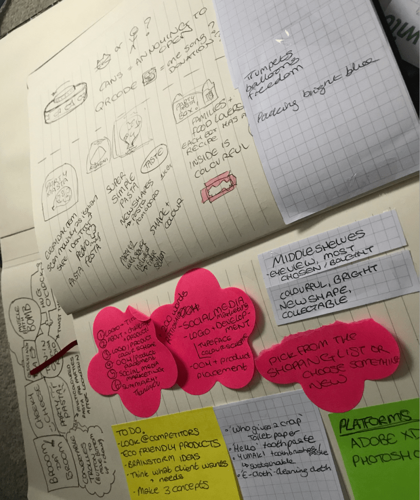
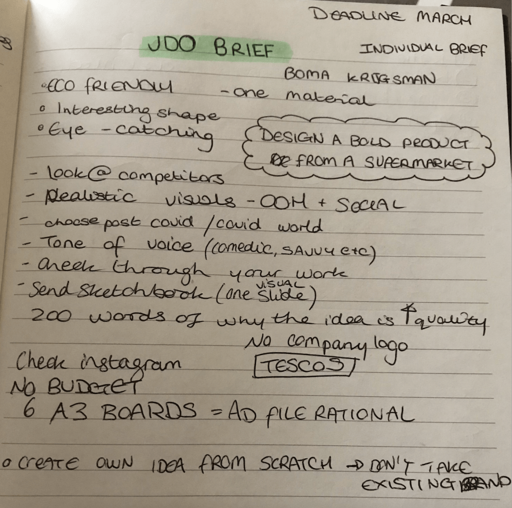
The client JDO asked for a rebranding of an everyday supermarket product, i.e. toilet paper, cabbage, cheese etc, and to have it presented in OOH visuals and across social media platforms. The idea should be innovative and advertise the item in a fresh new way.
Development and Research
The supermarket is a very visually busy place, and shoppers typically stick to a few favourite brands in order to ‘play it safe’ and know what they’re buying is right for them. The most popular items are placed in the middle of the rows, at eye level, so the Customer Journey is almost effortless for the customer. The packaging branding has similar colours, basic lettering and a familiar look which the public take comfort in when shopping.
The brief asks for a new product identity which brings an everyday supermarket item to life. Interpreting the brief meant brainstorming initial ideas and discovering connections and patterns amongst them. The fact this brief was particularly open meant having to digest the insight ‘The supermarket goods aren’t aesthetically pleasing’ and filtering my ideas down to a select few.
To begin this process, I wrote down my thoughts on paper to see them visually, and then weighed up the achievability of each idea and decided on the strongest. In a lecture, a speaker once said ‘How do I know what I think if I don’t see what I say’ which perfectly illustrates my thought process, I need to see it visually to properly understand and compartmentalise possible strategies.
The lists I created consisted of possible ideas, OOH and social media channel visuals to create, the platforms I would need to use (such as Photoshop, Adobe XD etc) and other thoughts towards the project.
After having weighed up my options and considering external opinions towards each idea, I decided to focus my project on PASTA.
‘Why pasta?’ you might be asking… Pasta was one of the top ‘panic buy’ items during the COVID outbreak. The public stocked up on so much pasta that stores were having to limit the number of packs bought per customer. This meant people were valuing the items they bought more and recognised which items they turned to the most for their everyday meals.
Considering customers’ loyalty to pasta, I was inspired to make pasta the project they turn to once the lockdown eventually ends. Many parties could take place after restrictions are lifted, so I came up with the idea ‘Party Pasta!’. I considered other names like ‘Pasta Festa’, but the name ‘Party Pasta’ seemed more suitable for the project I was conceptualising.
Survey | Breakdown and Analysis
In order to better understand my target audience, I created an online survey to find out their opinions about pasta as a food product and about their purchasinghabits and preferences.
This survey gave me a real insight into how to progress in the project and an idea of where to start from. With the data collected from 22 participants, I analysed my findings and discovered patterns with issues and successes around the product.
The first question was ‘Do you like pasta?’ where 90% answered ‘Yes’, and the participant who didn’t stated that they don’t digest it well therefore avoid it. This means that the survey targeted mainly those who are interested in the pasta product.
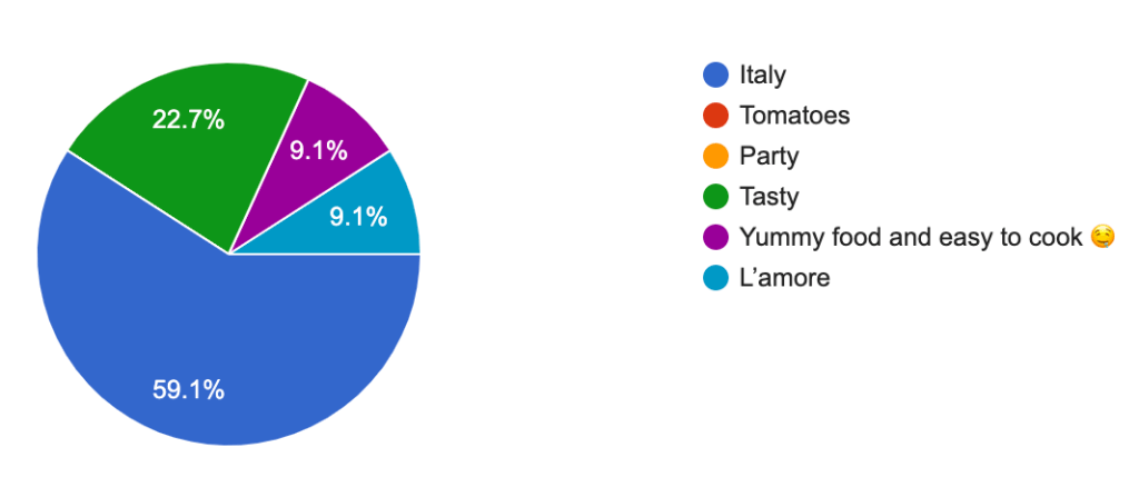
What comes to mind when you hear the word ‘pasta’ ?
The next question was ‘What comes to mind when you hear the word ‘pasta’ ?’. To this over 59% responded with ‘Italy’, 23% with ‘Tasty’ and 18% split with ‘Love’ and ‘Easy to cook’.
‘What would encourage you to buy more pasta?’ The top responses were ‘If it was healthier’, ‘Better packaging’ and ‘Easy recipes included on side of packet’. This shows that customers are looking for a healthier product, with more eye-catching and attractive visual identity and with an easy-to-follow recipe included to help the cooking experience. Millennials and Gen Z’s look for easy, straightforward tasks and to be entertained in the process. This means the Party Pasta will need to contain an element of interactivity and advertise achievability and success.
The following question was ‘Have you ever cooked a pasta dish?’ which 100% answered yes to. They then selected out of 5 pasta dish options where the most popular turned out to be Lasagne (15 responses), Spaghetti Bolognese (15 responses), and Pasta Carbonara (14 responses). Cacio e pepe had 4 and Amatriciana 2 which I will not be targeting for this project.
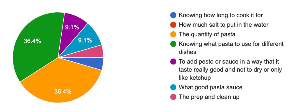
‘What is the most frustrating part of cooking pasta?’
‘What is the most frustrating part of cooking pasta?’. The two most popular answers were ‘The quantity of pasta’ (36%) and ‘Knowing what pasta to use for different dishes’ (36%). This confirms the choice of adding recipe with instructions on the packaging.
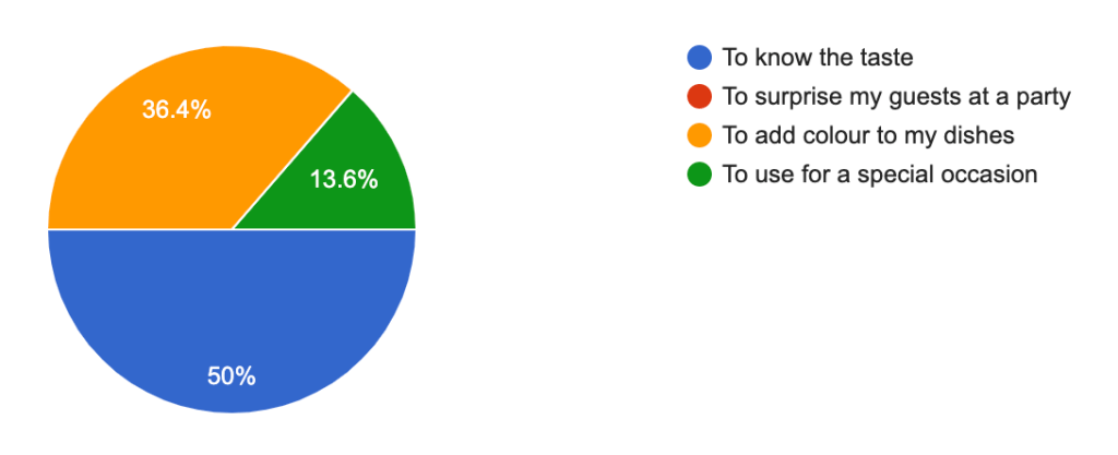
‘Have you ever tried multi-coloured pasta?’ The majority (63%) replied with yes, and the rest with no. The following question was ‘What would convince you to try it?’ where 50% answered ‘To know the taste’, 36% with ‘To add colour to my dishes’ and 13% with ‘To use for a special occasion’.
This data shows customers are more curious about the taste over all other factors, so this also needs to be considered in the advertising and product design.
‘Among the following brands, which is your favourite?‘ 45% of the answers selected ‘I don’t know’ meaning many aren’t connected to the brand identity of a product, but perhaps more so its purpose in a dish. Those who selected a brand answered the following question ‘Why this brand?’ where the majority chose the options ‘Taste’ and ‘Quality’ which further validates my point, that customers are more concerned about the value the item has rather than its packaging or visual identity.
‘Are pasta dishes easy to make?’ 59% answered ‘yes’ and 41% ‘Depends on the dish’.
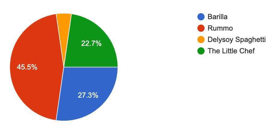
‘Out of these brands’ packaging, which is your favourite?’. In this section, the participants were given visual examples to choose from which helped them identify the name to the visual branding. 45% chose Rummo, 27% Barilla and 22.7% The Little Chef, which is a smaller pasta brand but with a strong visual identity. This data shows customers mostly choose the most popular brands, but are willing to try new brands if they have attractive and compelling packaging.
The final question was ‘If you see a new type of pasta that catches your attention, would you try it?’ 86% chose ‘Yes’, 9.1 chose ‘It depends on the price’ and only one participant chose ‘No’. This data shows customers are willing to try a new type of pasta if it is at a decent price and catches their attention.
The survey has revealed 7 main points:
Words ‘Italy’ and ‘Tasty’ are the first words that come to mind when thinking of pasta.
Customers are looking for a healthy product with an attractive visual identity.
Party Pasta will need to contain an element of interactivity and advertise achievability and success.
Most popular pasta dishes: lasagne, spaghetti bolognese and pasta carbonara.
Product needs to clearly show the quantity of pasta needed per person and give examples of what dishes can be made with each type of pasta.
Multicoloured pasta has been tried before, and people would buy it to know its taste and to add colour to their dishes.
Customers are willing to try new brands if the product tastes good, is high quality, is visuallyappealing and is sold at a reasonable price.
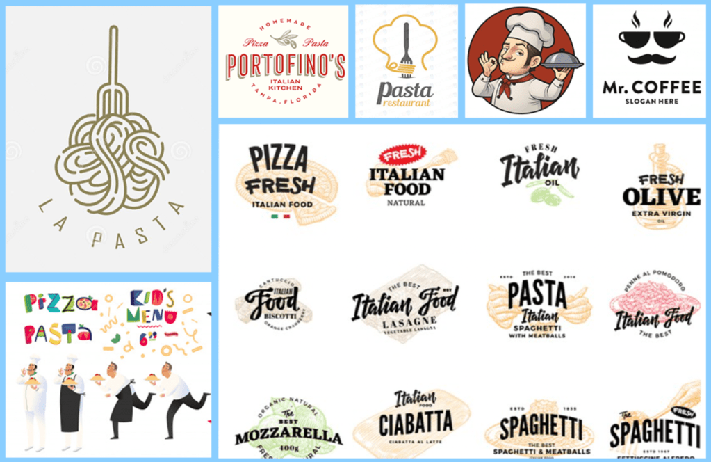
Visual Identity Research
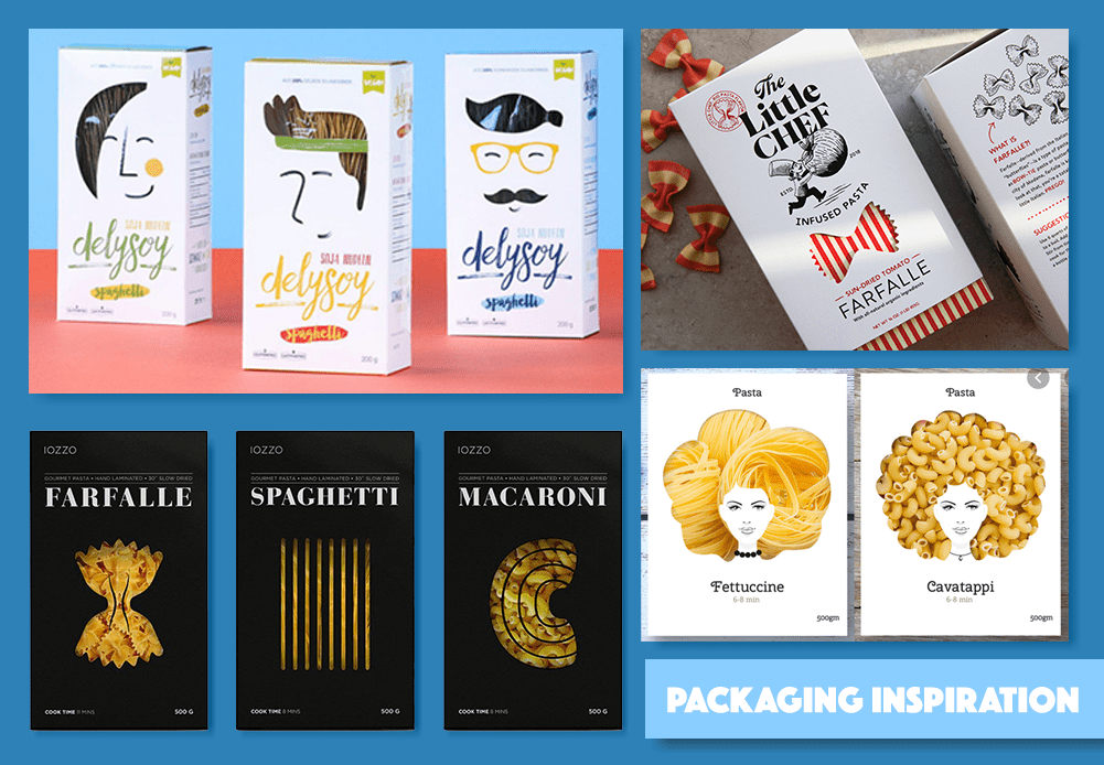
Packaging Research Board. Pictures taken from sites listed below.
My visual research was inspired by firstly focusing on examples of pasta packaging and then onto exploring other interesting product packaging. The mood-board above shows a collection of pasta packaging which inspired me in my visual research. Each branding contains similarities and differences that make the product unique and sellable.
In my survey’s results, we can see how customers look for a visually appealing, high quality product. The examples above show these factors in different ways.
The Little Chef story-telling method
The Little Chef has an imaginative style with a simple colour theme and a clear art direction. The red and white stripy packaging is clean and not overwhelming, while also demonstrating the shape and stripes on the pasta. The sleeve over this layer is a clean white, which brings emphasis on the brands name, logo and product. The stamp on the top left gives the impression the food is tested/ successful which could intrigue the customer more. Overall this packaging is my favourite, not only for the packaging but also for its story-telling technique and brand identity.
Designer Nikita Konkin and company Delysoy created packaging with wild pasta hair with a cut out shape revealing the product beneath. This idea is a very clever, creative design which would attract customers. Another company who used this technique is Iozzo who used the shape of the different types of pasta expressing how simple packaging can go a long way. Both Konkin and Iozzo added the time the pasta should be cooked for and quantity, which simplifies the customers experience.
Logo and Font | Research and Creation
Logo Research Board. Pictures taken from freepik.com, flaticon.com and google
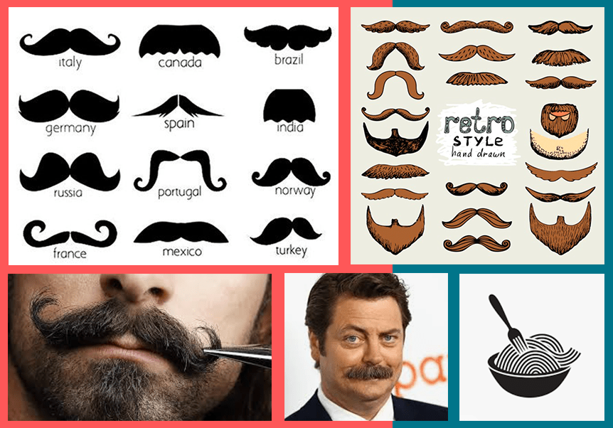
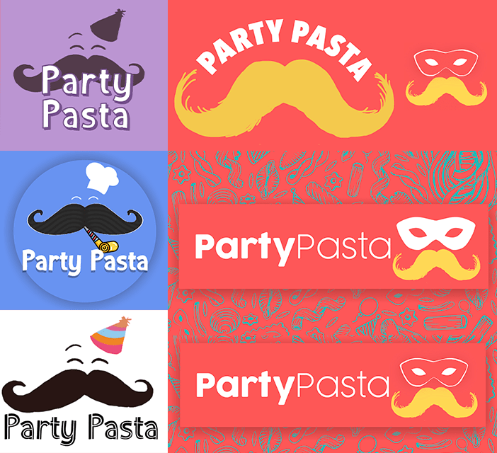
The creative execution for this project started by combining all of the insight and knowledge gained through research and by experimenting ways of executing my inspiration in an effective way. The packaging for Party Pasta will be eco-friendly, therefore recycled paper and plastic would be appropriate to use. When researching different logos for the brand, I was inspired by the different ways pasta is used in creating logos. It can fit in and around the logo at such an ease that the text falls into place around it, or layered on top. A lot of the logos I found were in an Italian style, and included chef characters or a moustache. Each interpretation expressed a sense of vibrancy, and this inspired me to make the logo dynamic with a sprinkling of personality.
Moustache Research Board. Pictures taken from freepik.com, flaticon.com and google
I was very inspired by chef characters I saw in my logo research, and I wanted to incorporate a comedic moustache into the brand. The stereotypical Italian moustache has personality and I thought would be interest to play with working with the shape and movement of pasta.
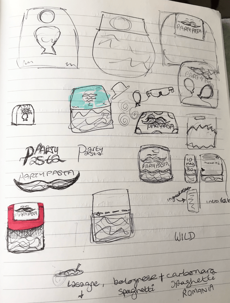
Logo and Packaging sketches
In the images to the left, you can see my brainstorming and ideas at this stage of the process. My ideas were very scattered and didn’t hold much form at this point, however my creativity was flowing, and I found drawing/ writing down my ideas very useful to do.
In order to include the party theme in the logo, I had to think of ways of visually showing this. I thought of including party poppers, balloons, party hats etc, however eventually the masquerade mask seemed to fit the idea perfectly.
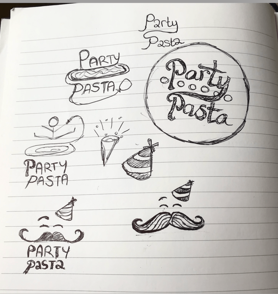
Logo development
Now there was the matter of putting all of these ideas into one visual without over complicating the message. At a certain point, the moustache was over-bearing and it seemed to come the central focus over the title which was not wanted. After lots of experimentation on Photoshop and with pen and paper, the final logo was realised and I am happy with the outcome. Below you will see the final logo with the stylised background, giving a true sense of the Party Pasta branding.
Final Party Pasta logo
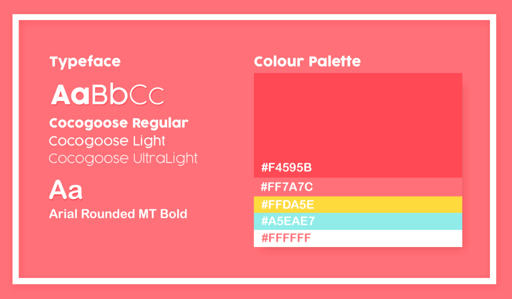
Font & Colour Palette
Throughout the creation process, I was inspired by lots of different colour palettes used in pasta branding. However I wanted to slightly venture away from the typical colours, as the brief outlined that it should stand out from the shelves. In the visual above, you will see the typeface and colours I decided upon for Party Pasta. There is a mix of the typical reds and yellows, which fit nicely alongside a brighter blue and white shade. The idea was to create a colour palette that is cheerful and pleasing to the eye so it would stand out against other more plain packaging around.
Font research on fontspace.com and fonts.google.com
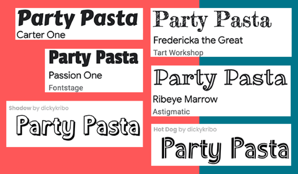
The chosen typeface was Cocogoose and Arial Rounded MT Bold, as they are easily legible and give personality to the text. To the right you can see different fonts that were considered but not chosen as they were either too off-brand or cluttered the overall image/ packaging.
Packaging Background
Moodboard of pasta backgrounds. Taken from freepik.com and vectorstock.com
Researching pasta backgrounds inspired me when looking at different ways of incorporating patterns into packaging. Above you can see a mood-board containing a selection of the pasta drawings I was inspired by for Party Pasta.
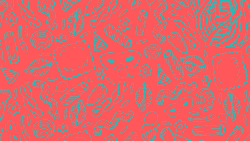
Final Party Pasta background/ pattern
On Photoshop I rearranged pasta vectors and created my own party themed drawings to build a new theme around the brand identity. The colours are purposefully dark in order to bring emphasis to the logo and text which would be layered on top.
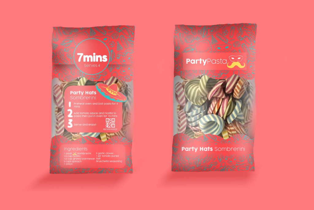
Pasta Product | Research and Idea
Party Pasta packaging I designed
After having researched packaging earlier on in the project, I built up an image over the weeks of how I wanted Party Pasta to look. The visuals above were created on Photoshop and follow all of the brand guidelines established before. The packaging has character and expresses the simplicity and colour the pasta can bring to peoples parties.
The front of the packaging is simple and easily legible, and exposes the pasta through see-through packaging and it’s name at the bottom. Each type of pasta will be displayed in the same way but will be different on the back. The bold ‘7 MINS’ instruction strikes the audiences attention and it gives a starting point to gain their curiosity for the rest of the instructions. The idea behind the text on the packaging was for it to be simple to follow and read, which can be shown through its simple 3 step cooking guide and a QR code for a video to follow.
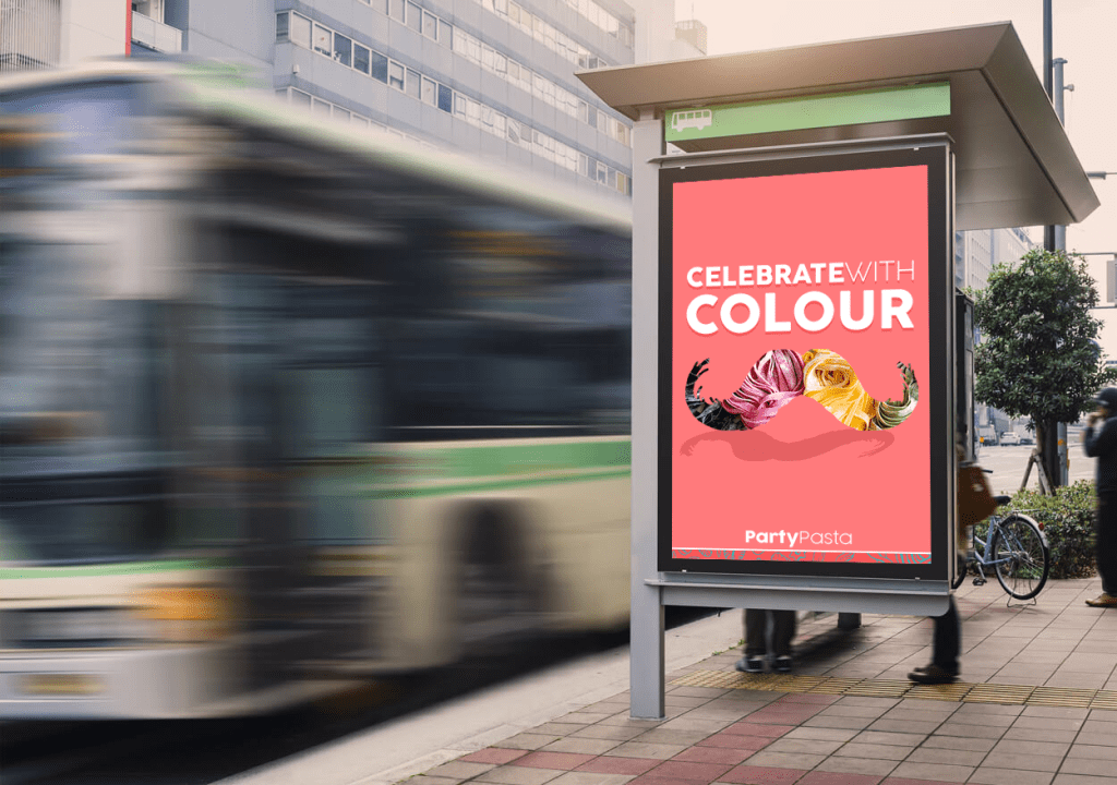
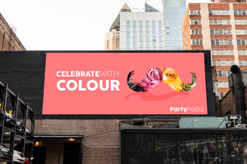
OOH Visuals
Out of Home visuals
The OOH visuals were created on Photoshop and clearly represent the visual identity of Party Pasta while advertising the moustache shape of the logo and the tagline. These banners would be shown across London, and would catch the attention of passers-by with their bright colours and inspiring message.
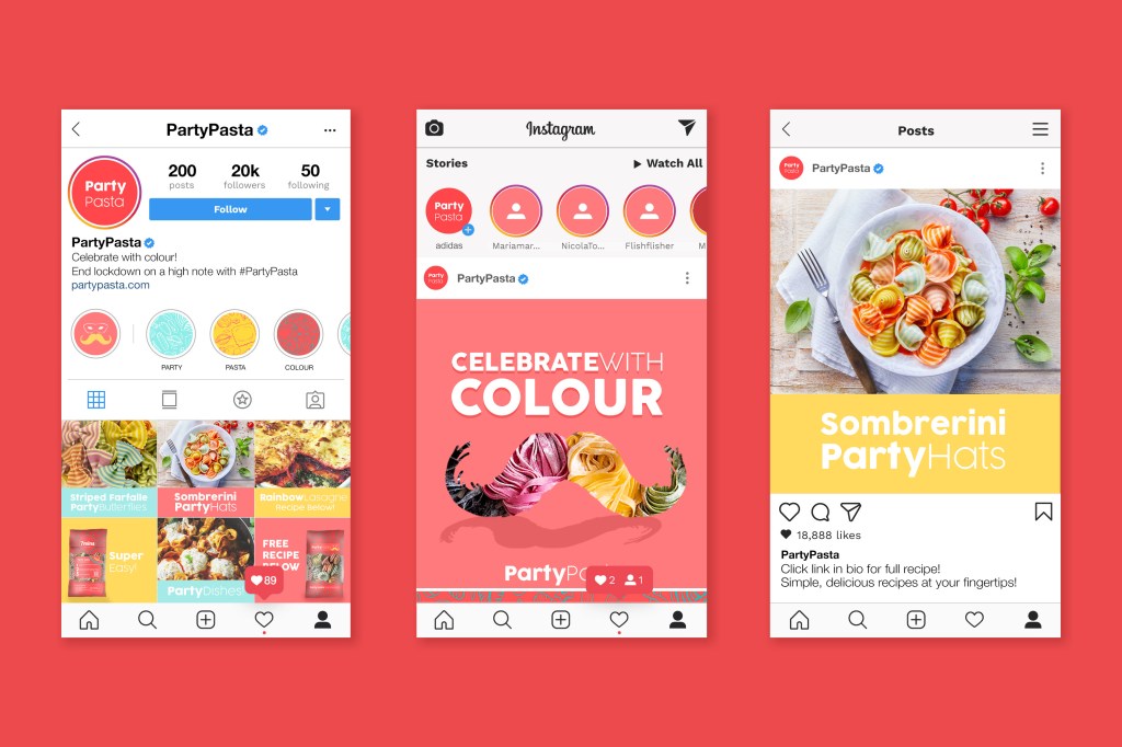
Social Media Mock-ups
The campaigns Social Media marketing will mainly focus on Instagram as a platform considering it’s popularity and audience engagement. The visuals will stick to the campaigns’ colour palette, and will advertise the dishes people can create with the colourful pasta. In the description section, and via the link in the biography, customers will be able to clearly access recipes for each type of Party Pasta for their events.
200 Word Summary
Pasta was one of the top ‘panic buy’ items during the COVID19 outbreak, so why can’t it be the best buy after lockdown? This insight inspired ‘Party Pasta’, a colourful, exciting brand of multi-coloured pasta bringing life to simple dishes after lockdown. This delicious party shaped pasta will transform average dishes into something spectacular!
Each Party Pasta pack contains an easy-to-follow recipe in three simple steps, the cooking time and quantity needed per portion. This enhances the customer experience and turns cooking into a fun activity. Next to the instructions are QR codes which link to videos demonstrating the process of creating the dish.
Its colourful and simple packaging will strike the audiences attention in supermarkets across the UK, and will intrigue them to find out what the brand is. Pasta types such as Sombrerini, Farfalle and Spaghetti are renamed to Party Hats, Butterfly Crazy and Multispag to enhance the party theme. Each type of pasta will be multicoloured and created with natural ingredients, guaranteeing customers a clean and healthy dish. The packaging will be made of recycled plastic, and will have no carbon footprint.
Party Pasta will enhance the parties we will have when celebrating our freedom after the national lockdown, bringing colour and ‘novità’ to simple dishes, and by making the comfort of cooking exciting again.
Project Summary
Party Pasta was an exciting project to develop and has taught me many skills along the way. I worked on this project independently and had a longer timeframe to complete it in which was beneficial. This process tested my organisational skills, stretched my schedule planning methods, inspired the use of different tools to create visual outputs, and tested my creative thinking.
The main challenge I faced in this project was when creating the Party Pasta logo. I experienced a major creative block that prevented me from coming up with a final outcome. I discovered how much value there is in having an external opinion on ideas, and how asking for help can bring a lot of clarity to creative processes. Once I decided on the final logo, the rest of the project was built around it and it complimented the insight very well.
In future projects, I will be less intimidated by my initial project designs and will be open to asking for a second opinion. The initial research I made at the beginning of the project inspired the rest of my decisions, so I will definitely be making more surveys like this to better understand target audiences in future work.
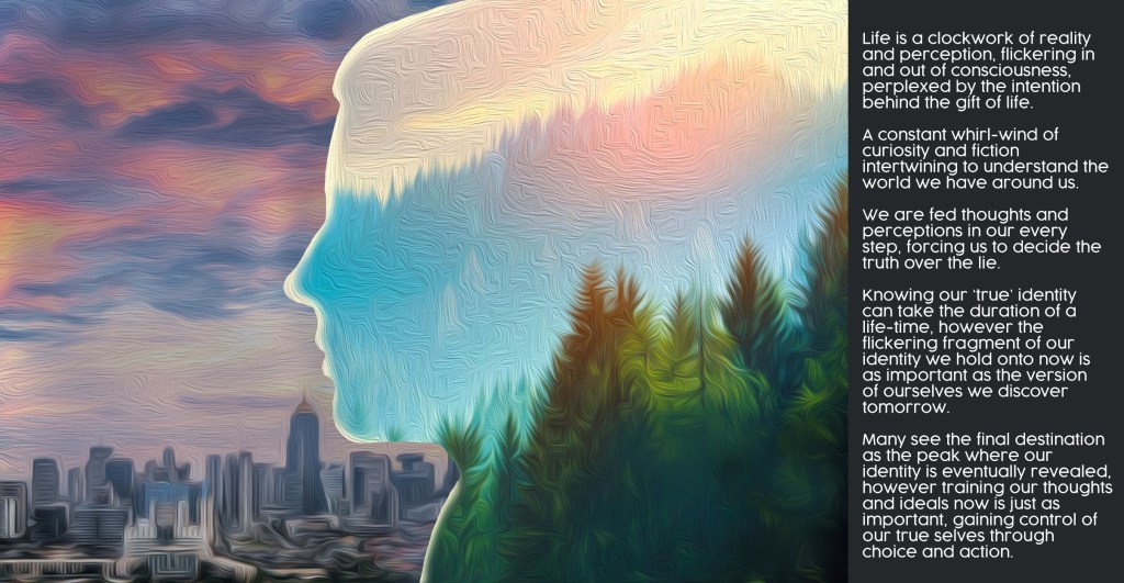
‘Advertise Yourself’ was the objective and title of this brief, where we were asked to create a poster to represent who we are. My interpretation of the brief is shown above, where I combined an interpretation of who I perceive myself to be (in the image) with a piece of text outlining my thoughts on how identity is viewed and treated as a whole.
Poster Manifesto
‘Life is a clockwork of reality and perception, flickering in and out of consciousness, perplexed by the intention behind the gift of life. A constant whirl-wind of curiosity and fiction intertwining to understand the world we have around us. We are fed thoughts and perceptions in our every step, forcing us to decide the truth over the lie. Knowing our ‘true’ identity can take the duration of a life-time, however the flickering fragment of our identity we hold onto now is as important as the version of ourselves we discover tomorrow. Many see the final destination as the peak where our identity is eventually revealed, however training our thoughts and ideals now is just as important, gaining control of our true selves through choice and action.’
Written Reflection
The brief to ‘advertise yourself’ required a lot of self-reflection and was so straight forward it was complex. This task taught me how to realise an abstract opinion/ concept as a visual piece. I ended up creating a representation of who I believe myself to be on the inside (spiritually and as a person) and what I am surrounded by in the natural world. The contrast between nature and the city shows the division between the two worlds and how often people’s identity isn’t reflected in their surroundings.
This brief pushed me to think outside the box and was consequently a useful exercise that allowed me to reflect on who I am as a person. If I could do this brief again, I would print the poster out and experiment in the university studios to bring the piece more depth and personality. Unfortunately, due to the Covid19 pandemic we were restricted to the resources available to us, so this meant being flexible with what we had. Despite this limitation, I enjoyed collaborating the artwork (created on Photoshop) with the written piece and look forward to experimenting with these two mediums in future projects.
Aim: Collaborate two brief concepts to create a case-study in response to a D&AD competition Insight: Audiences’ fear of learning languages
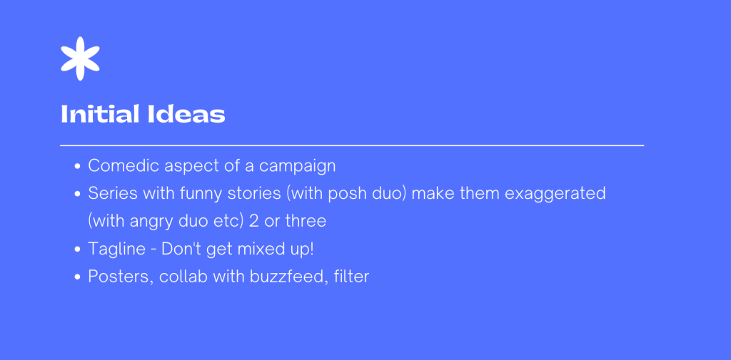
Idea Collaboration
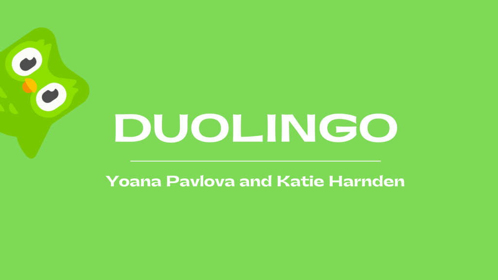
To begin the project, I was paired with Yoana who also created a Duolingo Campaign in our previous unit. We believed collaborating our ideas and knowledge would result in a strong campaign which would be submitted to D&AD.
My partner and I discussed the different ways we could combine our ideas to make a stronger concept to submit by the end of the term. We highlighted the strengths and weaknesses of each project, and commented on what skills we could use to make a strong campaign. This method of approaching the project was very productive and left us feeling enthusiastic and determined to create a unique and successful response.
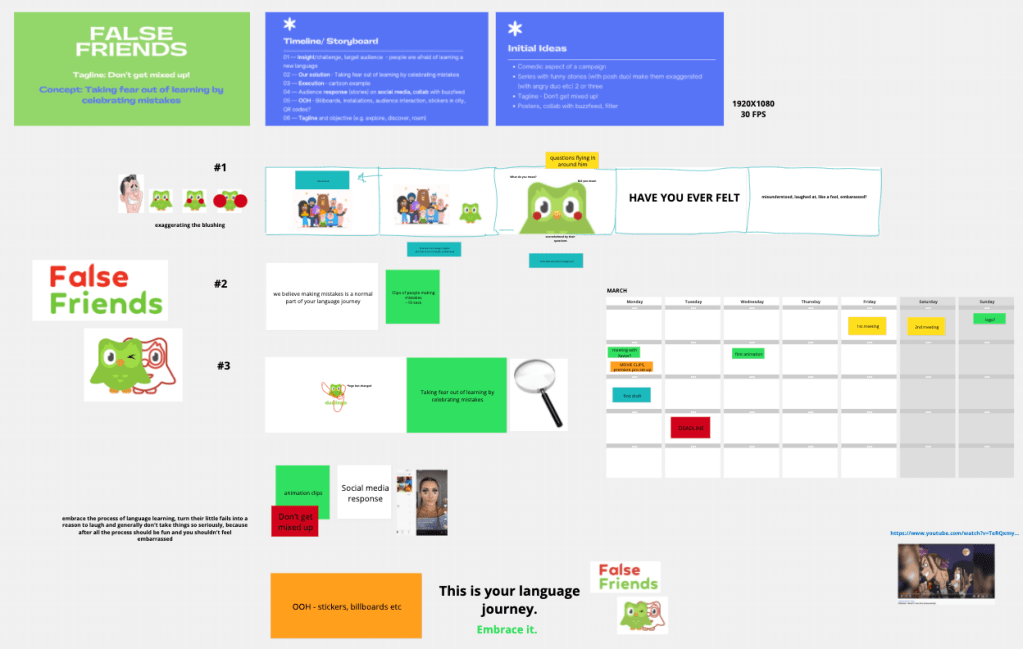
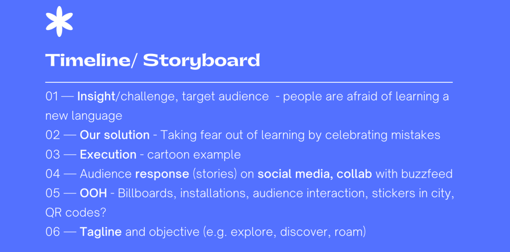
Due to the Covid19 outbreak, we had to complete this project online which meant having to find ways of communicating easily and productively. We created a concept board on conceptboard.com where we thought through our ideas, decided on a title, tagline and concept to run with. Developing a rough story-board meant we had a vague outline to follow from the get-go, and also meant we could communicate our ideas visually. My partner and I both appreciate a structured approach when project managing, so we worked with this strength and produced a good constructive plan (as seen below).
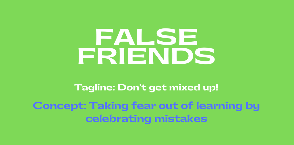
Title: False Friends Tagline: Don’t get mixed up! Concept: Taking fear out of learning by celebrating mistakes
Defining Objectives | Work Distribution
Considering out deadline was in two weeks, we decided to split the work load between us. This was done by writing the tasks we needed to complete and by assessing the time we needed for each task. The eventual work load completed is listed below.
Premiere Pro Video compilation: Text transitions (considering music, timing etc) Compiling assets Finding music Finding video clips to feature in video
4 OOH visuals
Story Board
Youtube Visual
Voice-over recruiting
Event Ideas and visuals
Tagline
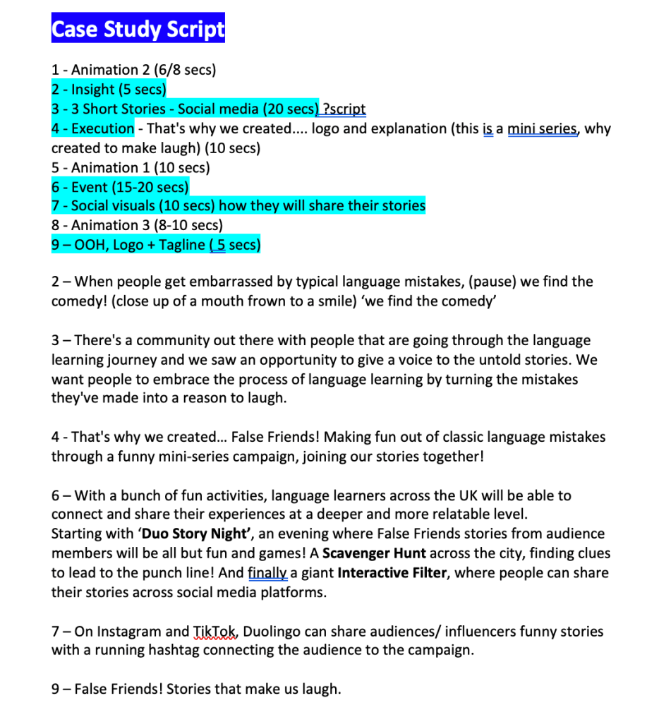
Case-study script
Considering the amount of work we needed to complete in two weeks, the work was well distributed and we worked to each-others strengths throughout the process.
Creating the Visual Assets
Storyboard Creation
First storyboard collaboration
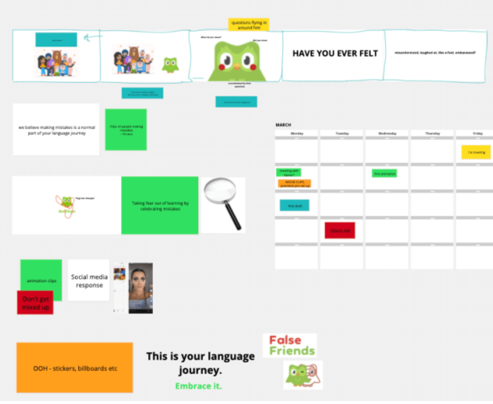
In order to have a clear plan as to how to approach the video creation, my partner and I discussed the different points we needed to cover in the case-study. We created a quick plan using conceptboard.com and collaborated our visions. This platform was difficult to use at first as we weren’t able to sketch properly on the website, so we decided to use text and images of duolingo to demonstrate our points.
Having completed a rough storyboard, we organised a meeting with our lecturer to ask for his opinion on our plan. He mentioned how the whole case study needs to reflect the comedic aspect of the campaign more, and have a clearer vision of our insight and execution. We agreed with his valuable feedback and had another meeting to discuss a way of simplifying and grasping a clearer message.
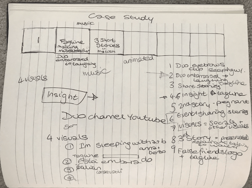
A lecturer gave us a useful list of points to craft our case-study around including the insight, idea, tagline, execution, script and storyboard. To understand these points better, I wrote down my ideas on how to tackle the project and organise the process. My partner and I had a further meeting where we discussed our ideas and thoughts on the over all structure of the study.
Rough notes on storyboard structure
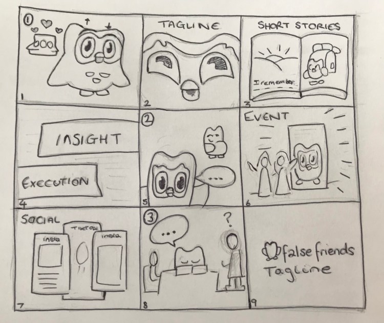
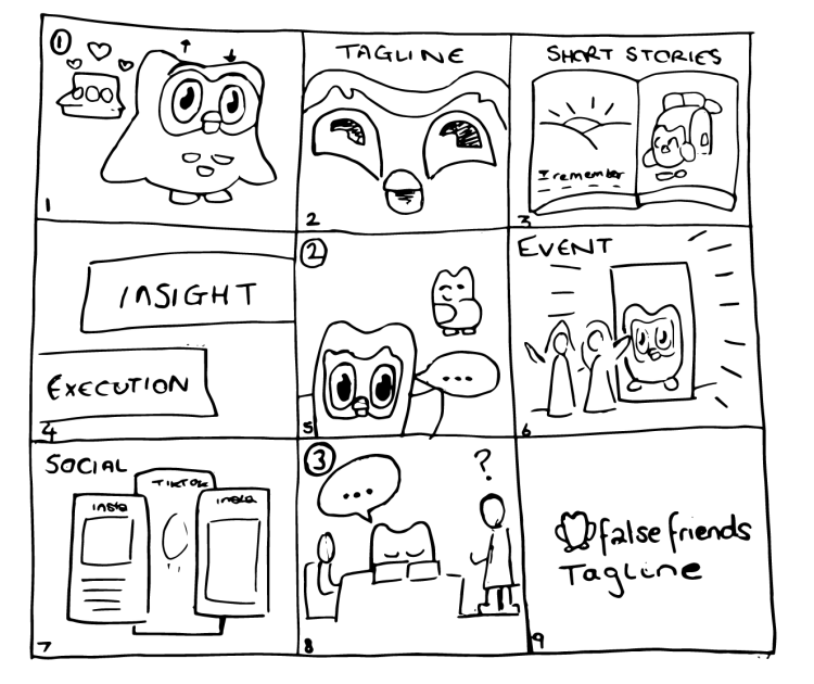
The process was a little confusing as my partner and I had never made a case-study before, so we found it difficult to create a frame to follow. I suggested we create a rough breakdown of the case study together and then create a visual to bring it to life. I wrote down my ideas and shared them with her, and we discussed the final structure. Below you can see the story-board I created for the project which I then finalised in a vector form on Illustrator and added to the case-study visuals.
Original Storyboard sketch and transformed to vector on Illustrator
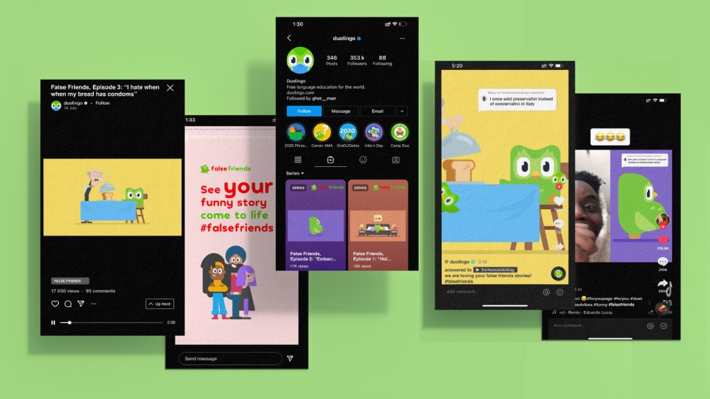
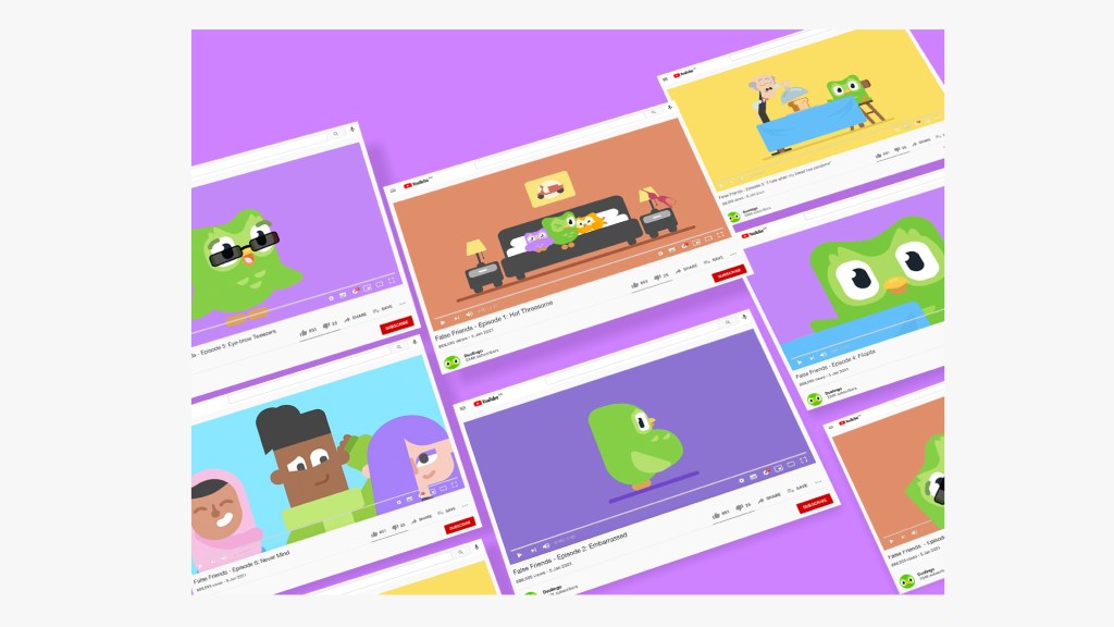
Youtube Visual
The idea behind the youtube visual was to show how the short stories would be accessible on the platform. My inspiration for the visual was found on nua.ac.uk in the business marketing section where they displayed clear and eye-catching visuals which inspired creating my visual.
This visual was changed many times throughout the process due to idea development and coming up with eventual names for each episode. The images on each visual needed to be the same as the visuals from the animations created by my partner in order to create consistency throughout the campaign.
Overall, the youtube visual turned out to be very visually appealing and colourful which fitted perfectly with the rest of the campaign. My partner also liked the work and we consequently used it in the case-study alongside her social visual.
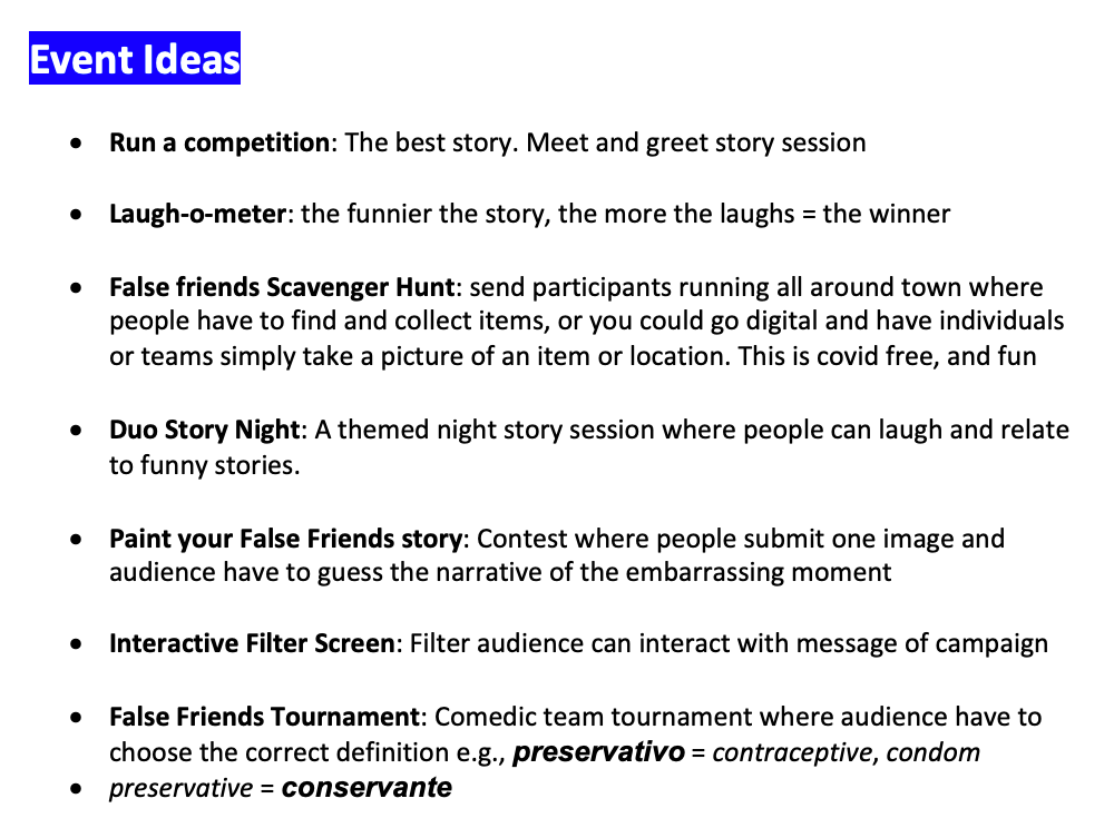
Event Ideas
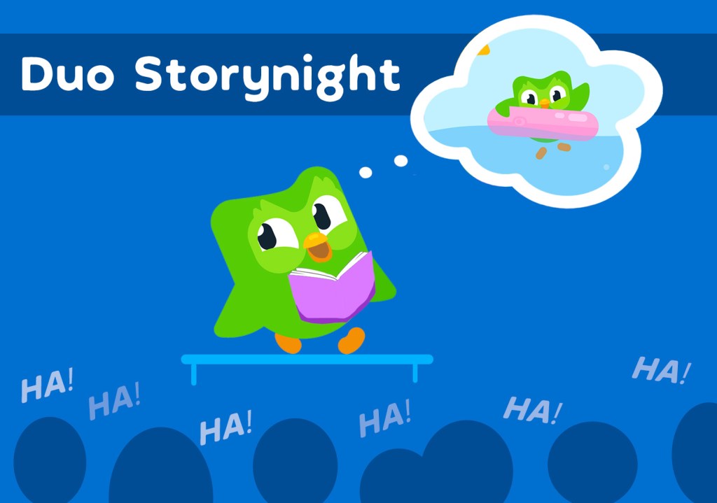
I developed the event ideas for the project and three were chosen ‘Duo Story Night‘, the ‘Scavenger Hunt‘ and the ‘Filter Screen‘. I created the script for these sections of the case study, however my partner wanted the ‘Filter Screen’ to be changed to the ‘Competition‘ idea, so a new script was made and recording. The complete list of ideas is displayed below…
I created the visual for ‘Duo Storynight‘ visual below, and this was to be added alongside my partners’ visuals in the case-study. However in the end, our tutors suggested to only use the ‘Competition’ idea as it was the most relevant to the campaign.
Event visual ‘Duo Storynight’
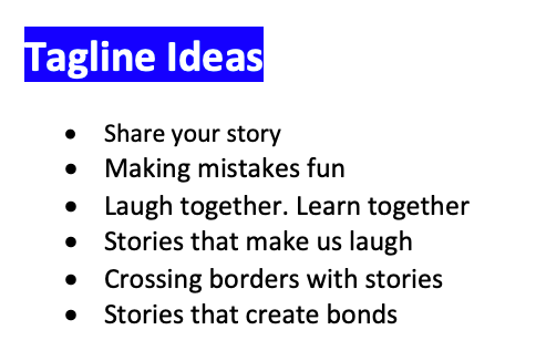
Tagline Creation
List of taglines I created
While my partner was creating the animations of the case-study, I kept working on the other sections. I came up with a list of tagline ideas for False Friends as listed on the left.
The tutors and my partner all liked the ‘Stories that make us laugh’ idea, as it fitted in perfectly with the case-study’s tone of voice.
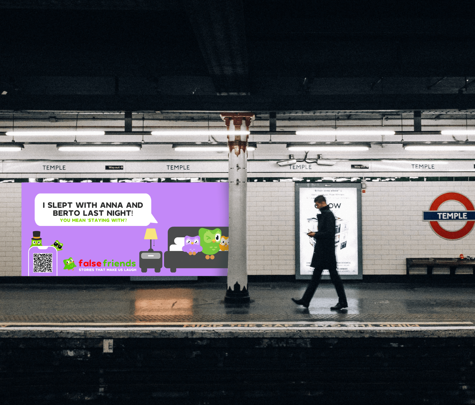
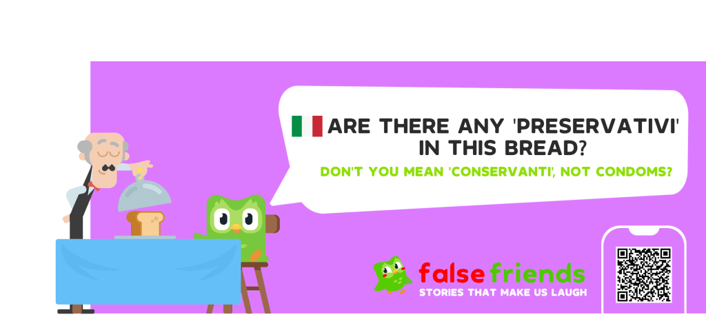
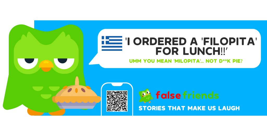
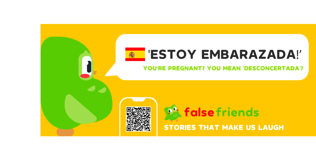
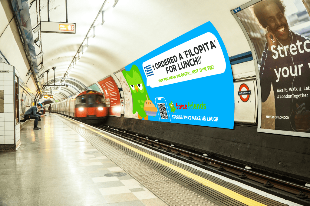
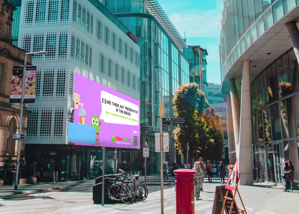
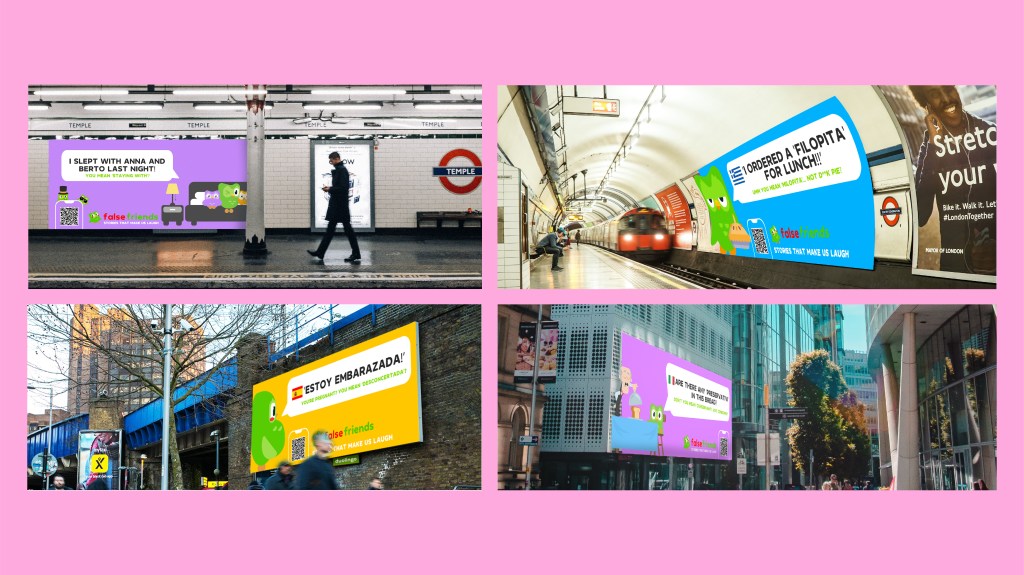
OOH Visuals
I created the 4 OOH visuals for this project advertising funny language mistakes in different languages. Each banner has an english response in order to make the jokes more understandable for the audience. The colours fit the campaigns main visual identity, the font is ‘Duolingo’. The QR code would direct audience to the campaign page and social account. Three of the ideas were made into animations by my partner, and the 4th ‘Filopita’ was left as an example. We originally confirmed on having three OOH visuals, however at last minute my partner suggested I create a fourth so the campaign would have fitted together better. In the end, the visuals looked great in their city environments, bringing colour and vibrancy to their surroundings. The final outcomes are presented below.
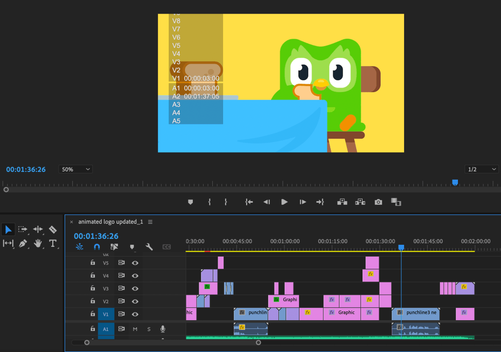
Searching for music for the backing track was more difficult than expected as it had to fit the fun and comedic theme of the case-study. The first song I chose was the famous track ‘Mood‘ as it is a catchy, current sound which Gen Z’s (our audience) can recognise and it has a positive, catchy sound. In the youtube tracks’ description, there was an option to download and permission to use for non-profit reasons -*FREE FOR NON-PROFIT USES & CREDIT ME (Prod. By Uriel)*. The tracks rhythm meant the text transition in the video would be interesting and strike attention.
After showing my first draft of the case-study video, the lecturer didn’t like the chosen track and having asked a second time for the track choice, it wasn’t liked again. Because of the urgency of completing the video, I asked my partner for help and she found the ‘Amazing Day‘ track which we used for the final video. The music is copyright free and fits well with the rest of the video.
Script Creation
The case-study script was developed by myself, and it was changed many times throughout the process as ideas were developed.
The script was written to be narrated in an upbeat, light-hearted tone. My friend volunteered to be the narrator, who is Italian and knows how to speak in an energetic and engaging tone. Considering the campaign is based on languages, his accent fit perfectly with the tone of voice.
He kindly recorded the entire script, my partner and I listened to the audio and I adjusted the tracks to make everything more comprehensible. My partner couldn’t understand many sections due to slight mis-pronunciation of words. Therefore I asked him many times to change different parts which made the script sound a little dis-jointed. My partner asked for further changes to be made which made the editing process behind the audio registrations sound different. It also meant changing the script, asking my friend to record during a busy working period etc. Fortunately, despite his busy schedule, he willingly recorded after each correction.
Before the deadline, my partner suggested making a change to the ending with “False friends are your friends!” instead of the title and tagline and asked for the narrator to record. I suggested we keep him saying the title and tagline at the end, but she was sure the idea would fit so I asked him to record the audio. These changes meant having to record, wait for responses, converting files, inserting and trimming the tracks, changing transition and visual duration times etc. Despite these changes, the case-study ended up sounding very good.
The 2nd case-study draft with Italian narrator
After presenting the finalised video with the voice over, the lecturers didn’t think the narration was clear enough and they suggested to re-record it with someone else’s voice. They suggested to use my partners voice who willingly accepted and recorded quickly after the meeting, following the timing of the video perfectly. This made the process of changing the voice-over easier, and meant mainly having to concentrate on the music timing and the visuals over the top. The lecturers also said to modify the music volume to a lower level, so it’s more in the background.
Overall, the video worked out perfectly after the adjustments were made, and the narration was much clearer despite liking the Italian accent from the previous one.
Images were exported and inserted individually from exported pngs
Final Submission
Created on Premiere Pro, time 1.50 1920×1080, 30 frames Video assets created from pexels.com – Copyright free
My partner and I were very happy with the final outcome of our case-study, and managed to achieve a lot in the matter of two weeks. I am pleased also with my personal development from this project, as it has stretched me to work alongside a new creative partner and has stretched my video making and practical skills on Photoshop, Illustrator and Premiere Pro.
The final JPGs submitted alongside the video are shown below. These were created on Illustrator collaboratively, and successfully reflect the insight and motive of False Friends.
Presentation & Project Reflection
False Friends was a creative campaign in response to client D&AD and was developed and realised with my partner Yoana. We worked well together and created a strong interpretation of the brief by collaborating our Duolingo outputs from last term, and creating a comedic spin on mistakes in language learning. With Yoanas’ animation skills and design eye, and my video making skills and creative thinking, we made a good team and were able to use our strengths to our advantage.
In this project, I gained further skills on Photoshop, Illustrator and Premiere Pro while also gaining practical experience working to a short deadline and organising a large workload. I developed the majority of the visual assets for this campaign and found creating the case-study video a rewarding experience. I also gained written skills through writing the case-study script and creating the tagline ‘Stories that make us laugh’.
If I did this project again, I would spend more time with my partner discussing our initial ideas at a greater depth to ensure a stronger foundation to work from. Considering our task was to combine two projects in two weeks, our final outcome False Friends was very rewarding and successful due to quick creative thinking and strategic organising.
The Aim: The client Cake/ Havas asked for us to create a campaign advertising disability football and finding a way of gaining audience interest in the sport. They asked to use our creative skills to develop a multi-media campaign for BT.
After the client meeting, we went into groups of three to complete the project. I joined a group with students Alex and Angelique. We had a group meeting after the initial client call and agreed to look over the brief individually and come together with ideas in a following meeting.
Independent research
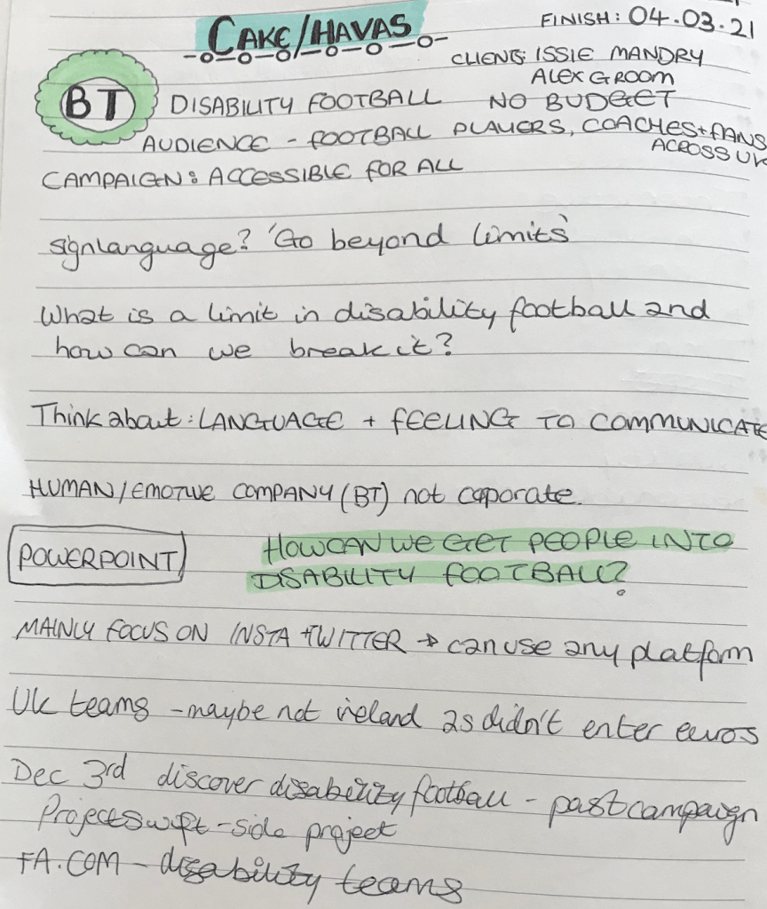
To start my independent research, I analysed my notes taken during the client meeting and wrote down possible points to dive deeper on. The first question that came to mind was ‘How does the idea tell our brand story of connecting for good?’
I thought we needed to create a positive, upbeat campaign highlighting top players within disability teams and their stories, and one that would create an approachable feel for audience.
Another idea was having an event/ competition learning tricks and showing off talent. The campaign should advertise disabled football takes more SKILL than a regular game. This would highlight the effort and skill behind disabled football players.
Possible tagline – YOU FOCUS, WE PLAY
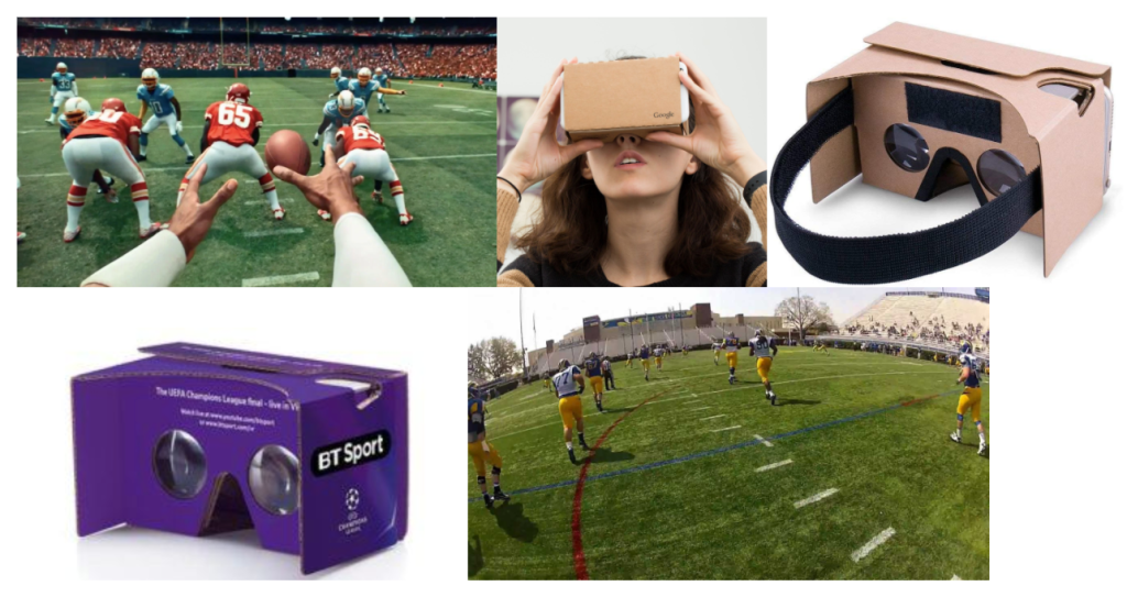
An interactive VR experience where the audience can see the game being played in a first person view). This will give the user an experience of what disabled football players see around them, feel and hear when they play (heightened senses).
Social media could show chats between a famous sportsmen/women and a disabled football players, chatting about technique and how the game differs.
Abstract idea – Live brail commentary of game on iPads.
Identifying Idea and Project Roles
My group had a meeting where we brainstormed our ideas and came up with the main POA for the project. The team were very enthusiastic about my ideas, and especially liked the VR interactive match experience. We also agreed on having the title ‘Heightening Senses‘ and the tagline ‘Taking senses to a new height‘.
Tech convention event idea
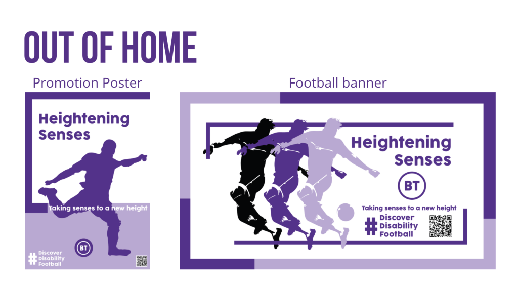
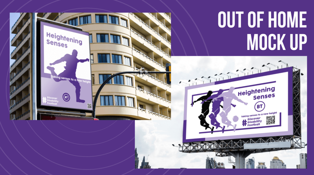
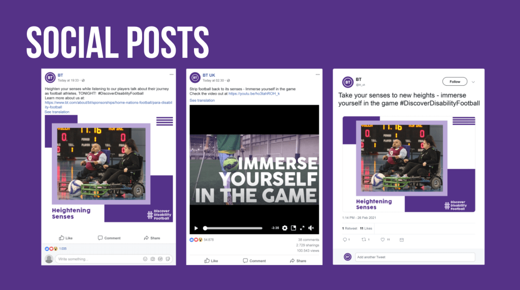
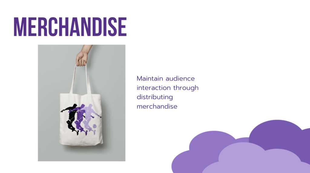
After deciding on the main concept we wanted to run with and thinking about the possible ways of approaching the campaign, we split the tasks between us and identified what we thought we could focus on the best. The team wanted me to create the advert as they didn’t feel experienced/ confident enough and mentioned liking previous video pieces I’ve made in previous projects. I accepted the challenge and broke down the specific requirements with the team. Alex decided on creating the logo, colour palette and the font. Angelique, the marketing strategy and social mockups. I mentioned creating an event (VR Tech Convention) and OOH visuals for football match banners. This work was decided on being distributed between Alex and Angelique while I got on with creating the video (which was more time consuming).
CAMPAIGN: VR interactive experience first person view of the disabled football player, where you can see what they see/ hear around them (heightened senses)
The first step for the video creating process was to identify the tone of voice and message we wanted to bring across. We decided the advert should be informative, showing the using of the VR headset, while having an energetic and positive vibe. Considering my organisation strategy from past work, I decided to research copy-right free music which best fit the campaign. The links below are the tracks I sent back to my group to filter down to their top 2 choices.
We decided on the best suited track, which was n.4 ( Percussion Background Music For Videos ), and agreed that n.1 was a great reference for the transition styles throughout the advert.
The Video Assets
The second step involved finding suitable video assets for the advert. To start this process, we agreed as a group on the art-direction and the type of videos I needed to look for. I used pexels.com to look for appropriate copy-right free clips. Having used this website before when creating videos, I knew that this was a reliable source to take advantage of. On youtube, there were some fantastic videos using go-pros which was the kind of footage we were looking for, therefore I contacted our lecturer to check if we were able to take clips for the advert and he confirmed it was fine due to the usage being for educational reasons. This was fantastic news, and opened up a lot of options for the video creation.
The clips from youtube were:
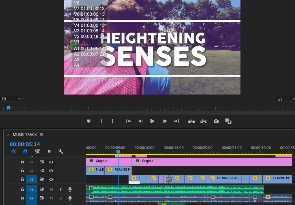
Compiling the Video | Premiere Pro
Video Format: YOUTUBE | 1280 x 720 MP4 H264 CODEC | 30 seconds advert
Logo, Colour Scheme and Font – Created by Alex
I used Premiere Pro to create the video, and started off by setting the correct format and time, and then by adding the base assets. The most interesting part of creating the video was discovering how the initial clips and music timing inspired the rest of the video. The advert needed to follow the beat of the drums and to have an energetic feel running throughout it. This meant having to shorten the clips and follow the footballers’ movement. Creating the base of the piece with the music and the video clips set the narrative for the text. For the text, I followed the rhythm of the music and transitions, and made sure it didn’t clutter the screen. The minimal use of text meant the audience could concentrate on the sport and technique more so than distracting words. Finding the balance was a useful task, and coding each asset to move in different ways was great practise.
The colour theme is consistent throughout, and the font is inline with the campaign guidelines. Throughout the process, I kept my team updated with changes, and asked for regular feedback so they were involved in the process. The whole project was completed remotely, and we were working from different countries… China, Indonesia and England, so the time difference meant we had to wait for replies and trust that we were all working on our sections. Below you can find the completed video which my team and I are very happy with.
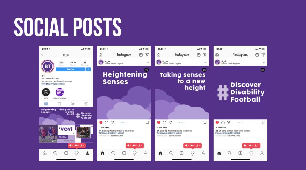
Marketing and Project Identity
My teammates worked on the Marketing visuals and the identity. They both worked on their side of the brief while I was creating the video. We were all in regular communication, and had meetings throughout the process. You can see the work they produced below…
Project Reflection
The Heightening Senses project has been enjoyable to produce not only because of working alongside proactive teammates, but for the confidence I have gained in creating videos with Premiere Pro. This practise has further developed my skills and intrigue to experiment with other formats and styles. These fast paced projects have tested my ability to think quickly and efficiently while in collaboration with the groups. This team was great to work with, and we produced an insightful and successful campaign.