Task Breakdown
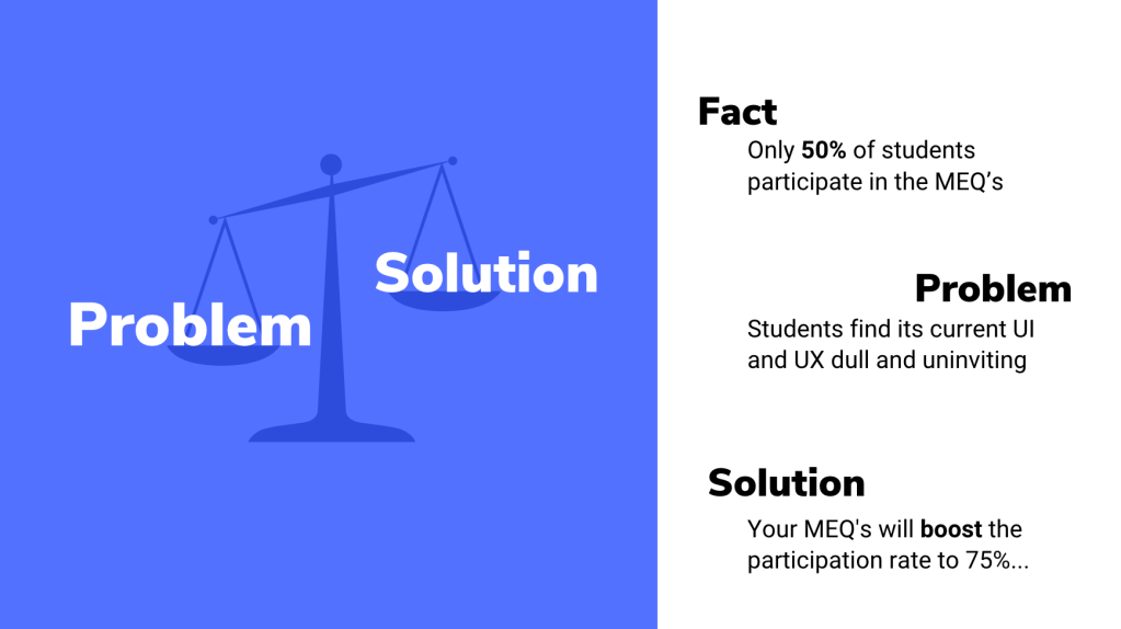
The task was to increase the student participation of the MEQ’s (Module Evaluation Questionnaires) from 50% to 75%. A high percentage of students do not engage in giving feedback, so the aim was to improve this by changing the UI and UX of the MEQ’s.
Learning Outcomes
- Problem frame, idea and prototype
- Reflect on your problem analysis. Your conclusions. Why are you doing what you are doing
- User journey, touchpoints
- Design and prototype solution (MEQs) as an installation or UX/UI
- Make a case study video (1 min)
I worked independently on this project to challenge my self-organisation skills. The deadline for the project was on Monday 8th November 5PM.
Response to Brief
To begin the assignment we collectively brainstormed as a class different ways of approaching the brief and the initial ideas we had.
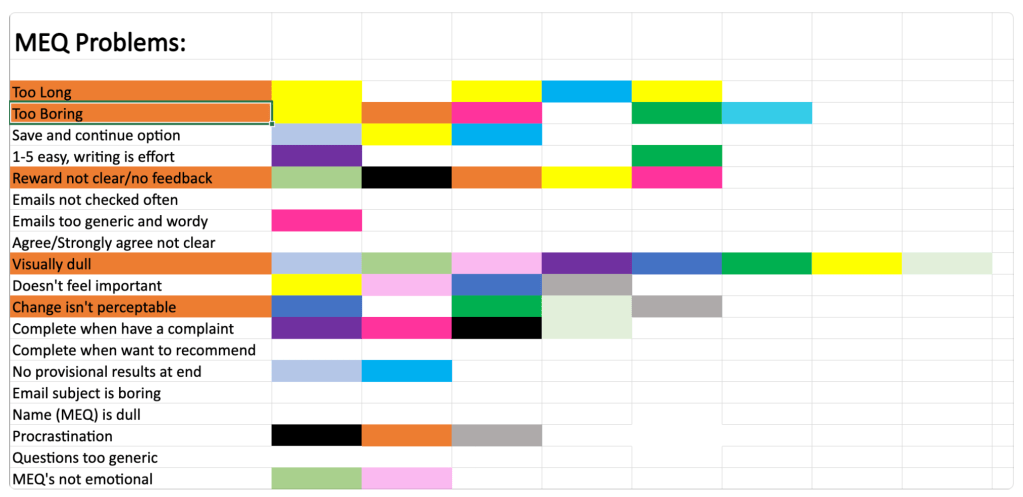
From this information we were able to analyse the positive and negative feedback given about the MEQ’s and start to apply it to our own ideas. This session was crucial for the development our projects and prompted further research into website UIs and UXs.
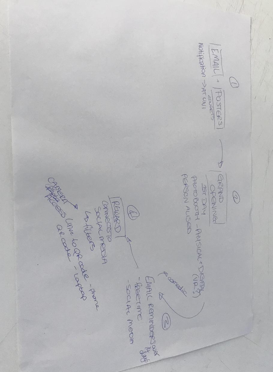
Above you can see the ideas I had during the session as well as a collective flow-map created with a smaller group.
Research and Framing the Problem
Target audience – students of Kingston University, mostly Gen Z’s and Millenials
What they want – reflecting back on my past research in my ‘The future of Gen Z‘ post, we can see that the majority of our target audience are wanting: A simple customer journey, clean and visually appealing interface, familiar buttons and navigation tools, a quick process and to be involved in the experience whilst being entertained.
When I complete surveys, I hardly ever enjoy the experience and it is usually something to finish quickly rather than something I want to spend a long period of time on.
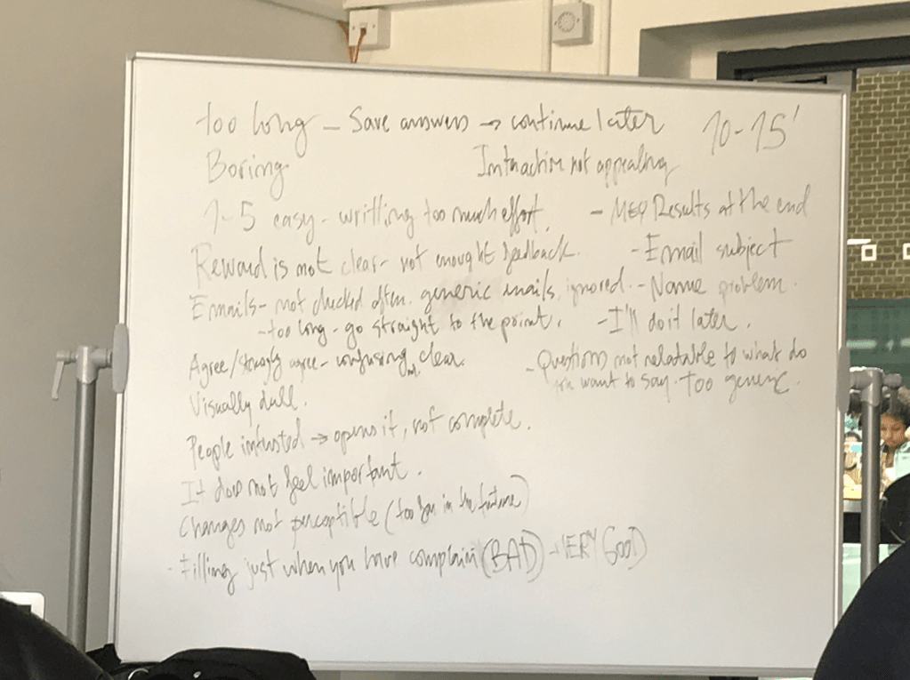
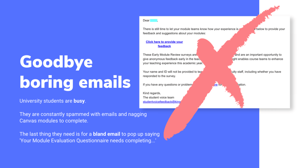
When we had our class brainstorming session, I remembered how most of the class didn’t raise their hands when asking who had completed their MEQ’s. So the majority of the opinions from the class were negative, which meant our results were easier to target and analyse.
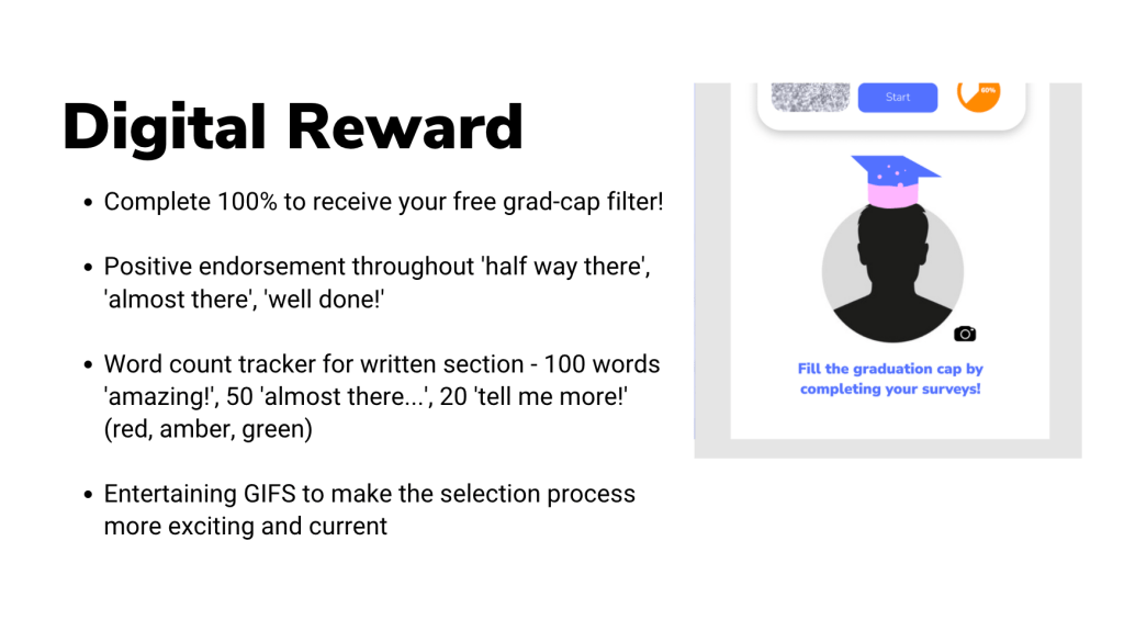
Students are typically bombarded my emails and information throughout the week, so the last thing they would want is another nagging email from their University asking them to complete a task. Knowing this inspired me to create a visually appealing interface that wouldn’t be irritating when seen by students and also for them to have some sort of incentive involved. Many of the students in the previous lesson mentioned that if an award was involved, they would more likely to partake in the survey.
Identifying UX and UI solutions
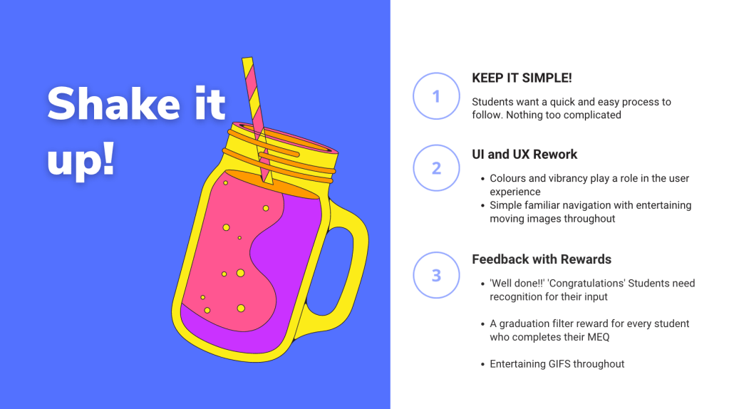
Simplicity
- Students want an easy, quick process to follow. Nothing too complicated!
UI and UX
- Colours and vibrancy play a role in the user experience
- Simple familiar navigation with entertaining moving images throughout.
Feedback
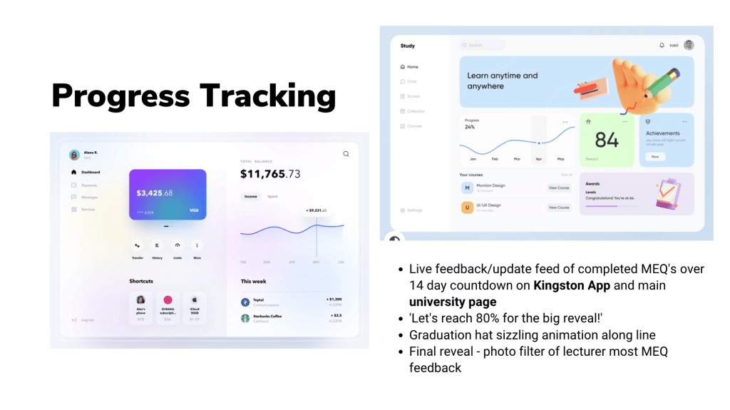
- Constant acknowledgement given to students throughout process, with written prompts and eventual feedback once results are collected and assessed
- A reward for every student who completes their MEQ
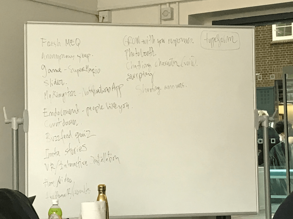
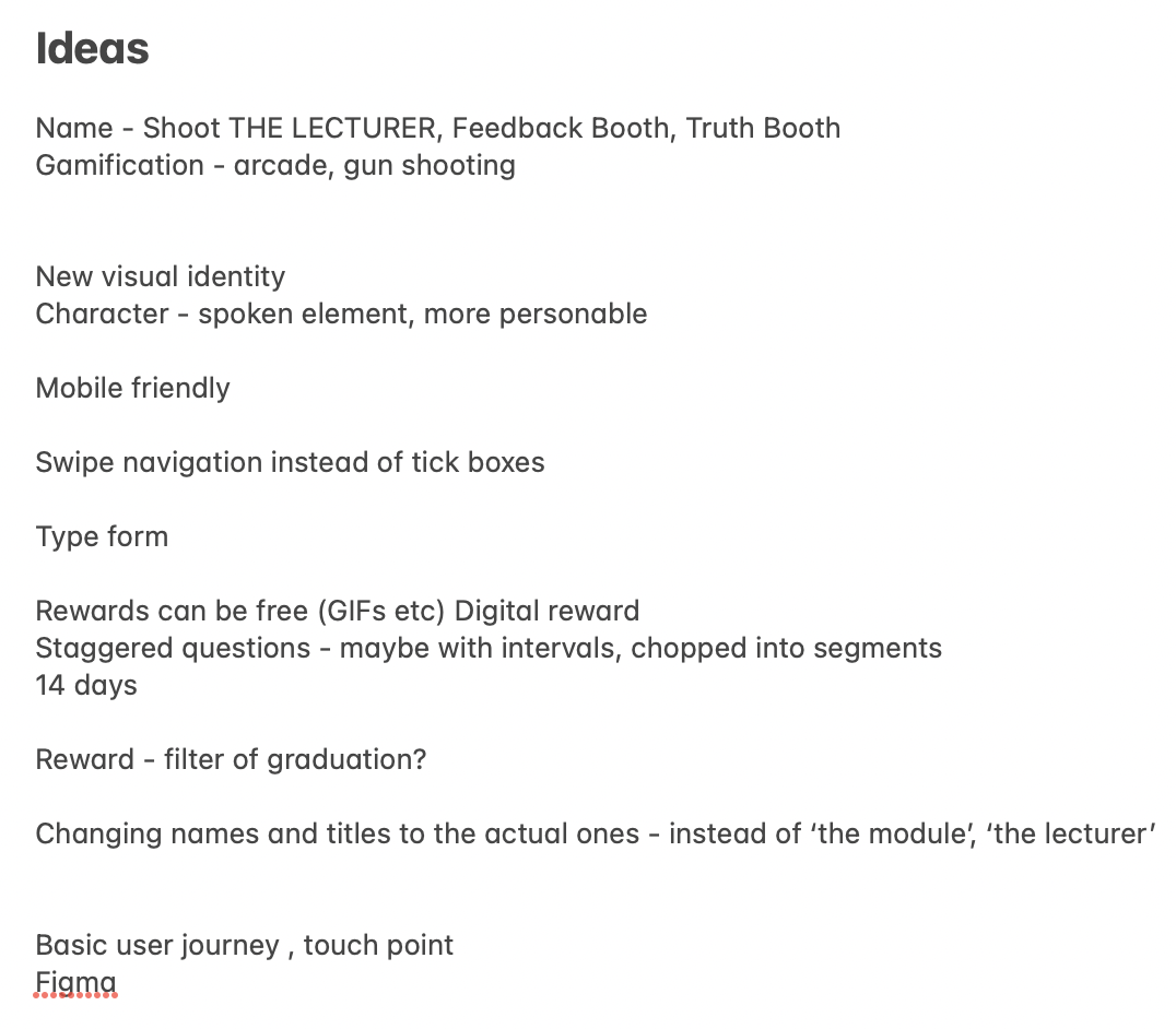
Exploring Rewards
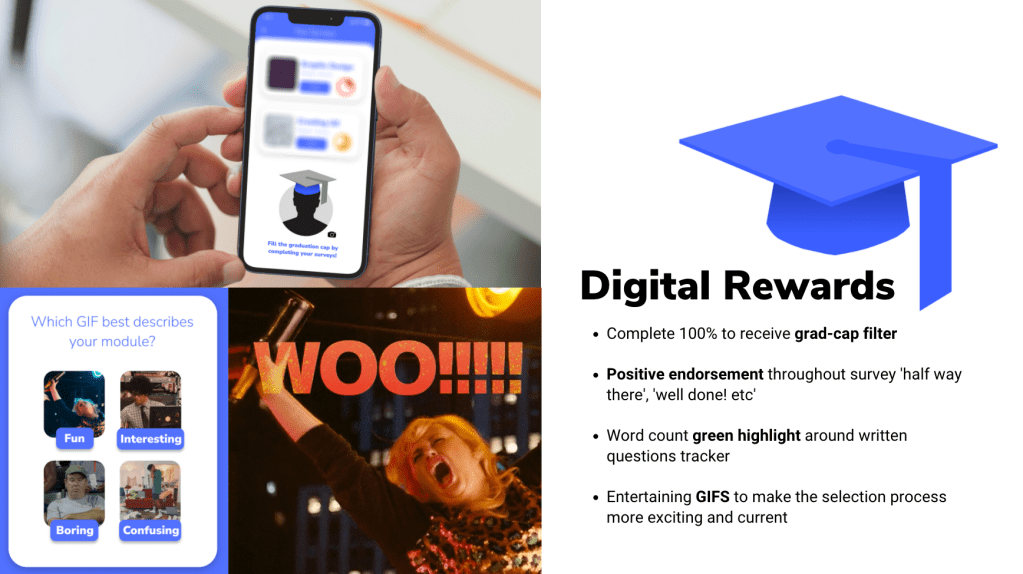
Creating a visual board of different reward types helped me to compartmentalise my ideas and decide on the best choices to go ahead with for the survey.
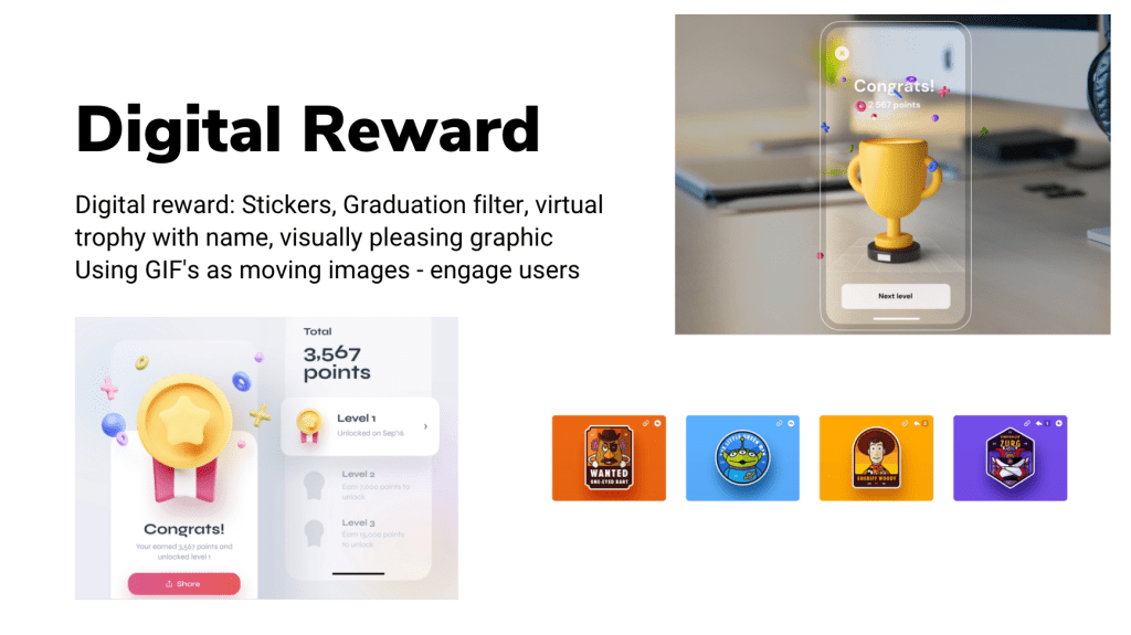
The strongest ideas lay in the digital rewards section, and that was fortunate as the brief didn’t give a budget to use for physical rewards. I decided to weigh up the effectivity of the following rewards: stickers, graduation cap filter, virtual trophy with customised name, and moving images (GIFS, videos etc).
In order to decide, I held some customer research across the university where I asked colleagues and friends what they would most likely find rewarding from completing a survey experience. 90% stated they typically find the surveys dull and not entertaining enough. Most mentioned how having an interesting moving image at the end would be enough. When I mentioned using stickers, most said they would make the experience more complicated and less precise. The filter grad-cap idea and the GIFs had the most positive feedback, so I decided to include them in the MEQ creation.
Website Design Research
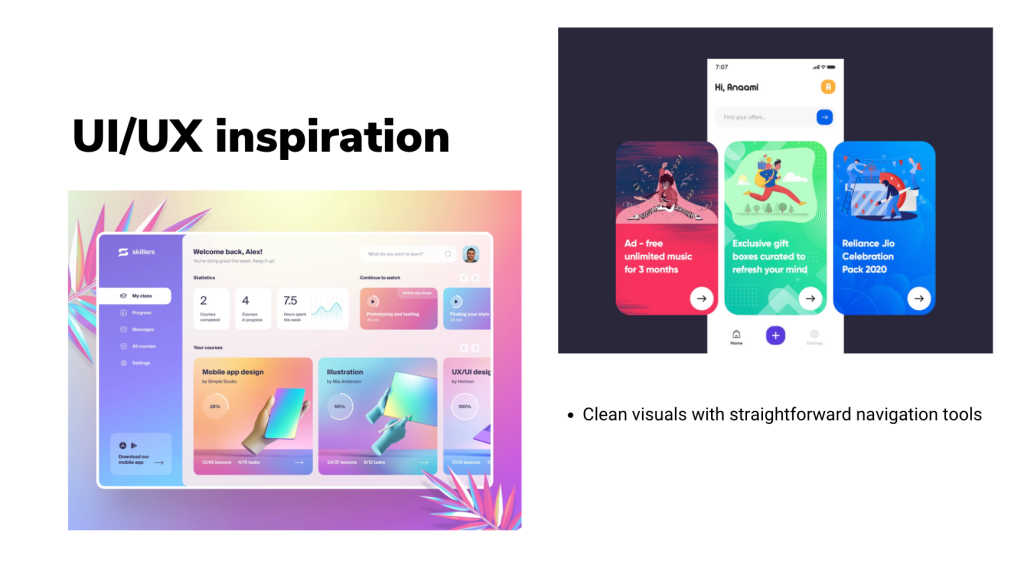
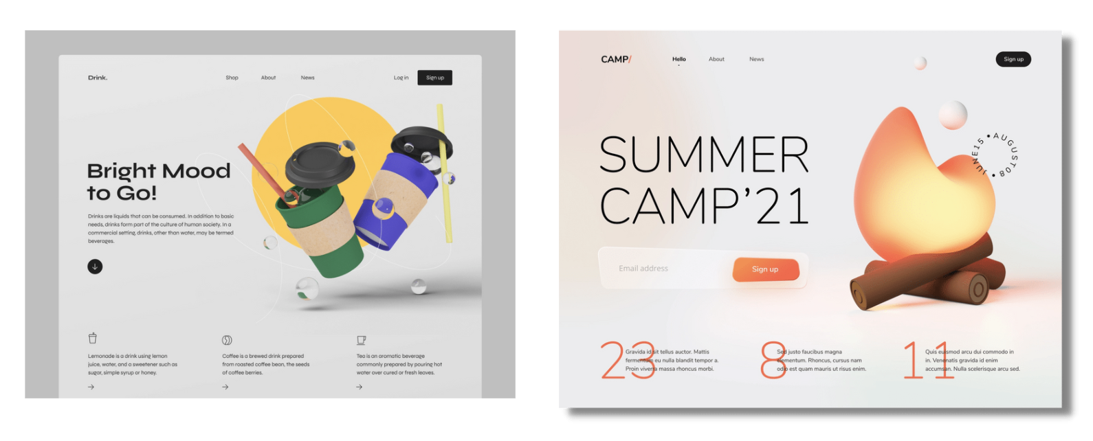
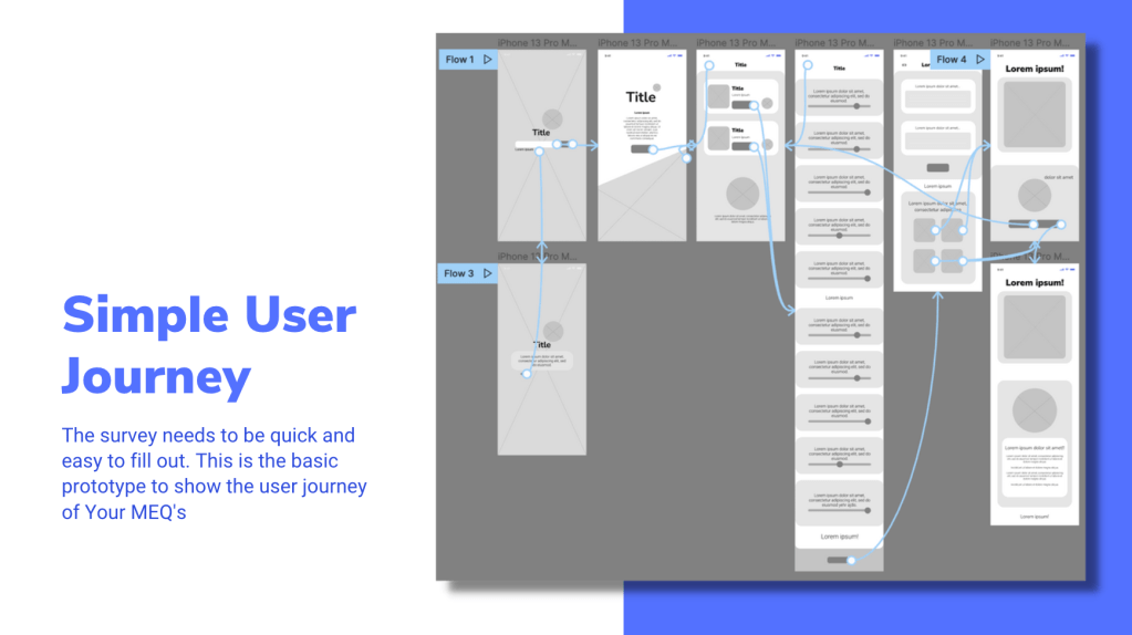
Students are looking for clean visuals with straightforward navigation tools which can take them quickly through their customer journey. Exploring different website interfaces online (desktop and mobile) spring-boarded me into starting the creative process on Figma.
References – https://thefwa.com/cases/the-shift-p2 , https://www.bartleboglehegarty.com/ , https://dribbble.com/shots/15360888-Illustration-for-the-NerdWallet-App ,
Figma Course
As a part of the project, we were advised to take a Figma Wireframing course on LinkedIn called ‘Figma Essential Training: The Basics’. I thoroughly enjoyed this course and learned a lot of new tools and techniques to develop website designs.
Learning about the many different navigation tools you can incorporate in a user experience made me realise how much we take for granted when browsing online or using an app. The familiar symbols and buttons we use today are very different to the ones we used even 10 years a go. Listening to my lecturer talk about the change of interfaces over the years taught me how complicated and cluttered the UI and UX used to be, and how most websites and graphics today follow a very similar layout and pattern.
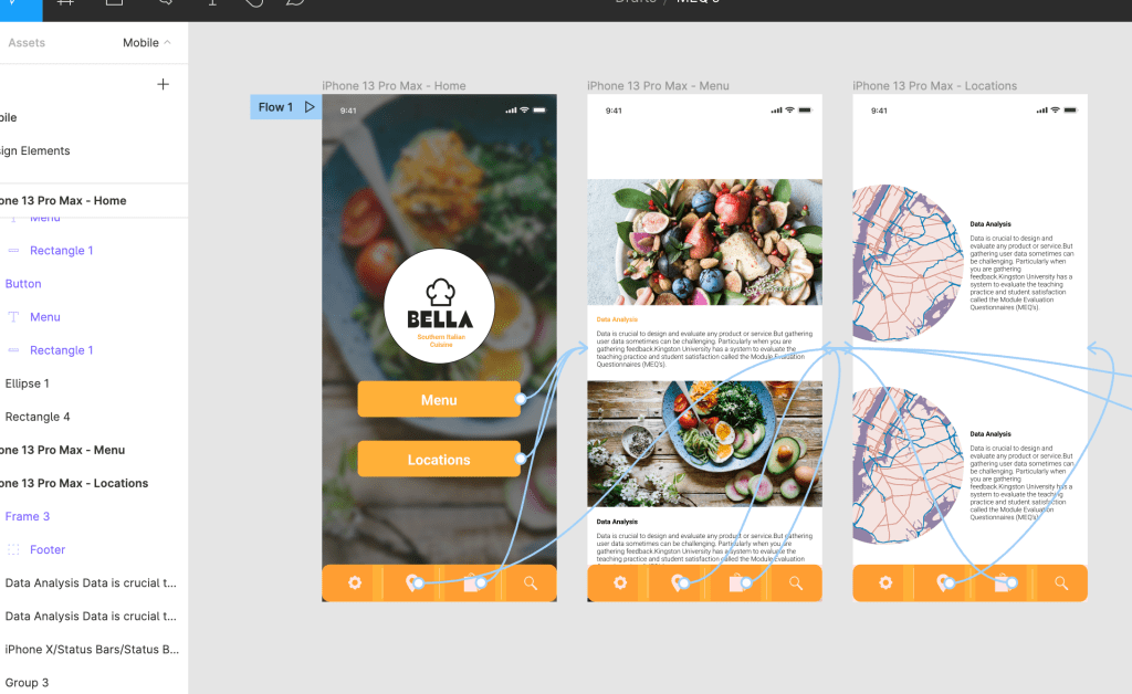
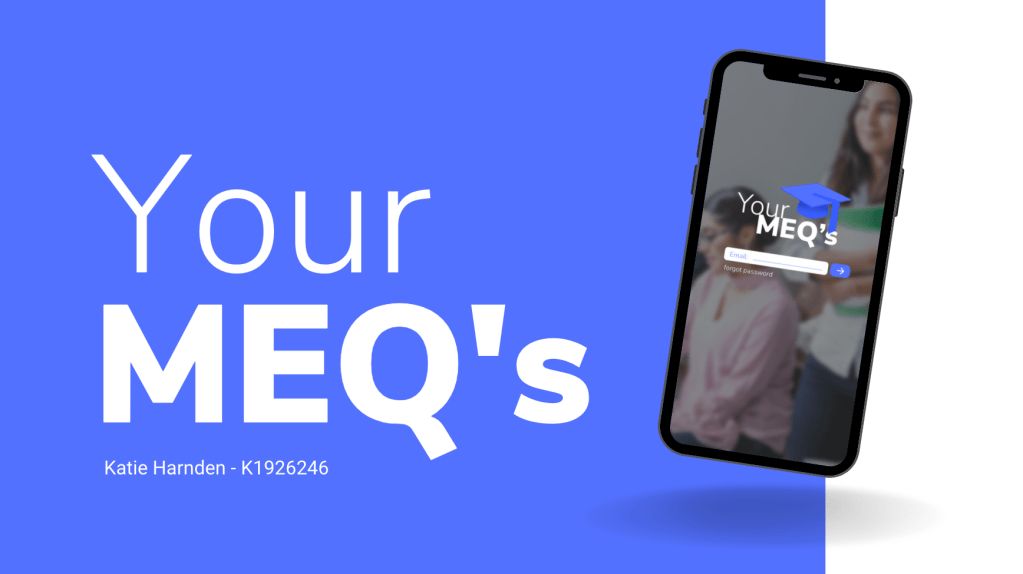
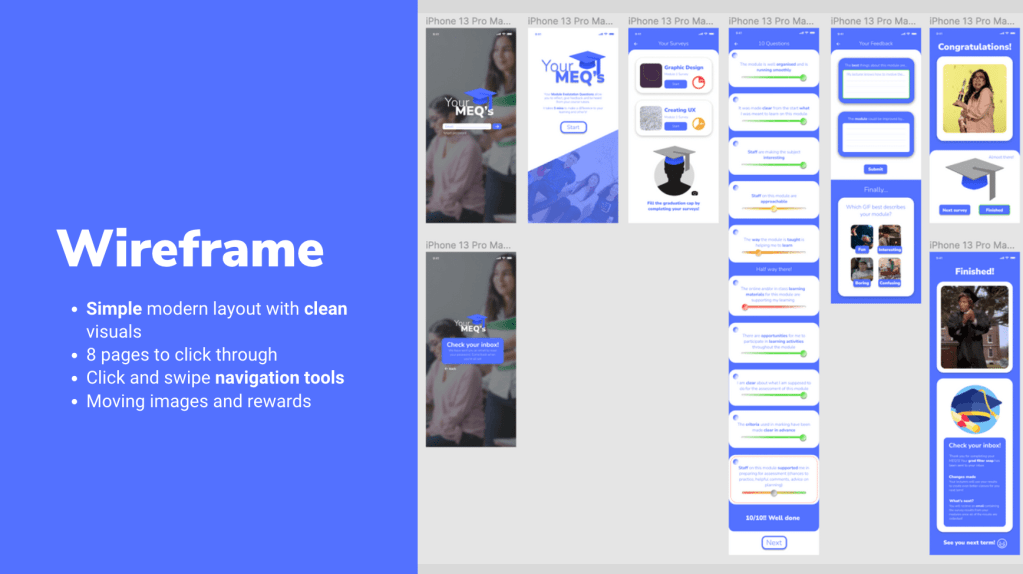
Your MEQ’s Creation on Figma
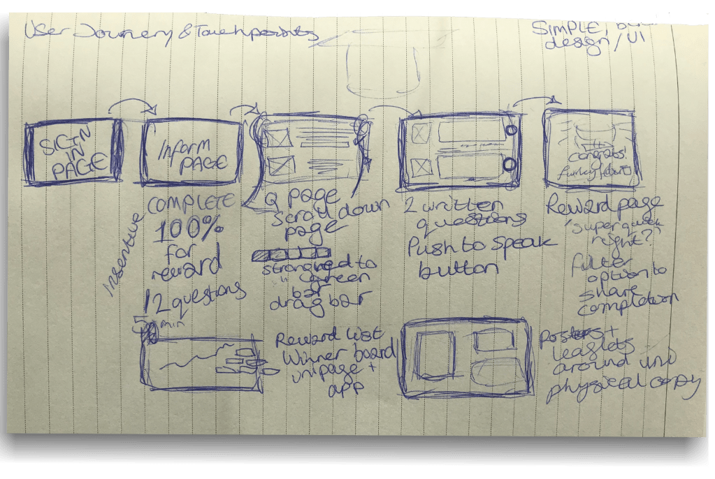
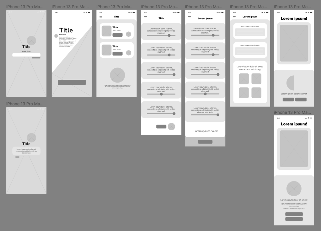
To begin wireframing, I used the wireframe I created on the Figma course as a base to work on and began to plan out how I wanted to structure the UX and UI. I sketched on a piece of paper how I wanted to approach the project with a loose wireframe with captions explaining the interconnectivity.
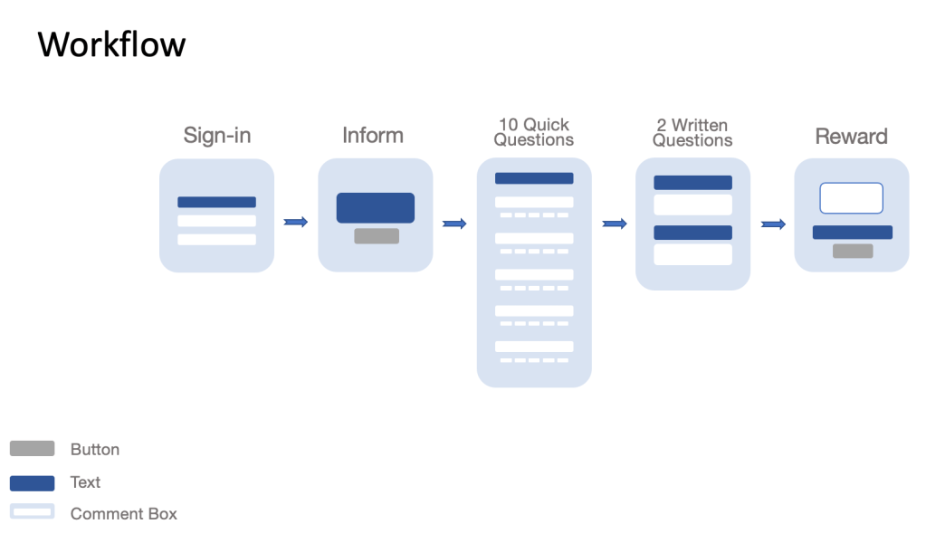
After this, I began to create the two wireframes of Your MEQ’s using this structure:
- Home page
- (Forgot Password Page)
- Overview
- Your Surveys
- 10 Questions
- 2 Feedback Questions
- Reward Page
- Final reward page
With 8 pages to click through, the users can complete all of their surveys in one sitting, or on separate occasions.
Overview and Considerations
- Title creation – Your MEQ’s as a name is personal and expresses how the whole experience depends on the users form completion
- Colour palette – Blue is a calming colour and is often used across educational UIs. This connection creates a familiar environment for the users and increases productivity throughout the survey.
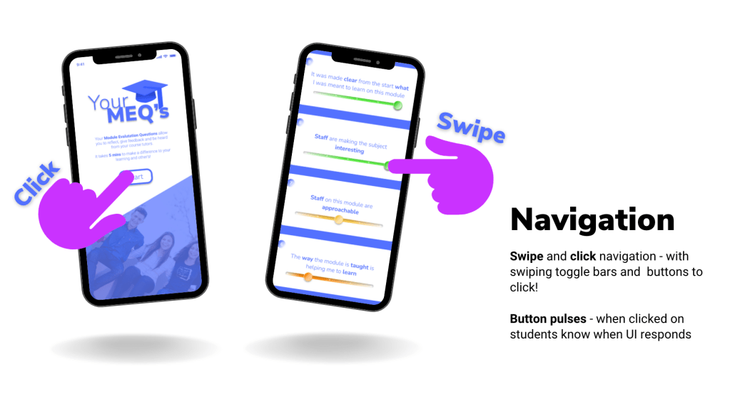
For the toggle bars to rate your experience having a red, orange and green colour code (in 5 shades) so users can identify whether they strongly disagree to strongly agree. A mutual grey colour is used when the user hasn’t completed the task. - Simple design layout with familiar buttons and navigation tools.
- Easy click navigation between pages.
- An eye-catching and memorable logo.
Feedback
I had a constructive feedback session with my lecturer which helped me to further develop and make changes to the UI and UX of Your MEQ’s. This session was very useful and inspired tweaks and improvements of the user experience.
The points mentioned were:
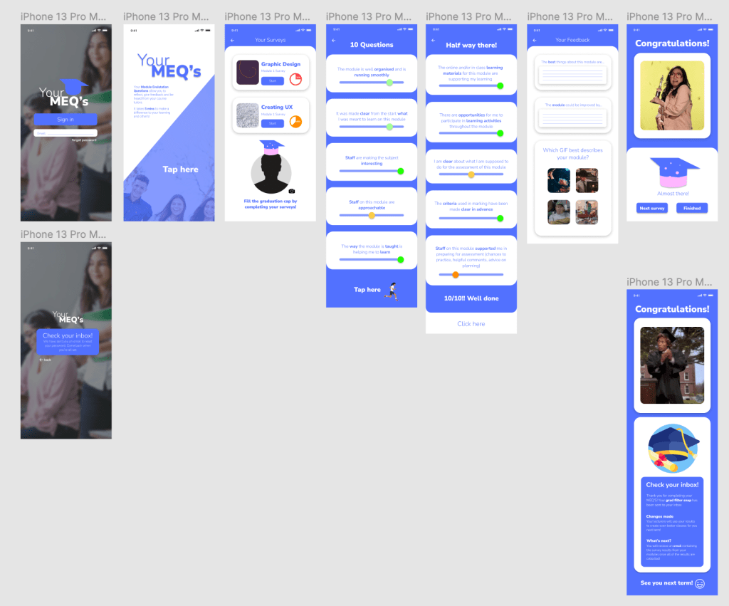
- To change the buttons from ‘click here’ to ‘start’ in order to express the action rather than a command
- Try adding a scroll bar down the side of the page
- Move the 10 questions on to one screen so it shortens the customer journey
- Number the questions
- Find a way of changing the slider toggle bar so they can understand the 5 levels to choose from
- What would happen if a question wasn’t completed?
- Make the user experience simpler
- The 2 longer questions need some sort of submit button
- Explain the process in the video submission – analyse, solve and explain
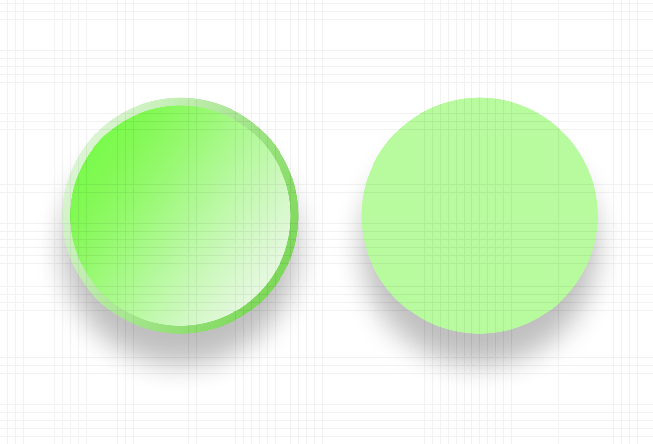
After having applied the changes, I decided to brush up on the visual assets throughout the prototype. Firstly I changed the colours on the toggle bars, and also the circular bar that you drag to answer the questions. I researched other buttons on Figma for inspiration and analysed the way they were made by checking their gradients, sizes, shape layers and translucency. Learning these techniques helped me to create realistic icons across the project. Below you will see the green toggle buttons I created from the reference to the right.

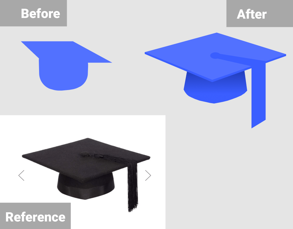
I asked for external advice about the logo and whether it was memorable enough. A friend advised me to look at the shape of a real graduation cap and try to recreate it as it wasn’t obvious enough. I took this advice and recreated the cap on Figma which ended up looking much better.
Case Study Video
The case-study video was created on Premiere Pro as I felt confident using the software due to using it in past projects. To begin with, I screen recorded myself using the Your MEQ’s mobile prototype on Figma and inputted it into Premiere Pro. While recording I made sure to highlight and hover over each button and navigation point so they would be explained in the voice-over. The video was initially meant to be one minute long, so I kept the recording under 50 seconds.
After this I began to write up the script for the voice-over. I kept in mind how I recorded the screen recording and elaborated on each section of the process. I ended up writing too much (494 words) and tried to record myself reading it but it ended up being over 2 minutes long. So I chopped the information down, and cut out the unnecessary parts to make it to 387 words instead. I recorded myself again and then inserted the audio files onto the Premiere Pro timeline and made sure the timings matched and flowed smoothly.

To finish the case-study, I added a light-hearted music track in the background to set the tone of the video and a short video clip to narrative the problem section. The music and videos are copyright-free: https://pixabay.com/music/ (In the Forest, Lesfm) , https://www.pexels.com/video/people-walking-in-the-corridor-with-coffee-while-having-a-break-3254006/
Presentation Deck
MEQ’s Gif References
https://giphy.com/gifs/achartaday-the-visual-agency-thevisualagency-Up8GmvOMbSdvJWvhgI – GIF 1
https://giphy.com/gifs/playstation-gaming-ps5-dualsense-FOEO0C38oVvveWHo3V – GIF 2
https://giphy.com/gifs/party-how-i-met-your-mother-applause-6nuiJjOOQBBn2 GIF 3
https://giphy.com/gifs/reactionseditor-interesting-hmm-3oKIPnbKgN3bXeVpvy GIF 4
https://giphy.com/gifs/l0MYu38R0PPhIXe36 GIF 5
https://giphy.com/gifs/sammhenshaw-broke-samm-henshaw-OQrx03s8VwOl7XmfiZ GIF 6
https://giphy.com/gifs/awkwafina-26u4exk4zsAqPcq08 GIF 7
https://giphy.com/gifs/jimmy-fallon-graduation-dwane-johnson-3oEduUGL2JaSK7oS76 GIF 8
