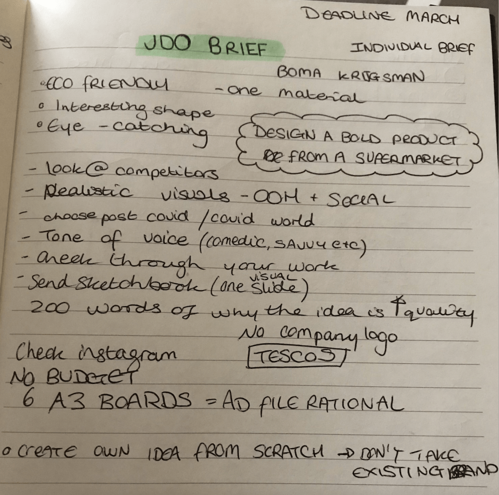
The Brief:
The client JDO asked for a rebranding of an everyday supermarket product, i.e. toilet paper, cabbage, cheese etc, and to have it presented in OOH visuals and across social media platforms. The idea should be innovative and advertise the item in a fresh new way.
Development and Research
The supermarket is a very visually busy place, and shoppers typically stick to a few favourite brands in order to ‘play it safe’ and know what they’re buying is right for them. The most popular items are placed in the middle of the rows, at eye level, so the Customer Journey is almost effortless for the customer. The packaging branding has similar colours, basic lettering and a familiar look which the public take comfort in when shopping.
The brief asks for a new product identity which brings an everyday supermarket item to life. Interpreting the brief meant brainstorming initial ideas and discovering connections and patterns amongst them. The fact this brief was particularly open meant having to digest the insight ‘The supermarket goods aren’t aesthetically pleasing’ and filtering my ideas down to a select few.
To begin this process, I wrote down my thoughts on paper to see them visually, and then weighed up the achievability of each idea and decided on the strongest. In a lecture, a speaker once said ‘How do I know what I think if I don’t see what I say’ which perfectly illustrates my thought process, I need to see it visually to properly understand and compartmentalise possible strategies.
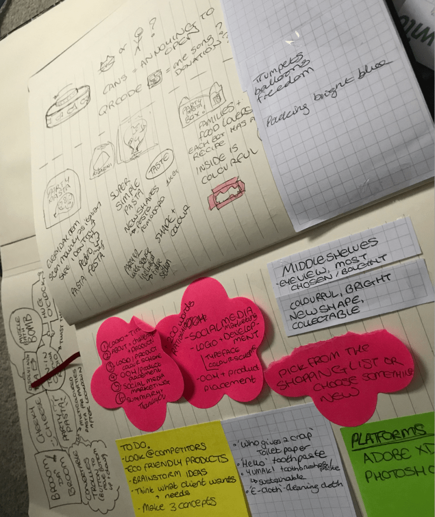
The lists I created consisted of possible ideas, OOH and social media channel visuals to create, the platforms I would need to use (such as Photoshop, Adobe XD etc) and other thoughts towards the project.
After having weighed up my options and considering external opinions towards each idea, I decided to focus my project on PASTA.

‘Why pasta?’ you might be asking…
Pasta was one of the top ‘panic buy’ items during the COVID outbreak. The public stocked up on so much pasta that stores were having to limit the number of packs bought per customer. This meant people were valuing the items they bought more and recognised which items they turned to the most for their everyday meals.
Considering customers’ loyalty to pasta, I was inspired to make pasta the project they turn to once the lockdown eventually ends. Many parties could take place after restrictions are lifted, so I came up with the idea ‘Party Pasta!’. I considered other names like ‘Pasta Festa’, but the name ‘Party Pasta’ seemed more suitable for the project I was conceptualising.
Survey | Breakdown and Analysis
In order to better understand my target audience, I created an online survey to find out their opinions about pasta as a food product and about their purchasing habits and preferences.
Survey link – https://forms.gle/zZQLAJitGJZvDqZG9
This survey gave me a real insight into how to progress in the project and an idea of where to start from. With the data collected from 22 participants, I analysed my findings and discovered patterns with issues and successes around the product.
The first question was ‘Do you like pasta?’ where 90% answered ‘Yes’, and the participant who didn’t stated that they don’t digest it well therefore avoid it. This means that the survey targeted mainly those who are interested in the pasta product.
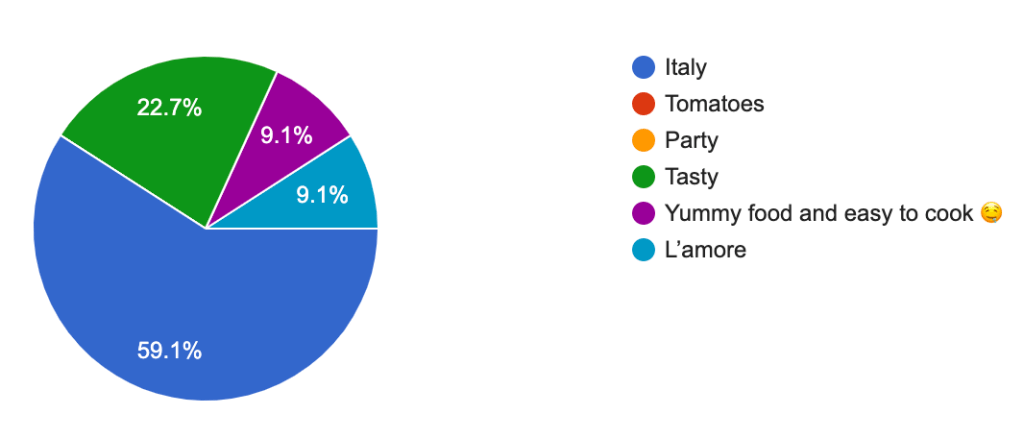
The next question was ‘What comes to mind when you hear the word ‘pasta’ ?’. To this over 59% responded with ‘Italy’, 23% with ‘Tasty’ and 18% split with ‘Love’ and ‘Easy to cook’.
‘What would encourage you to buy more pasta?’ The top responses were ‘If it was healthier’, ‘Better packaging’ and ‘Easy recipes included on side of packet’. This shows that customers are looking for a healthier product, with more eye-catching and attractive visual identity and with an easy-to-follow recipe included to help the cooking experience. Millennials and Gen Z’s look for easy, straightforward tasks and to be entertained in the process. This means the Party Pasta will need to contain an element of interactivity and advertise achievability and success.
The following question was ‘Have you ever cooked a pasta dish?’ which 100% answered yes to. They then selected out of 5 pasta dish options where the most popular turned out to be Lasagne (15 responses), Spaghetti Bolognese (15 responses), and Pasta Carbonara (14 responses). Cacio e pepe had 4 and Amatriciana 2 which I will not be targeting for this project.
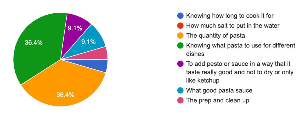
‘What is the most frustrating part of cooking pasta?’. The two most popular answers were ‘The quantity of pasta’ (36%) and ‘Knowing what pasta to use for different dishes’ (36%). This confirms the choice of adding recipe with instructions on the packaging.
‘Have you ever tried multi-coloured pasta?’ The majority (63%) replied with yes, and the rest with no. The following question was ‘What would convince you to try it?’ where 50% answered ‘To know the taste’, 36% with ‘To add colour to my dishes’ and 13% with ‘To use for a special occasion’.
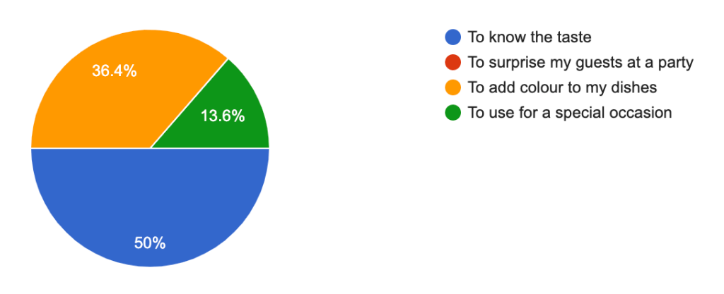
This data shows customers are more curious about the taste over all other factors, so this also needs to be considered in the advertising and product design.
‘Among the following brands, which is your favourite?‘ 45% of the answers selected ‘I don’t know’ meaning many aren’t connected to the brand identity of a product, but perhaps more so its purpose in a dish. Those who selected a brand answered the following question ‘Why this brand?’ where the majority chose the options ‘Taste’ and ‘Quality’ which further validates my point, that customers are more concerned about the value the item has rather than its packaging or visual identity.
‘Are pasta dishes easy to make?’ 59% answered ‘yes’ and 41% ‘Depends on the dish’.
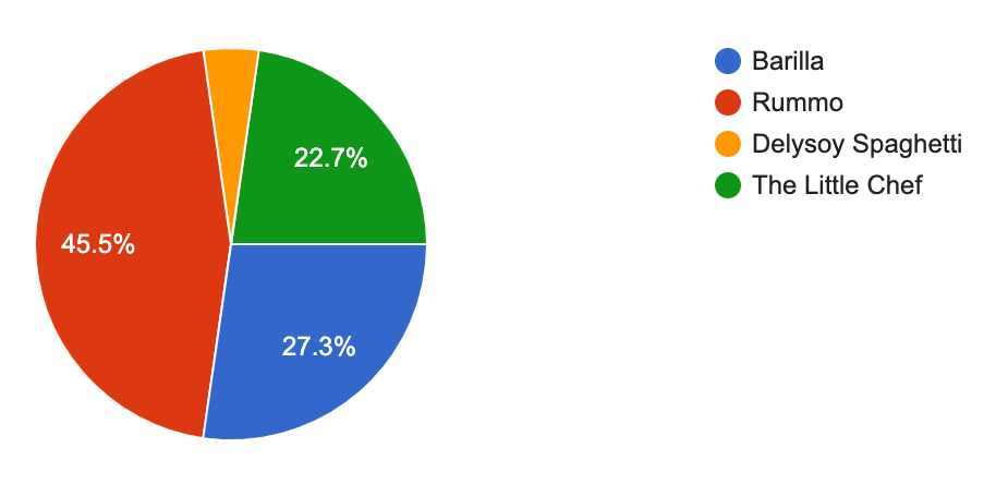
‘Out of these brands’ packaging, which is your favourite?’. In this section, the participants were given visual examples to choose from which helped them identify the name to the visual branding. 45% chose Rummo, 27% Barilla and 22.7% The Little Chef, which is a smaller pasta brand but with a strong visual identity. This data shows customers mostly choose the most popular brands, but are willing to try new brands if they have attractive and compelling packaging.
The final question was ‘If you see a new type of pasta that catches your attention, would you try it?’ 86% chose ‘Yes’, 9.1 chose ‘It depends on the price’ and only one participant chose ‘No’. This data shows customers are willing to try a new type of pasta if it is at a decent price and catches their attention.
The survey has revealed 7 main points:
- Words ‘Italy’ and ‘Tasty’ are the first words that come to mind when thinking of pasta.
- Customers are looking for a healthy product with an attractive visual identity.
- Party Pasta will need to contain an element of interactivity and advertise achievability and success.
- Most popular pasta dishes: lasagne, spaghetti bolognese and pasta carbonara.
- Product needs to clearly show the quantity of pasta needed per person and give examples of what dishes can be made with each type of pasta.
- Multicoloured pasta has been tried before, and people would buy it to know its taste and to add colour to their dishes.
- Customers are willing to try new brands if the product tastes good, is high quality, is visually appealing and is sold at a reasonable price.
Visual Identity Research
Delysoy – https://www.packagingoftheworld.com/2016/10/delysoy.html
The Little Chef – https://carpentercollective.com/project/the-little-chef/
Iozzo – https://www.pinterest.it/pin/427490189613613723/
Nikita Konkin – http://nikitakonkin.com/portfolio/good-hairday-pasta
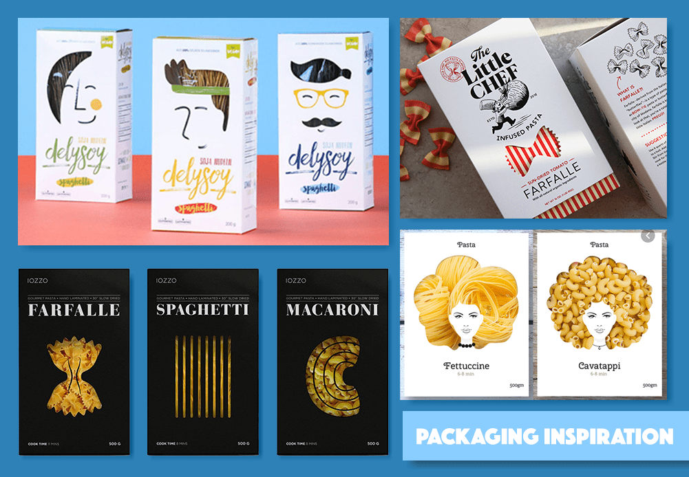
My visual research was inspired by firstly focusing on examples of pasta packaging and then onto exploring other interesting product packaging. The mood-board above shows a collection of pasta packaging which inspired me in my visual research. Each branding contains similarities and differences that make the product unique and sellable.
In my survey’s results, we can see how customers look for a visually appealing, high quality product. The examples above show these factors in different ways.

The Little Chef has an imaginative style with a simple colour theme and a clear art direction. The red and white stripy packaging is clean and not overwhelming, while also demonstrating the shape and stripes on the pasta. The sleeve over this layer is a clean white, which brings emphasis on the brands name, logo and product. The stamp on the top left gives the impression the food is tested/ successful which could intrigue the customer more. Overall this packaging is my favourite, not only for the packaging but also for its story-telling technique and brand identity.
Designer Nikita Konkin and company Delysoy created packaging with wild pasta hair with a cut out shape revealing the product beneath. This idea is a very clever, creative design which would attract customers. Another company who used this technique is Iozzo who used the shape of the different types of pasta expressing how simple packaging can go a long way. Both Konkin and Iozzo added the time the pasta should be cooked for and quantity, which simplifies the customers experience.
Logo and Font | Research and Creation
The creative execution for this project started by combining all of the insight and knowledge gained through research and by experimenting ways of executing my inspiration in an effective way. The packaging for Party Pasta will be eco-friendly, therefore recycled paper and plastic would be appropriate to use.
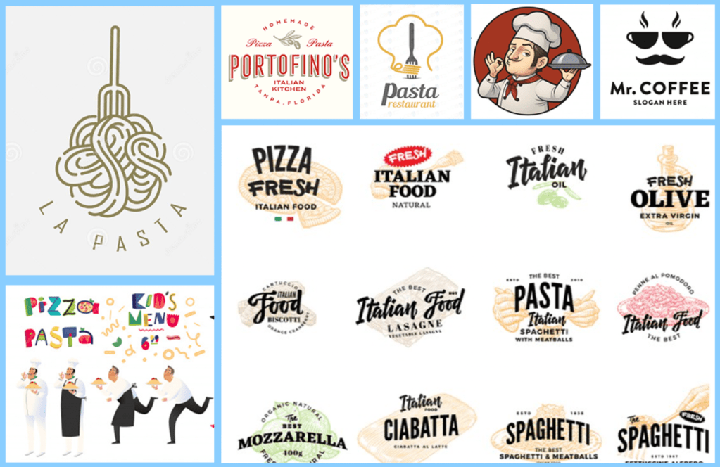
When researching different logos for the brand, I was inspired by the different ways pasta is used in creating logos. It can fit in and around the logo at such an ease that the text falls into place around it, or layered on top. A lot of the logos I found were in an Italian style, and included chef characters or a moustache. Each interpretation expressed a sense of vibrancy, and this inspired me to make the logo dynamic with a sprinkling of personality.
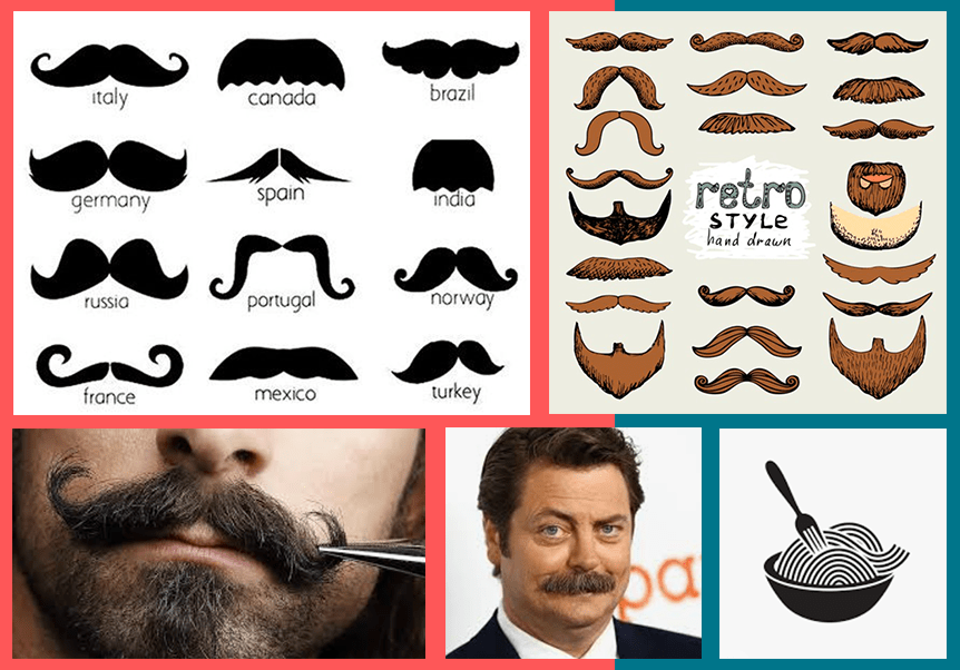
I was very inspired by chef characters I saw in my logo research, and I wanted to incorporate a comedic moustache into the brand. The stereotypical Italian moustache has personality and I thought would be interest to play with working with the shape and movement of pasta.
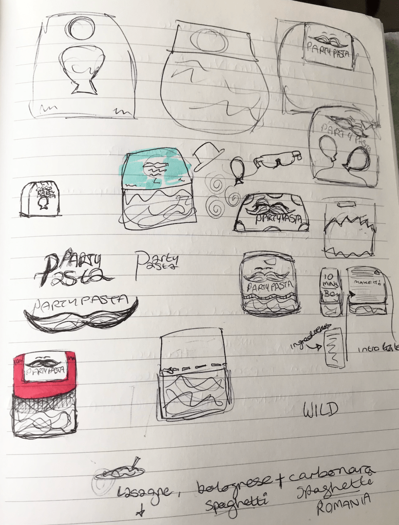
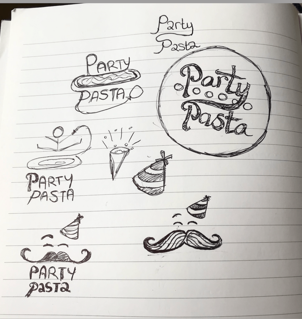
In the images to the left, you can see my brainstorming and ideas at this stage of the process. My ideas were very scattered and didn’t hold much form at this point, however my creativity was flowing, and I found drawing/ writing down my ideas very useful to do.
In order to include the party theme in the logo, I had to think of ways of visually showing this. I thought of including party poppers, balloons, party hats etc, however eventually the masquerade mask seemed to fit the idea perfectly.
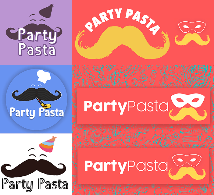
Now there was the matter of putting all of these ideas into one visual without over complicating the message. At a certain point, the moustache was over-bearing and it seemed to come the central focus over the title which was not wanted. After lots of experimentation on Photoshop and with pen and paper, the final logo was realised and I am happy with the outcome. Below you will see the final logo with the stylised background, giving a true sense of the Party Pasta branding.
Font & Colour Palette
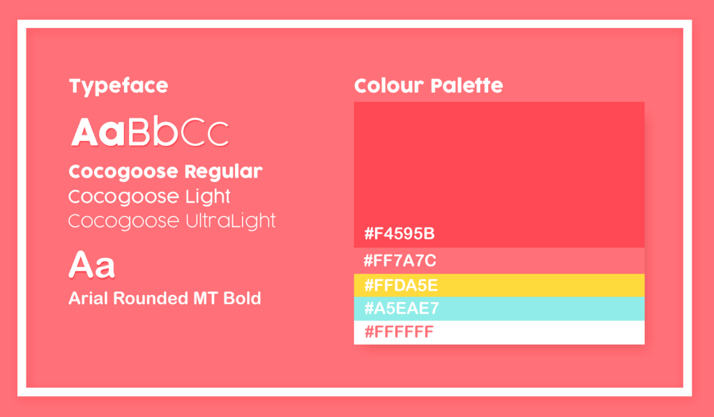
Throughout the creation process, I was inspired by lots of different colour palettes used in pasta branding. However I wanted to slightly venture away from the typical colours, as the brief outlined that it should stand out from the shelves. In the visual above, you will see the typeface and colours I decided upon for Party Pasta. There is a mix of the typical reds and yellows, which fit nicely alongside a brighter blue and white shade. The idea was to create a colour palette that is cheerful and pleasing to the eye so it would stand out against other more plain packaging around.
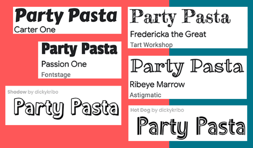
The chosen typeface was Cocogoose and Arial Rounded MT Bold, as they are easily legible and give personality to the text. To the right you can see different fonts that were considered but not chosen as they were either too off-brand or cluttered the overall image/ packaging.
Packaging Background

Researching pasta backgrounds inspired me when looking at different ways of incorporating patterns into packaging. Above you can see a mood-board containing a selection of the pasta drawings I was inspired by for Party Pasta.
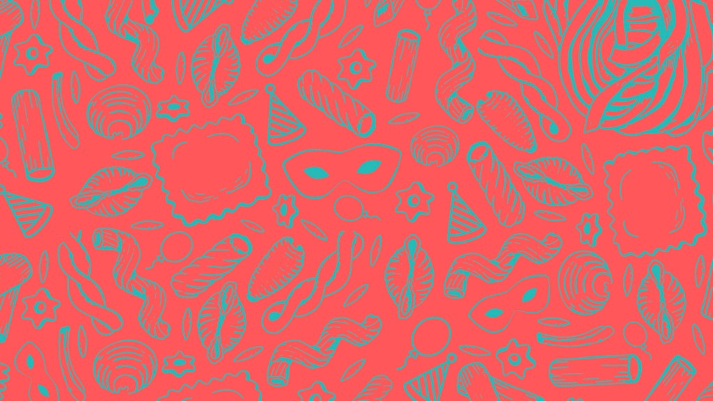
On Photoshop I rearranged pasta vectors and created my own party themed drawings to build a new theme around the brand identity. The colours are purposefully dark in order to bring emphasis to the logo and text which would be layered on top.
Pasta Product | Research and Idea
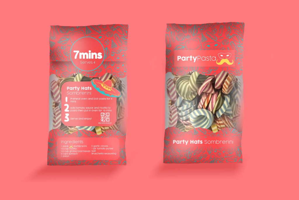
After having researched packaging earlier on in the project, I built up an image over the weeks of how I wanted Party Pasta to look. The visuals above were created on Photoshop and follow all of the brand guidelines established before. The packaging has character and expresses the simplicity and colour the pasta can bring to peoples parties.
The front of the packaging is simple and easily legible, and exposes the pasta through see-through packaging and it’s name at the bottom. Each type of pasta will be displayed in the same way but will be different on the back. The bold ‘7 MINS’ instruction strikes the audiences attention and it gives a starting point to gain their curiosity for the rest of the instructions. The idea behind the text on the packaging was for it to be simple to follow and read, which can be shown through its simple 3 step cooking guide and a QR code for a video to follow.
OOH Visuals
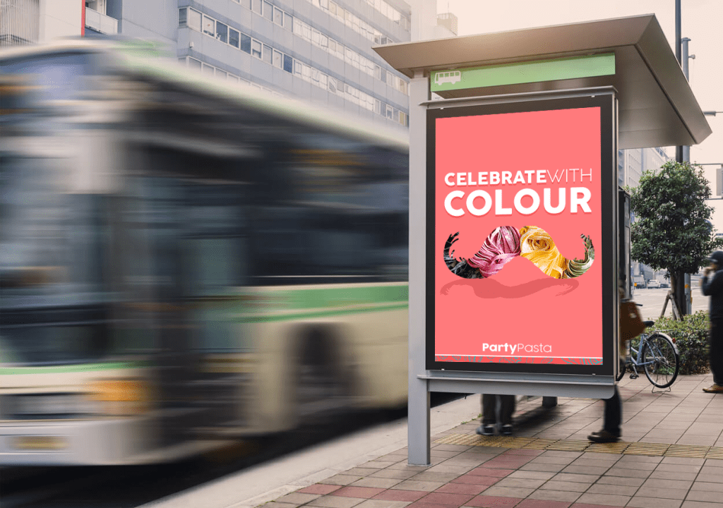
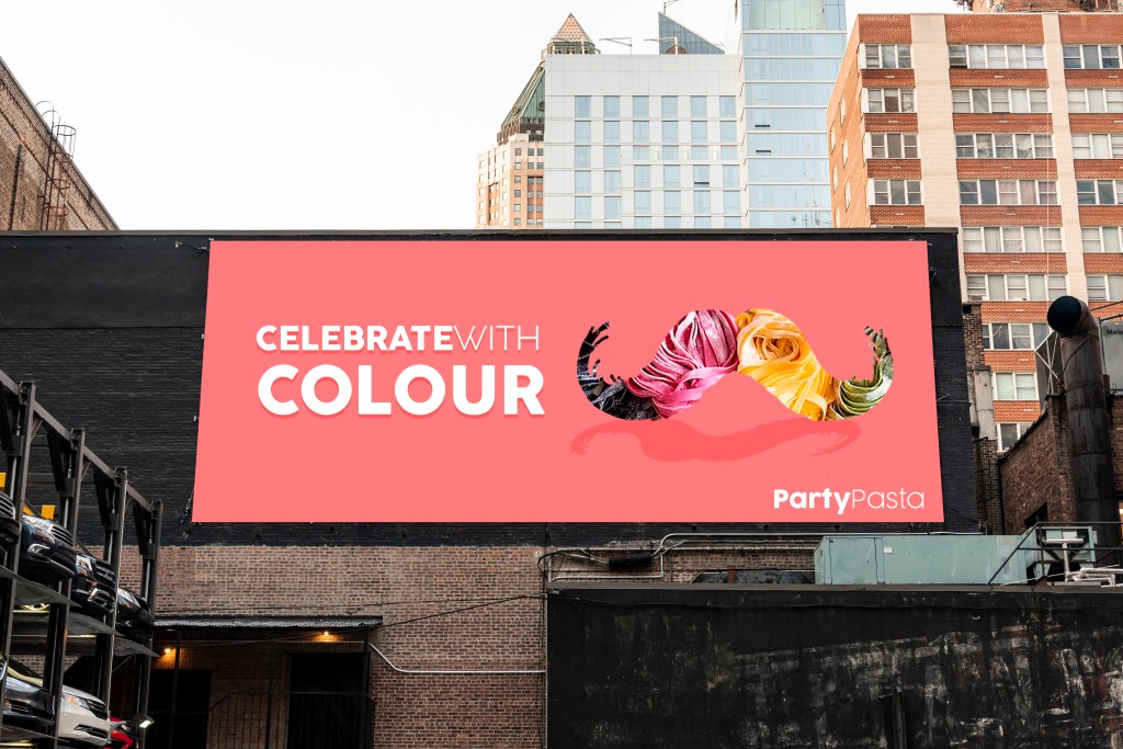
The OOH visuals were created on Photoshop and clearly represent the visual identity of Party Pasta while advertising the moustache shape of the logo and the tagline. These banners would be shown across London, and would catch the attention of passers-by with their bright colours and inspiring message.
Social Media Mock-ups
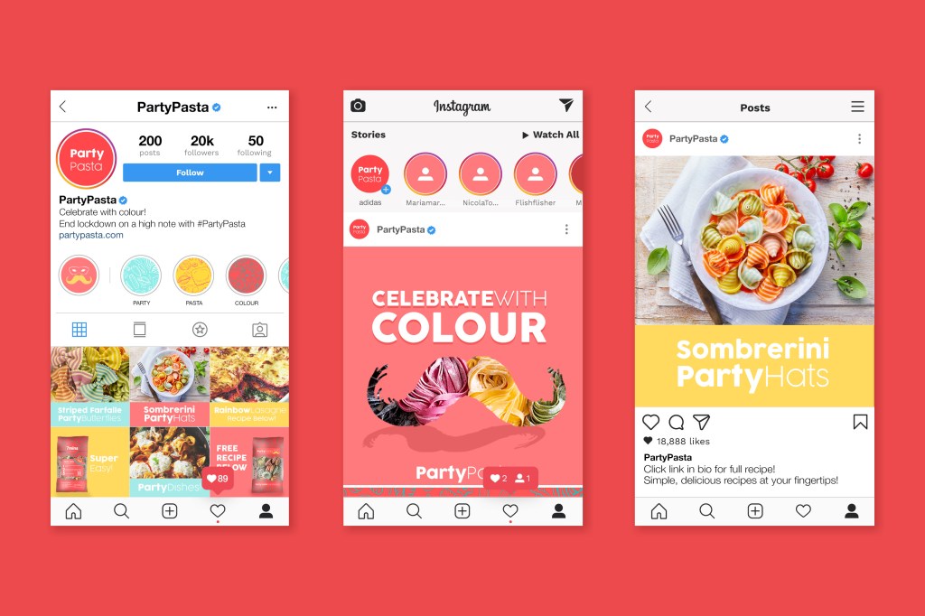
The campaigns Social Media marketing will mainly focus on Instagram as a platform considering it’s popularity and audience engagement. The visuals will stick to the campaigns’ colour palette, and will advertise the dishes people can create with the colourful pasta. In the description section, and via the link in the biography, customers will be able to clearly access recipes for each type of Party Pasta for their events.
200 Word Summary
Pasta was one of the top ‘panic buy’ items during the COVID19 outbreak, so why can’t it be the best buy after lockdown? This insight inspired ‘Party Pasta’, a colourful, exciting brand of multi-coloured pasta bringing life to simple dishes after lockdown. This delicious party shaped pasta will transform average dishes into something spectacular!
Each Party Pasta pack contains an easy-to-follow recipe in three simple steps, the cooking time and quantity needed per portion. This enhances the customer experience and turns cooking into a fun activity. Next to the instructions are QR codes which link to videos demonstrating the process of creating the dish.
Its colourful and simple packaging will strike the audiences attention in supermarkets across the UK, and will intrigue them to find out what the brand is. Pasta types such as Sombrerini, Farfalle and Spaghetti are renamed to Party Hats, Butterfly Crazy and Multispag to enhance the party theme. Each type of pasta will be multicoloured and created with natural ingredients, guaranteeing customers a clean and healthy dish. The packaging will be made of recycled plastic, and will have no carbon footprint.
Party Pasta will enhance the parties we will have when celebrating our freedom after the national lockdown, bringing colour and ‘novità’ to simple dishes, and by making the comfort of cooking exciting again.
Project Summary
Party Pasta was an exciting project to develop and has taught me many skills along the way. I worked on this project independently and had a longer timeframe to complete it in which was beneficial. This process tested my organisational skills, stretched my schedule planning methods, inspired the use of different tools to create visual outputs, and tested my creative thinking.
The main challenge I faced in this project was when creating the Party Pasta logo. I experienced a major creative block that prevented me from coming up with a final outcome. I discovered how much value there is in having an external opinion on ideas, and how asking for help can bring a lot of clarity to creative processes. Once I decided on the final logo, the rest of the project was built around it and it complimented the insight very well.
In future projects, I will be less intimidated by my initial project designs and will be open to asking for a second opinion. The initial research I made at the beginning of the project inspired the rest of my decisions, so I will definitely be making more surveys like this to better understand target audiences in future work.
