Richard Long is famous for creating geometrical shapes out of resources such as stones and wood, in open spaces. The paleolithic style can be seen through his art due to his use of simple shapes and materials. His deliberately placed mediums forming circles and lines shows the simplicity of connecting art with the natural world.
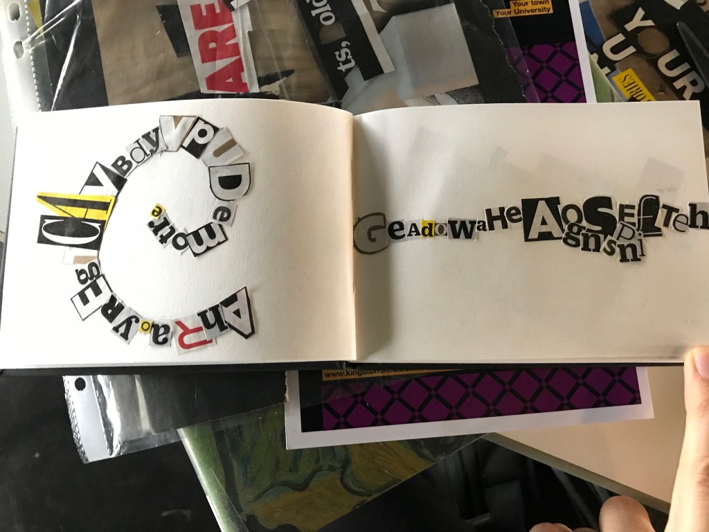
When thinking about how to incorporate Richard Long’s art into a typography piece, I began by sketching possible ideas using shapes and text. The text limit is 25 words, so I initially thought it would fit in one circle.
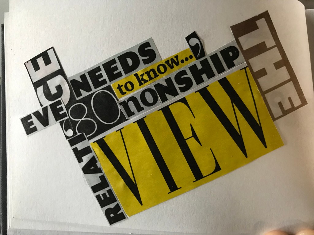
The idea of cluttering text around a solid circle shows the precision the artist uses with shapes. His use of materials (stones and wood) are wild and unpredictable, so to express this I’m using an unorganised method of placing the letters.
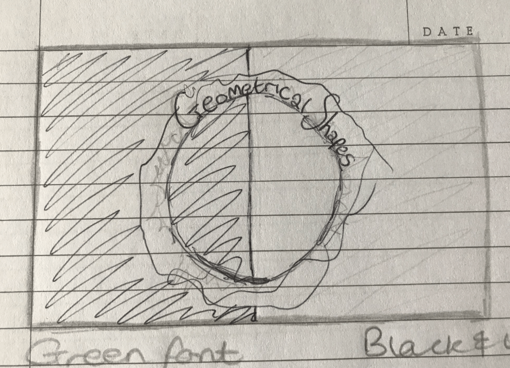
To start with, I stuck black paper onto a white A2 sheet to have a black and white background. This represents Richard’s simple approach to making decisions, and how it can have an impact on the viewer. The strong line down the middle of the page (from the separation of paper) is to represent his work with lines.

I started by selecting a range of bold and interesting fonts to place around a cut-out circle template to see how the composition would look.
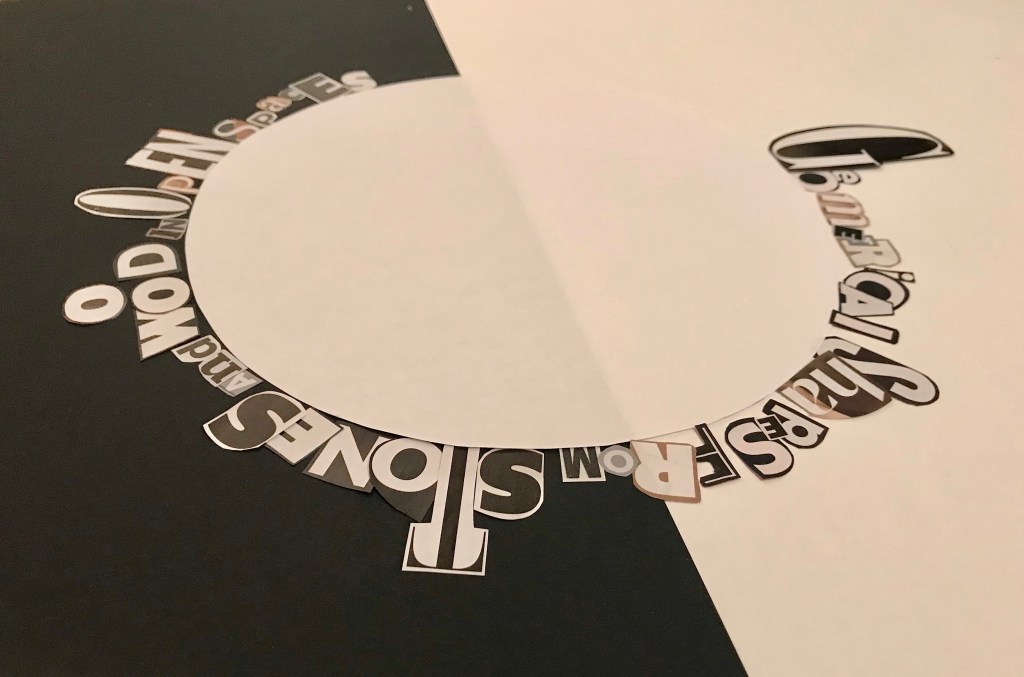
This was the point when I realised all of the worlds can’t fit around a circle, so I decided to create a swirl instead.
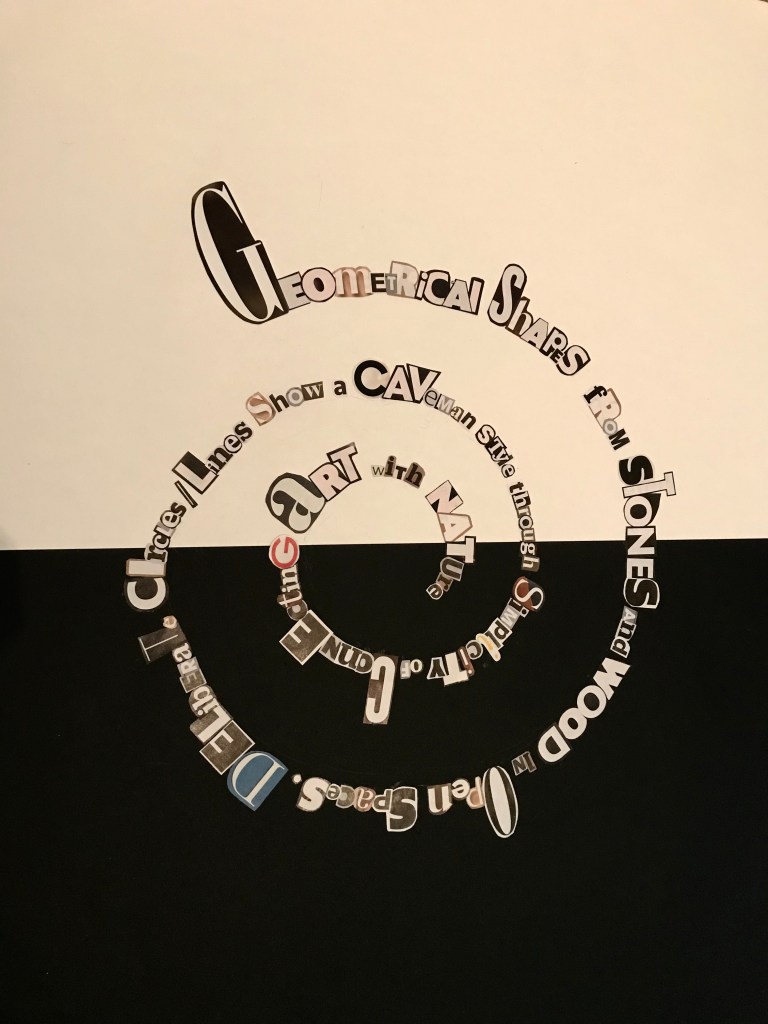
After lots of concentration, cutting and sticking my piece was finished. I have enjoyed this project, and was inspired to create extra mini pieces as a result…